Santos Henarejos, Infographic: Speak My Language
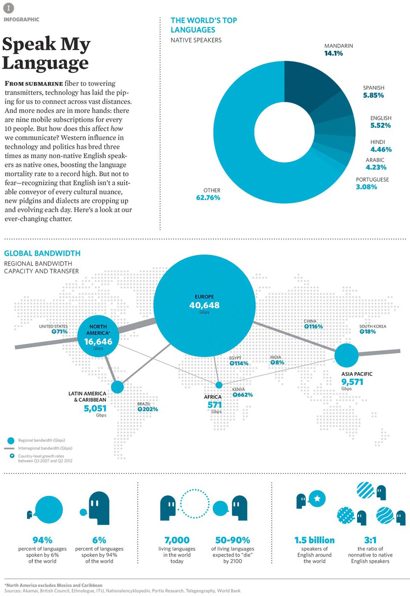
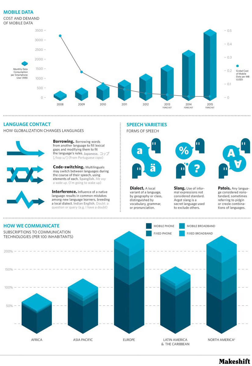
Santos Henarejos is a graphic designer who lives in Madrid, Spain. With Gemma Navarro, he is co-founder of the international design firm We Are Rifle; both serve as art directors for Makeshift, where we found this selection. Makeshift is a magazine that seeks to be a “field guide to hidden creativity,” and you can visit it online at http://mkshft.org/. The idiom “speak my language” can mean to communicate in a way that someone else understands, often because of shared worldview (Janet speaks Alissa’s language. They get along just fine.) or to express a strong positive feeling for something (Chocolate cake? Now you’re speaking my language!). In this visual argument, Henarejos offers an infographic, a genre for presenting data and text that, when done well, does not misrepresent the information displayed but encourages readers to see new relationships between the phenomena illustrated. As you study Henarejos’s infographic, spend time thinking about whether and how its various parts add up to a single argument or several possible arguments.
Infographic: Speak My Language
SANTOS HENAREJOS


Consider the organization of this infographic. What other ways might Santos Henarejos have chosen to convey this information? Chapter 14 discusses how different types of visuals transmit information clearly and effectively.
RESPOND •
Infographics are most successful when they help us see things in new ways, often by putting together bits of information we hadn’t seen juxtaposed before. What information about language (rather than cellular communication and broadband) in this chart is new to you?
A key to understanding many infographics is the accompanying text. How does Henarejos’s text “Speak My Language” frame the way we read and consume the various parts of this infographic? In other words, how does his text create a context for understanding the various parts of the infographic?
As you’ll note, there are no marginal glosses for this selection. Why would we expect a successful infographic for a general audience not to need glosses? (Chapter 14 on visual rhetoric may be helpful here.)
From a linguistic point of view, one instance of Henarejos’s word choice is especially interesting. Find the two places in the infographic where Henarejos uses a form of the verb breed. What are the connotations of this verb in English? (In other words, who or what breeds or is bred? Is the term usually used in ways that are positive or negative?) Someone trained in linguistics would likely have used a verbal phrase like give rise to in these cases. What difference is communicated by the choice of give rise to instead of breed? If we assume that Henarejos knows about this distinction and consciously chose to use breed, what argument is he making by using that word rather than other alternatives? (See Chapter 13 for a discussion of word choice.) By the way, we wonder if Henarejos’s choice might be related to the fact that his first language is Spanish; if so, this would be an instance of the phenomenon of interference, which he discusses, and he likely does not realize that in using breed, he will be taken by many readers as having made an evaluative argument about the topics he is discussing.
As noted, an infographic often juxtaposes various kinds of information while providing limited remarks to provide context for the information presented. In contrast, when using visual information in academic writing, writers need to make explicit the point of any figure they include. Choose one of the sections of this infographic that includes limited text (e.g., the diagram “The World’s Top Languages: Native Speakers”) and write a short paragraph that might accompany it if it were to be used in an academic essay. You may wish to begin the paragraph “The figure [name of the figure] provides information about . . .” In writing this paragraph, you’ll be constructing an argument of fact. (See Chapter 8 on factual arguments and Chapter 14 on visual rhetoric.)