EXAMPLE 15![]() From Histogram to Density Curve
From Histogram to Density Curve
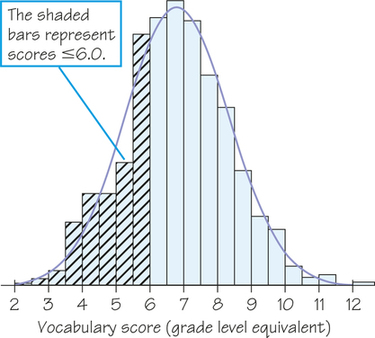
You can think of a normal curve as a smoothed-out histogram when there is symmetry and one mode. Our eyes respond to the areas of the bars in a histogram. The bar areas represent proportions of the observations. Figure 5.20a is a copy of Figure 5.19 with the leftmost bars shaded. The area of the shaded bars in Figure 5.20a represents the students with vocabulary scores of 6.0 or lower. This area reflects the proportion 287/947≈0.30 of Gary, Indiana, seventh graders, so 6.0 is the 30th percentile.
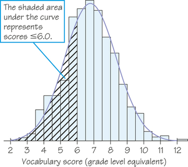
Now look at the curve drawn through the bars. In Figure 5.20b, the area under the curve to the left of 6.0 is shaded. We know that the areas of histogram bars represent proportions of all the observations, but we don’t worry about the actual total area. Note that all the bars together represent 100% of the students, so we treat the total area under the normal curve as 1 for 100%, which turns the curve into a normal density curve. Now, areas under the density curve actually are proportions of the observations. The shaded area under the normal density curve in Figure 5.20b is the proportion of students with scores of 6.0 or lower. This area turns out to be 0.293, only 0.010 away from the histogram result. You see that areas under the normal density curve give quite good approximations of areas given by the histogram.