EXAMPLE 3![]() Describing a Distribution
Describing a Distribution
Every 10 years, the Census Bureau (www.census.gov) tries to contact every household in the United States. One finding of the 2010 Census was that the Hispanic population (which is now over 50 million) accounted for most of the nation’s growth in the past decade. Table 5.5 presents the percentage of adult residents (age 18 and over) in each of the 50 states who identified themselves in the 2010 Census as "Hispanic, Latino, or Spanish origin." Because we are interested in patterns at the state level, the individuals in this dataset are not the millions of Americans but the 50 states. The variable is the percentage of Hispanics in a state’s adult population.
Table 5.5 contains too much detail to find patterns and trends easily. Again, we begin by grouping the data into convenient intervals (or "classes") to make a frequency distribution. Since no more than 45% of the residents of any state identified as Hispanic, we subdivide the interval from 0% to 45% into nine class intervals of width 5% and then classify the data into these intervals. The resulting frequency distribution is given in Table 5.6.
| State | Percent | State | Percent | State | Percent |
|---|---|---|---|---|---|
| Alabama | 3.2 | Louisiana | 4.0 | Ohio | 2.5 |
| Alaska | 4.7 | Maine | 1.0 | Oklahoma | 7.1 |
| Arizona | 25.0 | Maryland | 7.3 | Oregon | 9.1 |
| Arkansas | 5.0 | Massachusetts | 8.1 | Pennsylvania | 4.6 |
| California | 33.1 | Michigan | 3.5 | Rhode Island | 10.2 |
| Colorado | 17.5 | Minnesota | 3.7 | South Carolina | 4.3 |
| Connecticut | 11.6 | Mississippi | 2.5 | South Dakota | 2.1 |
| Delaware | 6.7 | Missouri | 2.9 | Tennessee | 3.8 |
| Florida | 21.1 | Montana | 2.3 | Texas | 33.6 |
| Georgia | 7.5 | Nebraska | 7.2 | Utah | 11.3 |
| Hawaii | 7.2 | Nevada | 22.3 | Vermont | 1.3 |
| Idaho | 9.0 | New Hampshire | 2.2 | Virginia | 6.9 |
| Illinois | 13.4 | New Jersey | 16.3 | Washington | 8.9 |
| Indiana | 4.8 | New Mexico | 42.3 | West Virginia | 1.0 |
| Iowa | 3.8 | New York | 16.2 | Wisconsin | 4.6 |
| Kansas | 8.4 | North Carolina | 6.8 | Wyoming | 7.5 |
| Kentucky | 2.5 | North Dakota | 1.5 |
| Class | Frequency | Class | Frequency | Class | Frequency |
|---|---|---|---|---|---|
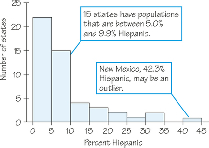
| 0.0 to 4.9 | 22 | 15.0 to 19.9 | 3 | 30.0 to 34.9 | 2 |
| 5.0 to 9.9 | 15 | 20.0 to 24.9 | 2 | 35.0 to 39.9 | 0 |
| 10.0 to 14.9 | 4 | 25.0 to 29.9 | 1 | 40.0 to 44.9 | 1 |
Now we can draw a histogram to represent the information from Table 5.6. Although the histogram contains the same information as the table, a graphic display often helps us identify patterns more easily.
Next, we use all the information we have gathered so far to describe features of this dataset.
- Shape: The distribution has a single peak, which represents states in which less than 5% of adults are Hispanic. Most states have no more than 10% Hispanics, but some states have much higher percentages, so the graph trails off to the right.
- Center: From the frequency distribution, we know that 22 of the 50 states had a Hispanic adult population of less than 5%. The middle point for the data is somewhere between 5% and 10%. From Table 5.5 we find that about half the states have less than 7% Hispanics among their adult residents and the rest have more. So the middle of the distribution is around 7%.
- Variability: The data’s span is from about 1% to 42% (a difference of 41%), but only six states exceed 20%.
- Outliers: New Mexico stands out. Whether this is an outlier or just part of the long right tail of the distribution is a matter of judgment.