5.4 5.3 Displaying Distributions: Stemplots
Histograms are not the only way to display distributions graphically. For small datasets, a stemplot is quicker to make and presents more detailed information.
Stemplot DEFINITION
A stemplot (or stem-and-leaf plot) is a display of the distribution of a variable that attaches the final digits of each observation as a leaf on a stem made up of all but the final digit.
Making a Stemplot PROCEDURE
- Separate each observation into a stem, which consists of all but the final (rightmost) digit, and a leaf, which is the final digit. (To make stems meaningful, it may be necessary to truncate or round the observed values. Tukey advocated truncating in his book Exploratory Data Analysis. Statistical packages are split over which approach to take.) Stems may have as many digits as needed, but each leaf contains only a single digit.
- Write the stems in a vertical column, with the smallest at the top, and draw a vertical line at the right of this column. Include all stems, even if they are not used.
- Write each leaf in the row to the right of its stem. Arrange the leaves from smallest to largest.
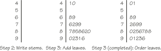
EXAMPLE 7![]() Stemplot of Midterm Exam Scores
Stemplot of Midterm Exam Scores
The midterm exam scores of a class of 20 students are given below.
| 41 | 87 | 88 | 90 | 68 | 92 | 93 | 40 | 91 | 96 |
| 76 | 85 | 88 | 86 | 82 | 69 | 72 | 79 | 80 | 79 |
Since the exam scores range from 44 to 96, the stems are 4, 5, 6, 7, 8, and 9 (Step 1). Figure 5.10 shows how to complete Steps 2 and 3. Notice that the stem of 5 is included in the plot even though there are no data values in the 50s.
Self Check 4
Make a stemplot of the following systolic blood pressures (in millimeters of mercury) of 10 randomly chosen adults. (Notice that to save space we have presented these data in two rows. However, if you wanted to enter these data into a spreadsheet, you would enter them into a single column.)
| 147 | 141 | 120 | 124 | 127 |
| 132 | 98 | 112 | 120 | 128 |
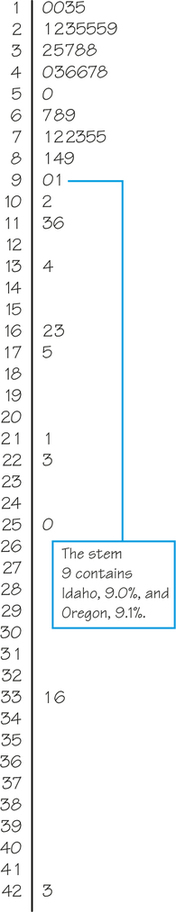
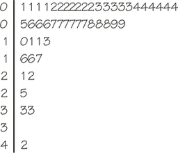
EXAMPLE 8![]() Stemplot of the Percentage of Hispanics
Stemplot of the Percentage of Hispanics
To make a stemplot of the percentage of Hispanics from the data in Table 5.5 (page 189), take the whole-number part of the percentage as the stem and the final digit (in this case, the tenths place) as the leaf. Figure 5.11 is the complete stemplot for the data in Table 5.5. The entries for Idaho and Oregon, 9|01, represent 9.0% and 9.1%, respectively.
If we rotate Figure 5.11 a quarter-turn counterclockwise, the stemplot would look like a histogram (of a distribution skewed to the right). Comparing the stemplot in Figure 5.11 with the histogram in Figure 5.4 (page 191) reveals the strengths and weaknesses of stemplots. The stemplot, unlike the histogram, preserves the actual value of each observation, at least in cases where the data values have not been truncated or rounded. But you can choose the classes in a histogram, whereas the classes (the stems) of a stemplot are not as flexible. Whether the large number of classes in Figure 5.11 is an improvement over Figure 5.4 is a matter of taste. To change the classes on the stemplot, we could truncate the tenths place; for example, 11.3% and 11.6% both become 11% when the tenths place is truncated. In Figure 5.12, we construct a stemplot of the truncated data. Notice that now the leaves represent 1% so that 0|1 and 1|0 represent 1% and 10%, respectively.
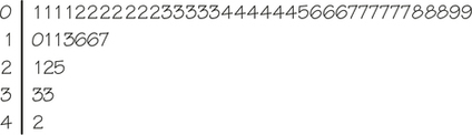
There are too many leaves on the first stem in Figure 5.12, and no outliers are obvious. Just as we might zoom in on a digital map to view added detail, we can zoom in by expanding each stem into two stems, using the first stem for leaves 0, 1, 2, 3, and 4 and the second stem for leaves 5, 6, 7, 8, and 9. Figure 5.13 shows the result.
Now our stemplot reveals the same information as the histogram in Figure 5.3 but gives the added detail of the truncated data values.
Stemplots do not work well for large datasets, like the 947 Iowa Test scores in Figure 5.6, because some stems (like the 0 stem in Figure 5.12) must hold such a large number of leaves.
Graphical representations are good for analyzing the shape of a distribution of values. To answer precise questions about features of a dataset, such as its center, however, it helps to have numerical summaries as well. We explore this next to help us obtain a statistical "map" of our data with just the right degree of detail.