5.7 5.6 The Five-Number Summary and Boxplots
We started by using the smallest and largest observations to indicate the variability of a distribution. These two observations tell us little about the distribution as a whole, but they give information about the tails of the distribution that is missing if we know Q1, M, and Q3. To get a quick summary of both center and variability, combine all five numbers.
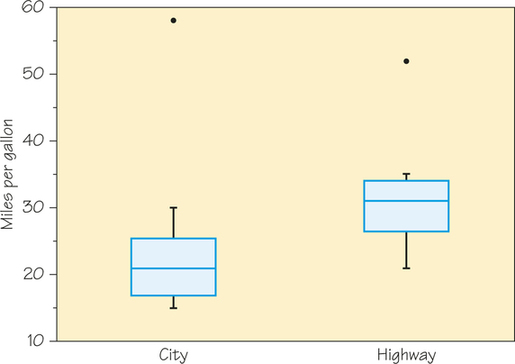
These five numbers offer a reasonably complete description of center and variability. For the 13 midsized cars in Table 5.7, you can verify that the five-number summary for city gas mileage is
| 15 | 17 | 21 | 25.5 | 58 |
Five-Number Summary DEFINITION
The five-number summary of a distribution consists of the smallest observation, the first quartile, the median, the third quartile, and the largest observation, written in order from smallest to largest. The five-number summary is expressed as follows:
| minimum | Q1 | M | Q3 | maximum |
Self Check 6
Determine the five-number summary for the highway gas mileage in Table 5.7 (page 196).
21, 26.5, 31, 34, 52
A boxplot can visually represent both the location and the variability of data-sets. To compare the cars’ city fuel efficiency to highway fuel efficiency, we can create boxplots from the five-number summaries of the data in Table 5.7. Figure 5.16 shows boxplots for both city and highway gas mileages for midsized cars.
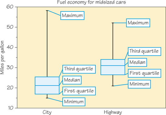
Boxplot DEFINITION
A boxplot (or box-and-whisker plot) is a graph of the five-number summary.
- A central box spans the quartiles Q1 and Q3.
- A line somewhere inside the box marks the median M of the dataset.
- Lines extend from the box out to the smallest and largest observations.
Because boxplots show less detail than histograms or stemplots, they are best used for side-by-side comparison of more than one distribution, as in Figure 5.16. When you look at a boxplot, first locate the median, which marks the center of the distribution. Then look at the variability. The quartiles show the variability of the middle half of the data, and the extremes (the smallest and largest observations) show the variability of the entire dataset. So is there really much of a difference in gas mileages between city and highway?
From the boxplots, we see at once that highway mileages are noticeably higher than city mileages: The third quartile city mileage is less than the first quartile of highway mileage. Boxplots can also indicate a distribution’s skewness. In both boxplots, the upper whiskers are longer than the lower whiskers, meaning that the upper quarter of the data is more spread out than the lower quarter. The upper whisker of the city mileage is longer and extends higher than the upper whisker of the highway mileage. That is due to the hybrid nature of Toyota’s Prius (an outlier), which gets better gas mileage in the city than on the highway.
We also see that the variability of highway mileages has a somewhat different pattern than the variability of city mileages. The range of the highway mileages is represented by the length of the boxplot (maximum - minimum) and is smaller for the highway mileage data than for the city mileage data. The variability of the middle half of the data is represented by the length of the box (Q3– and appears to be about the same for both diagrams.
Be aware that some calculators and software packages offer an alternative option for boxplots in which the lines go to the farthest values within 1.5 box-lengths of the quartiles, so they do not automatically go out to the minimum and maximum values. The advantage of this modified boxplot is that any individual values more than 1.5 box-lengths beyond either quartile can be marked as outliers. Figure 5.17 shows a modified boxplot for the city and highway gas mileages data. Only the mileage for the Prius was more than 1.5 box-lengths beyond Q3 and these values have been plotted as dots in the modified boxplot.