6.4 6.3 Correlation
A scatterplot displays the form, direction, and strength of the relationship between two quantitative variables. Straight-line relations are particularly important because a straight-line pattern is quite common and is easy to interpret. We say a straight-line association is strong if the points lie close to a line and weak if they are widely scattered about a line.
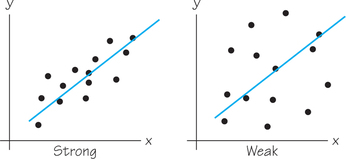
But this language is vague and our eyes can be fooled by the choice of scaling used in the scatterplot. We need to follow our strategy for data analysis by using a numerical measure along with the graph. Correlation is the measure we use. Correlation is usually denoted as r, thanks to 19th-century statistician Sir Francis Galton, who was studying related ideas of regression and reversion.
Correlation DEFINITION
The correlation measures the direction and strength of the straight-line relationship between two quantitative variables.
The correlation r is always a number between −1 and 1, inclusive. It has the same sign as the slope of a regression line for that dataset: r>0 for positive association and r<0 for negative association.
Perfect correlation r=1 or r=—1 occurs only when all points lie exactly on a straight line. As you will observe in Example 6, the correlation moves away from 1 or −1 as the straight-line relationship gets weaker.
EXAMPLE 6 Scatterplots and Correlation
The scatterplots in Figure 6.9 all involve the same scale for the horizontal and vertical axes and the same standard deviation value for the - and -variables. From these scatterplots, we are able to see how values of closer to 1 or −1 correspond to stronger straight-line relationships.
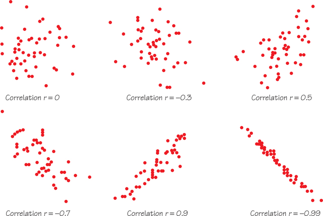
Figure 6.10 provides some guidelines for using correlation to classify both the direction and strength of a straight-line relationship. Using these guidelines, the relationship in Figure 6.9 corresponding to would be classified as a moderate negative straight-line relationship.
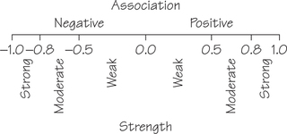
Earlier, we said that Figure 6.2 (page 244) shows a fairly strong positive straight-line relationship between how many beers a student drinks and his or her BAC. The correlation between these variables is , which puts this relationship into the strong category. Figure 6.5 (page 248), despite the clusters, also shows a strong straight-line relationship between the percentage of a state’s high school seniors who take the SAT exam and their mean SAT score. Here, the association is negative: Higher percentages taking the SAT go with lower mean scores. The correlation is .
Before giving a formula for computing the correlation , here are more facts about correlation:
- Correlation makes no sense for nonnumerical variables (such as ethnicity and occupation).
- The correlation measures the strength of only a straight-line relationship. It does not measure the strength of a relationship with a curved pattern, no matter how strong that curved relationship is. For example, the data in Figure 6.11 show a strong pattern indicating a relationship between the two variables. However, that relationship is not linear and .
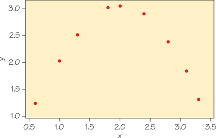 Figure 6.11 The two variables have a strong relationship, but .
 - Unlike regression, correlation makes no distinction between explanatory and response variables. It makes no difference which variable you call and which you call in interpreting (or calculating) a correlation.
- The correlation does not change when we change the units of measurement of , , or both. For example, measuring height in inches rather than centimeters, and weight in pounds rather than kilograms, does not change the correlation between height and weight. (This is different from the case of the slope of a regression line, which changes when the units of and change.) The correlation itself has no unit of measurement; it is just a number.
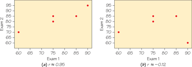
- Like the mean and standard deviation, the correlation is affected strongly by a few outlying observations. Use with caution when outliers appear in the scatterplot, especially for small datasets. Figures 6.12a and 6.12b display two scatterplots showing the relationship between scores on two exams. The data points are identical except for one point, which happens to be an outlier in part (b). Changing that one point switches the correlation from positive to negative.
Now get ready to compute some correlations. In practice, you will use a calculator or software to find the correlation from keyed-in data, as described in Spotlight 6.2 on page 259. That’s fortunate, because using the procedure box formula for correlation is quite a bit of work!
Formula for Correlation PROCEDURE
Suppose that we have data on variables and for individuals. The means and standard deviations of the two variables are and for the -values, and and for the -values. The correlation between and is
- Step 1. Find the mean and standard deviation of the -values. Find the mean and standard deviation of the -values. (Use your calculator and refer to Spotlight 5.3 on page 206.)
- Step 2.
Find the standardized value for each of the -values.
Find the standardized value for each of the -values.
- Step 3. Insert your numbers from Step 2 into the formula for . Remember that is the number of (, ) points or ordered pairs plotted in the scatterplot.

Using Formulas
EXAMPLE 7 Calculating Correlation
Table 6.5 gives the SAT Math and Critical Reading scores for five randomly chosen students entering a college.
| Math SAT, | Critical Reading SAT, |
|---|---|
| 610 | 550 |
| 440 | 410 |
| 550 | 520 |
| 520 | 540 |
| 420 | 410 |
Next, we walk through the steps of calculating the correlation between the SAT Math and Critical Reading scores.
- Step 1. Calculate the mean and standard deviations:
- Step 2. Calculate the standardized scores for each observation by subtracting the mean and dividing by the standard deviation:
- Step 3. Substitute into the formula:
Self Check 5
Suppose the fifth student retook the SATs and earned 530 and 510 on his Math SAT and Critical Reading SAT, respectively. Replace the last row of Table 6.5 with the new results and recalculate the correlation.
Math SAT:
Critical Reading:
Page 275
The formula for correlation starts by standardizing each observation value (as was done in Chapter 5, Exercises 62 and 63, on page 237). That is, subtract the mean for that variable from the observation and then divide by the standard deviation. Standardizing turns each original data value into “number of standard deviations from the mean.” This removes the original units and explains why has no units and doesn’t change when we change the units of or . The formula says that the correlation is an average of the products of the standardized - and -values for individuals. Although the procedure-box formula for correlation has conceptual clarity, it can be tedious to apply even for relatively small datasets. Spotlight 6.2 shows how technology can be used to speed up the calculation of correlation.
Spotlight 6.3 on page 260 shows the connection between correlation and fitting a line to data.
Correlation Calculation 6.2
6.2
We return to the problem of calculating the correlation between Math and Critical Reading SATs (see Example 7, Table 6.5, on page 257). With a basic calculator, you’ll get the same answer faster using this mathematically equivalent but more computationally efficient formula:
Here are the computations, using the means and standard deviations calculated in Example 7:
However, you probably have access to technology that is a bit more sophisticated than a basic-level calculator. The remainder of this spotlight is devoted to using a variety of technologies to calculate correlation with a single command.
If you have a scientific calculator, select the calculator mode to be able to do two-variable regression statistics, clear out any old data, and then enter your new - and -values. Once the data are entered, you can find the correlation (or regression-line slope and -intercept, for that matter) by hitting the appropriate key(s). On the Internet, you can find websites that will help with keystrokes for specific models.
TI Graphing Calculators
If you have a graphing calculator in the TI-83/84+ family, we illustrate one procedure for calculating correlation using the data from Table 6.5, Example 7.
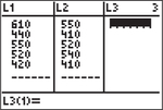
Step 1. Press to bring up the calculator lists. Then enter the Math SATs into list L1 and the Critical Reasoning SATs into list L2.
Step 2. Press the following sequence of keys:
- → TESTS → LinRegTTest and press .
Enter the lists where you stored the data from your independent (-list) and dependent (-list) variables.
(To enter the lists L1 and L2, press followed by the number keys and ] , respectively.)
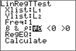
- Use the down arrow key to select Calculate and press .
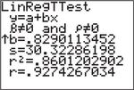
Scroll to the end of the output to see the correlation .
Keystrokes for other specific TI calculators can be found online in the Texas Instruments guidebooks, which are downloadable from education.ti.com/calculators/downloads/US/#Guidebooks.
Excel
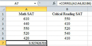
Next, we show how to calculate the correlation of the data in Table 6.5 using Excel. Begin by entering the Math and Critical Reasoning SAT scores into columns A and B, respectively, of an Excel spreadsheet. Here’s the procedure:
- In an empty cell, enter = CORREL(.
Click on the first data value for your -values (in this case, 610) and drag down to the last data value (420). Press the comma-key. Then click on the first data value for your -values (550) and drag down to the last data value (410). Finish the command with ) and press Enter.
Regression Toward the Mean 6.3
6.3
Sir Francis Galton (1822–1911) studied predicting the heights of men from the heights of their fathers. He found that tall fathers tend to have taller than average sons, but that there is a reversion or regression (i.e., going back) of a son’s height toward the average height for sons. Assume the mean height of men is about 70 inches. We use the following regression equation to demonstrate this concept:
Suppose a father is above average in height, say, 75 inches tall. Then using the regression equation, we predict the height of his son to be
Our prediction for the son’s height, 72.43 inches, is shorter than the father’s height but still an above-average height.
It goes the other way, too—a very short father tends to have a son who is also shorter than average, but not quite as short as his father.
More generally, the idea that extreme measurements including some random variation are likely to be followed by measurements that are not quite as extreme is called “regression toward the mean.” This dynamic shows up in many areas involving some combination of skill and luck. Students who are the very top performers on one test will tend to do a bit worse, on average, on the next test, and the very worst performers will tend to experience some improvement. An example of this idea in the world of sports is the “Sports Illustrated cover jinx,” in which athletes appear on the magazine’s cover after an “outlier performance,” but their subsequent performance is usually less impressive. Singer-songwriter Christine Lavin offers another example in this couplet from her song “Attractive Stupid People":
but the problem is the kids won’t look as good as mom or dad, and they’re always slightly smarter, which drives their pretty parents mad.

The following formula is an algebraic representation of regression to the mean because so long as the correlation is not equal to 1 or −1, the predicted standardized value of is closer to its mean than the standardized value of is to its mean. In other words, the -value (e.g., the son’s predicted height) has a less extreme deviation than the -value (e.g., the height of that son’s father).
Self Check 6
Suppose that a father is of below-average height, say, 64 inches.
- Use the regression equation from Spotlight 6.3 to predict the height of his son.
- Prediction for son’s .
- Explain how this result fits in with the topic of regressing toward the mean.
- This prediction indicates that the son is taller than his father but is still below average in height, which is 70 inches.