6.6 6.5 Interpreting Correlation and Regression
Correlation and regression are among the most used statistical methods for analyzing data on two or more quantitative variables. Here are a few cautions to keep in mind when you use or see these methods.
Both the correlation r and the least-squares regression line can be influenced strongly by a few outlying points. Always make a scatterplot before doing any calculations. Here is an artificial example that illustrates what can happen.
EXAMPLE 9![]() Beware the Outlier!
Beware the Outlier!
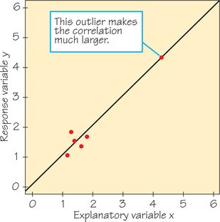
Figure 6.15 shows a scatterplot of data that have a strong positive straight-line relationship. In fact, the correlation is r=0.987, close to the r=1 of a perfect straight line. The line on the plot is the least-squares regression line for predicting y from x. One point is an extreme outlier in both the x- and y-directions. Let’s examine the influence of this outlier.
First, suppose we omit the outlier. The correlation for the five remaining points (the cluster at the lower left) is r=0.523. The outlier extends the straight-line pattern and greatly increases the correlation.
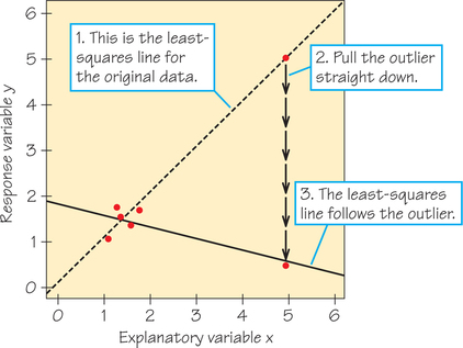
Next, suppose we grab the outlier and pull it straight down, as in Figure 6.16. The least-squares line chases the outlier down, pivoting until it has a negative slope. This is the least-squares idea at work: The line stays close to all six points. However, in this situation its location is determined almost entirely by the one outlier. Of course, the correlation is now also negative, r=−0.796. Never trust a correlation or a regression line if you have not plotted the data.

One way to explore this concept is to use the Correlation and Regression applet. Applet Exercise 1 (page 288) asks you to animate the situation shown in Figures 6.15 and 6.16 so that you can watch r change and the regression line move as you pull the outlier down.
Even if the correlation is moderate to strong and there are no outliers in the data that we used to find our regression line, we also must not be quick to extrapolate and make predictions well beyond the data collected. Example 10 illustrates this point.
EXAMPLE 10![]() Extrapolation Is Risky!
Extrapolation Is Risky!
Return to the data in Table 6.3 (page 245), which gives the times for an 8-year-old competitive swimmer’s 50-yard butterfly over 14 races (her time for race 10 was never recorded). A scatterplot of these data appears in Figure 6.3 (page 245). After removing the two circled outliers (corresponding to the times of the swimmer’s first two races), the form of the remaining data points appears to be a straight line. Figure 6.17 shows the result of using Excel (see Spotlight 6.5 on page 265) to make a scatterplot of the data and determine the equation of the least-squares regression line.
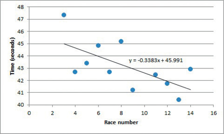
First, we’d like to predict the time for the 10th race, the race in which the swimmer’s time was never recorded:
predicted time=ˆy=−0.3383(10)+45.991≈42.61 seconds
Given the pattern in the surrounding data, a predicted time of 42.61 seconds seems reasonable. This is an example of interpolation, predicting a value of the response variable for an x-value within the range of the observed x-values.
The swimmer really wanted to be able to predict what her time would be after many races, say, for race 150 (she figured she’d be about 16 years old by that time):
predicted time=ˆy=−0.3383(150)+45.991≈−4.75 seconds
Finishing a race 4.75 seconds before the race begins is clearly impossible! This is an example of extrapolation, predicting a value of the response variable for an x-value that lies outside of the range of the observed x-values. Just because the data fit a particular linear trend over a certain interval, there is no guarantee that that trend will continue into the future. So, avoid extrapolation—particularly for x’s far from the x-values in the data.
Correlation and regression describe relationships. Interpreting relationships requires more thought. Often the relationship between two variables is influenced strongly by other variables. You should always think about the possible effect of other variables before you draw conclusions based on correlation or regression.
EXAMPLE 11![]() Money Helps SAT Scores?
Money Helps SAT Scores?
The College Board, which administers the SAT, offers this information on its website about the Class of 2013 seniors who take the test (the 55% of test-takers who did not respond to this income question had a mean score of 515):
| Family income (in $1000s) | Mean Math SAT score |
|---|---|
| 0–20 | 462 |
| 20–40 | 482 |
| 40–60 | 500 |
| 60–80 | 511 |
| 80–100 | 524 |
| 100–120 | 536 |
| 120–140 | 540 |
| 140–160 | 548 |
| 160–200 | 555 |
| Over 200 | 586 |
This information suggests a strong positive association between the test-taker’s score and family income. But there’s no direct mechanism that causes this association—wealthy families are not sending secret bribes to the College Board. It may simply be that children of wealthy parents are more likely to have advantages, such as well-educated role models, high expectations, access to extra tutoring or test preparation, I smaller class sizes, and schools with more experienced, better qualified teachers.
Example 11 brings us to the most important caution about correlation and regression. When we study the relationship between two variables, we often hope to show that changes in the explanatory variable cause changes in the response variable. A strong association between two variables is not enough to draw conclusions about cause and effect. Sometimes an observed association really does reflect cause and effect. Drinking more beer does cause an increase in BAC. But in many cases, as in Example 11, a strong association is explained by other variables that influence both x and y. Here is another example.
EXAMPLE 12![]() Evaluation Correlation?
Evaluation Correlation?
Grades that students earn in courses are correlated positively with the ratings that students give on anonymous end-of-course surveys administered by the university. One very simple interpretation is that instructors give easy tests with “low standards,” which in turn causes students to express appreciation through high instructor ratings. But perhaps there is a third variable that drives the other two variables: A professor who is a skillful teacher and motivator may be more likely both to be rated well and to inspire high performance. Or perhaps courses that have higher grade distributions are more likely to be upper-level courses for majors in that subject, and such students would be more prepared for and favorably inclined toward the course.
EXAMPLE 13![]() Does Running Lead to Winning in Football?
Does Running Lead to Winning in Football?
A football broadcaster discussed how often a team wins when it runs the ball at least 30 times in a game. For the 2010 NFL regular season, the correlation between wins and number of running plays was indeed close to being moderately positive (r=0.48). Could this mean that running causes winning—that all any team has to do to win more games is to run the ball more? No. In the extreme, if a team executed only running plays, the other team would simply adjust its defense to focus on and stop the run. Basically, once teams get a good lead in a game (regardless of their mix of special teams, running, and passing), they tend to start running the ball more often as a way to minimize the risk of losing the ball (pass plays are riskier) and to use up the clock faster (an incomplete pass stops the clock). And when teams fall far behind late in the game, they begin passing more often as a last chance to catch up before time runs out.

Correlations such as the one described in Example 13 are sometimes called “nonsense correlations.” The correlation is real, but it is nonsense to conclude that increasing the number of running plays will cause an increase in the number of wins that season. So correlations require thoughtful interpretation, not just computation.
Association Does Not Imply Causation RULE
An association between an explanatory variable x and a response variable y, even if it is very strong, is not by itself good evidence that changes in x actually cause changes in y. Causation also requires the following: (1) Demonstrating that you have ruled out the possibility that the change in the response variable was due to any other variable besides the explanatory variable, (2) showing that the association happens under a variety of conditions, and (3) having a reasonable mechanism or model to explain how x causes changes in y.
Here is a final example in which we use a scatterplot, correlation, and a regression line to understand data.
EXAMPLE 14![]() What Does Growth Hormone Do in Adults?
What Does Growth Hormone Do in Adults?
In most species, adults stop growing but still release growth hormone from the pituitary gland to regulate metabolism. Physiologists subjected groups of adult rats to various conditions that activated muscle tissue that was either fast-twitch (as sprinters use) or slow-twitch (as distance runners use). They then measured levels of a form of growth hormone (BGH) in the blood and in pituitary tissue. Units are hundreds of nanograms per milliliter of blood and micrograms per milligram of tissue, respectively.
| Blood | 15.8 | 20.0 | 26.7 | 25.0 | 23.0 | 23.8 | 24.7 | 16.3 | 0.8 | 0.8 |
| Tissue | 38.0 | 36.7 | 27.8 | 28.3 | 34.9 | 34.1 | 33.2 | 32.7 | 38.1 | 39.1 |
| Blood | 0.6 | 10.8 | 37.6 | 41.3 | 39.0 | 57.5 | 84.8 | 82.8 | 28.8 | 16.5 |
| Tissue | 43.9 | 42.8 | 19.3 | 13.7 | 11.2 | 14.2 | 9.7 | 9.5 | 31.7 | 32.8 |
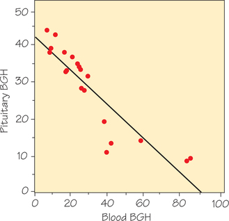
Figure 6.18 is a scatterplot of these data. The plot shows a strong negative straight-line association with correlation r=−0.90. Here’s the physiological mechanism for this association: When there is a higher BGH level in the blood, we can assume that means BGH must have been recently secreted by the pituitary gland so that less BGH now remains in pituitary tissue. The least-squares regression line is
ˆy=41.081−0.43343x
or
predicted pituitary BGH=41.081+((−0.43343)×blood BGH)
The slope m=−0.43343 is negative, which reflects how blood and pituitary tissue levels of BGH move in opposite directions. The y-intercept b=41.081 is the estimated amount of BGH that the pituitary gland has if it does not release any into the blood.
Next, we dig deeper into the data from this experiment. Each data point represents the mean BGH levels in the blood and in pituitary tissue for a group of rats undergoing the same treatment (Figure 6.19). The two highest points of the scatterplot represent groups of rats whose slow-twitch muscles were activated, while the five lowest points on the scatterplot involved the activation of fast-twitch muscles in separate groups of rats. The point (37.6, 19.3) comes from a group of rats that were exercised on a treadmill to activate fast- and slow-twitch muscles simultaneously. The remaining points represent groups that were untreated.
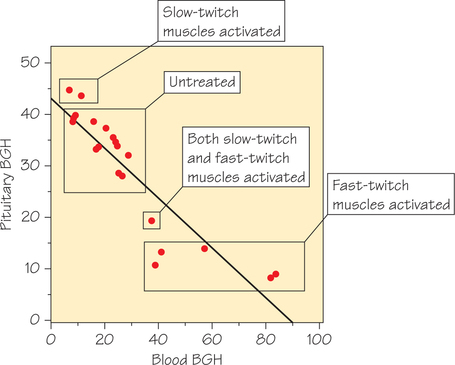
These data come from an experiment that assigned rats randomly to treatment (or no treatment) conditions. Random assignment makes us reasonably confident that slow-twitch muscle activation causes a decrease in BGH secretion (and hence lower levels of blood BGH) and that fast-twitch muscle activation causes an increase. We will discuss experiments in detail in Chapter 7.