4 Solving for International Prices
1. Objective: Derive world relative price using export supply curve and import demand curve.
2. Home Export Supply Curve
Derivation: Positively sloped for prices above Home’s opportunity cost of wheat.
a. Foreign Import Demand Curve
Derivation: Negatively sloped for prices below Foreign’s opportunity cost of wheat.
3. International Trade Equilibrium
Equilibrium is the intersection of the export supply and import demand curves.
The terms of trade is the price of a country’s exports divided by the price of its imports (e.g. Home terms of trade is PW/PC).
In Figure 2-5 and Figure 2-6, we assumed that the world relative price of wheat was  and that at this level Home’s exports of wheat just equaled Foreign’s imports of wheat (and vice versa for cloth). Now let’s dig a little deeper to show how the world price is determined.
Students find these demand and supply curves, with their discontinuities and flat sections, confusing. Be prepared to go over this several times. Explain that these things go away if there are diminishing returns, but that ignoring diminishing returns actually makes things simpler.
To determine the world relative price of wheat, we will use supply and demand curves. Home exports wheat, so we will derive a Home export supply curve, which shows the amount it wants to export at various relative prices. Foreign imports wheat, so we will derive a Foreign import demand curve, which shows the amount of wheat that it will import at various relative prices. The international trade equilibrium is the quantity and relative price at which Home exports equal Foreign imports of wheat. This equality occurs where the Home export supply curve intersects the Foreign import demand curve.
Home Export Supply Curve
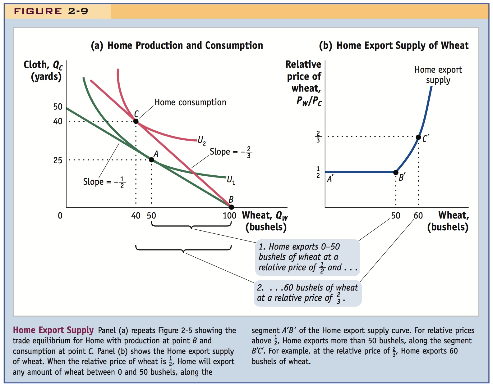
In panel (a) of Figure 2-9, we repeat Figure 2-5, which shows the trade equilibrium for Home with production at point B and consumption at point C. At the world relative price of PW/PC =  , Home exports 60 bushels of wheat (the difference between wheat production of 100 and consumption of 40). We can use these numbers to construct a new graph, the Home export supply curve of wheat, shown in panel (b). The vertical axis in panel (b) measures the relative price of wheat and the horizontal axis measures the exports of wheat. The points B and C in panel (a), with the relative price of PW/PC =
  and Home exports of 60 bushels of wheat, now appear as point C′ in panel (b), with PW/PC =
  on the vertical axis and Home wheat exports of 60 bushels on the horizontal axis. This is our first point on the Home export supply curve.

To derive other points on the export supply curve, consider the no-trade equilibrium in panel (a), which is shown by production and consumption at point A. The no-trade relative price of wheat is  (the slope of Home’s PPF), and Home exports of wheat are zero because there is no international trade. So the point A in panel (a) can be graphed at point A′ in panel (b), with a relative price of PW/PC =
  and zero Home exports of wheat. This gives us a second point on the Home export supply curve.
48
49
To get a third point, let us keep the relative price of wheat at PW/PC =  , as in the no-trade equilibrium, but now allow Home to export some wheat in exchange for cloth at this price. Home consumption remains at point A in panel (a), but production can shift from that point. The reason that production can shift to another point on the PPF is that, with the relative price PW/PC =
  , the wages of workers are equal in wheat and cloth. This result was shown in our earlier discussion. With wages equal in the two industries, workers are willing to shift between them, so any point on the PPF is a possible production point. Consider, for example, production at point B in panel (a), where all workers have shifted into wheat and no cloth is produced. With the relative price PW/PC =
  , consumption is still at point A, so the difference between points A and B is the amount of wheat that Home is exporting and the amount of cloth Home is importing. That is, Home exports 50 bushels of wheat (the difference between production of 100 and consumption of 50) and imports 25 yards of cloth (the difference between production of 0 and consumption of 25). Therefore, the relative price of PW/PC =
  , with wheat exports of 50, is another point on the Home export supply curve, shown by B′ in panel (b).
50
Again, explain that this curve goes away with diminishing returns.
Students with some experience in consumer theory may ask if exports necessarily increase as the relative price increases, using income and substitution effect arguments. Draw some pictures.
Joining up points A′, B′, and C′, we get a Home export supply curve that is flat between A′ and B′, and then rises between B′ and C′ and beyond. The flat portion of the export supply curve is a special feature of the Ricardian model that occurs because the PPF is a straight line. That is, with the relative price of PW/PC =  , production can occur anywhere along the PPF as workers shift between industries; meanwhile, consumption is fixed at point A, leading to all the export levels between A′ and B′ in panel (b). As the relative price of wheat rises above
  , production remains fixed at point B in panel (a), but the consumption point changes, rising above point A. With the relative price PW/PC =
  , for example, consumption is at point C. Then Home exports of wheat are calculated as the difference between production at B and consumption at C. Graphing the various relative prices above and the bushels of wheat exported at each price, we get the upward-sloping Home export supply curve between B′ and C′ in panel (b).
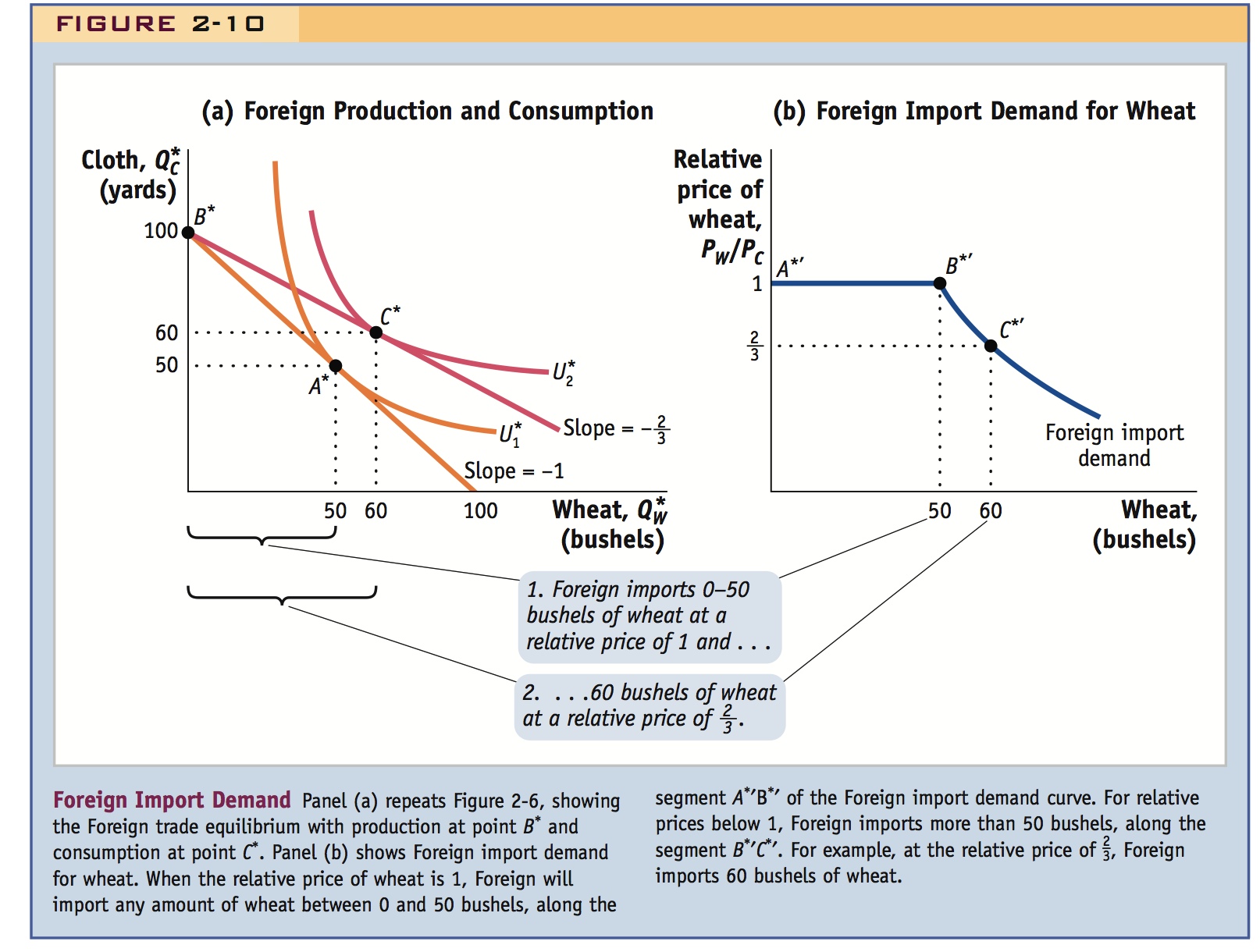
Foreign Import Demand Curve In Foreign we will again focus on the wheat market and construct an import demand curve for wheat. In panel (a) of Figure 2-10, we repeat Figure 2-6, which shows the Foreign trade equilibrium with production at point B* and consumption at point C*. At the world relative price of PW/PC =  , Foreign imports 60 bushels of wheat (the difference between wheat consumption of 60 and production of 0). These numbers are graphed as point C*′ in panel (b), where we have the relative price of wheat on the vertical axis and the Foreign imports of wheat on the horizontal axis.

51
Other points on Foreign’s import demand curve can be obtained in much the same way as we did for Home. For example, the no-trade equilibrium in Foreign is shown by production and consumption at point A* in panel (a), with the relative price of wheat equal to 1 (the slope of Foreign’s PPF) and zero imports (since there is no international trade). This no-trade equilibrium is graphed as point A*′ in panel (b). Keeping the relative price of wheat fixed at 1 in Foreign, production can shift away from point A* in panel (a). This can occur because, as we argued for Home, wages are the same in Foreign’s wheat and cloth industries when the relative price is at its no-trade level, so workers are willing to move between industries. Keeping Foreign consumption fixed at point A* in panel (a), suppose that all workers shift into the cloth industry, so that production is at point B*. Then Foreign imports of wheat are 50 bushels (the difference between Foreign consumption of 50 and production of zero), as shown by point B*′ in panel (b).
Joining up points A*′, B*′, and C*′, we get an import demand curve that is flat between A*′ and B*′ and then falls between B*′ and C*′ and beyond. The flat portion of the Foreign import demand curve is once again a special feature of the Ricardian model that occurs because the PPF is a straight line. As we investigate other trade models in the following chapters, in which the production possibilities frontiers are curved rather than straight lines, the export supply and import demand curves will no longer have the flat portions. A general feature of these export supply and import demand curves is that they begin at the no-trade relative price for each country and then slope up (for export supply) or down (for import demand).
International Trade Equilibrium
Do more with this section: Consider various comparative static stories. For example, an increase in productivity in the Home export sector may lower its terms of trade. This in turn relates to the earlier discussion of productivity and wages.
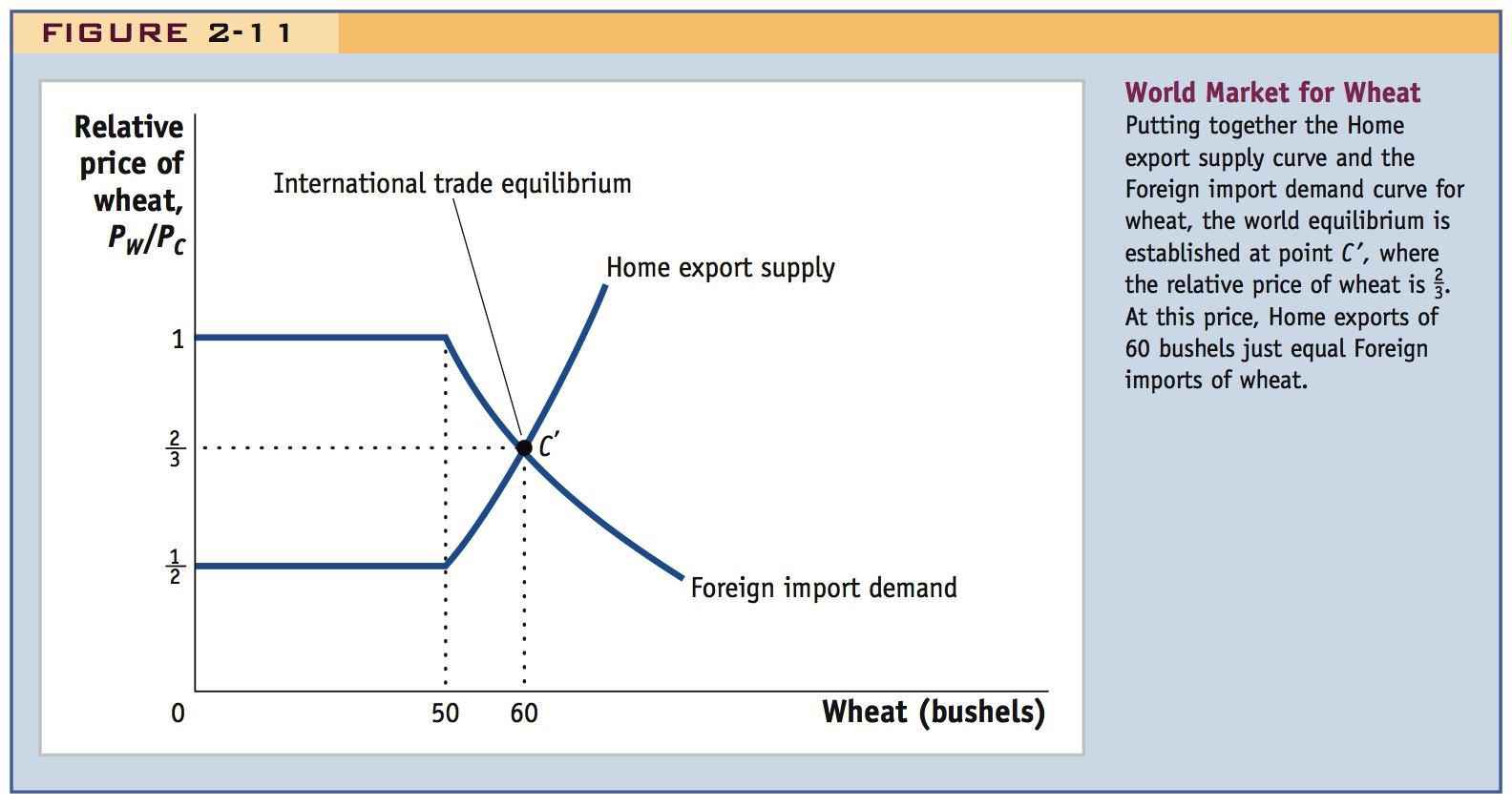
Now that we have derived the Home export supply curve and the Foreign import demand curve, we can put them together in a single diagram, shown in Figure 2-11. The intersection of these two curves at point C′ gives the international trade equilibrium, the equilibrium relative price of wheat at which the quantity of Home exports just equals Foreign imports. In Figure 2-11, the equilibrium relative price of wheat is PW/PC =  . This graph looks just like the supply equals demand equilibria that you have seen in other economics classes, except that Figure 2-11 now refers to the world market for wheat rather than the market in a single country. That is, Home’s export supply of wheat is the excess of the total Home supply over the quantity demanded by Home consumers, whereas Foreign import demand is the excess of total Foreign demand over the quantity supplied by Foreign suppliers. The intersection of these excess supply and demand curves, or export supply and import demand curves in Figure 2-11, determines the relative price of wheat that clears the world market, that is, at which the desired sales of Home equal the desired purchases by Foreign.

Explain that although all countries gain from trade, the EXTENT to which they gain from trade depends upon how much it changes their terms of trade.
The Terms of Trade The price of a country’s exports divided by the price of its imports is called the terms of trade. Because Home exports wheat, (PW/PC) is its terms of trade. Notice that an increase in the price of wheat (Home’s export) or a fall in the price of cloth (Home’s import) would both raise its terms of trade. Generally, an increase in the terms of trade is good for a country because it is earning more for its exports or paying less for its imports, thus making it better off. Foreign exports cloth, so (PC/PW) is its terms of trade. In this case, having a higher price for cloth (Foreign’s export) or a lower price for wheat (Foreign’s import) would make the Foreign country better off.
52
Interpret these explanations for and against the P-S hypothesis in terms of the demand and supply model just developed.
Prebisch-Singer hypothesis: prices of primary commodities should fall over time. Evidence in favor of the hypothesis for some commodities, but not others.
The Terms of Trade for Primary Commodities
What has happened over time to the terms of trade? Writing in the 1950s, the Latin American economist Raúl Prebisch and the British economist Hans Singer each put forward the hypothesis that the price of primary commodities (i.e., agricultural products and minerals) would decline over time relative to the price of manufactured goods. Because primary commodities are often exported by developing countries, this would mean that the terms of trade in developing countries would decline over time.
There are several reasons why the Prebisch-Singer hypothesis might be true. First, it is well known that as people or countries become richer, they spend a smaller share of their income on food.14 This means that as world income grows, the demand for food will decline relative to the demand for manufactured goods. Therefore, the price of agricultural products can also be expected to decline relative to manufactured goods. Second, for mineral products, it may be that industrialized countries continually find substitutes for the use of minerals in their production of manufactured products. For example, much less steel is used in cars today because automobile producers have shifted toward the use of plastic and aluminum in the body and frame. We can think of the substitution away from mineral products as a form of technological progress, and as it proceeds, it can lead to a fall in the price of raw minerals.
53
However, there are also several reasons why the Prebisch-Singer hypothesis may not be true. First, technological progress in manufactured goods can certainly lead to a fall in the price of these goods as they become easier to produce (e.g., think of the reduction in prices of many electronic goods, such as MP3 and DVD players). This is a fall in the terms of trade for industrialized countries rather than developing countries. Second, at least in the case of oil exports, the Organization of Petroleum Exporting Countries (OPEC) has managed to keep oil prices high by restricting supplies on the world market. This has resulted in an increase in the terms of trade for oil-exporting countries, which includes developing and industrialized nations.
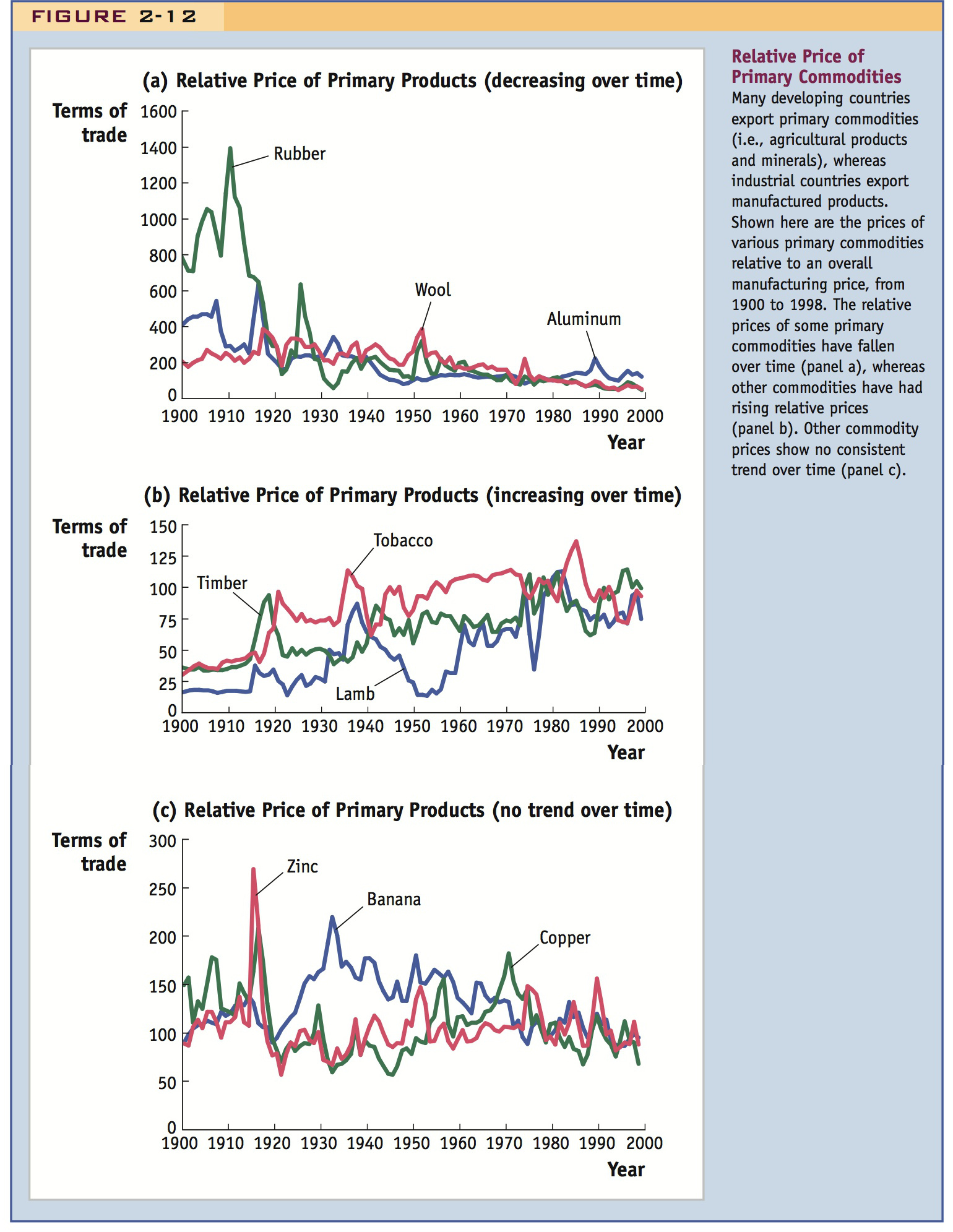
Data on the relative price of primary commodities are shown in Figure 2-12.15 This study considered 24 primary commodities from 1900 to 1998 and measured their world price relative to the overall price of manufactured goods. Of the 24 commodities, one-half of them showed a decline in their relative price for 50% or more of that period, including aluminum, cotton, hides, palm oil, rice, sugar, rubber, wheat, and wool. This evidence provides some support for the Prebisch-Singer hypothesis. Several examples of these commodities, with declining relative prices, are shown in panel (a) of Figure 2-12.

However, there are also a number of primary commodities whose prices increased for significant periods of time, or showed no consistent trend over the century. Commodities that had increasing relative prices for 50% or more of that period include beef, lamb, timber, tin, and tobacco. Several of these commodities are shown in panel (b) of Figure 2-12. Finally, commodities that had no consistent trend in their relative prices between the beginning and end of the century include bananas, coffee, copper, and zinc. Several of these are shown in panel (c) of Figure 2-12. From these results for different commodities, we should conclude that there are some that follow the pattern predicted by Prebisch and Singer, with falling prices relative to manufacturing. This is not a general rule, however, and other primary commodities have had increasing or no consistent change in their prices.
14 This relationship is known as Engel’s law after the nineteenth-century German statistician Ernst Engel. It is certainly true for purchases of food eaten at home but might not hold for dining out. As your income rises, you might spend a constant or even increasing share of your budget on restaurant food.
15 These results are provided by Neil Kellard and Mark E. Wohar, 2006, “Trends and Persistence in Primary Commodity Prices,” Journal of Development Economics, 79, February, 146–167.