Chapter 15. Question 15
Screen 1 of 5
Question 15
true
true
You must read each slide, and complete any questions on the slide, in sequence.
Use the two different distributions of income in the table below to answer the questions that follow.
| Quintile | A | B |
| Poorest | 10.5 | 2.5 |
| Second | 13.2 | 6.8 |
| Middle | 21.6 | 13.9 |
| Fourth | 26.4 | 24.2 |
| Richest | 28.3 | 52.6 |
Incorrect! The vertical axis represents percentage of income, and the horizontal axis represents the percentage of households. Both are cumulative, and include the current quintile as well as lower quintiles.
Correct! The vertical axis represents percentage of income, and the horizontal axis represents the percentage of households. Both are cumulative, and include the current quintile as well as lower quintiles.
| Quintile | A | Cumulative | B | Cumulative |
| Poorest | 10.5 | 2.5 | ||
| Second | 13.2 | 6.8 | ||
| Middle | 21.6 | 13.9 | ||
| Fourth | 26.4 | 24.2 | ||
| Richest | 28.3 | 52.6 |
Incorrect! For the lowest quintile, the cumulative value is the value for that quintile. For every other quintile, the cumulative value is calculated by adding the previous cumulative value and the quintile’s non-cumulative value. For example, Country A’s second quintile cumulative value includes the first quintile as well as the second quintile’s (non-cumulative) value. 10.5 + 13.2 = 23.7. This is done for all cells. Since there is no previous value to add for the poorest quintile, the cumulative and non-cumulative values are the same.
Correct! For the lowest quintile, the cumulative value is the value for that quintile. For every other quintile, the cumulative value is calculated by adding the previous cumulative value and the quintile’s non-cumulative value. For example, Country A’s second quintile cumulative value includes the first quintile as well as the second quintile’s (non-cumulative) value. 10.5 + 13.2 = 23.7. This is done for all cells. Since there is no previous value to add for the poorest quintile, the cumulative and non-cumulative values are the same.
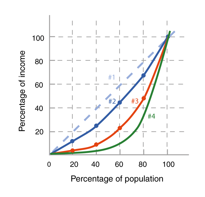
Incorrect! Lines #2 and #3 correspond to Country A and Country B’s cumulative income distributions point by point. For example, A’s first two points, in x-y format, would be (20, 10.5) and (40, 23.7). Line #4 represents an income distribution that is more unequal than either of the provided countries.
Correct! Lines #2 and #3 correspond to Country A and Country B’s cumulative income distributions point by point. For example, A’s first two points, in x-y format, would be (20, 10.5) and (40, 23.7). Line #4 represents an income distribution that is more unequal than either of the provided countries.
Incorrect! A’s Lorenz curve is much closer to the equal distribution line than is B’s Lorenz curve. In addition, in Country B each quintile except the richest has a greater share of income in Country A.
Correct! A’s Lorenz curve is much closer to the equal distribution line than is B’s Lorenz curve. In addition, in Country B each quintile except the richest has a greater share of income in Country A.
C. Are these distributions more or less equal than that for the United States today (2014 data presented on p. 400 of the text, Table 2)?
| A. |
| B. |
| C. |
Incorrect! The quintiles for 2014 are, from poorest to richest: 3.1, 8.2, 14.3, 23.2, and 51.2, resulting in cumulative numbers of 3.1, 11.3, 25.6, 48.8, and 100. These cumulative numbers are in between the corresponding numbers for Country A and Country B. Plotting them on an additional Lorenz curve would yield a curve that was between the two curves.
Correct! The quintiles for 2014 are, from poorest to richest: 3.1, 8.2, 14.3, 23.2, and 51.2, resulting in cumulative numbers of 3.1, 11.3, 25.6, 48.8, and 100. These cumulative numbers are in between the corresponding numbers for Country A and Country B. Plotting them on an additional Lorenz curve would yield a curve that was between the two curves.