Case Study: Color-Grading Texas Killing Fields
You should be able to do basic color grading with your classroom editing package. This case study shows how color grading works at the professional level, using more sophisticated tools.
Name: Adrian Seery, colorist for hundreds of commercials and music videos plus features, including Big Miracle (2012)
Situation: When Texas Killing Fields (2011) was shot, lighting conditions changed dramatically in one exterior scene. The DP wasn’t able to control the changes in natural light, and the resulting footage didn’t work for continuity or drama. Could the colorist make it work?
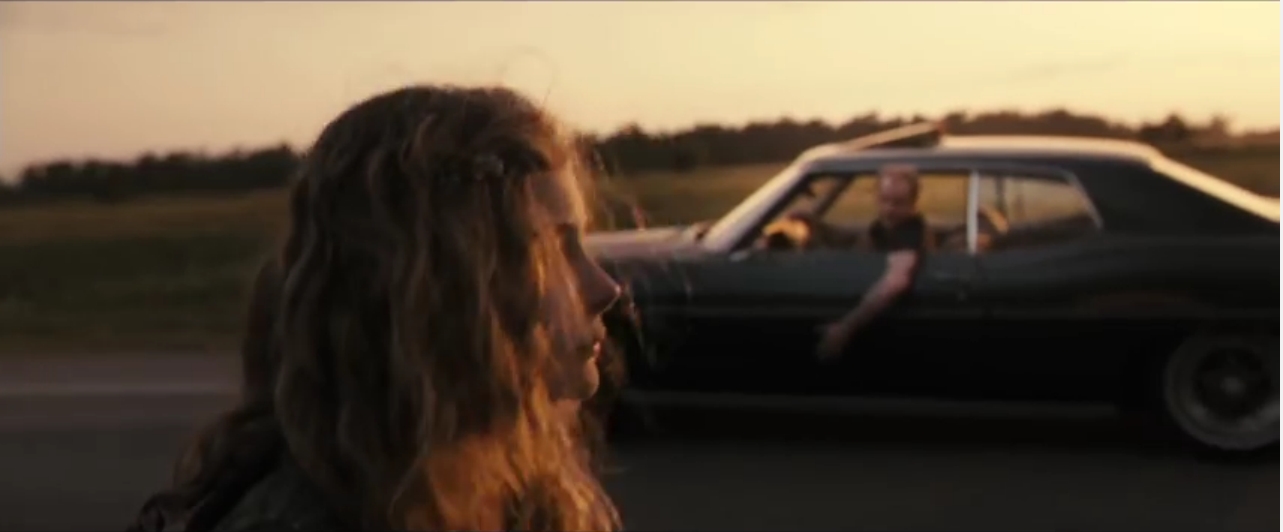
Because I had history in music videos and commercials—not films—I had to audition for this job, just like the actors. In my case, the DP brought me a scene on HDSR tape. It was to be a crucial scene: a 12-year-old girl walks away from the camera, down a road, to an uncertain fate. Here was the problem: the first part of the scene had been shot at sunset, and the last part had been shot an hour later, when it was dark. How would they ever match?
Stuart Dryburgh, the DP, and Ami Canaan Mann, the director, knew that the scene as it currently was wouldn’t work, so they wanted to see how I would approach the problem and, really, how we would get on together, because their relationship with the colorist is crucial and needs open communication. We got along gangbusters, and I won the gig.
When we started to do the color grading, I was at Technicolor in Los Angeles and Stuart was in New York. At 4 p.m. LA time, I would go into my studio and, connected by fiber-optic cable, show Stuart what I had done that day. He’d review my work and give me notes. The next day, I’d incorporate his notes and then show him the next reel. We worked like that for two weeks, then showed the film to Ami.
At first she didn’t like our choices—we had made the blacks very black, both because it is thematically a dark film and because inky blacks covered up a lot of the visual “noise” on the digitally shot negative. We spent a week lightening it up, but when she saw it again, she realized our first choices had been correct and, kudos to her, told us to go back to what we had. She’d just needed to see it for herself.
And how did I solve that crucial scene? After a lot of experimenting, I realized I couldn’t make the last shot lighter, but I could make the beginning shots darker. I matched the beginning to the final shot, in which the girl walks away into the darkness. To smooth out the transition between shots, I drew “windows” around her face, which are software forms that select a particular area. The windows tracked her face throughout the scene, and I was able to bring up the middle tones to give her face more dimension in the shallow light. I also added a hint of reflected sunset in the sky, some blue and red, to tie the whole scene together.
When Stuart looked at it, he didn’t realize at first that I had added all of these changes. He thought it looked completely natural. “Love it! Keep it!” he said, and that’s a good day’s work for me.
Takeaway: The less you do in coloring, the better—and the colorist’s work should never be obvious.