Chapter Introduction
appendix
Reading Graphs
Environmental scientists often use graphs to display the data they collect. Unlike a table that contains rows and columns of data, graphs help us visualize patterns and trends in the data and they communicate our results more clearly. Because graphs are such a fundamental tool of environmental science as well as most other sciences, we have designed this appendix to help you become familiar with the major types of graphs that environmental scientists use; we also discuss how to create each type of graph and how to interpret the data that are presented in the graphs.
Scientists use graphs to present data and ideas
A graph is a tool that allows scientists to visualize data or ideas. Organizing information in the form of a graph can help us understand relationships more clearly. Throughout your study of environmental science you will encounter many different types of graphs. In this section we will look at the most common types of graphs that environmental scientists use.
Scatter Plot Graphs
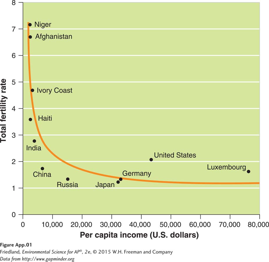
Although many of the graphs in this book may look different from each other, they all follow the same basic principles. Let’s begin with an example in which researchers who were investigating a possible relationship between per capita income and total fertility rate plotted data points for 11 countries. We can examine this relationship by creating a scatter plot graph, as shown in FIGURE A.1. In the simplest form of a scatter plot graph, researchers look at two variables; they put the values of one variable on the x axis and the values of the other variable on the y axis. By convention, the place where the two axes converge in the bottom left corner, called the origin, represents a value of 0 for each variable. The units of measurement tend to get larger as we move from left to right on the x axis, and from bottom to top on the y axis. In our example, per capita income is on the x axis and total fertility rate is on the y axis. As you can see in the graph, as income increases the fertility rate decreases.
When two variables are graphed using a scatter plot, we can draw a line through the middle of the data points that describes the general trend of these data points—
Line Graphs
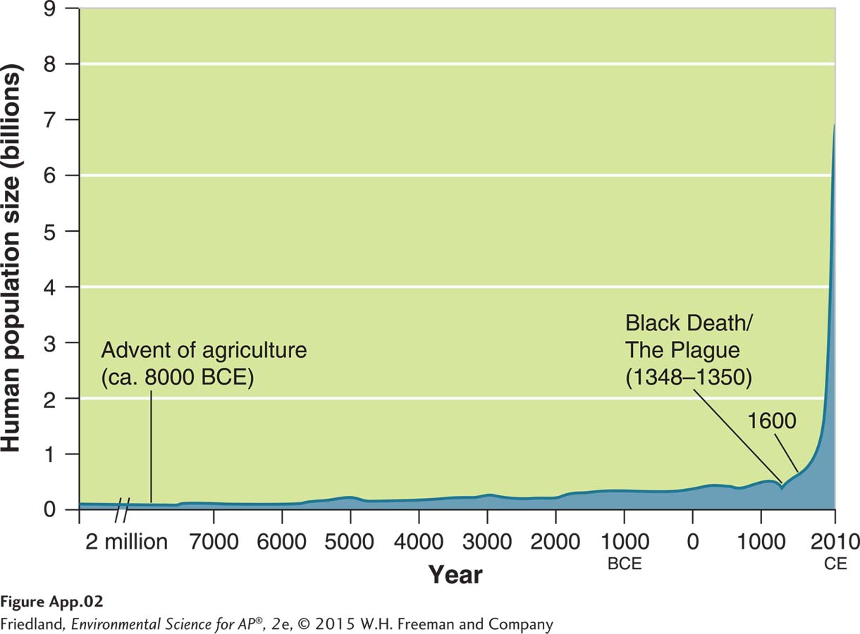
A line graph displays data that occur as a sequence of measurements over time or space. For example, scientists have estimated the number of humans living on Earth from 8,000 years ago to the present time. Using all of the available data points, a line graph can be used to connect each data point over time, as shown in FIGURE A.2. In contrast to a line of best fit that fits a straight or curved line through the middle of all data points, a line graph connects one data point to another, so it can be straight or curved, or it can move up and down as it follows the movement of the data points.
When a graph includes data points with a very large range of values, the size of the graph can become cumbersome. To keep the graph from becoming too large, we can use a break in the axis. For example in our graph of human population growth, we see that the size of the population varied little from 7000 BCE to 2 million BCE. Showing the data for those years would not provide much additional useful information but it would make the graph a lot wider. The break in the x axis between 7000 BCE to 2 million BCE, indicated by the double hatch marks, allows us to shorten the x axis. The double hatch marks indicate that we are condensing the middle part of the x axis.
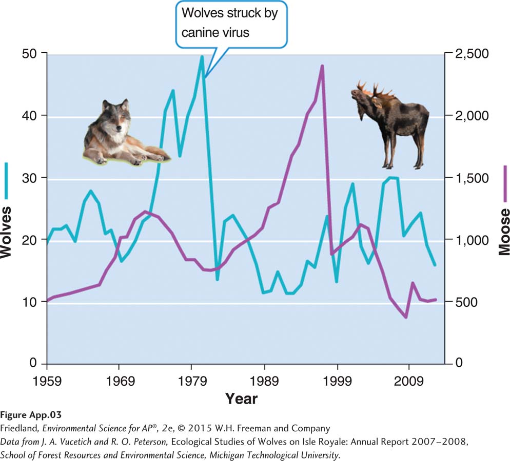
Line graphs can also illustrate how several different variables change over time. When two variables contain different units or a different range of values, we can use two y axes. For example, FIGURE A.3 presents data on changes in the population sizes of two different animals on Isle Royale in the years 1955 to 2011. The left y axis represents the population changes in the wolf population whereas the right y axis represents the population changes in the moose population during the same time span.
Bar Graphs
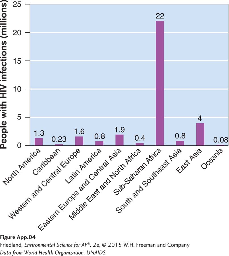
A bar graph plots numerical values that come from different categories. For example, in FIGURE A.4, the x axis contains categories that represent regions of the world. The y axis represents a numerical value—
A bar graph is a very flexible tool and can be altered in several ways to accommodate data sets of different sizes or even several data sets that a researcher wishes to compare. When scientists measured the net primary productivity of different ecosystems, as shown in FIGURE A.5, they put the categories—
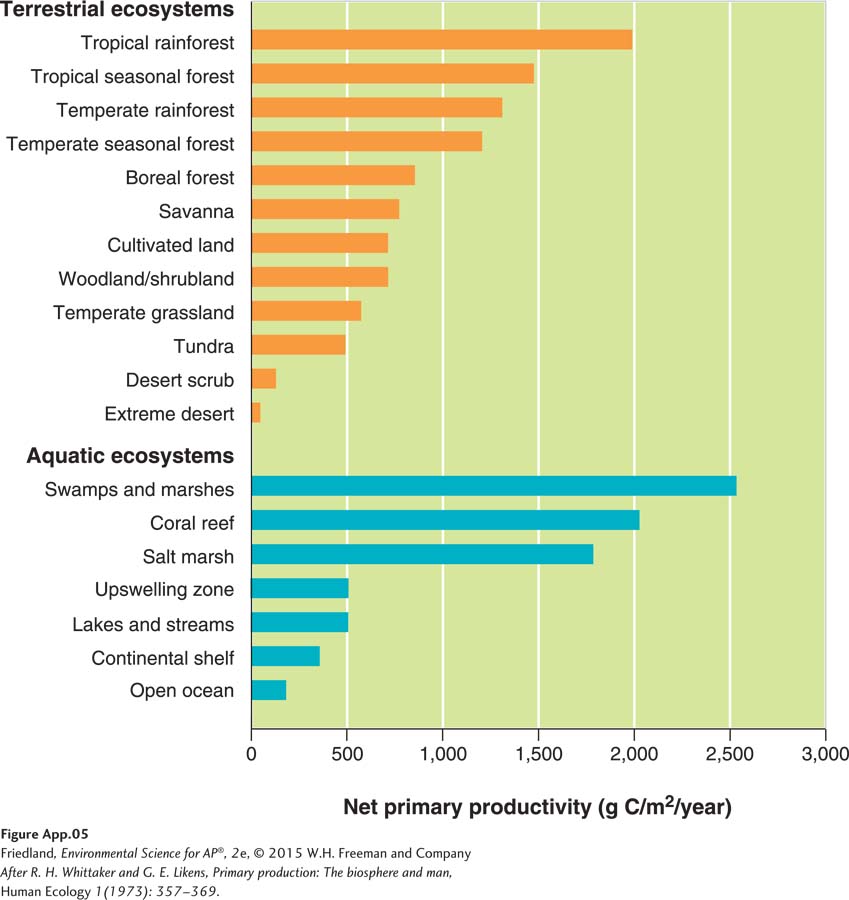
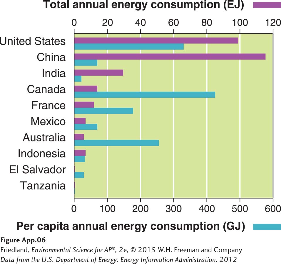
FIGURE A.6 shows an example of a bar graph that presents two sets of data for each category. In this example, the bar graph is rotated such that the categories are on the y axis and the numeric data are on two x axes. The upper x axis represents total annual energy consumption of each country. The lower x axis plots per capita (per person) annual energy consumption. Notice how much information we can gather from this graph; we can compare the total annual energy consumption versus per capita annual energy consumption within each country and also compare the energy consumption among countries.
Pie Charts
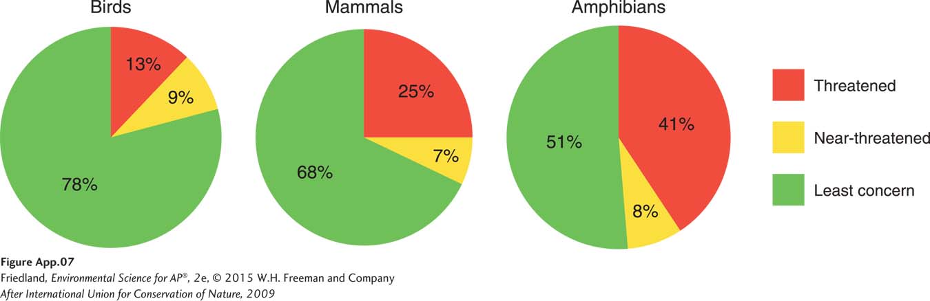
A pie chart is a graph represented by a circle with slices of various sizes representing categories within the whole pie. The entire pie represents 100 percent of the data and each slice is sized according to the percentage of the pie that it represents. For example, FIGURE A.7 shows the percentage of birds, mammals, and amphibians from around the world that have been categorized as threatened, near-
Two special types of graphs are used by environmental scientists
While scatter plots, line graphs, bar graphs, and pie charts are used by many different types of scientists, environmental scientists also use two types of graphs that are not common in most other fields of science: climate diagrams and age structure diagrams. Although these two types of graphs are discussed within the text, we provide them here for review.
Climate Graphs
Climate diagrams are used to illustrate the annual patterns of temperature and precipitation that help to determine the productivity of biomes on Earth. FIGURE A.8 shows two hypothetical biomes. By graphing the average monthly temperature and precipitation of a biome, we can see how conditions in a biome vary during a typical year. We can also observe the specific time period when the temperature is warm enough for plants to grow. In the biome illustrated in FIGURE A.8a, the growing season—
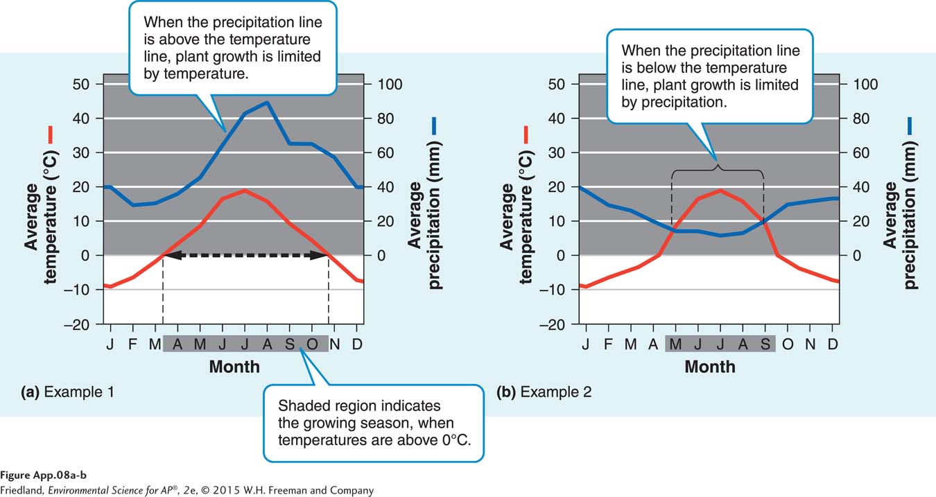
In addition to identifying the growing season, climate diagrams show the relationships among precipitation, temperature, and plant growth. In FIGURE A.8a, the precipitation line is above the temperature line in every month. This means that water supply exceeds demand, so plant growth is more constrained by temperature than by precipitation throughout the entire year. In FIGURE A.8b, the precipitation line intersects the temperature line. At this point, the amount of precipitation available to plants equals the amount of water lost by plants through evapotranspiration. When the precipitation line falls below the temperature line from May through September, water demand exceeds supply and plant growth will be constrained more by precipitation than by temperature.
Age Structure Diagrams
Age structure diagrams are visual representations of age distribution for both males and females in a country. FIGURE A.9 presents four examples. Each horizontal bar of the diagram represents a 5-
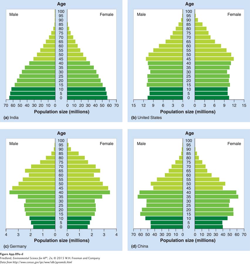
While every nation has a unique age structure, we can group countries very broadly into three categories. Figure A.9a shows a country with many more young people than older people. The age structure diagram of a country with this population will be in the shape of a pyramid, with its widest part at the bottom, moving toward the smallest at the top. Age structure diagrams with this shape are typical of countries in the developing world, such as Venezuela and India.
A country with a smaller difference between the number of individuals in the younger and older age groups has an age structure diagram that looks more like a column. With fewer individuals in the younger age groups, we can deduce that the country has little or no population growth. Figure A.9b shows the age structure of people in the United States, which is similar to the age structure of people in Canada, Australia, Sweden, and many other developed countries. Panels (c) and (d) show countries with a proportionally larger number of older people. This age structure diagram resembles an inverted pyramid. Such a country has a decreasing number of males and females within each younger age range and that number will continue to shrink. Italy, Germany, Russia, and a few other developed countries display this pattern. In recent years China has also begun to show this pattern.
As you can see, we can use many different types of graphs to display data collected in environmental studies. This makes it easier to view patterns in our data and to reach the correct interpretation. With this knowledge of graph making, you are now well prepared to interpret the graphs throughout the book.