15.1 General Equilibrium Effects in Action
General equilibrium analysis has two parts. One part describes the mechanics of market interactions and illustrates how various market features affect the size and direction of equilibrium effects in all these markets. This branch of general equilibrium analysis describes markets as they are. The other part asks whether economy-
These two approaches use somewhat different frameworks for thinking about general equilibrium, and are in some respects independent of each other. Later in the chapter, we look at how the second approach works. In this section, we discuss the first approach and learn how general equilibrium effects work in markets and what market features influence these mechanisms.
An Overview of General Equilibrium Effects
The Energy Policy Act of 2005 set mandates to encourage the use of renewable fuels, including biofuels like ethanol, in the United States. It required that billions of gallons be used in the years that followed, and they were amounts well above the quantities a freely operating market would provide. For various technological and cost reasons, virtually the entire mandate was met with the use of corn-
iStockphoto/Thinkstock
Recall that in the Chapter 8 Application “The Increased Demand for Corn”, we analyzed how this might affect the equilibrium price and quantity in the corn market. The increase in demand should drive up prices and induce more production: Corn producers would plant more, and wheat, soybean, or rice farmers would switch some of their production to corn. The increase in demand moves the market up its supply curve (because marginal costs rise with the added production), and raises the equilibrium price and quantity of corn. These predictions of the theory were borne out following the passage of the Act: Corn production grew 11% between 2005 and 2011, and prices more than doubled.1
Yet, corn wasn’t the only commodity crop that saw large price increases during this same period. Wheat and rice prices grew by two-
575
These cross-
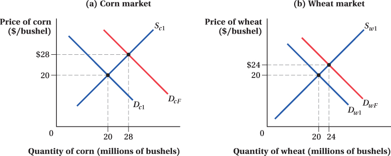
All these spillover effects on other markets bounce back and affect the corn market itself. Figure 15.1 demonstrates how this feedback might work. Panel a shows the corn market. Before the renewable fuels mandate, the market is in equilibrium with demand curve Dc1 and supply curve Sc1, and the equilibrium quantity and price are Qc1 and Pc1. The direct effect of the mandate is to increase the demand for corn from Dc1 to Dc2. In a partial equilibrium analysis, we’d expect this to increase the quantity and price of corn to Qc2 and Pc2, respectively, and we’d be done.
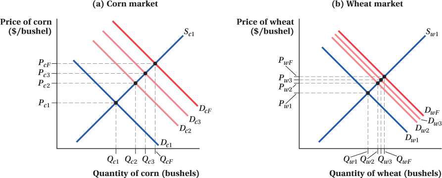
A general equilibrium analysis, however, recognizes that because wheat and corn are substitutes, an increase in the demand for corn will affect the wheat market as shown in panel b. Before the mandate, wheat supply and demand are at Sw1 and Dw1. The higher corn price caused by the renewable fuels mandate causes people to shift, say, from corn-
576
Now, because wheat is a substitute for corn, higher wheat prices cause the demand for corn to increase, and there is a secondary outward shift in corn demand, from Dc2 to Dc3. This raises the quantity and price of corn to Qc3 and Pc3. Higher corn prices, in turn, shift out wheat demand again, from Dw2 to Dw3, raising wheat quantity and price to Qw3 and Pw3, and so on.
This feedback eventually slows down and stops. The size of the secondary feedback effect is smaller than the initial demand shift from Dc1 to Dc2, the third shift is smaller than the second, and so on until the markets settle at a stable point. In the corn and wheat markets in Figure 15.1, the final demand curves after all the feedback effects are shown by DcF for corn and DwF for wheat.
Therefore, the general equilibrium effect of the renewable fuels mandate in the corn market is to increase quantity from Qc1 to QcF and price from Pc1 to PcF. These changes are considerably larger than the quantity and price increases to Qc2 and Pc2 that a partial equilibrium analysis implies. When the links between two markets are strong, as they are between corn and wheat, the gap between the partial and general equilibrium outcomes in the corn market is larger. Moreover, in a partial equilibrium analysis, the effect of the fuels mandate on wheat quantities and prices, which increase from Qw1 and Pw1 to QwF and PwF, is completely ignored.
We can also analyze the supply-
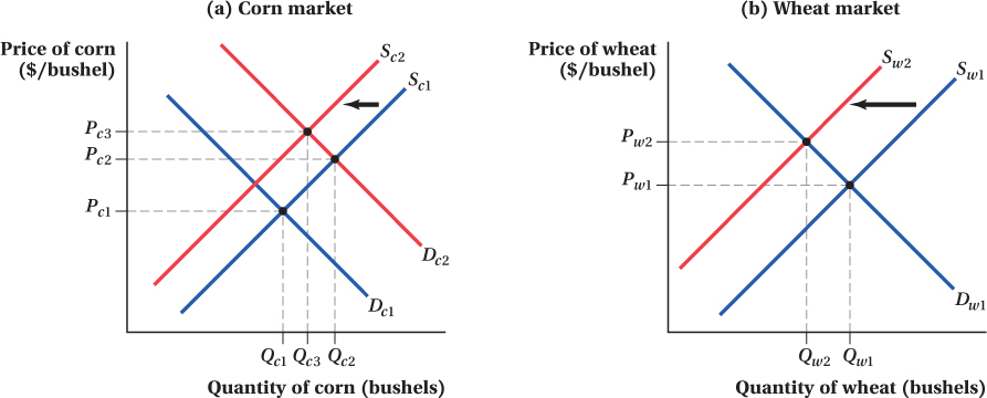
The decrease in wheat supply from Sw1 to Sw2 and the resulting increase in its price feed back, in turn, to the corn market and shift the supply of corn from Sc1 to Sc2 because this raises the price of inputs into corn production.
Now that we have an overview of how general equilibrium works, the next two subsections put actual numbers to the two cases we’ve just discussed to make the process of determining general equilibrium effects more explicit.
Quantitative General Equilibrium: The Corn Example with Demand-Side Market Links
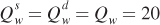
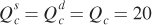
Let’s put some specific numbers on the types of processes discussed above to get a better feel for analyzing general equilibrium effects. To simplify our analysis, we assume that wheat and corn are the only two goods in the world. In this world, general equilibrium is the set of wheat and corn prices that simultaneously equate supply and demand in both markets.
We consider two numerical examples. In this section, we look at the cross-
Let’s suppose the supply of wheat is  , where
  is the quantity of wheat supplied (in millions of bushels) and Pw is the price of wheat (in dollars per bushel). This supply curve has the typical upward slope: The quantity of wheat supplied increases as wheat prices rise. Similarly, corn supply is
  , where
  is the quantity of corn supplied (in millions of bushels) and Pc is the price of corn (in dollars per bushel). This supply curve also slopes upward; the quantity of corn supplied increases as corn prices rise.
577
Now let’s say wheat demand is given by the equation 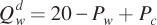 . This equation tells us that, as with a standard demand curve, the quantity of wheat demanded decreases as wheat prices rise. But notice that the quantity of wheat demanded is also affected by corn prices Pc: When they increase, so does
  . This second effect reflects the fact that wheat is a substitute for corn. Therefore, higher corn prices cause consumers to shift some corn purchases toward wheat. This raises the quantity of wheat demanded at any given wheat price and shifts out the wheat demand curve. We assume corn demand is given by the equation
  . Thus, corn is a substitute for wheat; higher wheat prices shift out the demand for corn.
The fact that wheat and corn are substitutes for each other in this example is what creates general equilibrium effects. If we had assumed that wheat demand and corn demand were only a function of their own prices (while keeping the same supply curves that we assumed above), no cross-
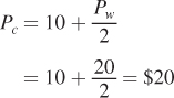
Finding Equilibrium Prices Describing the general equilibrium in this two-
578

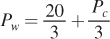
Pw = 20 – Pw + Pc
We can rearrange this equation to express the equilibrium wheat price in terms of the price of corn:
Repeating the same steps for corn (equating the quantity supplied and demanded and solving for the corn price in terms of the wheat price) gives
These equations look similar to each other because we set up the example so that the two markets have identically shaped supply and demand curves.
The two equations for wheat and corn prices make clear that each market’s equilibrium price depends on the other’s. This is the essence of general equilibrium. We can find the prices that put both markets in equilibrium by substituting
for Pc in
and solving for Pw:
Pw = $20
The general equilibrium price for wheat, then, is $20 per bushel.
To find corn prices in general equilibrium, we substitute the wheat price Pw = 20 into the equation for the price of corn:
Corn prices are also $20 per bushel. That corn and wheat prices are the same is a special case, once again, because we assumed the two markets have identically shaped supply and demand curves.
Finding Equilibrium Quantities Given the equilibrium prices of $20 per bushel, we can calculate the general equilibrium quantities of wheat and corn by substituting Pw = 20 and Pc = 20 into the supply or demand curve equations for wheat and corn:
| For wheat | For corn | |
| Supply |

|

|

|

|
|
| Demand |
|
|
|
|
|

|

|
|
| Equilibrium Q |
|
|
The general equilibrium quantities for wheat and corn are therefore both 20 million bushels.
579
This is the initial general equilibrium in the economy (akin to quantities and prices Qc1, Qw1, Pc1, and Pw1 in our example in the previous section).
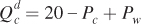
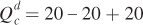
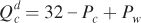
General Equilibrium Effects Now let’s look at how an isolated change in one market can create general equilibrium effects in the other. Suppose the renewable fuels mandate increases the demand for corn by 12 million bushels at any given set of corn and wheat prices. As a result, the demand curve for corn becomes
This is reflected in the shift of corn demand from Dc1 to DcF in Figure 15.3.
We know that prices have to change—
Because the supply and demand curves for wheat are not directly changed by the mandate, the equation for the price of wheat in terms of corn remains the same (
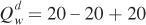
). But, the equation for the equilibrium price of corn, which was
, changes because of the new corn demand curve. Setting , we now have
Pc = 32 – Pc + Pw

580
Again, we can solve for the general equilibrium wheat price by plugging one price equation into the other. This gives
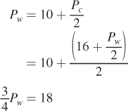
Pw = $24
The price of wheat is now $24 per bushel. Substituting this price back into the new price of corn equation shows that the new equilibrium corn price is  per bushel. We then plug these prices into the supply or demand curves to obtain the new general equilibrium quantities:
Summing Up We’ve just seen how an increase in the demand for corn leads not only to higher corn prices and quantities, as we would expect from a partial equilibrium analysis that just looks at what happens in the corn market, but also to higher wheat prices and quantities. Not surprisingly, the price increase is greater for corn (an $8 per bushel, or 40% increase) than for wheat (a $4 per bushel, or 20% increase). Notice how wheat prices rose even though the initial change in the economy—
figure it out 15.1

For interactive, step-
Whiskey and rye are substitutes. Suppose that the demand for whiskey is given by Qw = 20 – Pw + 0.5Pr, and that the demand for rye is given by Qr = 20 – Pr + 0.5Pw, where Qw and Qr are measured in millions of barrels and Pw and Pr are the prices per barrel. The supplies of whiskey and rye are given by Qw = Pw and Qr = Pr, respectively.
Solve for the general equilibrium prices and quantities of whiskey and rye.
Suppose that the demand for whiskey falls by 5 units at every price so that Qw = 15 – Pw + 0.5Pr. Calculate the new general equilibrium prices and quantities of whiskey and rye.
Solution:
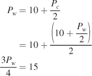
We first need to solve for the price of whiskey as a function of rye by setting quantity demanded and quantity supplied equal in the whiskey market:
20 – Pw + 0.5Pr = Pw
2Pw = 20 + 0.5Pr
Pw = 10 + 0.25Pr
Then, we follow the same step for the rye market so that we have the price of rye expressed as a function of the price of whiskey:
20 – Pr + 0.5Pw = Pr
2Pr = 20 + 0.5Pw
Pr = 10 + 0.25Pw
To solve for Pw, we can substitute in the equation we just derived for Pr:
Pw = 10 + 0.25Pr = 10 + 0.25[10 + 0.25Pw] = 10 + 2.5 + 0.0625Pw
0.9375Pw = 12.5
Pw = $13.33
This means that Pr is
Pr = 10 + 0.25Pw = 10 + 0.25(13.33) = 10 + 3.33 = $13.33
Because Qw = Pw and Qr = Pr, Qw = 13.33 million barrels and Qr = 13.33 million barrels.
When the demand for whiskey falls, both the markets for whiskey and rye will be affected. We will need to follow the same steps used in part (a) to solve for the new equilibrium prices and quantities.
First, we solve for the price of whiskey as a function of the price of rye:
15 – Pw + 0.5Pr = Pw
2Pw = 15 + 0.5Pr
Pw = 7.5 + 0.25Pr
Because the supply and demand for rye are not affected initially, we know from part (a) that
Pr = 10 + 0.25Pw
Therefore, we can substitute Pr into the equation for Pw:
Pw = 7.5 + 0.25Pr = 7.5 + 0.25[10 + 0.25Pw] = 7.5 + 2.5 + 0.0625Pw
0.9375Pw = 10
Pw = 10.67
Substituting for Pw and solving for Pr, we get
Pr = 10 + 0.25Pw = 10 + 0.25(10.67) = 10 + 2.67 = 12.67
Because Qw = Pw and Qr = Pr, Qw = 10.67 million barrels and Qr = 12.67 million barrels.
581
Application: The General Equilibrium of Carmageddon
In July 2011 residents of metropolitan Los Angeles prepared for disaster. Residents stocked up on food so they wouldn’t have to leave their houses for the weekend. Hospitals put into effect emergency procedures to ensure they would have enough staff. Local news stations planned for live coverage.
The city wasn’t preparing for a massive flood or military attack. Instead, they were getting ready for “Carmageddon,” a weekend-
The city government hoped that when the project was finished, it would lessen congestion and commute times on the notoriously busy Los Angeles freeways. To this end, officials planned to build an additional lane and add a carpool lane to encourage people to share their commutes with coworkers. How successful were these measures? Was Carmageddon worth all of the hassle?
582
It’s too early to tell for Los Angeles—
Over the past 20 years, as the U.S. roadway system expanded, the average number of cars on the road in metropolitan areas nearly doubled. Using this fact as a jumping-
What they found would probably shock the Angelenos: The elasticity between vehicle-
Why doesn’t the density of cars on the road decrease as the number of roads increase? When Los Angeles builds a highway to improve traffic, the city is relying on a partial equilibrium analysis. Unfortunately, this problem involves general equilibrium effects—
These findings indicate that Los Angeles gridlock is unlikely to be improved by highway expansion. But, there was one unexpected benefit of Carmageddon on area traffic: Because most people stayed home that weekend, those who did take to the roads faced practically empty roadways for a couple of days. 
Quantitative General Equilibrium: The Corn Example with Supply-Side Market Links
In the example just covered, the link between the corn and wheat markets was on the demand side. The two products were substitutes, so the change in one good’s price affected the demand for the other. Supply-
Again, let’s start with some specific and simple forms for the supply and demand curves. Suppose the demand curve for wheat is  and the demand curve for corn is
  . Notice that the demand-
583
The supply curves are now  for wheat and
  for corn. You can see the connections between the two markets in these new supply curve equations. The quantity supplied of each good increases as its own price increases and decreases as the other good’s price increases. This relationship captures the notion that when one good’s price increases, production shifts toward that good, allocating scarce resources away from production of the other good (such as replanting wheat fields as corn fields).
We can solve for the general equilibrium prices and quantities using the same steps we followed in the demand-
and solving for the price of wheat in terms of the corn price give
Again, the symmetry of how we’ve set up these markets will result in a similar solution for corn prices: 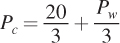 . If we solve this system of equations, we find that Pw = $10 per bushel and Pc = $10 per bushel. If we substitute these prices into the supply and demand curves, we find that the quantities of both wheat and corn in this general equilibrium are 10 million bushels.
Now again suppose there is a 12 million bushel increase in the quantity demanded of corn at all prices because of the renewable fuels mandate, so that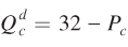 . The equation expressing the wheat price as a function of the corn price is the same as above
 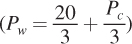 because the supply and demand curves for wheat are not directly affected. The equation for the price of corn changes, though. It’s now
 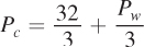 When we solve this equation and the one for wheat prices above, we find that Pw = $11.50 and Pc = $14.50 per bushel. Plugging these prices into the supply or demand curves shows that the equilibrium wheat quantity is 8.5 million bushels and the equilibrium quantity of corn is 17.5 million bushels.
Summing Up As in our previous example, an increase in corn demand leads to increases in both corn and wheat prices in general equilibrium. This is true in markets like this one where there are supply-
With supply-
However, notice that these similarities do not necessarily mean that demand-
The quantity results are different because with the demand-
584
FREAKONOMICS
Horse Meat and General Equilibrium
If you’ve ever shopped at IKEA, chances are that after picking out a ready-
But not in February 2013.
That’s when it was revealed that Ikea’s meatballs (supposedly all-

IKEA was just one of a long list of European companies caught up in a massive horsemeat scandal. Consumers reacted sharply to the scandal—
When consumers reduced their consumption of processed meats, they didn’t just eat less. Instead, they found substitutes. In February 2013 the National Federation of Meat and Food Traders reported a 30% increase in sales of beef burgers at independent butchers. Wary of purchasing processed products from the large supermarkets, consumers instead opted for meat from more trustworthy sources. As Brindon Addy, owner of a Yorkshire shop and chairman of an organization of local butchers, said, “Health scares are always good for us.”
Vegetarian products also experienced a boost following the horsemeat scandal. In a survey by research firm Consumer Intelligence, 6% of respondents said they knew someone who went vegetarian as a result of the scandal. And this response was reflected in the market—
General equilibrium sometimes seems abstract when it’s taught in a textbook, but it is a powerful economic force. Vegetarian food producers and storefront butchers tend not to see eye to eye on most issues, but one thing they can definitely agree on: More demand for their product, even if driven by changes in another market, is better.
585
Application: General Equilibrium Interaction of Cities’ Housing and Labor Markets
In these examples, we see that general equilibrium effects can show up when a price change in one market shifts supply or demand curves in other markets. But, general equilibrium effects can affect the slopes of supply and demand curves, too.
Recent research by economist Raven Saks documented an example of this.6 Saks looked at how the labor markets in major cities responded to increased demand for labor by local firms. (This outward shift in labor demand is typically caused by heightened demand for the products of firms that operate in the area.) A partial equilibrium analysis of the effect of a labor demand shift in the city follows. In the short run, as firms experience increased demand for their products, their demand for labor increases and the labor demand curve shifts to the right from DL1 to DL2 (Figure 15.4a). Given an upward-
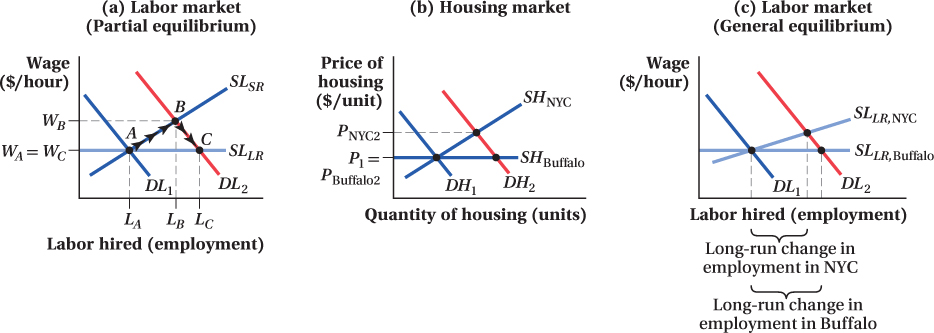
The short-
586
The long-
Saks’ research suggested the story is more complex than this, however. General equilibrium effects arising from links between the labor and housing markets also influence the size of the long-
Any price effect in the housing market has, in turn, its own impact on the labor market. Higher housing prices counteract wage increases driven by the shift in labor demand. To spur a given amount of migration, then, wages have to rise more in cities with steeper housing supply curves, because they have to make up for the higher home prices new workers in the city face. This means that markets like New York City with steeper long-
Saks tested the hypothesis that the total employment effect of labor demand shifts in general equilibrium depends on the steepness of cities’ housing supply curves. She compared employment responses to labor demand shifts in cities with different housing supply elasticities. Although she could not measure housing supply curves directly, she showed that metropolitan areas with more legal restrictions on building (and therefore likely with steeper housing supply curves, because such restrictions make it more expensive to increase the quantity of housing supplied) had smaller long-
587