5.1 How Income Changes Affect an Individual’s Consumption Choices
income effect
The change in a consumer’s consumption choices that results from a change in the purchasing power of the consumer’s income.
In Section 4.3, we learned how changes in income affect the position of a consumer’s budget constraint. Lower incomes shift the constraint toward the origin; higher incomes shift it out. In this section, we look at how a change in income affects a consumer’s utility-
Figure 5.1 shows the effect of an increase in income on consumption for Evan, a consumer who allocates his income between vacations and tickets to basketball games. Initially, Evan’s budget constraint is BC1 and the utility-
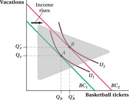
Because U2 shows bundles of goods that offer a higher utility level than those on U1, the increase in income allows Evan to achieve a higher utility level. Note that when we analyze the effect of changes in income on consumer behavior, we hold preferences (as well as prices) constant. Thus, indifference curve U2 does not appear because of some income-
157
Normal and Inferior Goods
normal good
A good for which consumption rises when income rises.
Notice how the new optimum in Figure 5.1 involves higher levels of consumption for both goods. The number of vacations Evan takes rises from Qv to Qv′, and the number of basketball tickets increases from Qb to Qb′. This result isn’t that surprising; Evan was spending money on both vacations and basketball tickets before his income went up, so we might expect that he’d spend some of his extra income on both goods. Economists call a good for which consumption rises when income rises—
inferior good
A good for which consumption decreases when income rises.
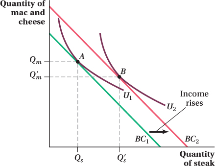
It is possible that an increase in income can lead to a consumer consuming a smaller quantity of a good. Recall from Chapter 2 that economists call such goods inferior goods. Figure 5.2 presents an example in which one of the goods is inferior. An increase in the consumer’s income from BC1 to BC2 leads to more steak being consumed, but less macaroni and cheese. Note that it isn’t just that the quantity of mac and cheese relative to the quantity of steak falls. This change can happen even when both goods are normal (i.e., they both rise, but steak rises more). Instead, it is the absolute quantity of macaroni and cheese consumed that drops in the move from A to B, because Q′m is less than Qm. Note also that this drop is optimal from the consumer’s perspective—
What kind of goods tend to be inferior? Usually, they are goods that are perceived to be low-
158
We do know that every good can’t be inferior, however. If a consumer were to consume a smaller quantity of everything when his income rises, he wouldn’t be spending all his new, higher income. This outcome would be inconsistent with utility maximization, which states that a consumer always ends up buying a bundle on his budget constraint. (Remember there is no saving in this model.)
Whether the effect of an income change on a good’s consumption is positive (consumption increases) or negative (consumption decreases) can vary with the level of income. (We look at some of these special cases later in the chapter.) For instance, a good such as a used car is likely to be a normal good at low levels of income, and an inferior good at high levels of income. When someone’s income is very low, owning a used car is prohibitively expensive and riding a bike or taking public transportation is necessary. As income increases from such low levels, a used car becomes increasingly likely to be purchased, making it a normal good. But once someone becomes rich enough, used cars are supplanted by new cars and his consumption of used cars falls. Over that higher income range, the used car is an inferior good.
Income Elasticities and Types of Goods
income elasticity
The percentage change in the quantity consumed of a good in response to a 1% change in income.
We’ve discussed how the income effect can be positive (as with normal goods) or negative (as with inferior goods). We can make further distinctions between types of goods by looking not just at the sign of the income effect, but at the income elasticity as well, which we discussed in Chapter 2. Remember that the income elasticity measures the percentage change in the quantity consumed of a good in response to a given percentage change in income. Formally, the income elasticity is
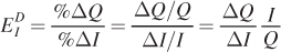
where Q is the quantity of the good consumed (ΔQ is the change in quantity), and I is income (ΔI is the change in income). As we noted in our earlier discussion, income elasticity is like the price elasticity of demand, except that we are now considering the responsiveness of consumption to income changes rather than to price changes.
The first ratio in the income elasticity definition is the income effect shown in the equations above: ΔQ/ΔI, the change in quantity consumed in response to a change in income. Therefore, the sign of the income elasticity is the same as the sign of the income effect. For normal goods, ΔQ/ΔI > 0, and the income elasticity is positive. For inferior goods, ΔQ/ΔI < 0, and the income elasticity is negative.
necessity good
normal good for which income elasticity is between zero and 1.
Within the class of normal goods, economists occasionally make a further distinction. The quantities of goods with an income elasticity between zero and 1 (sometimes called necessity goods) rise with income, but at a slower rate. Because prices are held constant when measuring income elasticities, the slower-
luxury good
A good with an income elasticity greater than 1.
Luxury goods have an income elasticity greater than 1. Because their quantities consumed grow faster than income does, these goods account for an increasing fraction of the consumer’s expenditure as income rises. First-
159
The Income Expansion Path
Imagine repeating the analysis in the previous section for every possible income level, starting with 0. That is, for a given set of prices and a particular set of preferences, find the utility-
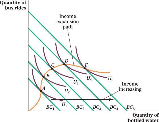
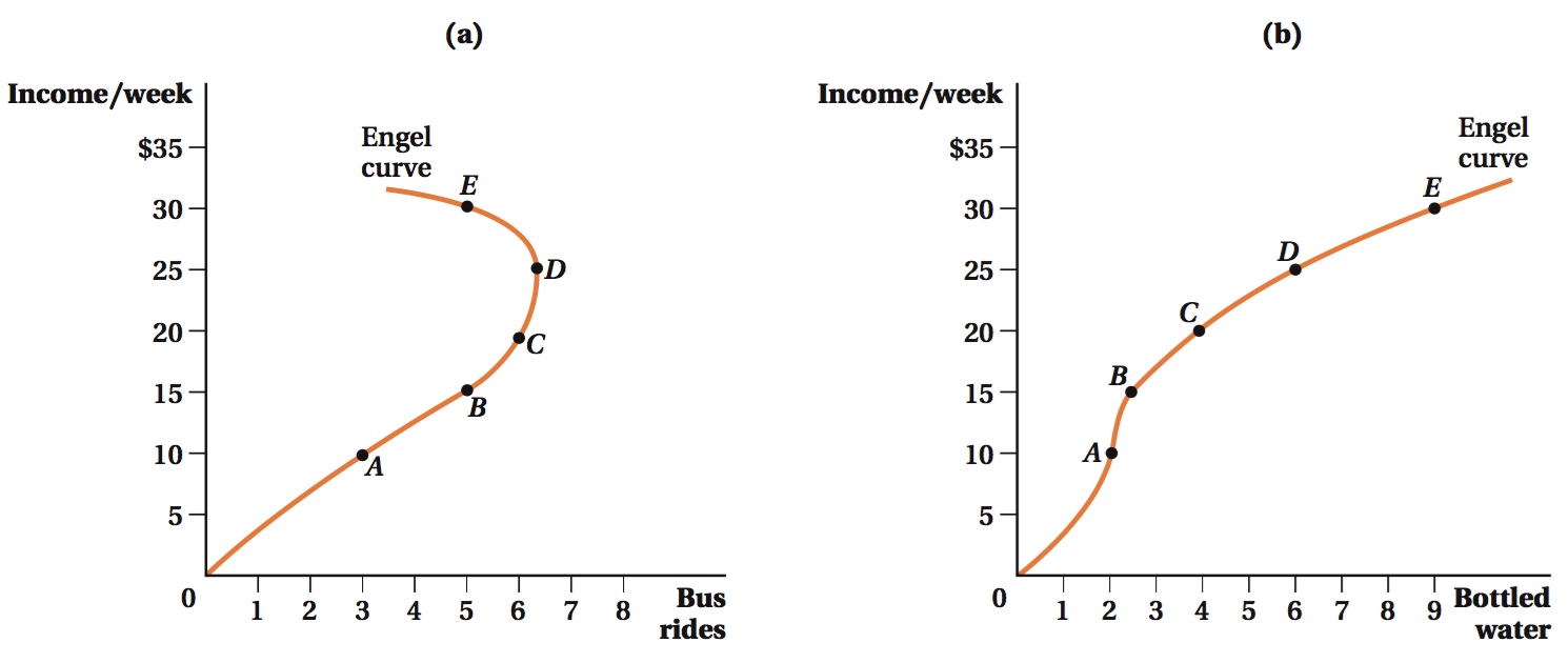
Figure 5.3 shows how Meredith allocates her income between bus rides and bottled water. Points A, B, C, D, and E are the optimal consumption bundles at five different income levels that correspond to the budget constraints shown. Point A is Meredith’s utility-
income expansion path
A curve that connects a consumer’s optimal bundles at each income level.
If we draw a line connecting all the optimal bundles (the five here plus all the others for budget constraints we don’t show in the figure), it would trace out a curve known as the income expansion path. This curve always starts at the origin because when income is zero, the consumption of both goods must also be zero. Figure 5.3 shows Meredith’s income expansion path for bus rides and bottled water.
When both goods are normal goods, the income expansion path will be positively sloped because consumption of both goods rises when income does. If the slope of the income expansion path is negative, then the quantity consumed of one of the goods falls with income while the other rises. The one whose quantity falls is an inferior good. Remember that whether a given good is normal or inferior can depend on the consumer’s income level. In Figure 5.3, for example, both bus rides and bottled water are normal goods at incomes up to the level corresponding to the budget constraint containing bundle D. As income rises above that and the budget constraint continues to shift out, the income expansion path begins to curve downward. This outcome means that bus rides become an inferior good as Meredith’s income rises beyond that level. We can also see from the income expansion path that bottled water is never inferior, because the path never curves back to the left. When there are only two goods, it’s impossible for both goods to be inferior at any income level. If they were both inferior, an increase in income would actually lead to lower expenditure on both goods, and the consumer wouldn’t be spending all of her income.
160
The Engel Curve
The income expansion path is a useful tool for examining how consumer behavior changes in response to changes in income, but it has two important weaknesses. First, because we have only two axes, we can only look at two goods at a time. Second, although we can easily see the consumption quantities of each good, we can’t see directly the income level that a particular point on the curve corresponds to. The income level equals the sum of the quantities consumed of each good (which are easily seen in the figure) multiplied by their respective prices (which aren’t easily seen). The basic problem is that when we talk about consumption and income, we care about three numbers—
A better way to see how the quantity consumed of one good varies with income (as opposed to how the relative quantities of the two goods vary) is to take the information conveyed by the income expansion path and plot it on a graph with income on the vertical axis and the quantity of the good in question on the horizontal axis. Panel a of Figure 5.4 shows the relationship between income and the quantity of bus rides from our example. The five points mapped in panel a of Figure 5.4 are the same five consumption bundles represented by points A, B, C, D, and E in Figure 5.3; the only difference between the figures is in the variables measured by the axes.
161
Engel curve
A curve that shows the relationship between the quantity of a good consumed and a consumer’s income.
The lines traced out in Figure 5.4 are known as Engel curves, named for the nineteenth-
Whether the income expansion path or Engel curves are more useful for understanding the effect of income on consumption choices depends on the question. If we care about how the relative quantities of the two goods change with income, the income expansion path is more useful because it shows both quantities at the same time. On the other hand, if we want to investigate the impact of income changes on the consumption of each particular good, the Engel curve is best because it isolates this relationship more clearly. The two curves contain the same information but display it in different ways due to the limitations imposed by having only two axes.
Application: Engel Curves and House Sizes


Houses in the United States have been getting larger for several decades. In 1950, newly built single-
Explanations for this trend vary. Some say people’s tastes changed (i.e., they now have different utility functions) in a way that reflects a greater desire for space. Others think that space is a normal good, so homeowners demand more space as they get richer. If this is the case, homeowners’ utility functions didn’t change. Instead, their income increased and that increase moved them to a different part of their utility function where they demand more space.
The numbers are consistent with an income effect. Figure 5.5 plots the average size of newly built homes (in square feet) and average inflation-
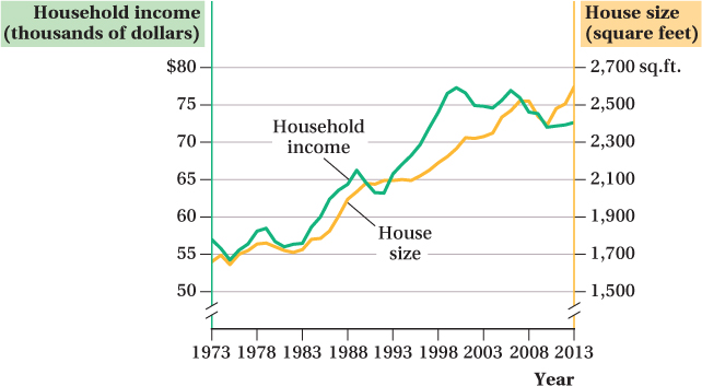
These trends are consistent with income growth driving homeowners to buy larger homes. We should be careful in leaping to this interpretation, though. Many things can trend over time even though they aren’t related. (For example, the coyote population of the United States also increased over the period, but it’s hard to argue that having more coyotes around makes people want larger homes.) And even if income effects matter, other factors might also contribute to the desire for larger homes, such as falling construction costs.
162
It would therefore be nice to have additional evidence about the income–
We fit a curve relating home size and annual household income in the 2013 survey data (a survey containing about 49,000 households) in Figure 5.6. This is very similar to an Engel curve for home size: It shows how much a household’s purchases of a good (square feet of house) varies with its income.2
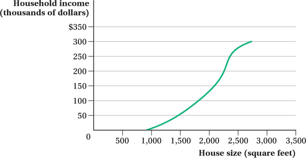
We can see that this Engel curve always slopes up. That is, based on these data, house size is always a normal good. However, there is a considerable income range—
163
figure it out 5.1
Annika spends all of her income on golf and pancakes. Greens fees at a local golf course are $10 per round. Pancake mix is $2 per box. When Annika’s income is $100 per week, she buys 5 boxes of pancake mix and 9 rounds of golf. When Annika’s income rises to $120 per week, she buys 10 boxes of pancake mix and 10 rounds of golf. Based on these figures, determine whether each of the following statements is true or false, and briefly explain your reasoning.
Golf is a normal good, and pancake mix is an inferior good.
Golf is a luxury good.
Pancakes are a luxury good.
Solution:
A normal good is one of which a consumer buys more when income rises. An inferior good is a good for which consumption falls when income rises. When Annika’s income rises, she purchases more pancake mix and more rounds of golf. This means that both goods are normal goods for Annika. Therefore, the statement is false.
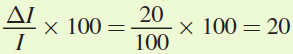
A luxury good has an income elasticity greater than 1. The income elasticity for a good is calculated by dividing the percentage change in quantity demanded by the percentage change in income. Annika’s income rises from $100 to $120. Therefore, the percentage change in income is
 . When Annika’s income rises, her consumption of golf changes from 9 rounds to 10. Thus, the percentage change in the quantity of rounds demanded is
 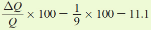 . To calculate the income elasticity, we divide the percentage change in quantity by the percentage change in income,
 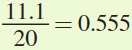 . Golf cannot be a luxury good for Annika because the elasticity is not greater than 1. Therefore, the statement is false.
Again, we must calculate the income elasticity, this time for pancake mix. When Annika’s income rises from $100 to $120 [a 20% rise as calculated in part (b)], Annika increases her purchases of pancake mix from 5 boxes to 10 boxes. Thus, the percentage change in the quantity of pancake mix demanded is
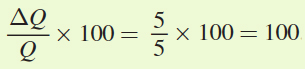 . This means that the income elasticity of demand is
 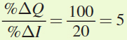 . Because the income elasticity is greater than 1, pancake mix is a luxury good for Annika. Therefore, the statement is true.
164