6.6 Technological Change
total factor productivity growth (or technological change)
An improvement in technology that changes the firm’s production function such that more output is obtained from the same amount of inputs.
When economists try to measure production functions using data from firms’ operations over time, they often find that output rises over time even though the firms might still be using the same amount of inputs. The only way to explain this is that the production function must somehow be changing over time in a way that allows extra output to be obtained from a given amount of inputs. This shift in the production function is referred to as total factor productivity growth (or sometimes technological change).
We can adjust a production function to allow for technological change. There are many possible ways to do this, but a common method is to suppose that the level of technology is a constant that multiplies the production function:
Q = Af(K, L)
where A is the level of total factor productivity, a parameter that affects how much output can be produced from a given set of inputs. Usually, we think of A as reflecting technological change. Increases in A mean that the amount of output obtainable from any given set of labor and capital inputs will increase as well.
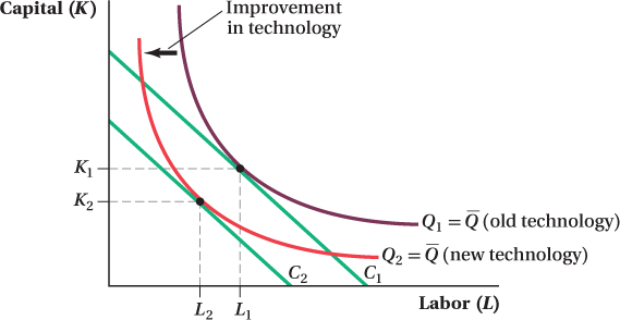
How does this kind of technological change affect a firm’s cost-
This is shown in Figure 6.13. Before, to produce  , the firm needed some combination of inputs on isoquant
  . After technological change leads to an increase in A, the firm doesn’t need to use as many inputs to produce
. Therefore, the isoquant for
shifts in, to
. After technological change leads to an increase in A, the firm doesn’t need to use as many inputs to produce
. Therefore, the isoquant for
shifts in, to  .
.
 inward to
. The new cost-
inward to
. The new cost-If the firm’s desired output remains
after the technological change, then the firm’s choice of inputs will be determined by the tangency of
and its isocost lines, as in Figure 6.13. The initial cost-
is tangent to isocost line C1, that is, K1 units of capital and L1 units of labor. After the technological change, the optimal input combination becomes K2 and L2, where
. is tangent to isocost line C2. Because the firm needs to use fewer inputs, technological change has reduced its costs of producing
.
227
For a vivid description of the power of technological change, see the Freakonomics study.
Application: Technological Change in U.S. Manufacturing
durable good
A good that has a long service life.
You might have heard discussion about the shrinking of the U.S. manufacturing sector over the past several decades. It’s true that manufacturing employment has fallen—
Given this trend, it might surprise you to find out that the total value of manufactured products made in the United States increased over the same period. Not by just a little, either. While the total inflation-
How is it possible for manufacturing employment to fall for an extended time while the sector’s output grows just as fast as, or even faster than, the rest of the economy? A partial answer to this question is that manufacturing firms shifted from using labor to using more capital inputs. But that’s not the whole story. Much of the explanation lies in the fact that technological change was faster in manufacturing than in the rest of the economy, particularly in durable goods manufacturing.
Figure 6.14 shows the growth of technology (total factor productivity) for three segments of the U.S. economy. The largest segment is the private business sector, which includes just about every producer in the economy outside of government bodies, including manufacturers. The second is the manufacturing sector, a subset of the first group, and the third isolates durable goods manufacturers specifically as a subset of the second group. The level of technology in each segment is given by an index, where the value of the index expresses the segment’s total factor productivity level as a fraction of its value in 1997. So, for instance, an index value of 110 in a particular year means that the segment’s total factor productivity is 10% higher than it was in 1997. This means that, given any fixed set of inputs, the segment’s producers can make 10% more output than they could in 1997.
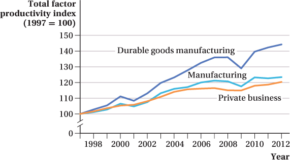
A comparison of the rates of technological change helps explain why manufacturing output could have gone up even as employment fell. Total factor productivity for the entire private business segment grew by 18% during the period, meaning producers were able to make 18% more output from the same set of inputs in 2012 as they could in 1997. Manufacturers saw a 23% increase in total factor productivity during the period, and that includes a big slide during the Great Recession that wasn’t experienced by the economy as a whole. Durable goods manufacturers, in particular, saw a much stronger rate of technological change during the period. They were able to produce 44% more output in 2012 with the same inputs they used in 1997. This meant that they could use even fewer inputs than producers in other segments of the economy and still experience the same total output growth. This relative productivity growth, combined with the fact that they substituted more capital-
228
FREAKONOMICS
Why Do Indian Fishermen Love Their Cell Phones So Much?
There are few products more cherished by American consumers than the cell phone. The modern smartphone is truly a technological wonder—
*The DynaTAC 8000x was the first cell phone available to the general public, but it was not the first cell phone produced or even to make a successful phone call. That distinction goes to an even heavier prototype in 1973.
When economists talk about technological progress, they are referring to changes in the production function. Compared to 30 years ago, we’ve gotten much better at taking a set of inputs (e.g., plastic, silicon, metal, the time of engineers and factory workers, etc.) and turning them into cell phones.

Although it is natural to think of technological progress in terms of innovations in manufacturing, there are many other sources of such progress. Indeed, the cell phone is not just the beneficiary of technological progress—
†Robert Jensen, “The Digital Provide: Information (Technology), Market Performance, and Welfare in the South Indian Fisheries Sector,” The Quarterly Journal of Economics 122, no. 3 (2007): 879–
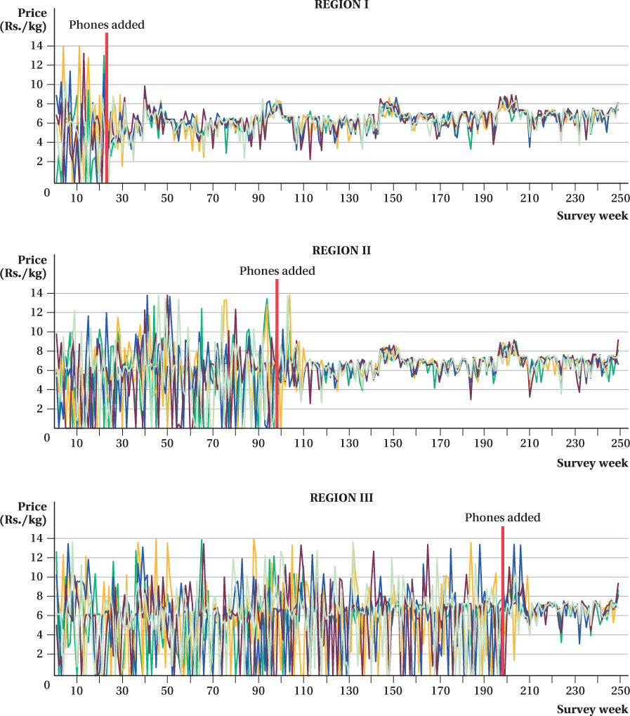
Traditionally, fishermen would take their boats out to sea, make their catch, and face a guessing game as to which market to choose on a given day. Then cell phone coverage came to the area. Very quickly, fishermen adopted cell phones, which allowed them to call ahead to determine which market would offer them the best prices on their fish. Better information led to better matching of buyers and sellers. There were rarely wasted fish; in fact, Jensen found that after the complete adoption of cell phones, it became extremely rare for sellers not to find buyers for their fish. The figure presents evidence of just how profoundly cell phones affected this market. It shows the fluctuation in fish prices over time in three areas in Kerala. Each colored line in the graph represents prices at one particular market. The introduction of cell phones was staggered across regions, and the points at which cell phones became available are denoted by the vertical lines near week 20 for Region I, week 100 for Region II, and week 200 for Region III.
Before cell phones, prices in each region were extremely volatile. Sometimes prices were almost as high as 14 rupees per kilogram on one beach, whereas at another beach on the same day, the fish were basically given away for free. From day to day, it was difficult if not impossible to predict which market would have the best price. The impact of cell phone use on the market was seen as soon as cell phone service became available in each area, although as you might expect, it took a few weeks for people to learn how to adjust and figure out how best to use this new technology. Roughly 10 weeks after the introduction of cell phones into this industry, though, the variation in prices across beaches in each of the three regions on a given day had shrunk dramatically.
229
230