8.3 Perfect Competition in the Short Run

We’ve just learned that a perfectly competitive firm maximizes its profit where MR = P = MC, and that the firm will operate in the short run (even at an economic loss) as long as price is greater than or equal to average variable cost. We can now take our analysis one step further and derive the short-run supply curve for a perfectly competitive firm.

A Firm’s Short-Run Supply Curve in a Perfectly Competitive Market

Because the supply curve shows the quantity supplied at any given price, and the firm chooses to produce where P = MC, the short-run marginal cost curve is the firm’s short-run supply curve. There is one caveat: Only the portion of the marginal cost curve above the minimum average variable cost will be on the firm’s supply curve, because at any price below the minimum average variable cost, the firm would shut down and quantity supplied would be zero.

Figure 8.6 shows that the firm’s short-run supply curve is the portion of its marginal cost curve MC that is at or above its average variable cost AVC, including the portion that is below its average total cost ATC. For prices below AVC, supply is zero, as shown in the figure. Keep in mind that we hold everything else constant except price and output when deriving the firm’s supply curve.

image
Figure 8.6: Figure 8.6 Perfectly Competitive Firm’s Short-Run Supply Curve
Figure 8.6: Because a firm will only operate in the short run when the market price is above its average variable cost curve AVC, the perfectly competitive firm’s short-run supply curve is the portion of the marginal cost curve MC above AVC. At prices below AVC, the firm shuts down, its quantity supplied is 0, and its supply curve is represented by the y-axis.

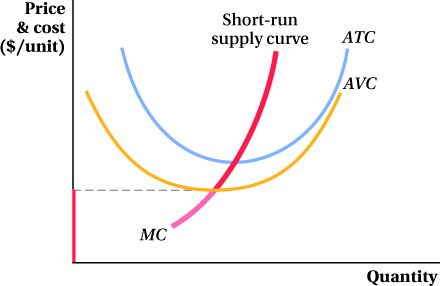
Because of this relationship between marginal cost and the firm’s short-run supply curve, anything that changes marginal cost will shift supply. As you may recall from Chapter 7, factors that shift the marginal cost curve include changes in input prices and technology. Note, however, that fixed cost does not affect a firm’s marginal cost, and therefore changes in fixed cost do not shift the short-run supply curve. In the long run, as we know, no costs are fixed. Later in the chapter, we talk about how firms’ long-run behavior in perfectly competitive markets differs from their short-run behavior.

300

Application: The Supply Curve of a Power Plant

3Ali Hortaçsu and Steven Puller, “Understanding Strategic Bidding in Multi-Unit Auctions: A Case Study of the Texas Electricity Spot Market,” RAND Journal of Economics 39, no. 1 (2008): 86–114.

Economists Ali Hortaçsu and Steven Puller published a detailed study of the Texas electricity industry.3 Using data from this study, we can see how to construct the supply curve for a single electricity firm with several electricity plants (Figure 8.7). This, along with the supply curves of the other firms in the industry, is a building block in the industry supply curve that we construct later in the chapter.

image
Figure 8.7: Figure 8.7 Marginal Cost Curve for an Electricity Firm (Firm 1)
Figure 8.7: A firm in the Texas electricity industry faces a stepwise marginal cost curve. When this firm supplies 200 MW or less, only its coal plant, Plant A, is on line, and its marginal cost is horizontal at $18 per MWh. At output quantities greater than 200 MW, the firm will also run its natural gas plants, Plants B and C, at marginal costs of $37 per MWh and $39 per MWh, respectively.

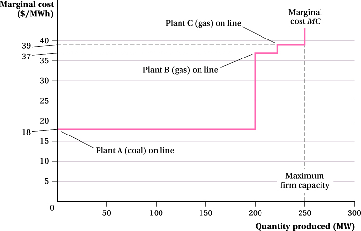
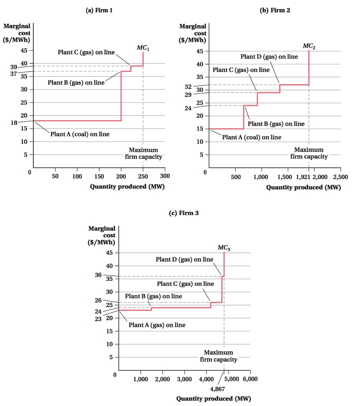
The first and most important step in deriving the firm’s supply curve is to determine its marginal cost curve. In the electric power generation industry, marginal cost reflects the firm’s cost of producing one more megawatt of electricity for another hour (this amount of energy, called a megawatt-hour [MWh], would power about 1,000 homes for an hour). This marginal cost comes from the firm’s variable cost of running its generators at its various power plants—this includes the labor cost of operating and maintaining generators, the cost of environmental permits, and, most importantly, the cost of fuel.

Our firm has three power plants. Plant A uses coal to power its generator and has a capacity of 200 megawatts (MW); Plants B and C use natural gas and each has a capacity of 25 MW. Coal generators are generally cheaper to run than natural gas generators.

301

The marginal cost of running Plant A’s coal generator is $18 per MWh and it is constant across the plant’s production quantity up to 200 MW. The plant cannot produce quantities above this level, so the plant’s marginal cost is, in effect, infinite at quantities greater than 200 MW. Plant B’s natural-gas-fired generator has a constant marginal cost of $37 per MWh (up to its 25-MW capacity), and Plant C’s natural gas generator has the highest constant marginal cost of $39 per MWh (up to its 25-MW capacity).

If the firm is generating 200 MW or less, only Plant A (its coal plant) will be on line (i.e., producing electricity) because that’s the lowest-cost way of generating that quantity. Thus, the firm’s marginal cost curve is flat at $18 per MWh for quantities from 0 to 200 MWh, as shown in Figure 8.7.

To generate quantities above 200 MWh, the firm has to use at least one of its other generators. If it wants to produce a quantity between 200 and 225 MWh, it only needs to run one of its natural gas plants, and it will put Plant B on line, the one with the smaller marginal cost of the two, $37 per MWh. Therefore, at a quantity of 200 MWh, the firm’s marginal cost curve jumps up to $37 per MWh. It stays at this level up to the quantity of 225 MWh. To produce a quantity above 225 MWh, it needs to put Plant C on line, its natural gas generator with the $39 marginal cost, so the marginal cost curve jumps up to $39 per MWh. The firm’s marginal cost remains at $39 per MWh up to the quantity of 250 MWh. At this point, the firm has exhausted its generating capacity and cannot produce any more electricity. Above 250 MWh, the firm’s marginal costs effectively become infinite. Figure 8.7 reflects this as a vertical line extending off the graph at 250 MWh.

The portion of this marginal cost curve at or above the firm’s average variable cost is its supply curve. We saw in Chapter 7 that a firm’s total variable cost at any quantity is the sum of its marginal cost of producing each unit up to and including that quantity. Therefore, the firm’s total variable cost of producing its first megawatt-hour is $18, and its average variable cost of producing that quantity is $18 per MWh. Its total variable cost of producing 2 MWh is $36, so its average variable cost is $36/2 = $18 per MWh. It’s clear, therefore, that the average variable cost will be $18 per MWh at quantities up to 200 MWh. In other words, the marginal cost curve is the average variable cost curve up to that quantity. When marginal cost rises to $37 per MWh for the 201st MWh the firm produces, the total variable cost rises by $37 for 201 MWh, but the average variable cost only rises to ($18 × 200 MWh + $37)/201 MWh = $18.09 per MWh. By this logic, the firm’s marginal cost curve will always be above its average variable cost curve at all quantities above 200 MWh. So, for this firm at least, its entire marginal cost curve is its supply curve.

The Short-Run Supply Curve for a Perfectly Competitive Industry

We know that an individual firm in a perfectly competitive market cannot affect the price it receives for its output by changing the level of its output. What does determine the price in a perfectly competitive market? The combined output decisions of all the firms in the market: the industry supply curve. In this section, we look at how this combined output response is determined.

Before we begin, we must clarify what we mean by firms’ “combined” decisions. What we do not mean is “coordinated.” Firms in a perfectly competitive market do not gather at an annual convention to determine their output levels for the year, or have an industry newsletter or website that serves the same function. (Such a practice would typically get a firm’s executives indicted for price fixing, in fact.) “Combined” here instead means aggregated—the total of all the individual firms’ independent output decisions added together. An industry supply curve, then, indicates how much total output an industry supplies at any particular price.

302

It’s easy to see how you can add up firms’ short-run supply curves in an example. We assume that firms’ combined output responses do not have any notable impact on input prices, so the industry short-run supply curve is the sum of firm-level short-run supply curves. Let’s suppose that there are 100 firms in a perfectly competitive industry, each with the same short-run supply curve. Below a market price of $1 per unit, the firms do not operate because this is less than their average variable costs. For prices greater than or equal to $1 and less than $2, each firm supplies 1 unit of output. At any price equal to or above $2, each firm produces 2 units of output, but no more because of capacity limitations. (This is a contrived example, but it keeps things simple enough so that we can concentrate on the concepts rather than the arithmetic.)

To derive the industry short-run supply curve from these firm supply curves, we add up the individual firm outputs at each possible market price. At prices below $1, the industry supplies no output, again because none of its firms can cover its average variable cost at those prices. When the price is between $1 and $2, the industry produces 100 units of output—1 unit from each of the 100 firms. When the price is at $2 or above, the industry quantity supplied is 200 units because each firm now makes 2 units. Therefore, the short-run supply curve for this industry is 0 units for prices below $1, 100 units for prices at or above $1 but below $2, and 200 units for prices $2 and higher.

The Short-Run Supply Curve: A Graphical Approach If we use a graphical approach to the short-run industry supply curve, the firms’ supply curves would look as they do on the left-hand side of Figure 8.8. There, we’ve drawn the short-run supply curve that each of the industry’s 100 firms share. To build the industry short-run supply curve, we horizontally add the firm’s short-run supply curves: At any given price, we find the individual firms’ outputs, add them up, and plot their sum to get the industry quantity supplied. These values yield the industry short-run supply curve on the right-hand side of the figure. Note how individual firms’ supply curves are added up horizontally, not vertically, to obtain the industry supply curve, just as individual consumers’ demand curves were horizontally added to obtain the market demand curve in Chapter 5.

image
Figure 8.8: Figure 8.8 Deriving the Short-Run Industry Supply Curve When Firms Have the Same Costs
Figure 8.8: SupplyFirm is the short-run supply curve of each firm in an industry with 100 firms. The short-run industry supply curve, SupplyIndustry, is the horizontal sum of the individual firms’ supply curves.

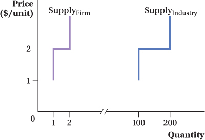
In Figure 8.8, all industry firms have the same short-run supply curves (this is equivalent to saying they have the same cost curves). The analysis gets more complicated if firms in a perfectly competitive industry have different costs. In this case, the process for determining the industry supply curve is the same (we add up the supply curves of the individual firms), but there are additional ways in which the supply curves of individual firms can affect the shape of the industry supply curve.

303

To illustrate this point, let’s now suppose that the industry (which still has 100 firms) has 50 firms with supply curves like those in Figure 8.8 and another 50 that have different supply curves. Let’s say these other firms have higher costs and therefore will not produce any output at a market price less than $2. For prices greater than or equal to $2 and less than $3, they produce 1 unit of output, and at prices at or above $3, they produce 2 units. Now the industry supply curve is 0 units for prices under $1 because no firms can profitably produce below that price. For prices from $1 to just under $2, industry supply is 50 units; only the 50 low-cost firms can operate at these prices, and they produce 1 unit each. At prices at or above $2 and less than $3, the industry supplies 150 units: 100 units (50 firms times 2 units each) for the low-cost firms, and 1 unit for each of the 50 high-cost firms. At prices greater than or equal to $3, supply is 200 units because all firms now produce 2 units of output.

In general, the industry supply curve is the horizontal sum of the supply curves of the individual firms within it. The examples above use very simple “step-type” firm-level supply curves, like those in the electricity example. Conceptually they are the same as the smooth curves that we’re accustomed to. The firms’ supply curves would look something like what we’ve drawn on the left-hand side of Figure 8.9. We’re assuming there are four firms in the industry, with Firm A having the lowest costs, Firm B the next lowest, and so on. Again, the industry supply curve is the horizontal sum of the firms’ supply curves. Only at prices above P1 does any firm produce, so the industry supplies positive quantities only at price P1 or higher. For prices between P1 and P2, the industry supply curve is the sum of Firm A’s and Firm B’s supply curves. At P2, Firm C starts producing. The industry supply curve shifts right by the quantity that C produces at P2 when this happens, and Firm C’s supply is also added to the industry supply curve above this price. Finally, Firm D starts producing at P3, and again the industry supply curve shifts horizontally as this output is added.

image
Figure 8.9: Figure 8.9 Short-Run Industry Supply Curve When Firms Have Different Costs
Figure 8.9: In a four-firm industry, in which each firm faces different costs, these cost differences are reflected in their individual supply curves (SFirm A, SFirm B, SFirm C, and SFirm D). The industry supply curve, SIndustry, is the horizontal sum of the four individual firms’ supply curves. At prices between P1 and P2, only Firms A and B produce; at price P2, Firm C also supplies its product on the market; and at price P3, all four firms supply positive quantities.

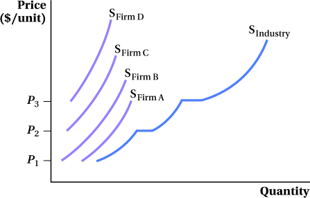
These examples make an interesting point: Industry output increases as price increases for two reasons. One is that individual firms’ supply curves are often upward-sloping—an individual firm will tend to produce more as the market price rises. The other comes from the fact that some firms might have higher costs than others, so they only begin operating at higher price levels.

304

Application: The Short-Run Supply of Crude Oil

U.S. politicians are constantly calling for the country to reduce its dependence on oil from the Middle East. About 20% of the oil the United States consumes comes from OPEC (the Organization of Petroleum Exporting Countries), and about 60% of that (12% of U.S. consumption) is supplied by Middle Eastern countries that are members of OPEC. Many politicians take this to mean that reducing the country’s dependence on Middle Eastern oil is simple: Cut consumption by 12%, and that will effectively eliminate imports from the Middle East. This will also increase the share of imported oil that comes from “friendlier” nations such as Canada.

This type of logic ignores what we know about how perfectly competitive firms make production decisions. We’ve seen that a competitive firm’s short-run supply curve is the portion of its marginal cost curve above its minimum average variable cost curve. If the market price dips below the price at the intersection between the marginal cost and average variable cost curves, then the firm will shut down in the short run.

4Austan Goolsbee, “Refined Thought: Dependency Paradox,” Fortune, August 22, 2005.

While the crude oil market is not perfectly competitive, the same relationship between price and average variable cost holds for all firms. If we reduce our consumption of oil, the countries that will be hurt by a decrease in demand and the price drop that accompanies it will be those with the highest costs—those countries for which the market price falls below their average variable costs first. Where are oil production costs higher, the Middle East or Canada? You guessed it: Canada. Saudi Arabia can extract and process oil at an average variable cost of only a couple of dollars per barrel, but producers tapping the Canadian oil sands face much higher average variable costs, greater than $30 per barrel. If the United States reduces its oil consumption, we will reduce the oil we consume from Canada before we reduce oil consumed from Saudi Arabia.4

This outcome has been borne out historically. At least until the drop in oil prices at the end of 2014, the United States actually imported more oil from Canada than it does from the Middle East. In the late 1990s, on the other hand, when crude oil prices were at historic lows, only about 8% of U.S. oil consumption came from Canadian imports, while about 12% of consumption was imported from the Middle East. Thus, if we want to reduce our dependence on the Middle East, cutting back consumption a bit isn’t the answer.

Producer Surplus for a Competitive Firm

The intersection of the short-run industry supply curve and the market demand curve determines the market equilibrium price. Each perfectly competitive firm then takes this price as given and chooses the quantity of output at which it maximizes profit (and chooses whether to operate at all). We showed how we can measure a firm’s short-run profit earlier. Equally important is producer surplus, which we first learned about in Chapter 3. Remember that producer surplus is the vertical difference between the market price and the supply curve, which we now know reflects firms’ marginal costs.

At all but the lowest market price levels, firms will sell some units of output at a price above their marginal cost of production. In the Application on Texas electricity generation, for example, Figure 8.7 shows that if the market price is at or above $37 per MWh, the firm would be able to sell the electricity generated by its coal plant at a marginal cost of $18 per MWh at a considerably higher price.

305

We can see this in a more general case in Figure 8.10 , which shows the production decision of a particular firm. Profit maximization implies the firm will produce Q*, the quantity where the firm’s marginal cost equals the market price P. Notice that for all units the firm produces before Q*, the firm’s marginal cost of producing them is lower than the market price. The firm earns a markup for each of these units.

image
Figure 8.10: Figure 8.10 Producer Surplus for a Firm in Perfect Competition
Figure 8.10: (a) At market price, a perfectly competitive firm produces Q*. For each unit the firm produces below Q*, the marginal cost MC is less than the market price, and the firm earns a producer surplus on that unit. As a result, total producer surplus is equal to the area below the demand curve and above MC.
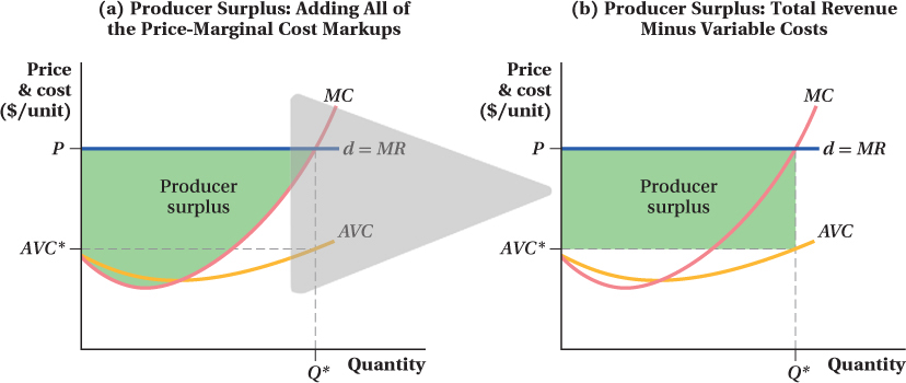
(b) Producer surplus can also be calculated by a firm’s total revenue minus its variable cost. A firm’s total revenue is the entire rectangle with height P and length Q*, and its variable cost is the rectangle with height AVC* and length Q*. Its producer surplus, therefore, is the area of the rectangle with height (PAVC*) and length Q*.

If we add up all these price-marginal cost markups across every unit of output the firm makes, we get the firm’s producer surplus, the shaded area in panel a of Figure 8.10 . If this isn’t clear, imagine slicing the shaded area into many tiny vertical slices, one for each unit of output. Each slice equals the difference between the price the unit sells for and the marginal cost of producing it. If we add up all the slices—that is, the price-cost gaps for all the units of output—we get the firm’s producer surplus.

There’s another way to compute producer surplus. First, remember from Chapter 7 that marginal cost involves only variable cost, not fixed cost. If we add up the firm’s marginal cost for all the units of output it produces, we have its variable cost. And if we add up the firm’s revenue for every unit of output it produces, we have its total revenue. That means the firm’s total revenue minus its variable cost equals the sum of the price-marginal cost markups it earns on every unit it sells—that is, its producer surplus:

PS = TRVC

In panel b of Figure 8.10 , the firm’s total revenue is the area of the rectangle with a height of P and a base of Q*. Variable cost is output multiplied by average variable cost, so the firm’s variable cost is the area of the rectangle with a base of Q* and a height of AVC* (AVC at the profit-maximizing level of output). The difference between these two areas is the shaded rectangle with base Q* and height (PAVC*). The area of this rectangle also equals the firm’s producer surplus.

306

Producer Surplus and Profit

You’re probably not going to be surprised when we tell you that producer surplus is closely related to profit. But it’s important to recognize that producer surplus is not the same thing as profit. The difference is that producer surplus includes no fixed costs, while profit does. In mathematical terms, PS = TRVC and π = TRVCFC.

A new firm may operate with profit less than zero. It will never operate with producer surplus less than zero because that means each unit costs more to produce than it sells for, even without fixed costs. In fact, we can rewrite the firm’s shut-down decision that we discussed above in terms of producer surplus: Operate if PS ≥ 0 (i.e., if TRVC), and shut down if PS < 0 (TR < VC).

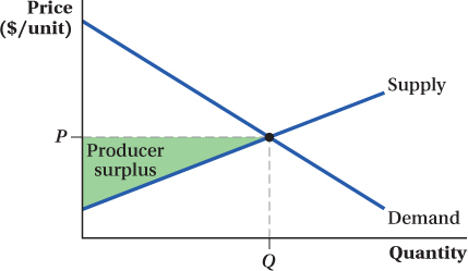
Producer Surplus for a Competitive Industry

Producer surplus for an entire industry is the same idea as producer surplus for a firm. It is the area below the market price but above the short-run supply curve—now, however, it is the industry supply curve rather than the firm’s (Figure 8.11). This surplus reflects the industry’s gain from producing units at a lower cost than the price at which they are sold.

image
Figure 8.11: Figure 8.11 Industry Producer Surplus
Figure 8.11: An industry’s producer surplus is the entire industry’s surplus from producing units at a lower cost than the market price. This is represented by the shaded triangle above the industry supply curve and below the market price P.

See the problem worked out using calculus

figure it out 8.3

Assume that the pickle industry is perfectly competitive and has 150 producers. One hundred of these producers are “high-cost” producers, each with a short-run supply curve given by Qhc = 4P. Fifty of these producers are “low-cost” producers, with a short-run supply curve given by Qlc = 6P. Quantities are measured in jars and prices are dollars per jar.

  1. Derive the short-run industry supply curve for pickles.

  2. If the market demand curve for jars of pickles is given by Qd = 6,000 – 300P, what are the market equilibrium price and quantity of pickles?

  3. At the price you found in part (b), how many pickles does each high-cost firm produce? Each low-cost firm?

  4. At the price you found in part (b), determine the industry producer surplus.

Solution:

  1. To derive the industry short-run supply curve, we need to sum each of the firm short-run supply curves horizontally. In other words, we need to add each firm’s quantity supplied at each price. Since there are 100 high-cost firms with identical supply curves, we can sum them simply by multiplying the firm supply curve by 100:

    QHC = 100Qhc = 100(4P) = 400P

    Similarly, we can get the supply of the 50 low-cost firms by summing their individual supply curves or by multiplying the curve of one firm by 50 (since these 50 firms are assumed to have identical supply curves):

    QLC = 50Qlc = 50(6P) = 300P

    The short-run industry supply curve is the sum of the supply by high-cost producers and the supply of low-cost producers:

    QS = QHC + QLC = 400P + 300P = 700P

  2. Market equilibrium occurs where quantity demanded is equal to quantity supplied:

    QD = QS

    6,000 – 300P = 700P

    1,000P = 6,000

    P* = $6

    The equilibrium quantity can be found by substituting P = $6 into either the market demand or supply equation:

    image
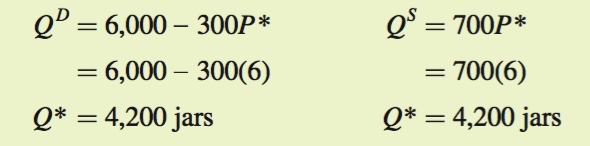
  3. At a price of $6, each high-
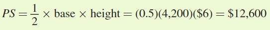
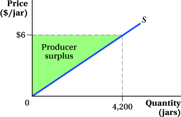
cost producer will produce Qhc = 4P = 4(6) = 24, while each low-cost producer will produce Qlc = 6P = 6(6) = 36 jars.

  4. The easiest way to calculate industry producer surplus is to graph the industry supply curve. Producer surplus is the area below the market price but above the short-run industry supply curve. In the figure below, this is the triangle with a base of 4,200 (the equilibrium quantity at a price of $6) and a height of $6:

image
image

307

Application: Short-Run Industry Supply and Producer Surplus in Electricity Generation

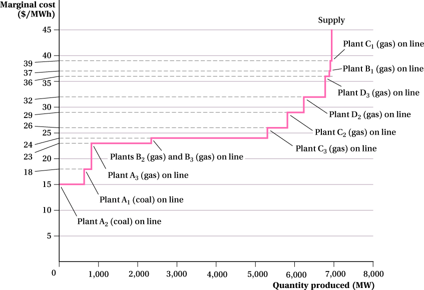
Let’s suppose that Firm 1 from the Application on the Texas electricity industry earlier in this section is in an industry with two other firms. (In reality, the Texas electricity industry comprises many firms, but we have chosen three to make it less complicated.) Like Firm 1, Firm 2 has both coal and natural gas plants, and it relies on its relatively low-cost coal plant up to its production capacity of 675 MW. To produce quantities above that, Firm 2 needs to also operate its natural gas generators. Firm 3, on the other hand, has only natural gas generators, though each has a different marginal cost. The three panels of Figure 8.12 show each firm’s marginal cost curve.

image
Figure 8.12: Figure 8.12 Differing Marginal Cost Curves across Electricity Producers
Figure 8.12: Firms 1, 2, and 3 have the marginal cost curves reflected in panels a, b, and c, respectively. While Firms 1 and 2 have both coal and natural gas plants, Firm 3 relies only on the relatively more expensive natural gas generators.

We can construct the industry marginal cost curve by finding the horizontal sum of the three firms’ individual marginal cost curves. This is demonstrated in Figure 8.13. As was true for Firm 1’s marginal cost curve, the industry will rely first on generators with relatively cheaper marginal costs. In other words, the industry will first use all available coal generators. For the first 675 MW, only Firm 2’s coal plant operates, because it has the lowest marginal cost of all the industry’s plants ($15 per MWh). If a higher quantity is produced, Firm 1 brings its 200-MW coal plant on line, raising the industry’s marginal cost to $18 per MWh. At quantities above 875 MW (the combined capacity of the industry’s coal-fired plants), Firm 3, which has the lowest-marginal-cost natural gas plant, at $23 per MWh, also starts generating power. Once that plant’s 1500-MW capacity is used up—that is, when the industry is producing more than 2,375 MW—the industry marginal cost curve shifts up again as more plants are brought on line. Notice that this next step up in the industry marginal cost curve (to $24 per MWh) actually reflects the total production capacity of two plants, one each from Firms 2 and 3, because both these firms have generators that operate at this same marginal cost. The horizontal summation of the three firms’ supply curves continues as the industry must bring additional plants on line to produce higher and higher quantities, and the industry marginal cost curve shifts up to reflect the higher marginal costs of operating these plants. Once the industry has exhausted its production capacity at 7,044 MWh, its marginal costs become infinite. This is reflected in the figure by the vertical marginal cost curve at that total capacity.

image
Figure 8.13: Figure 8.13 Short-Run Supply of Electricity in Texas
Figure 8.13: The short-run supply of electricity in Texas is the horizontal sum of the firms’ marginal cost curves in Figure 8.12. When the market price is at least $15 per MWh, Firm 2 supplies electricity on the market. At prices at or above $18 per MWh, Firms 1 and 2 both supply on the market. At a market price of $23 per MWh, Firm 3 generates electricity using natural gas, and all three firms are suppliers on the electricity market.

308

309

For all market prices at or above $18 per MWh, the industry is going to have at least one plant operating at a marginal cost that is below the market price. For example, if the market price were $23 per MWh, Firm 1 and 2’s coal plants would both be operating at marginal costs that are smaller than the market price. In other words, price equals marginal cost only for the marginal plant—the last plant that needs to be brought on line to produce the industry quantity at that price. At a market price of $23 per MWh, the marginal plant is Firm 3’s lowest-cost natural gas plant. The two coal plants therefore earn a markup above their marginal costs; they are able to sell their output at a price above their marginal cost of production. This markup is producer’s surplus.

310