8.4 Perfectly Competitive Industries in the Long Run
We already noted that there are differences between firms’ short- and long-run supply curves. In the short run, a firm supplies output at the point where its short-run marginal cost equals the market price. This price can be below the firm’s average total cost, but it must be at least as high as its short-run average variable cost. In other words, the firm must earn producer surplus, or else it shuts down. The short-run supply curve is therefore the portion of a firm’s short-run marginal cost curve that is above its short-run average variable cost curve and zero otherwise.
In the long run, however, a firm produces where its long-run marginal cost equals the market price. Moreover, because all inputs and costs are variable in the long run, the firm’s long-run supply curve is the part of its long-run marginal cost curve above its long-run average total cost curve (LATC = LAVC because there are no fixed costs in the long run).
At the industry level, there are other distinctions between the short run and long run. The primary difference is that, in the long run, firms can enter and exit the industry. In the short run, the number of firms in the industry is fixed, so only firms already in the market make production choices. This assumption makes sense; some inputs are fixed in the short run, making it difficult for new firms to start producing on a whim or for existing firms to avoid paying a fixed cost. In the long run, though, firms can enter or leave the industry in response to changes in profitability. In this section, we learn how this process works and what it implies about how competitive industries look in the long run.
Entry
Firms decide to enter or exit a market depending on whether they expect their action will be profitable.
Think about a firm that is considering entering a perfectly competitive market. For simplicity, assume that all firms in the market, including this and any other potential entrants, have the same cost curves. (We look at what happens when firms have different costs later.)
Figure 8.14 shows the current market price and long-run cost curves for a typical firm in this industry. A profit-maximizing firm would produce the quantity where its long-run marginal cost curve equals the market price. We know that this quantity must be at a point where the firm’s (long-run) marginal cost curve is at or above its (long-run) average total cost curve. If the market price is P1, the firm’s profit-maximizing quantity is Q*, where LMC equals P1. Notice that because P1 is greater than the firm’s minimum average total cost, the firm is making a profit of (P1 – LATC*) on each unit of output.
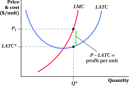
Figure 8.14: Figure 8.14 Positive Long-Run Profit
Figure 8.14: In the long run, a perfectly competitive firm produces only when the market price is equal to or greater than its long-run average total cost LATC*. Here, the firm produces Q*, market price P1 equals its long-run marginal cost LMC, and its long-run economic profit equals (P1 – LATC*) per unit.
The ability of a firm to enter an industry without encountering legal or technical barriers.
Because firms in this industry are earning positive profits, new firms—whether started anew by entrepreneurs or new divisions of companies already operating in different industries—will want to take advantage of this opportunity by entering the industry. With free entry into the industry—which doesn’t have to mean “free” in the monetary sense (there can be startup costs), but rather, indicates that entry is not blocked by any special legal or technical barriers—the market price will fall until it equals the minimum average total cost. Because the industry’s short-run supply curve is derived from the sum of all industry firms’ marginal cost curves, adding new firms would cause the industry to provide more output at any given price, as the supply from the new entrants is added to the industry total. In other words, entry shifts the short-run industry supply curve out from S1 to S2 (Figure 8.15). This outward shift lowers the market price from P1 to P2.
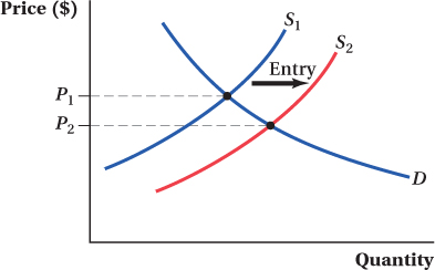
Figure 8.15: Figure 8.15 Entry of New Firms Increases Supply and Lowers Equilibrium Price
Figure 8.15: When firms in an industry are earning positive economic profits, new firms will enter, shifting the short-run industry supply curve out from S1 to S2 and lowering the market price from P1 to P2.
If P2 is still above the minimum average total cost, an incentive remains for more firms to enter because they would make a profit. Entering firms would be making less profit than earlier entrants, but they’re still better off entering the market than staying out. New entrants will shift the industry supply curve further out, lowering the market price even further.
long-run competitive equilibrium
The point at which the market price is equal to the minimum average total cost and firms would gain no profits by entering the industry.
This process continues until the last set of entrants drives down the market price to the minimum average total cost and there are no profits to be made by entering the industry. At this point, any potential entrant would be indifferent between entering the industry and staying out. Entry ceases, and the market is in long-run competitive equilibrium. The bottom line is that if there is free entry, the price in a perfectly competitive industry will be driven down toward the minimum average total cost of the industry’s firms, and no firms will be making a profit.
This important idea seems odd. How could the firms make no profit? And, if they make no profit, why bother? The answer is that the world of perfect competition is tough. You may have a good idea, but the profit you make only lasts until everyone else enters and copies it. One thing to remember about this no-profit condition is that it refers to economic profit, not accounting profit. The opportunity cost of the business owners’ time is included in the firms’ costs. It means business owners make only enough to stay in business—that is, to be no worse off than their outside option—and no more.
Exit
The ability of a firm to exit an industry without encountering legal or technical barriers.
Now suppose the market price is below the minimum average total cost instead. No firms will enter the industry because they would earn negative profits if they did. Further, firms already in the industry are making negative profits, so this market situation isn’t sustainable. If there is free exit from the market, some of these firms will close up shop and leave the industry. Because we’ve assumed all firms in the market are the same, all firms are equally unprofitable and would prefer to exit. Which firms exit first? There are two ways to look at how firms make this decision. One is that there are a lucky few who figure out that they’re losing money before the others, and they leave first. The other, probably more realistic possibility is that cost differences actually exist across firms, and the highest-cost firms exit first. (We’ll talk more about this case below.)
This exit from the industry shifts its supply curve in, raising the market price. Exit continues until the market price rises to minimum average total cost. At this point, exiting would not make any firms better off.
Free entry and exit are forces that push the market price in a perfectly competitive industry toward the long-run minimum average total cost. This outcome leads to two important characteristics of the long-run equilibrium in a perfectly competitive market. First, even though the industry’s short-run supply curve slopes upward, the industry’s long-run supply curve is horizontal at the long-run minimum average cost. Remember that a supply curve indicates the quantity supplied at every price. Long-run competitive equilibrium implies that firms produce where price is equal to minimum average total cost.
Application: Entry and Exit at Work in Markets—Residential Real Estate
Residential real estate brokerage in the United States is a peculiar industry. For one thing, real estate agents’ commissions are essentially the same everywhere, consistently hovering around 6% of the selling price, even though every city is a different market. Many have wondered whether that’s the result of collusion among agents, but regardless of the reason, agents selling houses in, say, Boston, Massachusetts, charge essentially the same commission rate as those in Fargo, North Dakota.
Given that agents across the country get paid the same percentage of the sales price, it seems like it would be better to be an agent in a place with higher house prices, such as Boston or Los Angeles. With an average house selling for a little over $500,000 in Boston, real estate agents get around $30,000 per house. Compare this to the $15,000 they would make on a typical home in Fargo (average price $250,000). But it turns out that Boston agents pull in approximately the same average yearly salary as those in Fargo, despite the higher house prices. The same pattern holds across the United States: Regardless of house prices, agents’ average salaries are roughly equal across cities.
Why do real estate agents everywhere end up making around the same yearly salary? Free entry. Economists Chang-Tai Hsieh and Enrico Moretti looked into just this phenomenon.5 They find the key to explaining this pattern is that the typical Boston agent sells fewer homes over the course of the year than does the typical agent in Fargo. In other words, as housing prices increase, agents’ productivity decreases, and the reduction in houses sold per year in high-house-price cities just about exactly counteracts the higher commission per house. So while average commissions per house might be twice as high in Boston as in Fargo, the typical Boston agent sells half the number of houses per year as the typical agent in Fargo. They end up making the same income.
Are the agents in Boston and other high-price real estate markets just being lazy? Hardly. This decrease in productivity is the result of free entry into the real estate market. It’s not hard to become a real estate agent—spend maybe 30 to 90 hours in the classroom and pass a test, and you’ll have your license. Therefore, in cities with high housing costs (and high commissions per house sold), more people choose to become real estate agents. Having more agents means each agent sells fewer houses, on average. This drives down agents’ average yearly salaries until they are on par with those for agents in other lower-cost cities.
Not only did Hsieh and Moretti find this pattern across cities with different average house prices, they found it within cities over time as well. When housing prices increased in a city, so did the number of agents seeking to sell those houses, keeping average agent salaries from rising along with house prices. If prices fell, the opposite happened: Agents left the market until the average productivity of those remaining rose to keep salaries at their original level. In this way, entry and exit into the market kept the long-run average price for agents (i.e., their salaries) more or less constant. So while the constant commission rate still marks residential real estate brokerage as a peculiar business, free entry into the business explains why average salaries are the same. 
Graphing the Industry Long-Run Supply Curve
Figure 8.16 shows how we can derive the industry long-run supply curve graphically. Suppose the industry (panel a) is currently in equilibrium at a price of P1. Each firm in the industry (panel b) takes the price as given and maximizes profit by producing where P1 = LMC. Because price equals long-run average total cost, all firms earn zero profit. This means that firms have no incentive to enter or exit the market, so the industry is in long-run competitive equilibrium at P1.
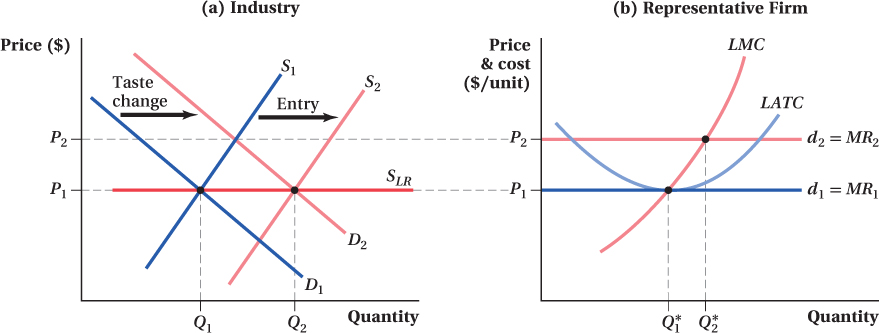
Figure 8.16: Figure 8.16 Deriving the Long-Run Industry Supply Curve
Figure 8.16: (a) The original long-run equilibrium for an industry is (P1, Q1) at the intersection between the long-run supply curve SLR and the original demand curve D1. After a change in tastes, demand increases to D2, price increases to P2, and firms earn positive economic profits in the short run. In the long run, new firms enter the industry, shifting the short-run supply curve to S2 until it reaches the long-run equilibrium price P1 at the new equilibrium quantity Q2.
(b) At the long-run market price P1, the representative firm earns zero economic profit and produces quantity Q*1. When market demand rises, the market price increases to P2 and the firm’s output increases to Q*2. At this combination, the firm earns positive economic profit. As entry into the industry occurs, the price falls back to P1, and the firm reduces its output to Q*1. At this point, the firm earns zero economic profit.
FREAKONOMICS
The Not-So-Simple Economics of Blackmail
In 2006 a suspicious envelope arrived at Pepsi headquarters. The envelope wasn’t laced with anthrax and didn’t contain an explosive booby trap, but the contents were potentially deadly to Pepsi’s main competitor, the Coca-Cola Corporation. The letter, sent by three Coke employees, offered to sell Coke’s closely guarded secret recipe. No doubt, they thought the value of the information to Pepsi would be massive and they would be rich beyond imagination. Instead, they found themselves behind bars, serving up to eight years on conspiracy charges after being caught in an FBI sting operation.

These three sketchy industrial spies (Edmund Duhaney, Joya Williams, and Ibrahim Dimson) appeared in an Atlanta court in 2006 for trying to sell confidential Coca-Cola Co. information to PepsiCo Inc.
Richard Miller, File/AP Photo
While their fate must have come as a surprise to the formula stealers, if they had paid more attention to intermediate microeconomics, they might have ended up far better off.
The PepsiCo and Coca-Cola Corporations have been entrenched in the Cola Wars for decades, and Coke’s U.S. market share today is around 40% compared to Pepsi’s 30%. In light of that fact, wouldn’t Pepsi be desperate to weaken Coke by, say, buying Coke’s secret formula and making it public? Most likely, the availability of the formula would cause dozens of new cola manufacturers to enter the market, making perfect substitutes for Coke, much like generic drug manufacturers enter the market when a prescription drug goes off patent. One might imagine that the market for the Coke version of cola would start to look a whole lot like perfect competition (granted, the advertising-induced mystique surrounding the Coke brand would probably prevent truly perfect competition), and the price of Coke would plunge.
What would such a scenario do to Pepsi’s profits? Coke and Pepsi are close substitutes. If the price of Coke falls, the demand for Pepsi falls, and along with it Pepsi’s profits. A (near) perfectly competitive market for Coke would likely be disastrous for Pepsi, not the boon that the formula stealers imagined. Thus, it is no surprise that the executives at Pepsi quickly delivered the letter to Coca-Cola, which then turned it, evidence of the employees’ offer to sell Coke’s secret formula, over to the FBI.
If the three renegade Coke employees had been better economists, what should they have done differently? For starters, they would have sent the letter not to Pepsi, but to a firm that was thinking of entering the cola market and would place a great value on knowing Coke’s formula. Crime doesn’t always pay; good economic thinking definitely does.
Now, suppose that the demand for the product rises as a result of a change in consumer tastes. This change increases the quantity demanded at each price and the demand curve shifts to D2. Prices would rise temporarily to P2. As a result, each firm in the industry would move upward along its supply curve LMC and produce a higher quantity where P2 = LMC. This increase in output would be reflected at the industry level as an increase in quantity to the level at the intersection of D2 and S1 in panel a. But even after this increase in output among existing industry firms, the market price is still above the firms’ minimum LATC. As a result, new firms enter the market to take advantage of these economic profits. This shifts the industry quantity supplied at any given price, thereby shifting the short-run industry supply curve to the right. Eventually, the industry returns to long-run equilibrium when short-run supply shifts to S2 and the market price falls back to long-run minimum average total cost (P1). If we connect the two long-run equilibria, we have the industry’s long-run supply curve SLR, which is horizontal at P1.
Adjustments between Long-Run Equilibria
In theory, the long-run implication of perfect competition is clear: a price just high enough to cover firms’ average total costs. Total industry quantity supplied adjusts through the free flow of firms in and out of the market. In reality, though, getting to the long run can take a long time. When changes in an industry’s underlying demand or costs occur, some interesting things can happen while the industry transitions from the old long-run equilibrium to the new one.
A Demand Increase Suppose an industry, such as cattle ranching, is in long-run equilibrium when the demand for its product unexpectedly rises. As before, let’s say this change in demand derives from a change in consumer tastes. That is, at any price, consumers now want to eat more beef. This change shifts out the industry demand curve as we saw in Figure 8.16, which is replicated in panels a and b in Figure 8.17. In the short run, when entry is limited, the relevant industry supply curve is the short-run curve S1. The initial short-term response to the demand increase is an increase in both equilibrium output and the market price as the industry moves up its short-run supply curve.
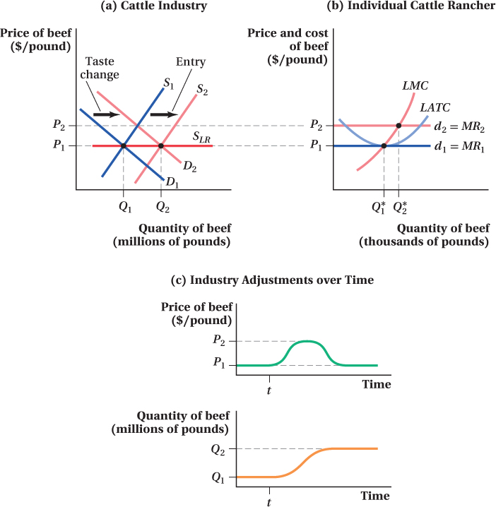
Figure 8.17: Figure 8.17 Long-Run Adjustments to an Increase in Demand in a Perfectly Competitive Industry
Figure 8.17: (a) As in Figure 8.16, an increase in the demand for beef will temporarily increase the market price from P1 to P2 and induce new ranchers to enter the market to capture the positive profits.
(b) An increase in demand leads to short-run economic profit for a perfectly competitive firm, here, a cattle ranch.
(c) An increase in demand leads to a short-run increase in price. Over time, new ranchers will enter the market, increasing equilibrium quantity to Q2 and returning the market price to its long-run equilibrium P1.
During this short-run response, ranchers earn positive economic profits and producer surplus. The market price, which was originally at the minimum long-run average total cost and therefore only just high enough for firms to earn zero economic profit, is now above this level.
Because price is above average cost, profit is positive and so new firms will enter the market. As new ranchers enter and existing ones expand, industry output increases at every price and the industry’s short-run supply curve shifts out, from S1 to S2. With the demand curve now stable and fixed at its new level D2, the supply shift raises industry output and lowers the market price, and consumers move along their demand curve. Entry continues until the price falls back to the minimum average cost level P1. Total ranching output Q2 is higher in this new long-run equilibrium because the demand for the industry’s product is higher than before, but the price is the same as that in the old long-run equilibrium. The horizontal line connecting the two long-run equilibria is the industry’s long-run supply curve because it reflects the industry’s supply response once free entry and exit are accounted for.
If we were to plot the industry’s output and market prices over time during this adjustment between two long-run equilibria, we would see something like panel c of Figure 8.17. The cattle ranching industry is initially in equilibrium at quantity Q1 and price P1 (where P1 equals the minimum long-run average total cost of industry firms). When demand shifts at time t, both quantity and price start to rise as the industry moves along its short-run supply curve. As entry begins, the rancher’s short-run supply curve shifts out, quantity continues to rise, and price falls. Eventually, price falls back to its original level P1, while quantity rises to Q2, the new equilibrium quantity.
The response to a decrease in demand for beef would basically look the same, but with the direction of all the effects reversed: Demand falls, price and quantity fall along the initial supply curve, ranches make negative profits, some leave the industry, supply decreases, Q falls, and prices rebound. When demand falls, exit from the industry is the force that brings price back (up) to the minimum long-run average total cost level.
A Cost Decrease Now let’s think about what happens if the cattle ranching’s costs fall. This might occur because of a technological innovation that allows cattle to grow faster or a permanent decrease in the cost of the industry’s inputs. In either case, the cost reduction shifts down both the marginal and average total cost curves of industry firms.
Because of the decrease in marginal cost, every firm will want to supply more output at any given price, and each firm’s short-run supply curve shifts out. The industry short-run supply curve also shifts out as a result.
These changes can be seen in Figure 8.18. Panel b shows what happens at the firm level. The ranch initially has marginal and average total cost curves LMC1 and LATC1. In the initial long-run equilibrium, the market price P1 equals the firm’s minimum average total cost. Given these market conditions, the ranch produces an output of Q*1. When costs fall, the ranch’s marginal and average total cost curves shift to LMC2 and LATC2. The original market price P1 is now above the firm’s average total cost.
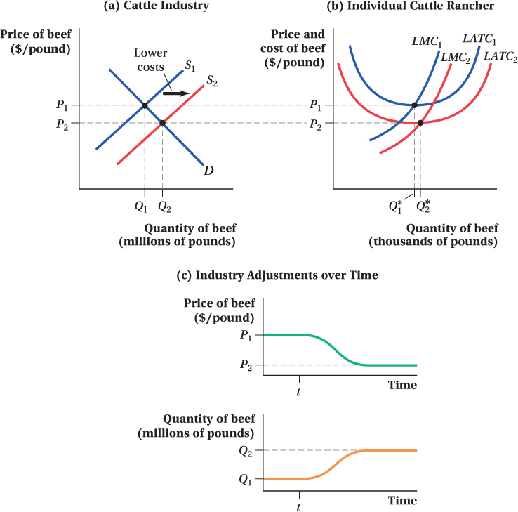
Figure 8.18: Figure 8.18 Long-Run Adjustments to a Reduction in Costs in a Perfectly Competitive Industry
Figure 8.18: (a) A decrease in industrywide marginal costs leads to an increase in the supply of beef from S1 to S2. Industry quantity increases from Q1 to Q2, and the market price decreases from P1 to P2 in the long run.
(b) The decrease in industrywide marginal costs shifts the individual cattle rancher’s long-run marginal cost from LMC1 to LMC2 and long-run average total cost from LATC1 to LATC2. In the long run, the rancher increases output from Q*1 to Q*2.
(c) An increase in the supply of beef leads to a long-run decrease in price from P1 to P2, and quantity of beef supplied increases from Q1 to Q2.
At the industry level (panel a), supply shifts out both because the lower costs mean existing ranches have a higher optimal quantity, Q*2, and because the high price P1 attracts new ranches to enter the industry. This outward shift in supply raises the industry’s quantity of cattle supplied and lowers the market price. The shift continues until supply reaches S2, at which point the market price of cattle has fallen to the new minimum average total cost level P2.
If we plot the quantity and price changes over time in this case, as in panel c of Figure 8.18, we see that quantity rises and prices fall throughout the transition from the high-cost to the low-cost long-run equilibrium. Here, unlike the response to the demand shift, there is a permanent drop in the long-run price. This is because long-run costs have declined.
Application: The Increased Demand for Corn
The Energy Policy Act of 2005 and the Energy Independence and Security Act of 2007 mandated enormous increases in ethanol consumption in the United States. Because most ethanol in the United States is made from corn, these two laws considerably raised the demand for corn in the decade that has followed. Small corn farmers operate in an essentially perfectly competitive market, so this shift in demand provides a good opportunity to explore the predictions of our analysis.
Our analysis predicts that the demand shift from the ethanol mandate would increase both corn output and prices in the short run. The data reflect this prediction. As the number of ethanol plants in the United States grew from 81 to 204 between 2005 and 2011 (the peak of the short-run response), corn production grew to 313 million metric tons, up 11% from 2005. While quantities increased, prices rose even more steeply. Corn prices, which had hovered around $2.25 per bushel for the decade prior to 2005, were over $6 per bushel in 2011.6

Prices as high as an elephant’s eye induce entry into corn production.
DHuss/E+/Getty Images
Our analysis also predicts that in the long run, prices that high should induce entry into corn production and eventually bring corn prices back down even as output continues to rise. Farms that once grew other crops will switch to corn production to take advantage of the new profit opportunities from growing corn. This shift in industry supply, if demand remains fixed (at its higher post-ethanol level), will increase quantity further and decrease price. This does seem to be happening. Between 2011 and 2014, corn production continued to rise another 15%. Prices, on the other hand, fell back to around $3.75 per bushel.
It isn’t guaranteed that corn prices must fall all the way back to their historical level of about $2.50 per bushel. Perhaps growing corn has increasing costs in the long run, as would be the case if the growth in corn acreage drives up the demand and prices of the special equipment farmers use to plant, tend, and harvest corn or drives corn onto more and more marginal land. Still, history offers a guide to the power of entry (plus some productivity improvement) to hold down prices. For example, there was a very substantial increase in grain prices in the 1970s. Corn prices rose to more than $3 per bushel in 1974 (this is about $14 per bushel in 2015 dollars). Within three years, they had fallen back to $2 per bushel ($7.75 in 2015 dollars)—still high compared to 2015’s price of $2.75 per bushel, but 45% lower than 1974—and over a longer period of time remained around the $2.50 per bushel mark (in 2015 dollars) all the way through 2005. Similar things happen in the oil market when prices rise—oil drillers scour the world for new reserves trying to enter the market.
figure it out 8.4
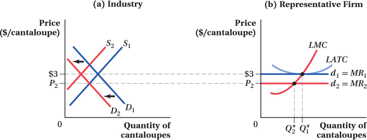
Suppose that the market for cantaloupes is currently in long-run competitive equilibrium at a price of $3 per melon. A listeria outbreak in cantaloupe crops leads to a sharp decline in the demand for cantaloupes.
In the short run, what will happen to the price of a cantaloupe? Explain and use a graph to illustrate your answer.
In the short run, how will firms respond to the change in price described in part (a)? What will happen to each producer’s profit in the short run? Explain, using a diagram to illustrate your answer.
Given the situation described in (b), what can we expect to happen to the number of producers in the cantaloupe industry in the long run? Why?
What will the long-run price of a cantaloupe be?
As we can see in panel a of the diagram below, a decline in the demand for cantaloupes will lead to a fall in the equilibrium market price of cantaloupes (from $3 to P2).
As shown in panel b, when price declines to P2, each firm moves along its long-run marginal cost curve to determine its output, which falls from Q*1 to Q*2. Remember that, before the decrease in demand, the industry was in long-run competitive equilibrium so that, at a price of $3 per cantaloupe, each firm was earning zero economic profit. Therefore, when price falls to P2, it must be below the firm’s average total cost. The drop in demand has led to an economic loss (or negative economic profit) for the firm.
If firms are incurring losses, we can expect some to exit the industry. Thus, the number of producers in the industry will fall, the quantity of cantaloupes will fall, and the price will rise.
The price of cantaloupes will continue to rise until it is once again at the minimum average total cost of $3. At this point, the industry is in long-run competitive equilibrium and firms have no incentive to enter or exit the industry.
Long-Run Supply in Constant-, Increasing-, and Decreasing-Cost Industries
An industry whose firms’ total costs do not change with total industry output.
We saw above that the long-run supply curve of a perfectly competitive industry is horizontal, at a price equal to the minimum average total cost of its producers. However, that analysis made an implicit assumption that firms’ total cost curves didn’t change when total industry output did. That is, we assumed that the industry is a constant-cost industry.
An industry whose firms’ total costs increase with increases in industry output.
This might not always be the case. Firms in increasing-cost industries see their cost curves shift up when industry output increases. This might occur because the price of an input rises in response to the industry’s higher demand for that input. Suppose an industry requires special capital equipment that is in limited supply. When there is an increase in the industry’s output, firms compete for this scarce capital, pushing up its price. This means that, the higher industry output, the greater firms’ average total costs, even in the long run. For this reason, the long-run supply curves of increasing-cost industries are upward-sloping. They’re not as steeply sloped as the short-run supply curve for the industry because they account for entry and exit, but they’re not horizontal either.
Shifts from one long-run equilibrium to another in response to a demand shift are similar to the case above for a constant-cost industry. The only difference is that entry only brings price back down to the new, higher long-run average total cost level.
An industry whose firms’ total costs decrease with increases in industry output.
In decreasing-cost industries, firms’ cost levels decline with increases in industry output. This might be because there are some increasing returns to scale at the industry level, or in the production of one or more of the industry’s inputs. The long-run supply curves for these industries are downward-sloping. Again, the short-run transition between long-run equilibria when demand for the industry’s product increases looks like the constant-industry case, but now entry continues past the point where the market price is driven down to the old long-run average cost level. Instead, entry continues until the price falls all the way to the new, lower minimum average total cost.