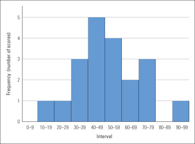
Figure A.1 A frequency distribution depicted by a bar graph This graph depicts the frequency distribution shown in Table A.2 . Each bar represents a different interval of possible scores, and the height of each bar represents the number of scores that occurred in that interval.