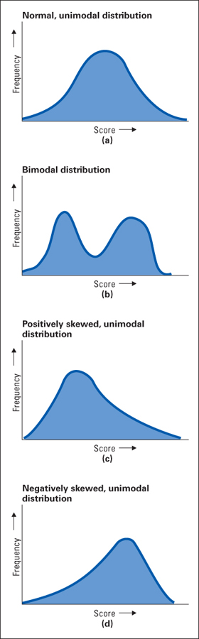
Figure A.2 Four differently shaped frequency distributions You can imagine that each of these curves was formed from a set of bars similar to those in Figure A.1 , but the bars would be narrower and more numerous (the intervals would be smaller) and the data sets would be much larger.