Chapter 1. Data and Data Presentation
Introduction
Data is the bedrock of science: it is the information upon which our theories are constructed and tested. Technically, “data” is the plural of “datum” and so you will usually see the word used as a plural—“the data are interesting,” but sometimes it used as a singular—“the data is interesting.” A “dataset” is the total set of information, which may derive from multiple sources, used in an analysis.
Kinds of Data
Data come in several fundamentally different forms:
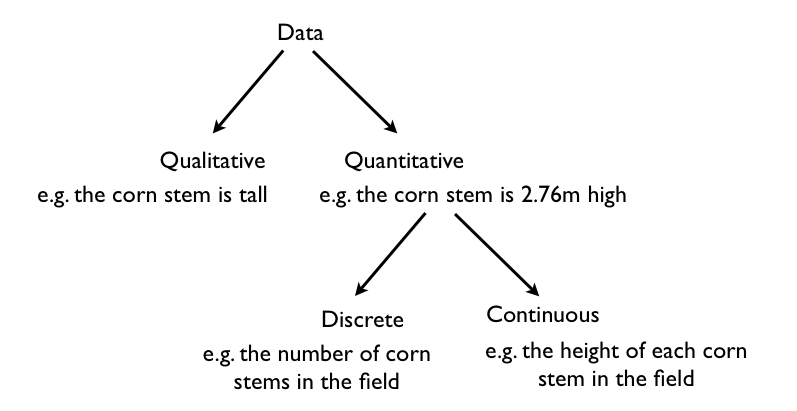
Qualitative data are descriptive; quantitative data are expressed numerically. Discrete data are counted and can only take certain values; continuous data are measured and can take any value. In general in science, we are dealing with quantitative data because they lead to more and more powerful methods of analysis. In particular, quantitative data lend themselves to statistical analysis. With the quantitative data gathered on the height of our corn stems, for example, we can calculate the average height of all the stems in the field. Data that may appear superficially qualitative is accordingly often transformed into quantitative data. To take a familiar example, in surveys you may be given a statement and asked whether you “Strongly Agree, Agree, Disagree, or Strongly Disagree.” These are qualitative assessments, but they are converted into quantitative data by giving each category a numerical score: Strongly Agree = 4, Agree = 3, Disagree = 2, Strongly Disagree = 1. With these numerical scores, we can summarize the results of the survey statistically. For example, we can compare our survey’s average with the averages from similar surveys carried out over different years or in different countries to see if responses vary by time and place.
Collecting Data
We can collect data as part of an experiment. For example, we vary the nutrients added to cells in culture to see which are critical for cell proliferation, and count the number of cells after a specified period in each of the different experimental treatments. Or data collection may be exploratory. For example, if we are interested in what mammal species are present in a remote patch of forest, we can simply record what we see as we walk through the forest. The tools needed for data collection vary correspondingly, ranging from expensive, sophisticated scientific hardware to a notebook and a pencil.
Nowadays computers often collect data automatically, meaning that it is possible to accumulate vast quantities of data. With our ability to sequence DNA cheaply and efficiently, genomic data—long strings of A’s, G’s, C’s, and T’s—is an example of the current explosion of mega-datasets. Satellite imagery, as well, supplies a vast reservoir of data about our planet.
Almost always, data represent a sample. We assume that the cells in our experiment are representative of the appropriate class of cells in general, and we assume that the animals we saw in the forest patch are representative of all the animals present in the forest. With this in mind, we have to be careful in designing our method of collecting data. Imagine, for example, that in determining what mammal species live in our patch of forest, we only visited the forest during daylight hours. Any claim to have assessed the forest for all of its inhabitants then is inaccurate because we have overlooked nocturnal species.
Data sometimes need to be weeded. A freak result in one experiment, for example, might have been caused by contamination and should be removed from the analysis because the result is produced by factors unrelated to what we are investigating. Imagine, for example, that we encounter a domestic cat belonging to a local resident in our forest mammal inventory. Given that we are interested in the native mammals, we should exclude this intruder from our data. Data weeding, however, is a tricky area. It is important only to exclude data that are clearly problematic rather than simply eliminating the data that seem to contradict our hypothesis!
Processing Data
Initially, we have raw data—our series of observations or measurements. Before we move to the next level of data analysis and presentation, we often need to process the raw data in some way. Sometimes, for example, this may entail transforming a long string of numbers into a data table. To do this, we may need to categorize the data. For example, in our forest example, imagine that over a 24-hour period in our forest patch, we count 108 sightings of mammals. The first step is to categorize the sightings according to species and put the data in table form. In this case, we generate a frequency table in which we specify the number of sightings of each of six mammal species, A–F:
| Species | A | B | C | D | E | F |
| Number of sightings | 43 | 47 | 3 | 5 | 7 | 3 |
This table illustrates the pitfalls of data collection and how we have to be very careful when we design our data collection protocol. How valid are these data? We have seen B’s many times, but maybe each sighting is of the same individual. It is possible that all 47 B sightings were the same individual, whereas perhaps the three F sightings were three different individuals. This suggests that the design of our sampling scheme was flawed. We should re-do the census, only this time using traps that can mark each individual. Imagine that the revised method results in the following numbers:
| Species | A | B | C | D | E | F |
| Number trapped | 17 | 29 | 5 | 2 | 5 | 3 |
Graphing Data
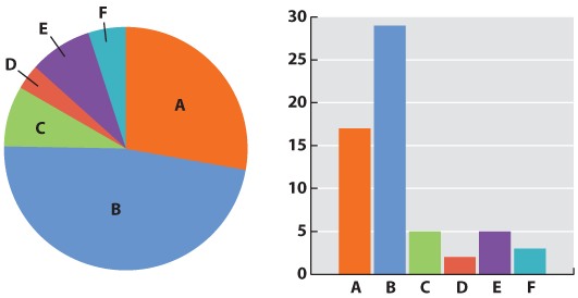
Now we can be confident that our numbers are reliable. The next challenge is to present the data. Typically we do this with a graph. Different kinds of data lend themselves to different kinds of graphs. Our mammal species data is discrete—we have clear categories: A, B, C, D, E, and F. For discrete data, either a pie chart or a bar graph would be appropriate. A pie chart divides a circle into “cake slices,” each representing the proportion of the total contributed by a particular category. In our trapping study, we have a total of 61 animals, so the slice representing species A will make an angle at the center of the pie of 17/61 x 360 = 100°. A bar graph represents the frequency of each species as a column whose height is proportional to frequency.
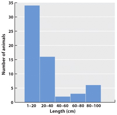
What about continuous data? Imagine that the data we collected is the body lengths of the mammals we trapped. In this case, we might choose a histogram, which looks similar to a bar chart; only here we have to impose our own categories on a continuum of data. Because they were discrete categories—different species—the columns in the bar graph may have gaps between them. In the histogram, by contrast, there are no gaps between the columns because the end of one range (1–20cm) is continuous with the beginning of the next (20–40cm).
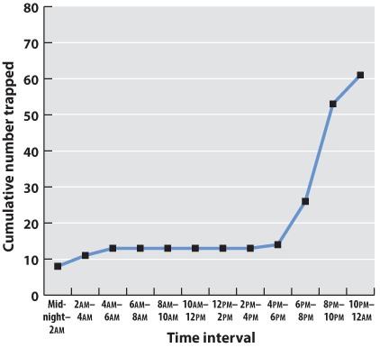
Often we are plotting two variables against each other. If, for example, we record the time of day that each mammal is trapped, we can plot the total number of mammals trapped over the course of the 24-hour period.
| Midnight–2am | 2am–4am | 4am–6am | 6am–8am | 8am–10am | 10am–12am | 12am–2pm | 2pm–4pm | 4pm–6pm | 6pm–8pm | 8pm–10pm | 10pm–midnight | |
| Number trapped | 8 | 3 | 2 | 0 | 0 | 0 | 0 | 0 | 1 | 22 | 17 | 8 |
| Cumulative number | 8 | 11 | 13 | 13 | 13 | 13 | 13 | 13 | 14 | 36 | 53 | 61 |
Often one variable is independent—time, for example, will elapse regardless of the mammal count. We plot this on the x-axis, the horizontal axis of the graph. The dependent variable—the values that vary as a function of the independent variable (in this case, time of day)—is plotted on the y-axis, the vertical axis of the graph. If there is reason to believe that consecutive measurements are related to each other, points can be connected to each other by a line. Plotting our data on a graph using the values of the independent and dependent variables as coordinates gives us a line graph. This is a good way to identify trends and patterns in data. Here we can see that the mammals in our forest plot tend to be inactive (and therefore unlikely to be trapped) during daylight hours.
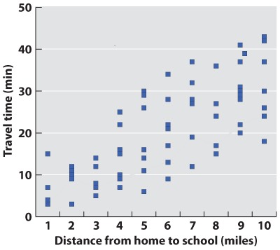
In science, data are typically presented as a scatterplot, in which points are specified by their (x,y) coordinates. Points are not joined to each other by lines unless there are specified connections among them. Here, plotted in a way similar to the line graph (with the independent variable on the x-axis) is a scatterplot showing the time taken to drive from home to campus for a large number of students. The independent variable is the distance traveled; the dependent variable is travel time because the distances are fixed but travel times vary. Overall, there is a positive correlation between travel time and distance (the further you live from campus, the longer, on average, it will take you to get there), but there is plenty of variation as well. Look at the eight points representing the eight students who live five miles from campus. The variation we see in travel time (from 6 minutes to 30 minutes) is a reflection of differences in driving speed, traffic conditions, and route.
What if there are more than two variables? Three-dimensional plots can be informative (but can also cause the reader headaches). A popular modern solution to this problem is a so-called temperature plot, in which the third dimension is represented in two dimensions through color: red (hot) for a strong effect in the third dimension and blue (cool) for a weak effect.
Graphs are the mainstay of scientific presentation, but you will see many other ways of presenting data in your textbook. For example, studies showing how different genes interact with each other in the course of development are often illustrated using network diagrams that give the reader a direct sense of the “connectedness” of a particular gene (or node). Evolutionary trees reveal the branching pattern of evolution with species that are closely related having a more recent common ancestor than those that are more distantly related.
Methods of presenting data in science are not limited, even in textbooks, by standard approaches. The popular press has developed many graphics-intense ways of presenting data. Think of an electoral map after an election. You can view information on a number of levels: whether the state is red or blue, the name of the election winner, the size of his or her majority, and so on. Scientists are learning that they too can package information in ways that are simultaneously informative and attractive.
Question
Data and Data Presentation Activity