Chapter 1. Working With Data 22.7

Working with Data: HOW DO WE KNOW? Fig. 22.7

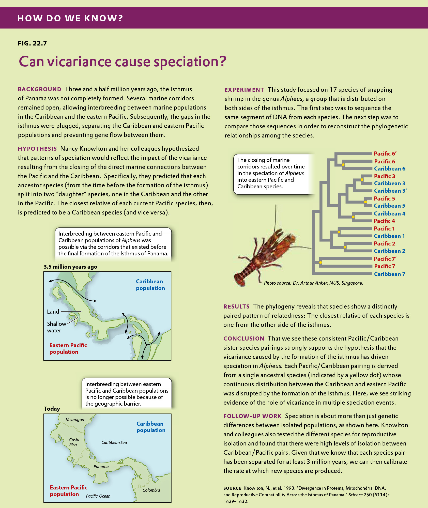
Fig. 22.7 describes a study of shrimp species after a vicariance event, the formation of the Isthmus of Panama. Answer the questions after the figure to practice interpreting data and understanding experimental design. Some of these questions refer to concepts that are explained in the following two brief data analysis primers from a set of four available on LaunchPad:

  • Experimental Design
  • Data and Data Presentation

You can find these primers by clicking on the button labeled “Resources” in the menu at the upper right on your main LaunchPad page. Within the following questions, click on “Primer Section” to read the relevant section from these primers. Click on “Key Terms” to see pop-up definitions of boldfaced terms.

Question

Although we think of the formation of the isthmus of Panama as a geologically instantaneous event – at one moment there was a water connection between the two sides, and at the next there was not – it was likely not instantaneous from the perspective of marine species living close to the shore. As the land bridge slowly formed, so the marine channels became shallower and shallower. The growing isthmus therefore isolated populations of a species that specialized in deep water earlier than populations of a species that specialized in shallow water. Here are some data on the depth tolerances for six species of another genus of shrimp, Beteus, on either side of the isthmus.

Species Current distribution Depth tolerance (m below surface)
A Caribbean 0.5-3
B Pacific 0.5-3
C Caribbean 8-11
D Pacific 8-11
E Caribbean 5-7
F Pacific 5-7
Table
nXgm6sT6RW19Guu0d9sHq3QkC9A8o1WWCrtCW+IPa5SrsuB0bf7OwQdttH92faTmoCy3PAilSesVMWmF3tYu7SNxxlJiyyNZTWRVBpFYgc6QkG1GPz9olQA4M0qZQxHv1sk0M/ZzfGSfC4JjN4cM6QucrU8IqB7AAlqsrekDyW4xxTSh9q3uS7V807uIwNj3ZX8svkGbSq+NfqChZ0pO4W+7646C3LylRD/BGo9vATKvwVWdTZESi5/V88IqxyjuBL5sn6c1CqFPqYHWMSYbBOhgqXSWiHXpkdE0CBWV8Y3Upt8BkZtk4xnvkWAxMJB70i1MJoeKPMf6tWUuVMVJk5SlEH1JN9S+Z04+okJXfx8xu4tHiqRDNhfXtZ7cwOtGBdAWZbex0vPe5mbO+LM8WLJd+Dq1jkkP/GwTojzzRUId5fmSP34g0BgFrtxd8OQj4aI/XxwMYBbz2FtL20jyJd/UpjhDAI+4UKdyhQry0lvufOKXY6YlvBjTW/htqxMd3GhwRqFVqZ+AcuYcTsPiJgwIxAZ5k9DoFMl+enRBCHtguRRelC9nvqfrgUZO8aVaikuyCmSKKMvkhfpZ70qflSPZn/1Tp0bWq4gWlGlbPYLSZROGNx/h1kZsbOv6INi02h50sxKTcT4LDpWrkK9SN54da+tcaHr7LdlRXnfBwSVmbaAKR7fYct6WGgNRqX6DClLt2T2WVAftcAdJdD8YjdYbTFBmALtJpsErLAs8sR8epcPSlJQjNFJ9ldd9itsligx6dja/B+sTzGtKC4Tipxd/et43tzAWlDFGe7RU5fcUFB2Lt9R+X11GgMtOeDsnoxyiibP6P2x9ZILCXBmNcEi9Y4J4bX3r2vZ6rkSto0u9c0XdiG7AgGJc4Cu1bfkhLOnLa3mbBi0NyEgnEdUB7OxNJ9popgVWk5sT3AmoNbO8sWFnjH+Fw0dBvIDn0iAnywouUyS58aPvdNrO69z1xPt5hiW+loxOxVRkYA==
Correct.
Incorrect.
Incorrect. Please try again.
1

Data and Data Presentation

Processing Data

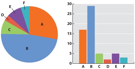
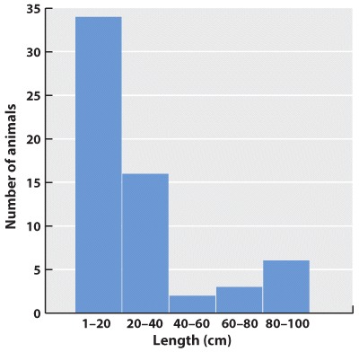
Initially, we have raw data—our series of observations or measurements. Before we move to the next level of data analysis and presentation, we often need to process the raw data in some way. Sometimes, for example, this may entail transforming a long string of numbers into a data table. To do this, we may need to categorize the data. For example, in our forest example, imagine that over a 24-hour period in our forest patch, we count 108 sightings of mammals. The first step is to categorize the sightings according to species and put the data in table form. In this case, we generate a frequency table in which we specify the number of sightings of each of six mammal species, A–F:

Species A B C D E F
Number of sightings 43 47 3 5 7 3
Table

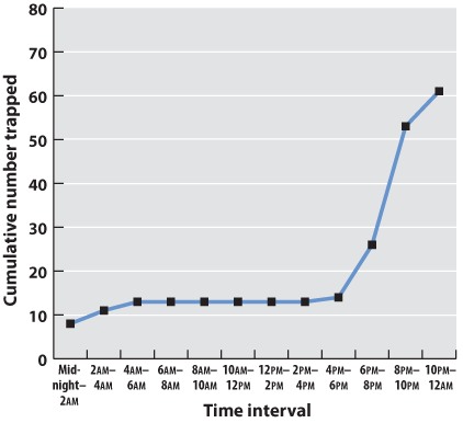
This table illustrates the pitfalls of data collection and how we have to be very careful when we design our data collection protocol. How valid are these data? We have seen B’s many times, but maybe each sighting is of the same individual. It is possible that all 47 B sightings were the same individual, whereas perhaps the three F sightings were three different individuals. This suggests that the design of our sampling scheme was flawed. We should re-do the census, only this time using traps that can mark each individual. Imagine that the revised method results in the following numbers:

Species A B C D E F
Number trapped 17 29 5 2 5 3
Table

Question

Which phylogeny is the most likely representation of the relationships among the six Beteus species?

06DaKfcdKhIwrHCXfRcBTsMwho3qTgO4XdyeWRLLkt5H4ZxTBNs7d5HjUYG0WEbHdlfV2SxotuU/Dg4U3j5HDZi3zu66x152eb0JTOukoqsVpOqG17ArG5qgbP/pUuL2Wr5L4g==
Correct.
Incorrect.
Incorrect. Please try again.
1

Question

In a study of species at a different location, we identify five endemic species of mammals living on an island a short distance from the mainland. We also identify each species’ closest relative on the mainland. Two alternative hypotheses exist to explain this group of species:

i. The ancestors of the current island species dispersed from the mainland to the island and subsequently diverged on the island (dispersal).

ii. The island was originally part of the mainland, but a rise in sea level caused it to become cut off, with the result that the mammals on the island diverged from the ones on the mainland (vicariance).

sYEtrJ4ySmli+koEooTLegm9k3FYievC90XcKGE7ZafFwrdwBz93LVK6j6/4FgtF7WqtHHWjW0qW+wv3N0Qe8m5DuBpUx9Hhad6j3G622p0v0RIN37v/ELkpQVdVPfu9lBC41OqwQaUtV9JBXJUr9/cOzL2IBCOoS3LDGV4Ht34hXmGjD80VhDUVam8Kzwu1rcNjACuLF+p12VtMnyT70t2ptITSYt0klrB+xhTthrUxlsohpCOknIcSYkeJMu+Ql6sbU7ldEdeKWD5o52uxXokW249CojrQK08oTSU33bNc7jFsBVsYJfeINMpOFeTYiSw2z2VcD0CIkwfTVtZxSyJm04ZyatVyvojXNtSkM9TqCHZiHFiJTs+5Xor3ARuK2TJvqdQYklhr58xFUXK+Sb5YE3S80fvVUefyNrz5hXHkBCVNfvp0LKY8SkqTzZqhoyBd84wJ3DfDpWWZbjfF+m1z3bRSS+l8RUj9ZDXVolDgyHjsnta6fzl3JY6ccuaW8j/wh6xVwtESYl4VS6u53kjqQvn4cbAFU20Ntcy+YmJf47kQFds/5OnDdVcavZIo+JS1wXVToUMBEAE9ZoktFbR9rUk1IFs3M4HV/8lOO1tI6JXvrQyh1KXEntYghQX5MgFwW1TJ1K+35yblKMURHWi+M+6Y6U9XqFZteKRXUcaobGPmWf4/ILhLHZS7fVK57p6wl5Ryweok0tJSMDJmM0PHlCjAov6nRhCRfDnbT0SpK4ct3w3h1zqtiU0mNoLYl8DnjWQzFkDiTUflqzCAoZSpL8VGn6cn1vqERNQ8+emEtMTvyWGH7X0He7Woee4srQ7v31fVCCiwMhs1mB86J7iCFC5AtyML9xF/br2nn9JqitUdblEof/bLwiY1lFxWzOGVZ/NQE+EuEFPGkM+df2v9TtOoRsVOReli+6FVNuKJcBmL1Xj0by3NhqvLPwXw5cgP/0TvzklQ+XYWQlOxoHRyp4H75JxX7NGQOWSa/sFayL9UeQNxvTY/8RNZequae8uvCTy0lKDUrzl8ZRL9In5GIe9jBnDsLCf6GConl9TxsR/XFxPdTFCgJYsmCA88n1bNTehqXPr3V1YLRX9LVKL8bRRfucJfpbv33A==
Correct.
Incorrect.
Incorrect. Please try again.
1

hypothesis A tentative explanation for one or more observations that makes predictions that can be tested by experiments or additional observations.
Table

Experimental Design

Types of Hypotheses

A hypothesis, as we saw in Chapter 1, is a tentative answer to the question, an expectation of what the results might be. This might at first seem counterintuitive. Science, after all, is supposed to be unbiased, so why should you expect any particular result at all? The answer is that it helps to organize the experimental setup and interpretation of the data.

Let’s consider a simple example. We design a new medicine and hypothesize that it can be used to treat headaches. This hypothesis is not just a hunch—it is based on previous observations or experiments. For example, we might observe that the chemical structure of the medicine is similar to other drugs that we already know are used to treat headaches. If we went into the experiment with no expectation at all, it would be unclear what to measure.

A hypothesis is considered tentative because we don’t know what the answer is. The answer has to wait until we conduct the experiment and look at the data. When an experiment predicts a specific effect, as in the case of the new medicine, it is typical to also state a null hypothesis, which predicts no effect. Hypotheses are never proven, but it is possible based on statistical analysis to reject a hypothesis. When a null hypothesis is rejected, the hypothesis gains support.

Sometimes, we formulate several alternative hypotheses to answer a single question. This may be the case when researchers consider different explanations of their data. Let’s say for example that we discover a protein that represses the expression of a gene. Our question might be: How does the protein repress the expression of the gene? In this case, we might come up with several models—the protein might block transcription, it might block translation, or it might interfere with the function of the protein product of the gene. Each of these models is an alternative hypothesis, one or more of which might be correct.

Question

In a study of multiple geological events in which an isthmus has formed separating marine populations on either side, we take the following data:

Event
1 2 3 4
Approximate date of isthmus formation (millions of years ago) 3.5 19 6.3 11
% difference in 1000 bp of DNA between closely related species from either side of the isthmus 5 21 7 10
Table
1MzB/xg1LNJRKtkHUjNNH7cV7qETbErutfGwCN+fSnDJ33Lvj/GFRMbCSZPN7Qyg8VGjr4EbOhv5oZMrFYWTac6dX7Lags0OXzH+EbY6KPjwN2jE4j6ozuWtRJa/KX2HL9KNtD9a1WJYPwI/OwjcCHTe9SoObtSxCmCRuRqwuYp1v3D4VPe50NS3IdDQFhK5/tm+gi7Cm6CYzxgroJxa4whV8XMF7QTNnuyLbf3apEXQPr89mvWaNO9krvqCoyCH8xpQSJaIx/XmdoVmoSmm9XE+Bmr8h/ybcIKqqGZo82TtxWoPZ6w7GB2+qHlaVOTNh8wClzYfNpSIBA1BeCYos4mzO10fQSawBnRGsDeX5fptOnvpTmmxjhVwQz8BbEC8aOzTX5rDL9DNiZbgGqpTHGkEgVeB2b5ZCrvhf5k7c8oAdqURgjdfHHX8/WiL+UW1sBMjP7ZM8Od7RFTErnGRWphBwjpkujLBHvAbGTB7VOhRldnB4mAsjF8J73OJwm7D3JLy4HTFkZJsRNbSHTRaKvKop11CYoE9lU2SY163lMWzjxvu9SocWc/JAGFqcWmaUPxGE7GUdZFQCgw5Yic3QJVbTMQceIhwaX1AqK5uj0odbRoNprveNLGBBg36+jh5Td6dWSQOfis6J+31nTCqtM1VMWsTx/5kEu8Cjh5FBVzq+zjO6JvxwfN8LjkVp0RzpEfH/Mn9XUeuGnxxxzyrjNUmZVXee2tMESQSyuX/QOt7Ga6ytC31FxCqpi1+71bYzM4tmt6EJ0PPWU+wHGxq1eGXjdAChVmWODMt8eC0kaxu+AJF+Sey7puU77bW1axC8NgC9FQz3HuTSI1pmJP7bERQvqMOedJQGWMWmQ==
Correct.
Incorrect.
Incorrect. Please try again.
1

Question

Eight shallow-water marine species―p, q, r, s, t, u, v, w—are present on either side of an isthmus thought to have been formed about 5 million years ago. Below is the phylogeny for the eight species.

We sequence 10,000 base pairs of DNA for each species and analyze the extent of the difference between the members of each closely related species pair (p and q, r and s, t and u, v and w). The results are in the bar graph below. What can we conclude from this data?

WZFN3pHJZxUWKyLXURexILWwLZm4XcNtjwzZU/QlpLx7P1mWEs+PBYXkKK62Bdtvcv5bxgyEA+GyA0vBhWGJOzNlwK+ieCgYVVqhI6lYoaO+TxA06AwLMFouwjJptdtvoPPhCIHz/q5Onxbcar6OcS0DuWJ56jREeclpnar/8GSr4zNbo7G9naqwuXofiVHv72eTFUcXLgyCwWXFFTFzt2gUw+DG13peT7vHEtIrzXMKj/X0oQbqlI+TDpQyZGo4I3+zL4MJYtYNIlOuTmCmJesfn+LCCXLdNhuFIntGmhXev8WskxL6SlICfEOVKR4XEejFgtJgw++ue+RiIU+w+/RMn1QmE6PbZYgk4mJvQK/rJRZgweetioR045G+xoTKNRaEUcD3OMmAfqi9rWTKY6/1hnPLMXXn4ENOILyphpq8KWfkcE2nKuZEeYZ7oSGtWIXqLRYgt7swobK0
Correct.
Incorrect.
Incorrect. Please try again.
1

bar graph A method of presenting discrete data whereby the height of each category’s bar is proportional to the category’s abundance in the sample.
Table

Data and Data Presentation

Graphing Data

Now we can be confident that our numbers are reliable. The next challenge is to present the data. Typically we do this with a graph. Different kinds of data lend themselves to different kinds of graphs. Our mammal species data is discrete—we have clear categories: A, B, C, D, E, and F. For discrete data, either a pie chart or a bar graph would be appropriate. A pie chart divides a circle into “cake slices,” each representing the proportion of the total contributed by a particular category. In our trapping study, we have a total of 61 animals, so the slice representing species A will make an angle at the center of the pie of 17/61 x 360 = 100°. A bar graph represents the frequency of each species as a column whose height is proportional to frequency.

Fig. 1

What about continuous data? Imagine that the data we collected is the body lengths of the mammals we trapped. In this case, we might choose a histogram, which looks similar to a bar chart; only here we have to impose our own categories on a continuum of data. Because they were discrete categories—different species—the columns in the bar graph may have gaps between them. In the histogram, by contrast, there are no gaps between the columns because the end of one range (1–20cm) is continuous with the beginning of the next (20–40cm).

Fig. 2

Often we are plotting two variables against each other. If, for example, we record the time of day that each mammal is trapped, we can plot the total number of mammals trapped over the course of the 24-hour period.

Midnight-2am 2am-4am 4am-6am 6am-8am 8am-10am 10am-12am 12am-2pm 2pm-4pm 4pm-6pm 6pm-8pm 8pm-10pm 10pm-midnight
Number trapped 8 3 2 0 0 0 0 0 1 22 17 8
Cumulative number 8 11 13 13 13 13 13 13 14 36 53 61
Table

Often one variable is independent—time, for example, will elapse regardless of the mammal count. We plot this on the x-axis, the horizontal axis of the graph. The dependent variable—the values that vary as a function of the independent variable (in this case, time of day)—is plotted on the y-axis, the vertical axis of the graph. If there is reason to believe that consecutive measurements are related to each other, points can be connected to each other by a line. Plotting our data on a graph using the values of the independent and dependent variables as coordinates gives us a line graph. This is a good way to identify trends and patterns in data. Here we can see that the mammals in our forest plot tend to be inactive (and therefore unlikely to be trapped) during daylight hours.

Fig. 3

In science, data are typically presented as a scatterplot, in which points are specified by their (x,y) coordinates. Points are not joined to each other by lines unless there are specified connections among them. Here, plotted in a way similar to the line graph (with the independent variable on the x-axis) is a scatterplot showing the time taken to drive from home to campus for a large number of students. The independent variable is the distance traveled; the dependent variable is travel time because the distances are fixed but travel times vary. Overall, there is a positive correlation between travel time and distance (the further you live from campus, the longer, on average, it will take you to get there), but there is plenty of variation as well. Look at the eight points representing the eight students who live five miles from campus. The variation we see in travel time (from 6 minutes to 30 minutes) is a reflection of differences in driving speed, traffic conditions, and route.

Fig. 4

What if there are more than two variables? Three-dimensional plots can be informative (but can also cause the reader headaches). A popular modern solution to this problem is a so-called temperature plot, in which the third dimension is represented in two dimensions through color: red (hot) for a strong effect in the third dimension and blue (cool) for a weak effect.

Graphs are the mainstay of scientific presentation, but you will see many other ways of presenting data in your textbook. For example, studies showing how different genes interact with each other in the course of development are often illustrated using network diagrams that give the reader a direct sense of the “connectedness” of a particular gene (or node). Evolutionary trees reveal the branching pattern of evolution with species that are closely related having a more recent common ancestor than those that are more distantly related.

Methods of presenting data in science are not limited, even in textbooks, by standard approaches. The popular press has developed many graphics-intense ways of presenting data. Think of an electoral map after an election. You can view information on a number of levels: whether the state is red or blue, the name of the election winner, the size of his or her majority, and so on. Scientists are learning that they too can package information in ways that are simultaneously informative and attractive.

Question

We know from the fossil record that three species of fish―a, b, and c―lived in an ancient lake in what is now New Jersey. Their phylogeny was as follows:

Four million years ago, the lake dried out, creating two new lakes, Lake1 and Lake2. There are now a total of six species in the two lakes: d, e, and f in Lake1; and g, h, and i in Lake2. What is the most likely phylogeny for the six modern fish species?

KmZ+KM2aY8In36cgfq4Sl+mN8hB3UaIkQatDsSy6uvw8B6URMqk0onNBF1VeXJoEegQd64EsJeRKxqF/410aEWv3r6mhcvM2BaRX56zpXmq5M3KtJpAMTEsJwBPA0SkxyvjyBB5JcLc=
Correct.
Incorrect.
Incorrect. Please try again.
1

Question

Two lakes, Lake3 and Lake4, were derived from a single parent lake several million years ago. These two lakes contain just four species of fish in total. Species a and b are in Lake3 and c and d in Lake4. We sequence 1000 base pairs of DNA from a representative individual from each of these four species. Here is a data matrix showing the numbers of differences between each of the species’s DNA sequences.

Species a b c d
a 245 237 130
b 125 233
c 241
d
Table

What is the most likely phylogeny for these four species of fish?

09Pu4B52zt7yAgdtbfLyLcqoMpODOM77wWYkrxmN8qMF9VFZw9zQCoLYLhjYEqtTZA32415Uw/yNnYkUNnwGn6MGXq9m9fsVWPFgnFNf/+4D2pTebTk8ONOoLjq/83zsourSYX1gCHT1BJm4
Correct.
Incorrect.
Incorrect. Please try again.
1

Question

5SVHDINZl0PklKsTDAGC4PWNYGrCiYC6xZAP07ox57GKz2Jq83yO/Y82QTJwKnrWW6vyeuQjH/7ANe7t1kdteXMowBjoF75573h6oMUyu643L8nU0Kv5bvcSqXs2J9DrIQK0pat+qu4XoDi56sQxiSDRJsk+mYozpcjC4V0VpSAmZdRFkcyd60sDPfwhh23/rYYOY+SBbVm+DQAY7N9x2/OwyZJFbsJGc4Rd4+U6gl6h3EuP6xi9OVMPABaazXghmwcedKeCh4ZBSeOYn59v8yz/Tq5569n5LKWmwqlZfMFYqzg0OQyQpbYU9xazF+6p1YYQzDfSXc4/EBekI06hw6RXocgskMAyrKvfdQhHOSZ1KGP6uA1amXrvmPyNMFpZoCl1kVXkB/1nZ9sWw7HIVcui9Kgaq92hyLKXAE0Dpg1OLbhaq9ApZXEr33lY8mh3yy2Puqckt0h2oRB/vwdkm6zLipVxTGxVsW0Mc0ZDT5Uu5DXEQl5bP6MH5ycGGyFrMrZXwe345UMui6vOne02zbO+02Rh1cHsb+SNwb8kLxBdeD7AVU/U6loZ5HwZhD4uY85MEBlUR8xISIW1aeFZWeT9HBhkMhLFTw5IlWYCvIFH1WgAiOyUjb+raWVgZQCQZYa0ErOwg81IazL4f8GqVTCqwE8mUxu86xAMrkDkBqDn4H1yGhNN4/zN5uCY8mlxCPWPX0DQmZRZFLIX/R4URPz692zBEr6RVmbt4tKbhg3puMIZpvVLk9KYFJigJBxDekufQH0Lamv5mnqoPxCQQSNcunjuVcXpVkK5DLC3oHxI8fUgA8aMtTLM2+i5HDq6FJ/ItpEv0LkjsfMMu93f4iNBQT+xPNJl7p8V4QAH0diQC2drkCnNM4kE6JtyIilEHzSan3hxCRe1MQiwtOe0mZB/hOhr2wTJdJOKXOlxSf2EjfNaGeACslco6rG7OepFyvzZOKujnF91NXwUEJh6LBMPx92qmkQAOFKyCjqc91m8ie2NuMMNppJ3PWPItn3bu01dTRP7RT/yYPCQPPVbjWx5rDe/V/l1Xl7YtI4/13+9lxViq3dvjNh0PZ+o1tfJnVqR4K2glZ1uVqfQR8Xnao565DsrjL/MKvjuku554Plje3JbZ3Hqt4neiwSKs1q0StOT2lww+6kdpcdR3ifJ/GKwrbcTItCH84PbLBVf1MQm1lwb+PwTlE1ErXX/fnhk5OlznHd+1eMzIm8pPTpTZpgI9v3lFSeDMJKhOH31mnojBvdxiU/Jf8Hv/lY23CDiW8li123989meEpaMKruPJTm4Vw4r7pROsd527jn5vlwCQQdZRtXHRb7g9hx3AOux0kIp8SOQbHc0M0efnZP2Ig==
Correct.
Incorrect.
Incorrect. Please try again.
1