Chapter 1. Working With Data 3.2

Working with Data: HOW DO WE KNOW? Fig. 3.2

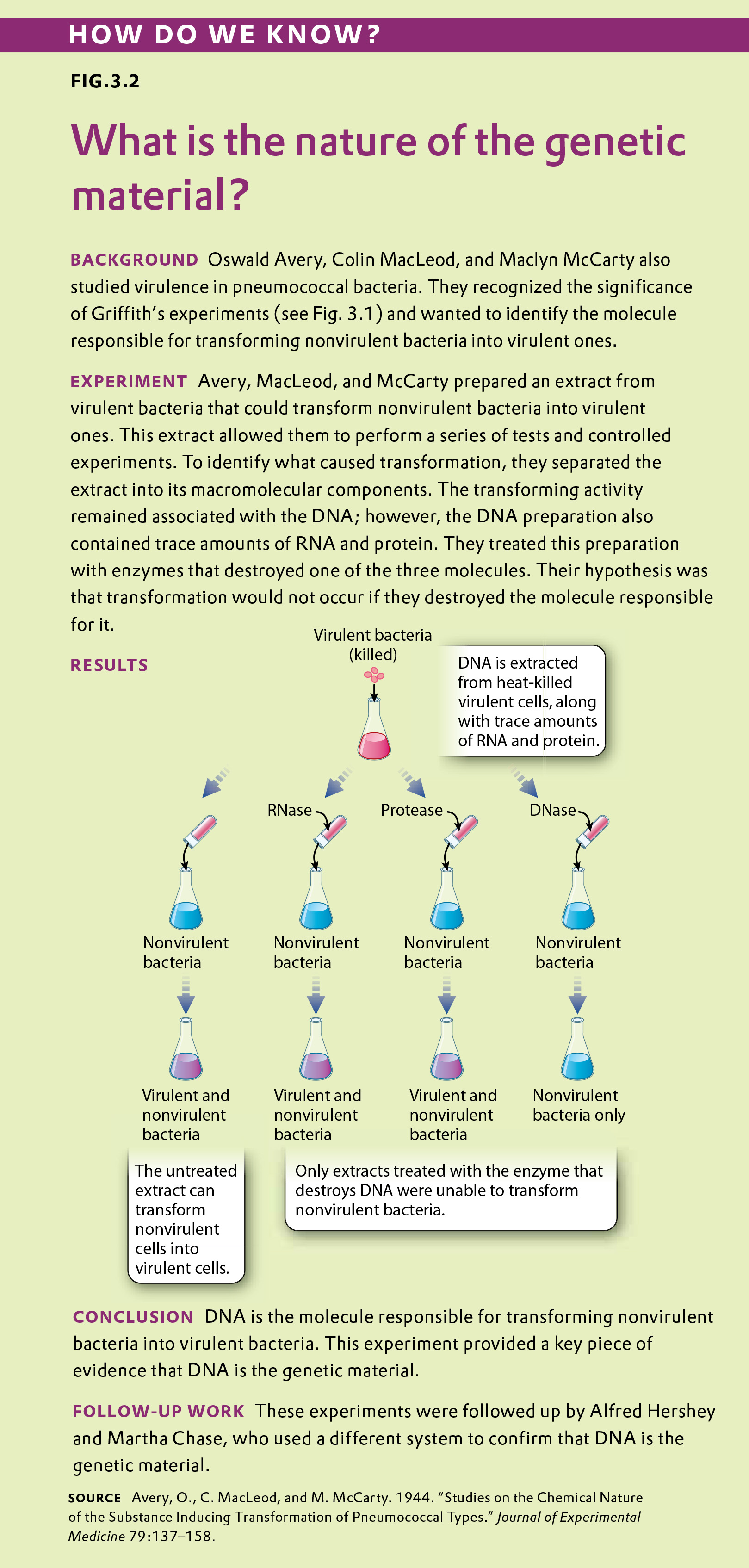
Fig. 3.2 describes Avery, MacLeod, and McCarty’s experiment determining the nature of the genetic material. Answer the questions after the figure to practice interpreting data and understanding experimental design. Some of these questions refer to concepts that are explained in the following two brief data analysis primers from a set of four available on LaunchPad.

  • Experimental Design
  • Data and Data Presentation

You can find these primers by clicking on the button labeled “Resources” in the menu at the upper right on your main LaunchPad page. Within the following questions, click on “Primer Section” to read the relevant section from these primers. Click on “Key Terms” to see pop-up definitions of boldface terms.
Certain diseases, including bovine spongiform encephalopathy ("mad cow disease") and Creutzfeldt-Jakob disease, are caused by an infectious agent whose nature was at first a mystery. Similar infectious agents are also known to cause a few traits in yeast. Under certain conditions, the infected yeast cells turn red whereas normal yeast cells are white.

Question

BvTxrzkSJ1XorhCrNgYWH4ofCpEq7APaGJ/dWwcvsYTH5dsUwopT/2AGwwKMOfR9DaX7ZpPbQlb4R4X0M8L2clFqoYPHd2PIKRakH9SSqJe1X4KlqozPcQoNBQu1ilJ9ie/SsrgPWPWRciLtS476Nd9c0AcoZ01tpI/kR0suBkuQNS/7q3t+MFgL2ymjVp172pyR0d0K2tFguXCa70cKFPTTsbN3c/ZvUATLXZnQX9TwdHiGyTqCR0loyKuyI8ckkbRbhNAfgOf0HnH9tFbfJBQvNdSrF+oV5YPQE1a1saM4DXZDv9dd9nib1i8vB/ar3t9fI+lb+czaWB84hf15FR+Wiol87aZNiI+CiIWDjByxQ7IaA31cKXzffQh4vdBkmj1DHZu9jbwSCEGX3oVqKDbfkWpES0YVl3ifIp0+fiZAO35ehDK3yXMuckeo4mUPGaEcCF+edzCE2q/56n0/6+VLikY9/5wjWse7OSYiLkeWRQAPU+AtGIj6bb8MOETcPr313ieRiamVPBQya+UbKB5UU97htE7B1aEBsNKOL5AiRF2U2cOoa5UYrXKUg/IifsdtJdEO1XXUjFZ/sphfH6ckeljd3P5JHztm53sa27Q+pmvk6zpGC0i2oy0v+vAUJpscN54w1ZCzqfVE76c5NFSE2IuIOzaDe1uyHuoq4u2/hCvHTGaeJki8dzuV6SzRvrqq/r5rDRQqXwuzzmjFIhtfhiRgnwsOlYrWMWd+a+msEtNsGQzoYj+ZtnMiFeczr5sY0uIU+M5QK8o2fSedTU1/loyd8kJC9kQiEDwANYbvD7bu+MXH8ETJetZ+JVPhG05ZauKS9oKcPxSB5o6hFLEQNu91ROr4eXX6yl5h4pG6gPDe
Correct.
Incorrect.
Incorrect. Please try again.
1

control Operations or observations that are set up in such a way that the researcher knows in advance what result should be expected if everything in the study is working properly
Table

Experimental Design

Testing Hypotheses: Controls

Hypotheses can be tested in various ways. One way is through additional observations. There are a large number of endemic species on the Galápagos Islands. We might ask why and hypothesize that it has something to do with the location of the islands relative to the mainland. To test our hypothesis, we might make additional observations. We could count the number of endemic species on many different islands, calculate the size of each of these islands, and measure the distance from the nearest mainland. From these observations, we can understand the conditions that lead to endemic species on islands.

Hypotheses can also be tested through controlled experiments. In a controlled experiment, several different groups are tested simultaneously, keeping as many variables the same among them. In one group, a single variable is changed, allowing the researcher to see if that variable has an effect on the results of the experiment. This is called the test group. In another group, the variable is not changed and no effect is expected. This group is called the negative control. Finally, in a third group, a variable is introduced that has a known effect to be sure that the experiment is working properly. This group is called the positive control.

Controls such as negative and positive control groups are operations or observations that are set up in such a way that the researcher knows in advance what result should be expected if everything in the study is working properly. Controls are performed at the same time and under the same conditions as an experiment to verify the reliability of the components of the experiment, the methods, and analysis.

For example, going back to our example of a new medicine that might be effective against headaches, you could design an experiment in which there are three groups of patients—one group receives the medicine (the test group), one group receives no medicine (the negative control group), and one group receives a medicine that is already known to be effective against headaches (the positive control group). All of the other variables, such as age, gender, and socioeconomic background, would be similar among the three groups.

These three groups help the researchers to make sense of the data. Imagine for a moment that there was just the test group with no control groups, and the headaches went away after treatment. You might conclude that the medicine alleviates headaches. But perhaps the headaches just went away on their own. The negative control group helps you to see what would happen without the medicine so you can determine which effects in the test group are due solely to the medicine.

In some cases, researchers control not just for the medicine (one group receives medicine and one does not), but also for the act of giving a medicine. In this case, one negative control involves giving no medicine, and another involves giving a placebo, which is a sugar pill with no physiological effect. In this way, the researchers control for the potential variable of taking medication. In general, for a controlled experiment, it is important to be sure that there is only one difference between the test and control groups.
Question

2nQf7cz2xCX5lFuSGqFGFT6nQJZZQbZQlZjGamgvCIhbUx1apALrY8vp+GWdwV8OInuRVyeKftA+kvuI2CRcavhnT5vGXShs27vyfN+FtBkQCSzQV/U9N3R291+kqVe1b03d1bPgz9o3LQXbtR52PD5KqvRIscYZsx93aGlOi9bYXZ5f+cPOiD6ylnT1hckVkSFQQxZISP0X/Hg6BH2Tsmvrhbm2MJOkXsXCP3TNidP3x8RsIzXTXeHLBhCgPDduRpOryCGMvo9aAMab5NzQA+unBZ++RVfQgvpGTxBCDhl2TzhVUjQaJI1UiJEMEO/k973Y5S/qNSqX8+iz3MhkuMR7U+KTq+sZmlxY7Gz41HA4SQBhyD37mxzqWZqTTNXrDQQcBZ3mM4AZvJqhlUFYhj4OK0IhobhQJYmR0VaSN++T5Xb9YjL0aaA8nKzhEGiIkWAW/ZQK3bkqKuyao9caDHqw0c0P47RnSBlHglsgiwj5sAN60tGtiRLO8zca4JRbE5hhVOVr9CJjP8GOMCN2QUW+EjZr1ZFbT9h33HrU4WHx7hpk8WTFijAz1ol50hL5/0jJiwNeyTGxVcbECwCwM/q/Bi5hUsfaSHRbSNH7cys=
Correct.
Incorrect.
Incorrect. Please try again.
1

Question

HirQnIS4kcWp8giYp7/AOXn9M60bGUIV9eKyUcshrB6Ci8MPCRuG1fIPatQzYeGwFSjZeokLu0b92jjus+XwHfAXeE9DjJnbpSB0qMIgY0sf9CaV++HGWU5el21lz8oQc+6TwHFcwP7Pc3UhZjGzRz5CGwtHL64jcY5UJwM4B+h+5ckdzD5nhOXiOm3pftHMGD61/RpttoQiX2K1S7bUh6wgEqxWCp9nobkDD8ZWqEsyMWmr3p0ZRi6UO1hQqvQE4qik6ea7qZjgkiTINO7dm79fR/zaC3YKZZLEvQ77oRqNIU/AhtPkSF2BGonk1T/rIV67G8CagI/ptMt5/WEacew1txWo4x5BnvNmGV7CeUd6W0CmjVUc97kkW7HQ2APCLI5nDCMXPNkS6KqNsD2LtQuYO9Y6yUc0dn3pfETg2K5evIiy4kvbjURGp8n+Kq1XCRIgL1ZJCE2M1dQITtR6bX9xj9xPbO296PIbsVfCo4U=
Correct.
Incorrect.
Incorrect. Please try again.
1

Question

Vm2k4wBjkcqH3wH9+cFCyEnfGKCtMitIdVsUDA5m21h37S5zaZdnr/smNkP5SjNv3RmNthrPB9eMVeupBsjfU0GwnY8ODYl9qhSvvtHV63OM+hFi/pbT/8c2tBWMeKUjbwEggiIU1Fwpd3fz4R6g76omEZWoqJmp3oCpDP9zcYpxpbJBf5NbwdTJocB0RtKI+ypXHEN3Y2zytolLiGtFsr/laPqj47HqToUVm3Z+UGb8e4Re3s2ly4OQqGEvGuEpj2/G5KboiwEw9CVGheKwzar4LXU4k3rfFLMo+ZOs3XeN8wc+nCMRqG2LJ1TpXyOTw6TEpfQnOeDL5ijspvUYH9nAsyyoakktynxdfL/8loNmPqFND4861obifAoEU0IikzTnoCOq05cxiFrHdV7RtlN/8bFH5a00msNh2Ykvzv/6MMhiy3OEH4OqORsRKW5lLTqCFa+lNWRhPLaGVIat/cUjINI6rRbmzsniQyLZDVTtOw+gLxJ7CC3bf4mKaSOEZzZ3knkys0r7cLXIOSV/x5hGmmQyMO+dXuz0dgsmb/1AXxVl1Ge3907+tVBP76TGI82rcvr7X+UMkh8wfTJyBaAgrFtE3dWqHH1fvnBqeSxE+ExUfxMxwU3DJsoUb2Khuyr2S0UWq+THsQsWKtlO3lRCULYw+6X7AkkPdiFIUNUVbe6/e/XPgBLNzPk=
Correct.
Incorrect.
Incorrect. Please try again.
1

Question

q1xILL7MiWFAN6sxMlk/1cmZwr1eq9Pf9MharXGfoKhfgyxreiOiogGECyJceX6HAh8Dd+hBlaJb7VBQAY+IPLxLCLriFk4XfvgxabShGBSvyffaRZpx2vB2DQncbFq3L1qaZUqvV7m6UzgXJXw09YP80CnbrFgV9/iqNBY7fJUMc+BC3zVubj0vNNL1NgnJSk34KJlM4iidlBrnaLREO2bI+Ov5UlyvxlpeWGHPCIIYs/LWHRg9xO2VWvsgbHgQieBDZFjnveuNai9OJ0Srq/cY4GntYn/3DtV+6rAfEqSr34j2WDMLEnOzaf0lr+AkUelHZOd29f5FBZygWYlWQYed/ipmR4ThokqsKx82uhLajcCn0QX/PthxWy1Han8cHq1W5OOezIv21fD9Ovb/T0vtllvoPywKdBDxqoJWkTrszwkc/gh79DIX4b2fl8Jgw1WwVYBRVKQ6ucgiPX+oieOhV9azERrPt6JOfwV5ZN7poaWglQXcbl1UKq/oUMt1u/1mJ4mpO1lynDAQR9pB+/W/ic5EBWrgdxSClb2GeVWQgJLFi0Q3PcyQpnd56njvvZKewSKsmMiu2NRYIpKv2jvE8qp4yPhLUKx8T1ioZvtGQ296xb8Wd8+aSlTPIpwkKmt2LCxHEQdWEFEcBIq1kIB2Ec5BxRcx3i6b0Kwq8HqIvmQW1d/xFA==
Correct.
Incorrect.
Incorrect. Please try again.
1

Question

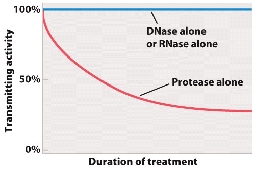
The result of treating the transmitting extract with enzymes is shown in the graph below.

XuR+L8tkfIz2k5RHg6MzBkrtR1gFBn2xaPanXd9x+zKt+6NlaZdmMbmdTrNnkF7kLmyGiXDlWjBWpYDeCJwsMrInHeDhhAaE4uskRkeDGSwi8L9hhpeowjNvhb/COxzfc7tYJ7TVVO9h/j81k1HSSNFFmcJ8seFlDOgw68HvhpB06k9b4fPgIevwKNL/AFI8b9e7j6bMHixzfAdbZ4gUgyk2J5Rc7P2WCy3AF4ShSBNVyZDXSrE59d0JzOmvaFOM1MvIBs9TjUlRWL63dGni4gFn7koLD6yt39wLd8xNz7QnhKRgjmYSASAOTSZ3Jid+lFWdVbw3BQeQEYonkg4pFo10wTZ8ms/PDoC4c359mxAkpK38SM19ucvPeW93V+OEhSRhl0FSY1QcjnCguPPOWHZB81J2dKTuCyCMlIIqoC/HMYOFakwWw/FH4Ociy+V5bI6dfg==
Correct.
Incorrect.
Incorrect. Please try again.
1

Data and Data Presentation

Graphing Data

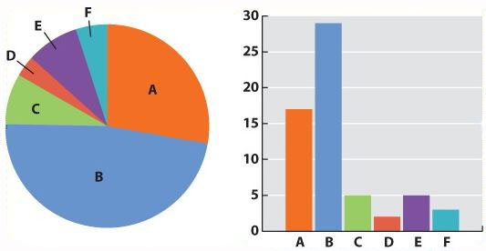
Now we can be confident that our numbers are reliable. The next challenge is to present the data. Typically we do this with a graph. Different kinds of data lend themselves to different kinds of graphs. Our mammal species data is discrete—we have clear categories: A, B, C, D, E, and F. For discrete data, either a pie chart or a bar graph would be appropriate. A pie chart divides a circle into “cake slices,” each representing the proportion of the total contributed by a particular category. In our trapping study, we have a total of 61 animals, so the slice representing species A will make an angle at the center of the pie of 17/61 x 360 = 100°. A bar graph represents the frequency of each species as a column whose height is proportional to frequency.

Fig. 1

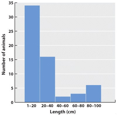
What about continuous data? Imagine that the data we collected is the body lengths of the mammals we trapped. In this case, we might choose a histogram, which looks similar to a bar chart; only here we have to impose our own categories on a continuum of data. Because they were discrete categories—different species—the columns in the bar graph may have gaps between them. In the histogram, by contrast, there are no gaps between the columns because the end of one range (1–20cm) is continuous with the beginning of the next (20–40cm).

Fig. 2

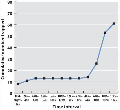
Often we are plotting two variables against each other. If, for example, we record the time of day that each mammal is trapped, we can plot the total number of mammals trapped over the course of the 24-hour period.

Midnight-2am 2am-4am 4am-6am 6am-8am 8am-10am 10am-12am 12am-2pm 2pm-4pm 4pm-6pm 6pm-8pm 8pm-10pm 10pm-midnight
Number trapped 8 3 2 0 0 0 0 0 1 22 17 8
Cumulative number 8 11 13 13 13 13 13 13 14 36 53 61
Table

Often one variable is independent—time, for example, will elapse regardless of the mammal count. We plot this on the x-axis, the horizontal axis of the graph. The dependent variable—the values that vary as a function of the independent variable (in this case, time of day)—is plotted on the y-axis, the vertical axis of the graph. If there is reason to believe that consecutive measurements are related to each other, points can be connected to each other by a line. Plotting our data on a graph using the values of the independent and dependent variables as coordinates gives us a line graph. This is a good way to identify trends and patterns in data. Here we can see that the mammals in our forest plot tend to be inactive (and therefore unlikely to be trapped) during daylight hours.

Fig. 3

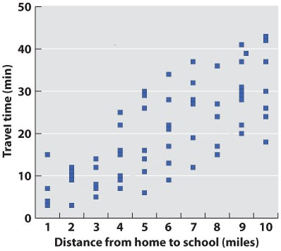
In science, data are typically presented as a scatterplot, in which points are specified by their (x,y) coordinates. Points are not joined to each other by lines unless there are specified connections among them. Here, plotted in a way similar to the line graph (with the independent variable on the x-axis) is a scatterplot showing the time taken to drive from home to campus for a large number of students. The independent variable is the distance traveled; the dependent variable is travel time because the distances are fixed but travel times vary. Overall, there is a positive correlation between travel time and distance (the further you live from campus, the longer, on average, it will take you to get there), but there is plenty of variation as well. Look at the eight points representing the eight students who live five miles from campus. The variation we see in travel time (from 6 minutes to 30 minutes) is a reflection of differences in driving speed, traffic conditions, and route.

Fig. 4

What if there are more than two variables? Three-dimensional plots can be informative (but can also cause the reader headaches). A popular modern solution to this problem is a so-called temperature plot, in which the third dimension is represented in two dimensions through color: red (hot) for a strong effect in the third dimension and blue (cool) for a weak effect.

Graphs are the mainstay of scientific presentation, but you will see many other ways of presenting data in your textbook. For example, studies showing how different genes interact with each other in the course of development are often illustrated using network diagrams that give the reader a direct sense of the “connectedness” of a particular gene (or node). Evolutionary trees reveal the branching pattern of evolution with species that are closely related having a more recent common ancestor than those that are more distantly related.

Methods of presenting data in science are not limited, even in textbooks, by standard approaches. The popular press has developed many graphics-intense ways of presenting data. Think of an electoral map after an election. You can view information on a number of levels: whether the state is red or blue, the name of the election winner, the size of his or her majority, and so on. Scientists are learning that they too can package information in ways that are simultaneously informative and attractive.

Question

Gu89kX17s4OqbRnha8YsaI/KRHK28jhqEyhFl2RHwbE+f2Q2MkfhVF160hMurAAuBs1YSZN3fqmYoaT/qnpo4+wKW6vUZYDBqTW4sC7zoWuMU5RglnAJtBCuwhME/VaQHbV07r9GBFPZbnfaqLb+4KBW1ZpdrqYJtvoYh1dcIeHyG9dYxMsb+9XKj7+uYjXYd+h2Mm+5q0Vwzav1qYE2d3U+jbk5ydqcDlWDi42ScdBddEaZ00oz4bzpntjHYpRXK06Twz1nruv/XBfDKxSk/2rdC/tDbn7sdjjpziduQ+VluXMllxbqRwgKIp2bLybSFwo9o4zgmU/iU6MQ3v5q0Gb75nGLx8Xmz8lRkHyKatfH8gLzAbGZnTw16Oiv1YM/ADdhLyB3oYzHYXU/GGH8w6tJQ8Y1NouT
Correct.
Incorrect.
Incorrect. Please try again.
1

Question

FCgjuSNnEDVroJx0YYwOARf1bXBHTU3bSLK+NKy/wXVKApzw98tZBBMXcF4u9TYhDO67i/Q/PmEx288TJFdz7tdiYNMWStFiyZ4bYp2DZVSbruT6tojMXPfFfdP4ri7stJutgiSz1J12nlCew2kIcEbwhsqyKWm5A2OvuBUvGu/iCetCWNQ9m0/wRAQJrhUwtlsmoMiJxUhPbFuN89nmptFiswfOKry/
Correct.
Incorrect.
Incorrect. Please try again.
1

Question

yZX3+y8Wd3mHHmGRNJXOwG2zSbXKaSabO00DU7Ar/R7cHlMQGC7KVdmTyXjL8JXEI+eg6AJr+Jhsus+ryJ4YcHYoK34HyHn1x05Vx9VXYwI9EkTadaETB4Qj7Vqg6B95jtzvwtt77W82sWxpUQZDBFlIi+h7yrcKSgTHey54qC8sELwYC0XVlQQOeIDj984EbbhRm7RU6AJa8BK2gmKrP60X9Y4RKaQ29CqlypPYbtPtWGaAmCk3UDbEEMrm9ZpAEmTmr5Dn0ztH2yGPUwL80ghToJe/wAABTZMfbs6v5VVsOKibOGwGNHSxnzY2hArmmoLh3RacxOZEgt0WdYimE+cT6MWoByPy4mLIJTgSwmUlWu8x
Correct.
Incorrect.
Incorrect. Please try again.
1

Question

KNlmrbSMuR+Tt13Kw7YuQw4K+3ACKrbmesseaW2U/bx7pM/eqNptamcJYEKKGmxwRaIYdfzAQlTpESw+23dm2/igmdiF5rfWmlE8d/eSJ3eYkwybvR8KtJ6noKtTjSxMCiI89h9pcDqq4f9UI+to0ZRecIz0MHw5wkA7jhq7p1hE4f5lOoxq4y1WMcW3l7G9kBAy+mIr98fJbsJBdlWAAA4Ot2RcxTVhMYDpLIhesMdIEHaL8GM/GVr/aI6XQ/l0GZU9o2fKML5nCMd+AEZKVwP72dDsVCIrgQcuhOJGTi/LTnRYfckfwwdmOs2ot2yAlVVjLQBhRb8sWwc99XemgbvqNEDnx7KaevsYAItZQy3K/yHInhCJnPn9yF1YlFXxdf7ZDVbHpYpTCC8U7dMYsTHtdLy9tmZZ5VO+F1Q0lg72rpuKovfRiOUm9tLhLnkQE+dbgmz9MSWUDPptqFmge6DCK01npIwQ6rJqLibjVy1Nn6NPQUQbRz4t2NE9+igCqkQvzxcePEvaWwUd33Gukk3u99U7WnlFTQ8/9CpE0OJ8ShEFpQ8bYQAaQhbUylt/PPXJAuSzWmKWc/v/sWVTrkZh3oef4YACRemgVVAiOZPCxH9VNZAJaY/DF7W19DW4EaSzfWpGIscPQ+Ouv7NtGWQBhp1zLLMcnxIGl7cFnB4aLjy5u+Y5UI42k/tQxSlo50mHynNBiVsLWxl/9gQm6+1uMM31s//B
Correct.
Incorrect.
Incorrect. Please try again.
1