Chapter 2. Data Presentation
General Background Information
Types of Data
Data can vary in a continuous manner (like temperature) or it can vary in a discrete fashion (male or female). Discrete data has a limited number of possibilities and there are no data values between those discrete possibilities. A traffic signal can be red, yellow, or green—but no other possibilities exist.
Data that is continuous has an almost unlimited number of possibilities. Even in cases where the extremes of the data limit its bounds (human height), there are a very large number of possible data points between the extremes as finer and finer measurements are taken. In general, if numbers with decimals can be used with the data, then the data are continuous.
Tables
Data tables are used to show the exact value of all the observations. This is often referred to as the raw data. Tables can also be a summary of the data where averages of the observations from replicates are shown. Summary tables can also include statistical descriptions of the data (e.g., standard deviation or standard error). Regardless of which type of table is used there should be a title above the table and a description of what the table shows. Within the table the columns should be labeled (including units where appropriate).
Graphs
Graphs are used to show trends or patterns in the data. Often, we (scientists) are more interested in the trend in the data than the exact values of the data. Graphs illustrate these trends in a more obvious way than tables. It is kind of like seeing a picture of the Grand Canyon versus reading a description of it.
Procedures for Making Graphs
- Put information on appropriate axis.
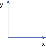
x-axis (horizontal axis) = independent variable (what you manipulated goes on this axis)
y-axis (vertical axis) = dependent variable (what you measured goes on this axis)

For instance, if you had measured meters of tree growth over years, then you would graph Growth (e.g., meters) on the y-axis and Time (e.g., years) on the x-axis. The x- and y-axes should both be labeled and include units where appropriate.

This type of a graph allows you to easily see the effect that the independent variable (time) has on the dependent variable (growth).
- If constructing a graph by hand use real graph paper or at least paper with a grid pattern.
This will allow you to plot the values of your data as accurately as possible.
- Determine the appropriate size of your graph.
The size of your graph should largely match the size of the graph paper. The graph should not go off the edges of the paper or be limited to just one corner of the paper. One way to accomplish this is to examine the largest values for the dependent and independent variables and use those values to establish the appropriate lengths for the x-axis and y-axis. For example, with the graph shown in Figure B-2, if the longest time in years is 150 years, then an appropriate length for the x-axis could be 175 years, where an x-axis length of 100 years would be inadequate and an x-axis of 500 years would be much too long.
- Use easy-to-read and evenly spaced intervals on both the x-axis and the y-axis.
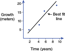
Most people think in units of 1, 2, 5, or 10 (not 3 or 7). If the total span of an axis is 25 meters, then using 5-meter intervals gives the reader an adequate sense of the trends the graph will show (Figure B-3). Do not change the intervals for the graph. In other words, if you make 1 square on the graph paper equal to 5 meters, then 1 square will always be 5 meters. The first square will be 5 meters; the second square will be 10 meters; and so forth. You cannot just jump up to 100 meters if the previous square is 20 meters, unless you clearly show the reader you have done this and you can only do it once on a graph.
- Plotting the points.
From the graph below (Figure B-3), you can see that in the first two years of growth, the tree grew about 5 meters. After four years, the tree was about 7 meters tall, etc.

- Typically, do not connect dots.
The reason to graph data is to show trends in the data. If the trend the graph is showing is that growth is relatively linear over time (Figure B-3), then connecting the dots will distract from presenting that trend. Therefore, a straight line (or best-fit line) is drawn to show this linear relationship. The line is drawn as an average between all the points shown. Notice there is the same amount of total space between the various points above the line and the line itself and the points below the line and the line itself. In addition to being called a best-fit line, this is also referred to as linear regression.
- Choose the type of graph that best represents the data.
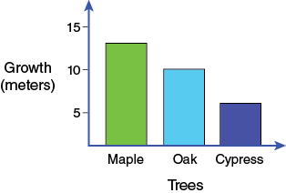
If you have continuous data for both axes you will typically plot a scatter plot, which is simply a line graph without the points connected. If you have discrete data, then a bar graph may be more appropriate. For instance, if you measured how many meters three different types of trees grew in 10 years, you would use a bar graph. The measurements (the dependent variables) still go on the y-axis, while the x-axis now has categories instead of numerical values.

- Annotations on the graph.
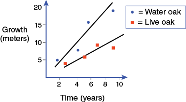
If the meaning of the graph is unclear, annotations can help. One form of annotation is a legend. A legend may be necessary when the graph contains multiple elements. In Figure B-5 two sets of data have been graphed for comparative purposes. The addition of the legend allows the reader to easily discern which points and lines go with the individual data sets.

- Place a figure caption below the figure.
Figure captions (placed below the figure) contain the details of what the figure represents. For instance, the caption for the tree growth data might tell how many replicates were done, that the trees measured were from an open field, how long the trees grew for, etc.