Tables, Graphs, and Infographics
Chapter Opener
49
display data
Tables, Graphs, and Infographics
Just as images and photographs are often the media of choice for conveying visual information, tables, graphs, and other “infographics” are essential tools for displaying numerical and statistical data. They take raw data and transform it into a story or picture readers can interpret.
Most such items are created in spreadsheet programs such as Excel that format charts and graphs and offer numerous design templates — though you will find basic graphics tools in Word and PowerPoint as well. More elaborate charts and graphs can be drawn with software such as Adobe Illustrator.
Often the most effective way to describe, explore, and summarize a set of numbers -- even a very large set -- is to look at pictures of those numbers.

— Edward R. Tufte
Inge Druckrey.
Creating effective tables and graphs is an art in itself, driven as always by purpose and audience. A table in a printed report that a reader will study can be rich in detail; a bar graph on screen for only a few moments must make its point quickly and memorably. Function always trumps appearance. Yet there’s no question that handsome visual texts appeal to audiences. So spend the time necessary to design effective items. Use color to emphasize and clarify graphs, not just to decorate them. Label items clearly (avoiding symbols or keys that are hard to interpret), and don’t add more detail than necessary.
In academic projects, be sure to label (Fig., Table), number, and caption your important graphic items, especially any that you mention in your text. Both MLA and APA style offer guidelines for handling labels; the APA rules are particularly detailed and specific.
Use tables to present statistical data. Tables can do all kinds of work. They are essential for organizing and recording information as it comes in, for example, daily weather events: temperature, precipitation, wind velocities, and so on. A table may also show trends or emphasize contrasts. In such cases, tables may make an argument (in a print ad, for example) or readers may be left to interpret complex data on their own — one of the pleasures of studying such material.
Tables typically consist of horizontal rows and vertical columns into which you drop data. The axes of the chart provide different and significant ways of presenting data, relating x to y: for example, in Table 1, lifetime earnings are connected to education level.
In designing a table, determine how many horizontal rows and vertical columns are needed, how to label them, and whether to use color or shading to enhance the readability of the data. Software templates will provide options. Good tables can be very plain. In fact, many of the tables on federal government Web sites, though packed with information, are dirt simple and yet quite clear.
Use line graphs to display changes or trends. Line graphs are dynamic images, visually plotting and connecting variables on horizontal x-and vertical y-axes so that readers can see how relationships change or trends emerge, usually over time. As such, line graphs often contribute to political or social arguments by tracking fluctuations in income, unemployment, educational attainment, stock prices, and so on.
Table 1
Expected Lifetime Earnings Relative to High School Graduates, by Education Level
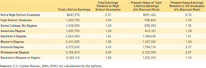
From College Board, Education Pays: The Benefits of Higher Education for Individuals and Society, 2007. Copyright © 2007 The College Board. www.collegeboard.org. Reproduced with permission.
Properly designed, line graphs are easy to read and informative, especially when just a single variable is presented. But it is possible to plot several items on an axis, complicating the line graph but increasing the amount of information it offers (see fig. 1).
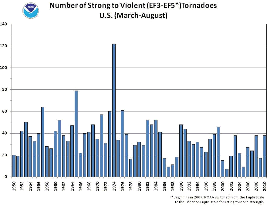
Use bar and column graphs to plot relationships within sets of data. Column and bar graphs use rectangles to represent information either horizontally (bar graph) or vertically (column graph). In either form, these graphs emphasize differences and can show changes over time; they enable readers to grasp relationships that would otherwise take many words to explain. Bar and column graphs present data precisely, if their x-and y-axes are carefully drawn to scale. In Figure 2, for example, a reader can determine the number of major tornadoes in any of more than fifty years and also note a slight trend toward fewer severe storms.
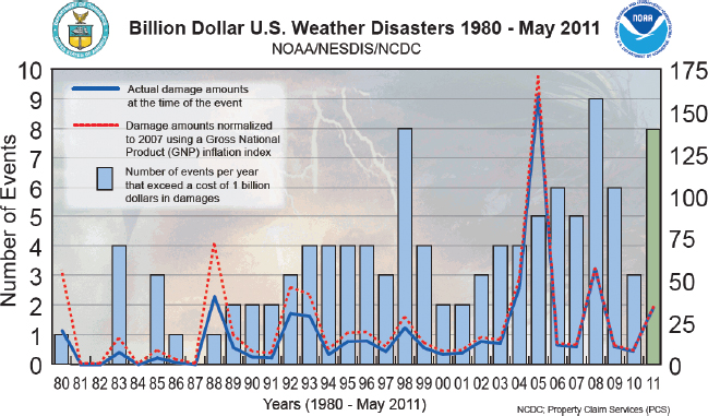
But it is easy to ask a single graphic image to do too much. For example, many readers probably find Figure 3 hard to interpret. Is the chart about the number of storms, their growing frequency, or their actual and adjusted costs? Storm effects in the background of the graphic just add to the clutter.
Use pie charts to display proportions. A typical pie chart is a circle broken into segments that represent some proportion of a whole. Such charts illustrate which parts of that whole have greater or lesser significance, but they do not display precise numbers well. Note in Figure 4, for example, that without the actual sales percentages attached to the chart, you could not easily tell which auto brand sold the most cars in the United States in 2012 — Mercedes or BMW. Since the segments in a typical pie chart need to total 100 percent, you sometimes have to include a segment called “Others / Don’t know” to account for items not actually present in the major categories.
Pie-
Explore the possibilities of infographics. Under the rubric of “infographics,” many organizations and information specialists create data-
Various tools are available online to support the creation of infographics, including Many Eyes, Google Public Data Explorer, Wordle, and StatPlanet. For more about infographics and many examples, search the term online.