EXAMPLE 10.9
pabmi
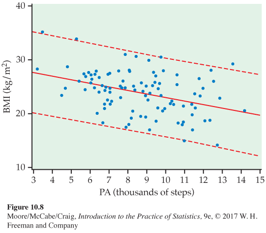
Prediction intervals for BMI. Figure 10.8 shows the upper and lower prediction limits, along with the data and the leas
Page 573
FIGURE 10.8 The 95% prediction limits (dashed curves) for individual responses for the physical activity study, Example 10.9. Compare with Figure 10.7. The limits are wider because the margins of error incorporate the variability about the subpopulation means.
[Leave] [Close]