1.4 1.4 Density Curves and Normal Distributions
When you complete this section, you will be able to:
• Compare the mean and the median for symmetric and skewed distributions.
• Sketch a Normal distribution for any given mean and standard deviation.
• Apply the 68–95–99.7 rule to find proportions of observations within one, two, and three standard deviations of the mean for any Normal distribution.
• Transform values of a variable from a general Normal distribution to the standard Normal distribution.
• Compute areas under a Normal curve using software or Table A.
• Perform inverse Normal calculations to find values of a Normal variable corresponding to various areas.
• Assess the extent to which the distribution of a set of data can be approximated by a Normal distribution.
We now have a kit of graphical and numerical tools for describing distributions. What is more, we have a clear strategy for exploring data on a single quantitative variable:
1. Always plot your data: make a graph, usually a stemplot or a histogram.
2. Look for the overall pattern and for striking deviations such as outliers.
3. Calculate an appropriate numerical summary to briefly describe center and spread.
Technology has expanded the set of graphs that we can choose for Step 1. It is possible, though painful, to make histograms by hand. Using software, clever algorithms can describe a distribution in a way that is not feasible by hand, by fitting a smooth curve to the data in addition to or instead of a histogram. The curves used are called density curvesdensity curves. Before we examine density curves in detail, here is an example of what software can do.
EXAMPLE 1.36
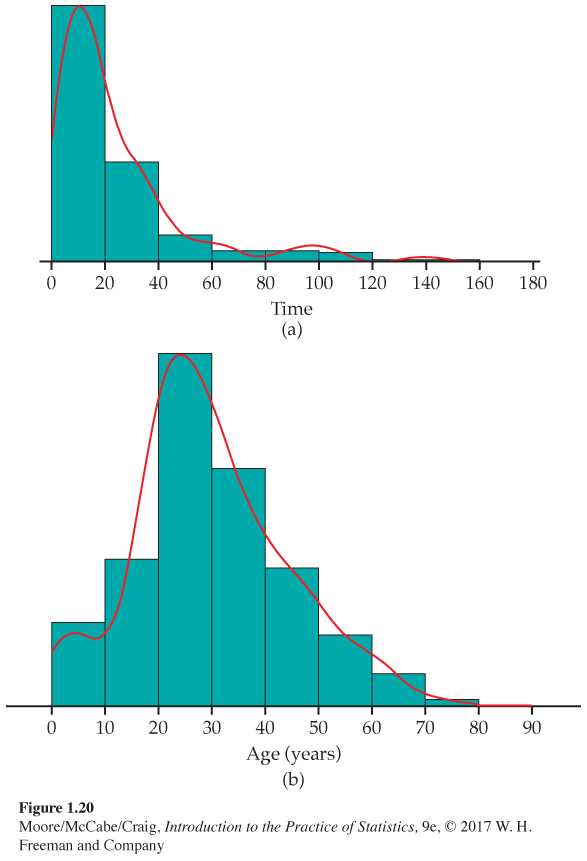
Density curves for times to start a business and Titanic passenger ages. Figure 1.20 illustrates the use of density curves along with histograms to describe distributions. Figure 1.20(a) shows the distribution of the times to start a business for 189 countries (see Example 1.23. page 28). The outlier, Suriname, described in Exercise 1.43 (page 29) has been deleted from the data set. The distribution is highly skewed to the right. Most of the data are in the first two classes, with 40 or fewer days to start a business.
Exercise 1.27 (page 24) describes data on the class of the ticket of the Titanic passengers, and Figure 1.20(b) shows the distribution of the ages of these passengers. It has a single mode, a long right tail, and a relatively short left tail.
A smooth density curve is an idealization that gives the overall pattern of the data but ignores minor irregularities. We first discuss density curves in general and then focus on a special class of density curves, the bell-shaped Normal curves.
Density curves
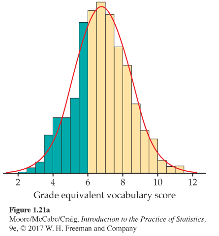
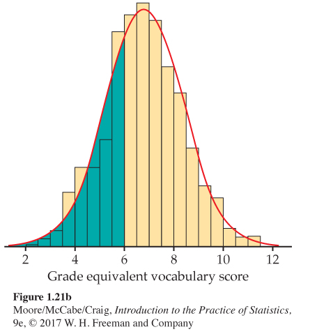
One way to think of a density curve is as a smooth approximation to the irregular bars of a histogram. Figure 1.21 shows a histogram of the scores of all 947 seventh-grade students in Gary, Indiana, on the vocabulary part of the Iowa Test of Basic Skills. Scores of many students on this national test have a very regular distribution. The histogram is symmetric, and both tails fall off quite smoothly from a single center peak. There are no large gaps or obvious outliers. The curve drawn through the tops of the histogram bars in Figure 1.21 is a good description of the overall pattern of the data.
EXAMPLE 1.37
Vocabulary scores. In a histogram, the areas of the bars represent either counts or proportions of the observations. In Figure 1.21(a), we shaded the bars that represent students with vocabulary scores 6.0 or lower. There are 287 such students, who make up the proportion 287/947 = 0.303 of all Gary seventh-graders. The shaded bars in Figure 1.21(a) make up proportion 0.303 of the total area under all the bars. If we adjust the scale so that the total area of the bars is 1, the area of the shaded bars will also be 0.303.
In Figure 1.21(b), we shaded the area under the curve to the left of 6.0. If we adjust the scale so that the total area under the curve is exactly 1, areas under the curve will then represent proportions of the observations. That is, area = proportion. The curve is then a density curve. The shaded area under the density curve in Figure 1.21(b) represents the proportion of students with score 6.0 or lower. This area is 0.293, only 0.010 away from the histogram result. You can see that areas under the density curve give quite good approximations of areas given by the histogram.
DENSITY CURVE
A density curve is a curve that
• Is always on or above the horizontal axis.
• Has area exactly 1 underneath it.
A density curve describes the overall pattern of a distribution. The area under the curve and above any range of values is the proportion of all observations that fall in that range.
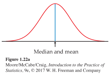
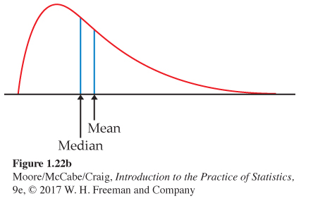
The density curve in Figure 1.21 is a Normal curve. Density curves, like distributions, come in many shapes. Figure 1.22 shows two density curves, a symmetric Normal density curve and a right-skewed curve.
We will discuss Normal density curves in detail in this section because of the important role that they play in statistics. There are, however, many applications where the use of other families of density curves are essential.
A density curve of an appropriate shape is often an adequate description of the overall pattern of a distribution. Outliers, which are deviations from the overall pattern, are not described by the curve.
Measuring center and spread for density curves
Our measures of center and spread apply to density curves as well as to actual sets of observations, but only some of these measures are easily seen from the curve. A mode of a distribution described by a density curve is a peak point of the curve, the location where the curve is highest. Because areas under a density curve represent proportions of the observations, the median is the point with half the total area on each side. You can roughly locate the quartiles by dividing the area under the curve into quarters as accurately as possible by eye. The IQR is the distance between the first and third quartiles. There are mathematical ways of calculating areas under curves. These allow us to locate the median and quartiles exactly on any density curve.

What about the mean and standard deviation? The mean of a set of observations is their arithmetic average. If we think of the observations as weights strung out along a thin rod, the mean is the point at which the rod would balance. This fact is also true of density curves. The mean is the point at which the curve would balance if it were made out of solid material. Figure 1.23 illustrates this interpretation of the mean.
A symmetric curve, such as the Normal curve in Figure 1.22(a), balances at its center of symmetry. Half the area under a symmetric curve lies on either side of its center, so this is also the median.
For a right-skewed curve, such as those shown in Figures 1.22(b) and 1.23, the small area in the long right tail tips the curve more than the same area near the center. The mean (the balance point), therefore, lies to the right of the median. It is hard to locate the balance point by eye on a skewed curve. There are mathematical ways of calculating the mean for any density curve, so we are able to mark the mean as well as the median in Figure 1.22(b). The standard deviation can also be calculated mathematically, but it can’t be located by eye on most density curves.
MEDIAN AND MEAN OF A DENSITY CURVE
The median of a density curve is the equal-areas point, the point that divides the area under the curve in half.
The mean of a density curve is the balance point, at which the curve would balance if made of solid material.
The median and mean are the same for a symmetric density curve. They both lie at the center of the curve. The mean of a skewed curve is pulled away from the median in the direction of the long tail.
A density curve is an idealized description of a distribution of data. For example, the density curve in Figure 1.21(page 53) is exactly symmetric, but the histogram of vocabulary scores is only approximately symmetric. We therefore need to distinguish between the mean and standard deviation of the density curve and the numbers ˉx and s computed from the actual observations. The usual notation for the mean of an idealized distribution is μmean μ (the Greek letter mu). We write the standard deviation of a density curve as σstandard deviation σ (the Greek letter sigma). In Chapter 5, we refer to ˉx and s as statistics associated with a sample and to μ and σ as parameters associated with a population.
Normal distributions
One particularly important class of density curves has already appeared in Figures 1.21 and 1.22(a). These density curves are symmetric, unimodal, and bell-shaped. They are called Normal curvesNormal curves
Normal distributions, and they describe Normal distributions. All Normal distributions have the same overall shape.
The exact density curve for a particular Normal distribution is specified by giving the distribution’s mean μ and its standard deviation σ. The mean is located at the center of the symmetric curve and is the same as the median. Changing μ without changing σ moves the Normal curve along the horizontal axis without changing its spread.
The standard deviation σ controls the spread of a Normal curve. Figure 1.24 shows two Normal curves with different values of σ. The curve with the larger standard deviation is more spread out.
The standard deviation σ is the natural measure of spread for Normal distributions. Not only do μ and σ completely determine the shape of a Normal curve, but we can locate σ by eye on the curve. Here’s how. As we move out in either direction from the center μ, the curve changes from falling ever more steeply

to falling ever less steeply

The points at which this change of curvature takes place are located at distance σ on either side of the mean m. You can feel the change as you run your finger along a Normal curve, and so find the standard deviation. Remember that m and σ alone do not specify the shape of most distributions, and that the shape of density curves in general does not reveal σ. These are special properties of Normal distributions.

There are other symmetric bell-shaped density curves that are not Normal. The Normal density curves are specified by a particular equation. The height of the density curve at any point x is given by
1σ√2π e−12(x−μσ)2
We will not make direct use of this fact, although it is the basis of mathematical work with Normal distributions. Notice that the equation of the curve is completely determined by the mean μ and the standard deviation σ.
Why are the Normal distributions important in statistics? Here are three reasons.
1. Normal distributions are good descriptions for some distributions of real data. Distributions that are often close to Normal include scores on tests taken by many people (such as the Iowa Test of Figure 1.21, page 53), repeated careful measurements of the same quantity, and characteristics of biological populations (such as lengths of baby pythons and yields of corn).
2. Normal distributions are good approximations to the results of many kinds of chance outcomes, such as tossing a coin many times.
3. Many statistical inference procedures based on Normal distributions work well for other roughly symmetric distributions.
However, even though many sets of data follow a Normal distribution, many do not. Most income distributions, for example, are skewed to the right and so are not Normal. Non-Normal data, like nonnormal people, not only are common but are also sometimes more interesting than their Normal counterparts.
The 68–95–99.7 rule
Although there are many Normal curves, they all have common properties. Here is one of the most important.
THE 68–95–99.7 RULE
In the Normal distribution with mean μ and standard deviation σ:
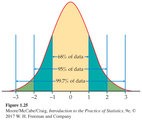
• Approximately 68% of the observations fall within σ of the mean μ.
• Approximately 95% of the observations fall within 2σ of μ.
• Approximately 99.7% of the observations fall within 3σ of μ.
Figure 1.25 illustrates the 68–95–99.7 rule. By remembering these three numbers, you can think about Normal distributions without constantly making detailed calculations.
EXAMPLE 1.38
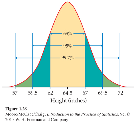
Heights of young women. The distribution of heights of young women aged 18 to 24 is approximately Normal with mean μ = 64.5 inches and standard deviation σ = 2.5 inches. Figure 1.26 shows what the 68–95–99.7 rule says about this distribution.
Two standard deviations equals five inches for this distribution. The 95 part of the 68–95–99.7 rule says that the middle 95% of young women are between 64.5 − 5 and 64.5 + 5 inches tall, that is, between 59.5 and 69.5 inches. This fact is exactly true for an exactly Normal distribution. It is approximately true for the heights of young women because the distribution of heights is approximately Normal.
The other 5% of young women have heights outside the range from 59.5 to 69.5 inches. Because the Normal distributions are symmetric, half of these women are on the tall side. So the tallest 2.5% of young women are taller than 69.5 inches.
Because we will mention Normal distributions often, a short notation is helpful. We abbreviate the Normal distribution with mean μ and standard deviation σ as N(μ, σ) N(μ, σ) . For example, the distribution of young women’s heights is N(64.5, 2.5).
USE YOUR KNOWLEDGE
Question 1.93
1.93 Test scores. Many states assess the skills of their students in various grades. One program that is available for this purpose is the National Assessment of Educational Progress (NAEP).30 One of the tests provided by the NAEP assesses the reading skills of 12th-grade students. In a recent year, the national mean score was 288 and the standard deviation was 38. Assuming that these scores are approximately Normally distributed, N(288, 38), use the 68–95–99.7 rule to give a range of scores that includes 95% of these students.
1.93 According to the rule, 95% of scores will fall between μ ± 2. Therefore, 95% of scores are between 212 and 364.
Question 1.94
1.94 Use the 68–95–99.7 rule. Refer to the previous exercise. Use the 68–95–99.7 rule to give a range of scores that includes 99.7% of these students.
Standardizing observations
As the 68–95–99.7 rule suggests, all Normal distributions share many properties. In fact, all Normal distributions are the same if we measure in units of size σ about the mean μ as center. Changing to these units is called standardizing. To standardize a value, subtract the mean of the distribution and then divide by the standard deviation.
STANDARDIZING AND z-SCORES
If x is an observation from a distribution that has mean μ and standard deviation σ, the standardized value of x is
z=x−μσ
A standardized value is often called a z-score .
A z-score tells us how many standard deviations the original observation falls away from the mean, and in which direction. Observations larger than the mean are positive when standardized, and observations smaller than the mean are negative.
To compare scores based on different measures, z-scores can be very useful. For example, see Exercise 1.124 (page 73), where you are asked to compare an SAT score with an ACT score.
EXAMPLE 1.39
Find some z-scores. The heights of young women are approximately Normal with μ = 64.5 inches and σ = 2.5 inches. The z-score for height is
z=height−64.52.5
A woman’s standardized height is the number of standard deviations by which her height differs from the mean height of all young women. A woman 68 inches tall, for example, has z-score
z=68−64.52.5=1.4
or 1.4 standard deviations above the mean. Similarly, a woman 5 feet (60 inches) tall has z-score
z=60−64.52.5=−1.8
or 1.8 standard deviations less than the mean height.
USE YOUR KNOWLEDGE
Question 1.95
1.95 Find the z-score. Consider the NAEP scores (see Exercise 1.93, page 59), which we assume are approximately Normal, N(288, 38). Give the z-score for a student who received a score of 350.
1.95 z = 1.63.
Question 1.96
1.96 Find another z-score. Consider the NAEP scores, which we assume are approximately Normal, N(288, 38). Give the z-score for a student who received a score of 240. Explain why your answer is negative even though all the test scores are positive.
We need a way to write variables, such as “height” in Example 1.38, that follow a theoretical distribution such as a Normal distribution. We use capital letters near the end of the alphabet for such variables. If X is the height of a young woman, we can then shorten “the height of a young woman is less than 68 inches” to “X < 68.” We will use lowercase x to stand for any specific value of the variable X.
We often standardize observations from symmetric distributions to express them in a common scale. We might, for example, compare the heights of two children of different ages by calculating their z-scores. The standardized heights tell us where each child stands in the distribution for his or her age group.
Standardizing is a linear transformation that transforms the data into the standard scale of z-scores. We know that a linear transformation does not change the shape of a distribution, and that the mean and standard deviation change in a simple manner. In particular, the standardized values for any distribution always have mean 0 and standard deviation 1.
If the variable we standardize has a Normal distribution, standardizing does more than give a common scale. It makes all Normal distributions into a single distribution, and this distribution is still Normal. Standardizing a variable that has any Normal distribution produces a new variable that has the standard Normal distribution.
THE STANDARD NORMAL DISTRIBUTION
The standard Normal distribution is the Normal distribution N(0, 1) with mean 0 and standard deviation 1.
If a variable X has any Normal distribution N(μ, σ) with mean μ and standard deviation σ, then the standardized variable
Z=X−μσ
has the standard Normal distribution.
Normal distribution calculations
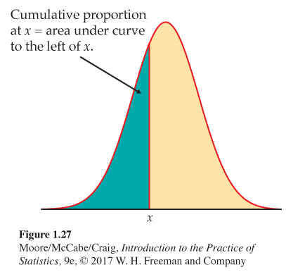
Areas under a Normal curve represent proportions of observations from that Normal distribution. There is no formula for areas under a Normal curve. Calculations use either software that calculates areas or a table of areas. The table and most software calculate one kind of area: cumulative proportionscumulative proportion. A cumulative proportion is the proportion of observations in a distribution that lie at or below a given value. When the distribution is given by a density curve, the cumulative proportion is the area under the curve to the left of a given value. Figure 1.27 shows the idea more clearly than words do.
The key to calculating Normal proportions is to match the area you want with areas that represent cumulative proportions. Then get areas for cumulative proportions either from software or (with an extra step) from a table. The following examples show the method in pictures.
EXAMPLE 1.40
NCAA eligibility for competition. To be eligible to compete in their first year of college, the National Collegiate Athletic Association (NCAA) requires Division I athletes to meet certain academic standards. These are based on their grade point average (GPA) in certain courses and combined scores on the SAT Critical Reading and Mathematics sections or the ACT composite score.31

For a student with a 3.0 GPA, the combined SAT score must be 800 or higher. Based on the distribution of SAT scores for college-bound students, we assume that the distribution of the combined Critical Reading and Mathematics scores is approximately Normal with mean 1010 and standard deviation 225.32 What proportion of college-bound students have SAT scores of 800 or more?
Here is the calculation in pictures: the proportion of scores above 800 is the area under the curve to the right of 800. That’s the total area under the curve (which is always 1) minus the cumulative proportion up to 800.
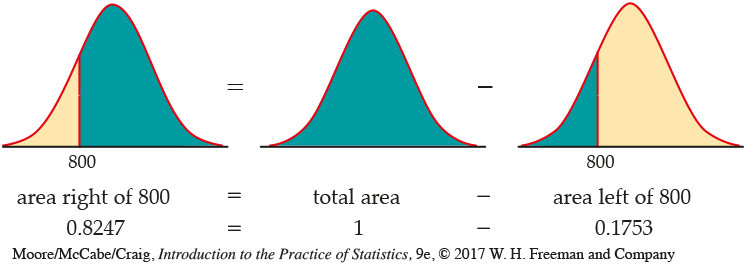
That is, the proportion of college-bound SAT takers with a 3.0 GPA who are eligible to compete is 0.8247, or about 82%.
There is no area under a smooth curve that is exactly over the point 800. Consequently, the area to the right of 800 (the proportion of scores > 800) is the same as the area at or to the right of this point (the proportion of scores ≥ 800). The actual data may contain a student who scored exactly 800 on the SAT. That the proportion of scores exactly equal to 800 is 0 for a Normal distribution is a consequence of the idealized smoothing of Normal distributions for data.
EXAMPLE 1.41
NCAA eligibility for aid and practice. The NCAA has a category of eligibility in which a first-year student may not compete but is still eligible to receive an athletic scholarship and to practice with the team. The requirements for this category are a 3.0 GPA and combined SAT Critical Reading and Mathematics scores of at least 620.
What proportion of college-bound students who take the SAT would be eligible to receive an athletic scholarship and to practice with the team but would not be eligible to compete? That is, what proportion have scores between 620 and 800? Here are the pictures:

area between 620 and 800 = area left of 800 − area left of 620
0.1338 = 0.1753 − 0.0415
About 13% of college-bound students with a 3.0 GPA have SAT scores between 620 and 800.
How do we find the numerical values of the areas in Examples 1.40 and 1.41? If you use software, just plug in mean 1010 and standard deviation 225. Then ask for the cumulative proportions for 800 and for 620. (Your software will probably refer to these as “cumulative probabilities.” We will learn in Chapter 4 why the language of probability fits.) Sketches of the areas that you want similar to the ones in Examples 1.40 and 1.41 are very helpful in making sure that you are doing the correct calculations.
You can use the Normal Curve applet on the text website to find Normal proportions. The applet is more flexible than most software—it will find any Normal proportion, not just cumulative proportions. The applet is an excellent way to understand Normal curves. But, because of the limitations of web browsers, the applet is not as accurate as statistical software.
If you are not using software, you can find cumulative proportions for Normal curves from a table. That requires an extra step, as we now explain.
Using the standard Normal table
The extra step in finding cumulative proportions from a table is that we must first standardize to express the problem in the standard scale of z-scores. This allows us to get by with just one table, a table of standard Normal cumulative proportions. Table A in the back of the book gives standard Normal probabilities. The picture at the top of the table reminds us that the entries are cumulative proportions, areas under the curve to the left of a value z.
EXAMPLE 1.42
Find the proportion from z. What proportion of observations on a standard Normal variable Z take values less than 1.47? We need to find the area to the left of 1.47; locate 1.4 in the left-hand column of Table A and then locate the remaining digit 7 as .07 in the top row. The entry opposite 1.4 and under .07 is 0.9292. This is the cumulative proportion we seek. Figure 1.28 illustrates this area.
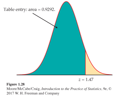
Now that you see how Table A works, let’s redo the NCAA Examples 1.40 and 1.41 using the table.
EXAMPLE 1.43
Find the proportion from x. What proportion of college-bound students who take the SAT have scores of at least 800? The picture that leads to the answer is exactly the same as in Example 1.40. The extra step is that we first standardize to read cumulative proportions from Table A. If X is SAT score, we want the proportion of students for which X ≥ x, where x = 800.
1. Standardize. Subtract the mean, then divide by the standard deviation, to transform the problem about X into a problem about a standard Normal Z:
X≥800X-1010225≥800-1010225Z≥-0.93
2. Use the table. Look at the pictures in Example 1.40. From Table A, we see that the proportion of observations less than −0.93 is 0.1762. The area to the right of −0.93 is therefore 1 − 0.1762 = 0.8238. This is about 82%.
The area from the table in Example 1.43 (0.8238) is slightly less accurate than the area from software in Example 1.40 (0.8247) because we must round z to two places when we use Table A. The difference is rarely important in practice.
EXAMPLE 1.44
Eligibility for aid and practice. What proportion of all students who take the SAT would be eligible to receive athletic scholarships and to practice with the team but would not be eligible to compete in the eyes of the NCAA? That is, what proportion of students have SAT scores between 620 and 800? First, sketch the areas, exactly as in Example 1.41. We again use X as shorthand for an SAT score.
1. Standardize.
620≤X<800620-1010225≤X-1010225<800-1010225-1.73≤Z<-0.93
2. Use the table.
area between −1.73 and −0.93 = (area left of −0.93) − (area left of −1.73)
= 0.1762 − 0.0418 = 0.1344
As in Example 1.41, about 13% of students would be eligible to receive athletic scholarships and to practice with the team.
Sometimes we encounter a value of z more extreme than those appearing in Table A. For example, the area to the left of z = −4 is not given in the table. The z-values in Table A leave only area 0.0002 in each tail unaccounted for. For practical purposes, we can act as if there is zero area outside the range of Table A.
USE YOUR KNOWLEDGE
Question 1.97
1.97 Find the proportion. Consider the NAEP scores, which are approximately Normal, N(288, 38). Find the proportion of students who have scores less than 350. Find the proportion of students who have scores greater than or equal to 350. Sketch the relationship between these two calculations using pictures of Normal curves similar to the ones given in Example 1.40 (page 61).
1.97 For X = 350, z = 1.63 and the proportion less than 350 is the area to the left, which is 0.9484. For the proportion greater than or equal to 350, we calculate 0.0516.
Question 1.98
1.98 Find another proportion. Consider the NAEP scores, which are approximately Normal, N(288, 38). Find the proportion of students who have scores between 300 and 350. Use pictures of Normal curves similar to the ones given in Example 1.41 (page 62) to illustrate your calculations.
Inverse Normal calculations
Examples 1.40 to 1.44 illustrate the use of Normal distributions to find the proportion of observations in a given event, such as “SAT score between 620 and 800.” We may instead want to find the observed value corresponding to a given proportion.
Statistical software will do this directly. Without software, use Table A backward, finding the desired proportion in the body of the table and then reading the corresponding z from the left column and top row.
EXAMPLE 1.45
How high for the top 10%? Scores for college-bound students on the SAT Critical Reading test in recent years follow approximately the N(500, 120) distribution.33 How high must a student score to place in the top 10% of all students taking the SAT?
Again, the key to the problem is to draw a picture. Figure 1.29 shows that we want the score x with an area of 0.10 above it. That’s the same as area below x equal to 0.90.
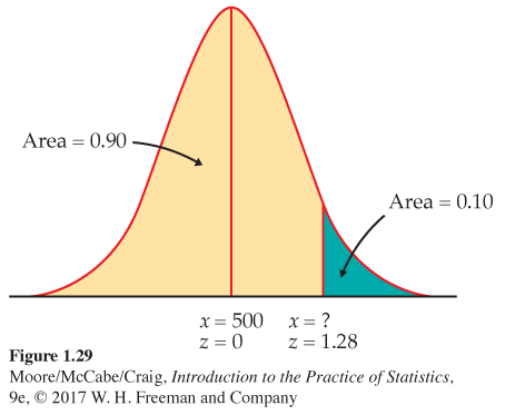
Statistical software has a function that will give you the x for any cumulative proportion you specify. The function often has a name such as “inverse cumulative probability.” Plug in mean 500, standard deviation 120, and cumulative proportion 0.9. The software tells you that x = 653.786. We see that a student must score at least 654 to place in the highest 10%.
Without software, first find the standard score z with cumulative proportion 0.9, then “unstandardize” to find x. Here is the two-step process:
1. Use the table. Look in the body of Table A for the entry closest to 0.9. It is 0.8997. This is the entry corresponding to z = 1.28. So z = 1.28 is the standardized value with area 0.9 to its left.
2. Unstandardize to transform the solution from z back to the original x scale. We know that the standardized value of the unknown x is z = 1.28. So x itself satisfies
x−500120=1.28
Page 66Solving this equation for x gives
x = 500 + (1.28)(120) = 653.6
This equation should make sense: it finds the x that lies 1.28 standard deviations above the mean on this particular Normal curve. That is the “unstandardized” meaning of z = 1.28. The general rule for unstandardizing a z-score is
x = μ + zσ
USE YOUR KNOWLEDGE
Question 1.99
1.99 What score is needed to be in the top 20%? Consider the NAEP scores, which are approximately Normal, N(288, 38). How high a score is needed to be in the top 20% of students who take this exam?
1.99 To get the top 20% of students, we need to solve for the 80th percentile. The corresponding z is 0.84. So x = 319.92.
Question 1.100
1.100 Find the score that 75% of students will exceed. Consider the NAEP scores, which are approximately Normal, N(288, 38). Seventy-five percent of the students will score above x on this exam. Find x.
Normal quantile plots
The Normal distributions provide good descriptions of some distributions of real data, such as the Iowa Test vocabulary scores. The distributions of some other common variables are usually skewed and therefore distinctly non-Normal. Examples include economic variables such as personal income and gross sales of business firms, the survival times of cancer patients after treatment, and the service lifetime of mechanical or electronic components. While experience can suggest whether or not a Normal distribution is plausible in a particular case, it is risky to assume that a distribution is Normal without actually inspecting the data.
A histogram or stemplot can reveal distinctly non-Normal features of a distribution, such as outliers, pronounced skewness, or gaps and clusters. If the stemplot or histogram appears roughly symmetric and unimodal, however, we need a more sensitive way to judge the adequacy of a Normal model. The most useful tool for assessing Normality is another graph, the Normal quantile plot.Normal quantile plot
Here is the basic idea of a Normal quantile plot. The graphs produced by software use more sophisticated versions of this idea. It is not practical to make Normal quantile plots by hand.
1. Arrange the observed data values from smallest to largest. Record what percentile of the data each value occupies. For example, the smallest observation in a set of 20 is at the 5% point, the second smallest is at the 10% point, and so on.
2. Do Normal distribution calculations to find the values of z corresponding to these same percentiles. For example, z = −1.645 is the 5% point of the standard Normal distribution, and z = −1.282 is the 10% point. We call these values of Z Normal scoresNormal scores.
Page 673. Plot each data point x against the corresponding Normal score. If the data distribution is close to any Normal distribution, the plotted points will lie close to a straight line.
Any Normal distribution produces a straight line on the plot because standardizing turns any Normal distribution into a standard Normal distribution. Standardizing is a linear transformation that can change the slope and intercept of the line in our plot but cannot turn a line into a curved pattern.
USE OF NORMAL QUANTILE PLOTS
If the points on a Normal quantile plot lie close to a straight line, the plot indicates that the data are Normal. Systematic deviations from a straight line indicate a non-Normal distribution. Outliers appear as points that are far away from the overall pattern of the plot. An optional line can be drawn on the plot that corresponds to the Normal distribution with mean equal to the mean of the data and standard deviation equal to the standard deviation of the data.
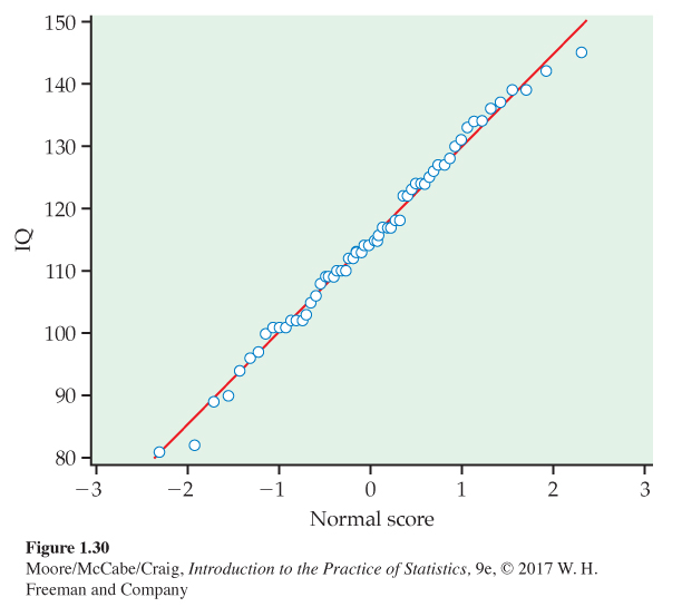
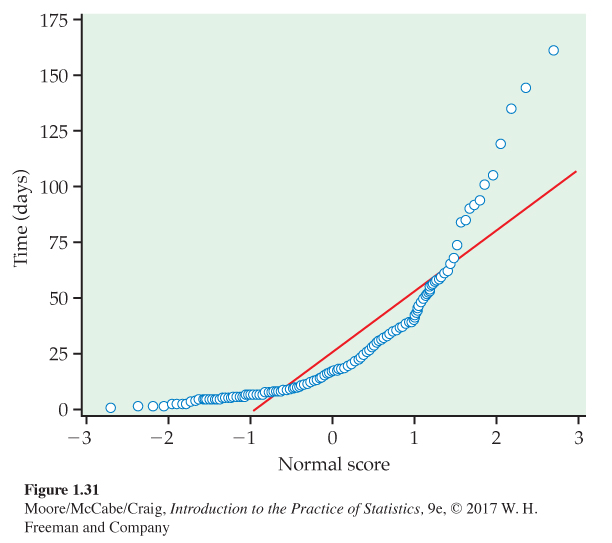
Figures 1.30 and 1.31 are Normal quantile plots for data we have met earlier. The data x are plotted vertically against the corresponding standard Normal z-score plotted horizontally. The z-score scale generally extends from −3 to 3 because almost all of a standard Normal curve lies between these values. These figures show how Normal quantile plots behave.
EXAMPLE 1.46
IQ scores are approximately Normal. Figure 1.30 is a Normal quantile plot of the 60 fifth-grade IQ scores from Table 1.1 (page 14). The points lie very close to the straight line drawn on the plot. We conclude that the distribution of IQ data is approximately Normal.
EXAMPLE 1.47
Times to start a business are skewed. Figure 1.31 is a Normal quantile plot of the data on times to start a business from Example 1.23. We have excluded Suriname, the outlier that you examined in Exercise 1.43 (page 29). The line drawn on the plot shows clearly that the plot of the data is curved. We conclude that these data are not Normally distributed. The shape of the curve is what we typically see with a distribution that is strongly skewed to the right.
Real data often show some departure from the theoretical Normal model. When you examine a Normal quantile plot, look for shapes that show clear departures from Normality. Don’t overreact to minor wiggles in the plot. When we discuss statistical methods that are based on the Normal model, we are interested in whether or not the data are sufficiently Normal for these procedures to work properly. We are not concerned about minor deviations from Normality. Many common methods work well as long as the data are approximately Normal and outliers are not present.
![]()
BEYOND THE BASICS
Density Estimation
A density curve gives a compact summary of the overall shape of a distribution. Many distributions do not have the Normal shape. There are other families of density curves that are used as mathematical models for various distribution shapes. Modern software offers more flexible options. A density estimatordensity estimator does not start with any specific shape, such as the Normal shape. It looks at the data and draws a density curve that describes the overall shape of the data. Density estimators join stemplots and histograms as useful graphical tools for exploratory data analysis.
Density estimates can capture other unusual features of a distribution. Here is an example.
EXAMPLE 1.48
StubHub! StubHub! is a website where fans can buy and sell tickets to sporting events. Ticket holders wanting to sell their tickets provide the location of their seats and the selling price. People wanting to buy tickets can choose from among the tickets offered for a given event.34
Tickets for the 2015 NCAA women’s basketball tournament were available from StubHub! in a package deal that included the semifinal games and the championship game. On June 28, 2014, StubHub! listed 518 tickets for sale. A histogram of the distribution of ticket prices with a density estimate is given in Figure 1.32. The distribution has three peaks: one around $700, another around $2800, and the third around $4650. This is the identifying characteristic of a trimodal distribution. There appears to be three types of tickets. How would you name the three types?
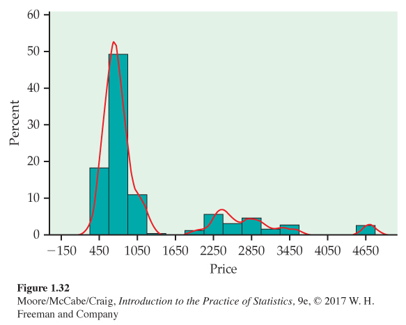
Many distributions that we have met have a single peak, or mode. The distribution described in Example 1.48 has three modes and is called a trimodal distributiontrimodal distribution
bimodal distribution. A distribution that has two modes is called a bimodal distributionbimodal distribution.
The previous example reminds of a continuing theme for data analysis. We looked at a histogram and a density estimate and saw something interesting. This led us to speculation. Additional data on the type and location of the seats may explain more about the prices than we see in Figure 1.32.