2.7 2.6 Data Analysis for Two-Way Tables
When you complete this section, you will be able to:
• Identify the row variable, the column variable, and the cells in a two-way table.
• Find and interpret the joint distribution in a two-way table.
• Find and interpret the marginal distributions in a two-way table.
• Use the conditional distributions to describe the relationship displayed in a two-way table.
• Determine the joint distribution, the marginal distributions, and the conditional distributions in a two-way table from software output.
• Interpret examples of Simpson’s paradox.
quantitative and categorical variables, p. 3
When we study relationships between two variables, one of the first questions we ask is whether each variable is quantitative or categorical. For two quantitative variables, we use a scatterplot to examine the relationship, and we fit a line to the data if the relationship is approximately linear. If one of the variables is quantitative and the other is categorical, we can use the methods in Chapter 1 to describe the distribution of the quantitative variable for each value of the categorical variable. This leaves us with the situation where both variables are categorical. In this section, we discuss methods for studying these relationships.
Some variables—such as sex, race, and occupation—are inherently categorical. Other categorical variables are created by grouping values of a quantitative variable into classes. Published data are often reported in grouped form to save space. To describe categorical data, we use the counts (frequencies) or percents (relative frequencies) of individuals that fall into various categories.
The two-way table
A key idea in studying relationships between two variables is that both variables must be measured on the same individuals or cases. When both variables are categorical, the raw data are summarized in a two-way tabletwo-way table that gives counts of observations for each combination of values of the two categorical variables. Here is an example.
EXAMPLE 2.33
Is the calcium intake adequate? Young children need calcium in their diet to support the growth of their bones. The Institute of Medicine provides guidelines for how much calcium should be consumed for people of different ages.23 One study examined whether or not a sample of children consumed an adequate amount of calcium, based on these guidelines. Because there are different requirements for children aged 5 to 10 years and for children aged 11 to 13 years of age, the children were classified into these two age groups. For each student, his or her calcium intake was classified as meeting or not meeting the requirement. There were 2029 children in the study. Here are the data:24
| Two-way table for “met requirement” and age | ||
|---|---|---|
| Age (years) | ||
| Met requirement | 5 to 10 | 11 to 13 |
| No | 194 | 557 |
| Yes | 861 | 417 |
We see that 194 children aged 5 to 10 did not meet the calcium requirement, and 861 children aged 5 to 10 years met the calcium requirement.
USE YOUR KNOWLEDGE
Question 2.113
2.113 Read the table. Refer to the table in Example 2.33. How many children aged 11 to 13 met the requirement? How many did not?
2.113 Sum the rows of the table. 1278 met the requirements and 751 did not meet requirements.
For the calcium requirement example, we could view age as an explanatory variable and “met requirement” as a response variable. This is why we put age in the columns (like the x axis in a scatterplot) and “met requirement” in the rows (like the y axis in a scatterplot). We call “met requirement” the row variablerow variable because each horizontal row in the table describes whether or not the requirement was met. Age is the column variablecolumn variable because each vertical column describes one age group. Each combination of values for these two variables is called a cellcell. For example, the cell corresponding to children who are 5 to 10 years old and who have not met the requirement contains the number 194. This table is called a 2 × 2 table because there are two rows and two columns.
To describe relationships between two categorical variables, we compute different types of percents. Our job is easier if we expand the basic two-way table by adding various totals. We illustrate the idea with our calcium requirement example.
EXAMPLE 2.34
Add the margins to the table. We expand the table in Example 2.33 by adding the totals for each row, for each column, and the total number of all the observations. Here is the result:
| Two-way table for “met requirement” and age | |||
|---|---|---|---|
| Age (years) | |||
| Met requirement | 5 to 10 | 11 to 13 | Total |
| No | 194 | 557 | 751 |
| Yes | 861 | 417 | 1278 |
| Total | 1055 | 974 | 2029 |
In this study there were 1055 children aged 5 to 10. The total number of children who did not meet the calcium requirement is 751, and the total number of children in the study is 2029.
USE YOUR KNOWLEDGE
Question 2.114
2.114 Read the margins of the table. How many children aged 11 to 13 were subjects in the calcium requirement study? What is the total number of children who met the calcium requirement?
In this example, be sure that you understand how the table is obtained from the raw data. Think about a data file with one line per subject. There would be 2029 lines or records in this data set. In the two-way table, each individual is counted once and only once. As a result, the sum of the counts in the table is the total number of individuals in the data set. Most errors in the use of categorical-data methods come from a misunderstanding of how these tables are constructed.
![]()
Joint distribution
We are now ready to compute some proportions that help us understand the data in a two-way table. Suppose that we are interested in the children aged 5 to 10 years who do not meet the calcium requirement. The proportion of these is simply 194 divided by 2029, or 0.0956. We would estimate that 9.56% of children in the population from which this sample was drawn are 5- to 10-year-olds who do not meet the calcium requirement. For each cell, we can compute a proportion by dividing the cell entry by the total sample size. The collection of these proportions is the joint distributionjoint distribution of the two categorical variables.
EXAMPLE 2.35
The joint distribution. For the calcium requirement example, the joint distribution of age “met requirement” and age is
| Joint distribution of “met requirement” and age | ||
|---|---|---|
| Age (years) | ||
| Met requirement | 5 to 10 | 11 to 13 |
| No | 0.0956 | 0.2745 |
| Yes | 0.4243 | 0.2055 |
Because this is a distribution, the sum of the proportions should be 1. For this example the sum is 0.9999. The difference is due to roundoff error.
USE YOUR KNOWLEDGE
Question 2.115
2.115 Explain the computation. Explain how the entry for the children aged 5 to 10 who met the calcium requirement in Example 2.35 is computed from the table in Example 2.34.
2.115 Divide the cell count by the table total. 861 / 2029 = 0.4243.
How might we use the information in the joint distribution for this example? Suppose that we were to develop an outreach unit to increase the consumption of calcium. The distribution suggests that the older students should be targeted if we have to make a choice because of limited funds. Children who are 11 to 13 years old and do not meet the calcium requirement are 27.45% of the total; however, children who are 5 to 10 years old and do not meet the requirement are only 9.56% of the total. For other uses of these data, we may need to calculate different numerical summaries. Let’s look at the distribution of age.
Marginal distributions
When we examine the distribution of a single variable in a two-way table, we are looking at a marginal distributionmarginal distribution. There are two marginal distributions, one for each categorical variable in the two-way table. They are very easy to compute.
EXAMPLE 2.36
The marginal distribution of age. Look at the table in Example 2.34. The total numbers of children aged 5 to 10 and children aged 11 to 13 are given in the bottom row, labeled “Total.” Our sample has 1055 children aged 5 to 10 and 974 children aged 11 to 13. To find the marginal distribution of age, we simply divide these numbers by the total sample size, 2029. The marginal distribution of age is
| Marginal distribution of age | ||
|---|---|---|
| 5 to 10 | 11 to 13 | |
| Proportion | 0.52 | 0.48 |
Note that the proportions sum to 1; there is no roundoff error.
Often, we prefer to use percents rather than proportions. Here is the marginal distribution of age described with percents:
| Marginal distribution of age | ||
|---|---|---|
| 5 to 10 | 11 to 13 | |
| Percent | 52% | 48% |
Which form do you prefer?
The percent of children in each age group is approximately the same. This is interesting because the first category includes six ages (5, 6, 7, 8, 9, and 10); whereas the second includes only three ages (11, 12, and 13). Recall that the age categories were chosen in this way because the Institute of Medicine defined the calcium requirement differently for these age groups. In this study, the children were selected from grades 4, 5, and 6. The distribution of ages within these grades explains the marginal distribution of age for our sample.
The other marginal distribution for this example is the distribution of “met requirement.”
EXAMPLE 2.37
The marginal distribution of “met requirement.” Here is the marginal distribution of “met requirement,” in percents:
| Marginal distribution of “met requirement” | ||
|---|---|---|
| No | Yes | |
| Percent | 37.01% | 62.99% |
USE YOUR KNOWLEDGE
Question 2.116
2.116 Explain the marginal distribution. Explain how the marginal distribution of “met requirement” given in Example 2.37 is computed from the entries in the table given in Example 2.34.
bar graphs and pie charts, p. 9
Each marginal distribution from a two-way table is a distribution for a single categorical variable. We can use a bar graph or a pie chart to display such a distribution. For our two-way table, we will be content with numerical summaries: for example, 52% of the children are aged 5 to 10, and 37% of the children are not meeting their calcium requirement. When we have more rows or columns, the graphical displays are particularly useful.
Describing relations in two-way tables
The table in Example 2.34 contains much more information than the two marginal distributions of age alone and “met requirement” alone. We need to do a little more work to examine the relationship. Relationships among categorical variables are described by calculating appropriate percents from the counts given. What percents do you think we should use to describe the relationship between age and meeting the calcium requirement?
EXAMPLE 2.38
Meeting the calcium requirement for children aged 5 to 10. What percent of the children aged 5 to 10 in our sample met the calcium requirement? This is the count of the children who are 5 to 10 years old and who met the calcium requirement as a percent of the number of children who are 5 to 10 years old:
8611055= 0.8161 = 82%
USE YOUR KNOWLEDGE
Question 2.117
2.117 Find the percent. Refer to the table in Example 2.34 (page 137). Show that the percent of children 11 to 13 years old who met the calcium requirement is 43%.
2.117 Divide the cell count by the total number of children aged 11 to 13. 417 / 974 = 0.4281 (which rounds to 43%).
Conditional distributions
In Example 2.38, we looked at the children aged 5 to 10 alone and examined the distribution of the other categorical variable, “met requirement.” Another way to say this is that we conditioned on the value of age, 5 to 10 years old. Similarly, we can condition on the value of age being 11 to 13 years old. When we condition on the value of one variable and calculate the distribution of the other variable, we obtain a conditional distributionconditional distribution. Note that in Example 2.38, we calculated only the percent for children aged 5 to 10 years. The complete conditional distribution gives the proportions or percents for all possible values of the conditioning variable.
EXAMPLE 2.39
Conditional distribution of “met requirement” for children aged 5 to 10. For children aged 5 to 10 years, the conditional distribution of the “met requirement” variable in terms of percents is
| Conditional distribution of “met requirement” for children aged 5 to 10 |
||
|---|---|---|
| No | Yes | |
| Percent | 18.39% | 81.61% |
Note that we have included the percents for both of the possible values, Yes and No, of the “met requirement” variable. These percents sum to 100%.
USE YOUR KNOWLEDGE
Question 2.118
2.118 A conditional distribution. Perform the calculations to show that the conditional distribution of “met requirement” for children aged 11 to 13 years is
| Conditional distribution of “met requirement” for children aged 11 to 13 |
||
|---|---|---|
| No | Yes | |
| Percent | 57.19% | 42.81% |
Comparing the conditional distributions (Example 2.39 and Exercise 2.118) reveals the nature of the association between age and meeting the calcium requirement. In this set of data, the older children are more likely to fail to meet the calcium requirement.
Bar graphs can help us to see relationships between two categorical variables. No single graph (such as a scatterplot) portrays the form of the relationship between categorical variables, and no single numerical measure (such as the correlation) summarizes the strength of an association. Bar graphs are flexible enough to be helpful, but you must think about what comparisons you want to display. For numerical measures, we must rely on well-chosen percents or on more advanced statistical methods.25
![]()
A two-way table contains a great deal of information in compact form. Making that information clear almost always requires finding percents. You must decide which percents you need. Of course, we prefer to use software to compute the joint, marginal, and conditional distributions.
EXAMPLE 2.40
Software output. Figure 2.28 gives computer output for the data in Example 2.33 using Minitab, SPSS, and JMP. There are minor variations among software packages, but these outputs are typical of what is usually produced. Each cell in the 2 × 2 table has four entries. These are the count (the number of observations in the cell), the conditional distributions for rows and columns, and the joint distribution. Note that all of these are expressed as percents rather than proportions. Marginal totals and distributions are given in the rightmost column and the bottom row.
Most software packages order the row and column labels numerically or alphabetically. In general, it is better to use words rather than numbers for the column labels. This sometimes involves some additional work, but it avoids the kind of confusion that can result when you forget the real values associated with each numerical value. You should verify that the entries in Figure 2.28 correspond to the calculations that we performed in Examples 2.34 through 2.39. In addition, verify the calculations for the conditional distributions of age for each value of “met requirement.”
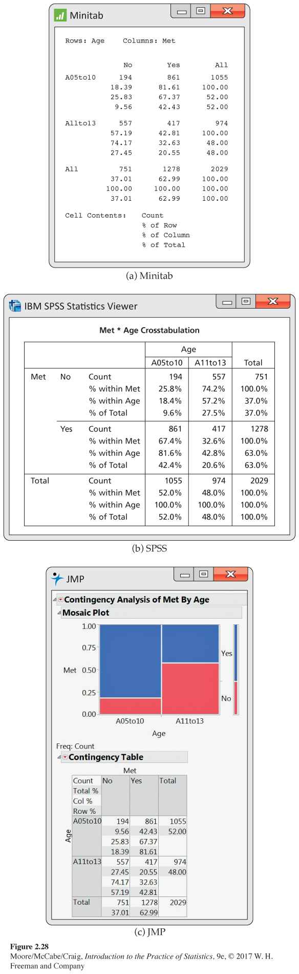
The JMP output in Figure 2.28 includes a graphical display of the data called a mosaic plotmosaic plot. The sizes of the four boxes display the joint distribution. The narrow bar to the right shows the marginal distribution of Met and the widths of the vertical bars show the marginal distribution of age. The conditional distribution of Met for each Age is represented in each of these vertical bars by the heights of the blue and red sections. Notice that they always add to one.
Simpson’s paradox
As is the case with quantitative variables, the effects of lurking variables can strongly influence relationships between two categorical variables. Here is an example that demonstrates the surprises that can await the unsuspecting consumer of data.
EXAMPLE 2.41
Which customer service representative is better? A customer service center has a goal of resolving customer questions in 10 minutes or less. Here are the records for two representatives:
| Representative | ||
|---|---|---|
| Goal met | Alexis | Peyton |
| Yes | 172 | 118 |
| No | 28 | 82 |
| Total | 200 | 200 |
Alexis has met the goal 172 times out of 200, a success rate of 86%. For Peyton, the success rate is 118 out of 200, or 59%. Alexis clearly has the better success rate.
Let’s look at the data in a little more detail. The data summarized come from two different weeks in the year.
EXAMPLE 2.42
Look at the data more carefully. Here are the counts broken down by week:
| Week 1 | Week 2 | |||
|---|---|---|---|---|
| Goal met | Alexis | Peyton | Alexis | Peyton |
| Yes | 162 | 19 | 10 | 99 |
| No | 18 | 1 | 10 | 81 |
| Total | 180 | 20 | 20 | 180 |
For Week 1, Alexis met the goal 90% of the time (162/180), while Peyton met the goal 95% of the time (19/20). Peyton had the better performance in Week 1. What about Week 2? Here, Alexis met the goal 50% of the time (10/20), while the success rate for Peyton was 55% (99/180). Peyton again had the better performance. How does this analysis compare with the analysis that combined the counts for the two weeks? That analysis clearly showed that Alexis had the better performance, 86% versus 59%.
These results can be explained by a lurking variable, Week. The first week was during a period when the product had been in use for several months. Most of the calls to the customer service center concerned problems that had been encountered before. The representatives were trained to answer these questions and usually had no trouble in meeting the goal of resolving the problems quickly. On the other hand, the second week occurred shortly after the release of a new version of the product. Most of the calls during this week concerned new problems that the representatives had not yet encountered. Many more of these questions took longer than the 10-minute goal to resolve.
Look at the totals in the bottom row of the detailed table. During the first week, when calls were easy to resolve, Alexis handled 180 calls and Peyton handled 20. The situation was exactly the opposite during the second week, when the calls were difficult to resolve. There were 20 calls for Alexis and 180 for Peyton.
The original two-way table, which did not take account of week, was misleading. This example illustrates Simpson’s paradox.
SIMPSON’S PARADOX
An association or comparison that holds for all of several groups can reverse direction when the data are combined to form a single group. This reversal is called Simpson’s paradox.
The lurking variables in our Simpson’s paradox example, Week and problem difficulty, are categorical. That is, they break the observations into groups by workweek. Simpson’s paradox is an extreme form of the fact that observed associations can be misleading when there are lurking variables.
![]()
The data in Example 2.42 are given in a three-way tablethree-way table that reports counts for each combination of three categorical variables: week, representative, and whether or not the goal was met. In our example, we constructed the three-way table by constructing two two-way tables for representative by goal, one for each week. The original table in Example 2.41 can be obtained by adding the corresponding counts for these two tables. This process is called aggregatingaggregation the data. When we aggregated data in Example 2.41, we ignored the variable week, which then became a lurking variable. Conclusions that seem obvious when we look only at aggregated data can become quite different when the data are examined in more detail.
![]()