Types of Numerical Graphs
A time-series graph has successive dates on the horizontal axis and the values of a variable that occurred on those dates on the vertical axis.
You have probably seen graphs in newspapers that show what has happened over time to economic variables such as the unemployment rate or stock prices. A time-series graph has successive dates on the horizontal axis and the values of a variable that occurred on those dates on the vertical axis. For example, Figure A.7 shows the unemployment rate in the United States from 1989 to late 2013. A line connecting the points that correspond to the unemployment rate for each month during those years gives a clear idea of the overall trend in unemployment during that period. Note the two short diagonal lines toward the bottom of the y-axis in Figure A.7. This truncation sign indicates that a piece of the axis—here, unemployment rates below 4%—was cut to save space.
| Figure A.7 | Time-Series Graph |
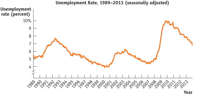
Figure 1.7: Time-Series GraphTime-series graphs show successive dates on the x-axis and values for a variable on the y-axis. This time-series graph shows the seasonally adjusted unemployment rate in the United States from 1989 to late 2013.
Source: Bureau of Labor Statistics.
Each point on a scatter diagram corresponds to an actual observation of the x-variable and the y-variable.
| Figure A.8 | Scatter Diagram |
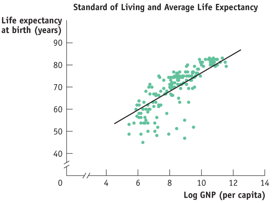
Figure 1.8: Scatter DiagramIn a scatter diagram, each point represents the corresponding values of the x- and y-variables for a given observation. Here, each point indicates the observed average life expectancy and the log of GNP per capita of a given country for a sample of 168 countries. The upward-sloping fitted line here is the best approximation of the general relationship between the two variables.
Source: World Bank (2012).
A pie chart shows the share of a total amount that is accounted for by various components, usually expressed in percentages.
Figure A.8 is an example of a different kind of numerical graph. It represents information from a sample of 168 countries on average life expectancy and gross national product (GNP) per capita—a rough measure of a country’s standard of living. Each point in the graph indicates an average resident’s life expectancy and the log of GNP per capita for a given country. (Economists have found that the log of GNP rather than the simple level of GNP is more closely tied to average life expectancy.) The points lying in the upper right of the graph, which show combinations of high life expectancy and high log of GNP per capita, represent economically advanced countries such as the United States. Points lying in the bottom left of the graph, which show combinations of low life expectancy and low log of GNP per capita, represent economically less advanced countries such as Afghanistan and Sierra Leone. The pattern of points indicates that there is a positive relationship between life expectancy and log of GNP per capita: on the whole, people live longer in countries with a higher standard of living. This type of graph is called a scatter diagram, a diagram in which each point corresponds to an actual observation of the x-variable and the y-variable. In scatter diagrams, a curve is typically fitted to the scatter of points; that is, a curve is drawn that approximates as closely as possible the general relationship between the variables. As you can see, the fitted curve in Figure A.8 is upward-sloping, indicating the underlying positive relationship between the two variables. Scatter diagrams are often used to show how a general relationship can be inferred from a set of data.
Page 45
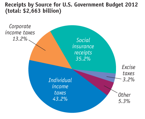
Figure 1.9: Pie ChartA pie chart shows the percentages of a total amount that can be attributed to various components. This pie chart shows the percentages of total federal revenues received from each source.
Source: Office of Management and Budget.
A pie chart shows the share of a total amount that is accounted for by various components, usually expressed in percentages. For example, Figure A.9 is a pie chart that depicts the various sources of revenue for the U.S. government budget in 2012, expressed in percentages of the total revenue amount, $2,663 billion. As you can see, social insurance receipts (the revenues collected to fund Social Security, Medicare, and unemployment insurance) accounted for 35% of total government revenue, and individual income tax receipts accounted for 43%.
Page 46
A bar graph uses bars of various heights or lengths to indicate values of a variable.
A bar graph uses bars of various heights or lengths to indicate values of a variable. In the bar graph in Figure A.10, the bars show the percent change in the number of unemployed workers in the United States from 2012 to 2013, indicated separately for White, Black or African-American, and Asian workers. Exact values of the variable that is being measured may be written at the end of the bar, as in this figure. For instance, the number of unemployed Asian workers in the United States decreased by 15% between 2012 and 2013. But even without the precise values, comparing the heights or lengths of the bars can give useful insight into the relative magnitudes of the different values of the variable.
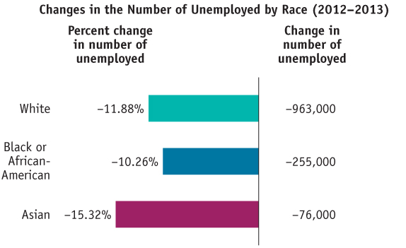
Figure 1.10: Bar GraphA bar graph measures a variable by using bars of various heights or lengths. This bar graph shows the percent change in the number of unemployed workers between 2012 and 2013, indicated separately for White, Black or African-American, and Asian workers.
Source: Bureau of Labor Statistics.