Two Key Concepts: Marginal Cost and Average Cost
We’ve just learned how to derive a firm’s total cost curve from its production function. Our next step is to take a deeper look at total cost by deriving two extremely useful measures: marginal cost and average cost. As we’ll see, these two measures of the cost of production have a somewhat surprising relationship to each other. Moreover, they will prove to be vitally important in later modules, where we will use them to analyze the firm’s output decision and the market supply curve.
Marginal Cost
In Module 53, you learned that marginal cost is the added cost of doing something one more time. In the context of production, marginal cost is the change in total cost generated by producing one more unit of output. We’ve already seen that marginal product is easiest to calculate if data on output are available in increments of one unit of input. Similarly, marginal cost is easiest to calculate if data on total cost are available in increments of one unit of output because the increase in total cost for each unit is clear. When the data come in less convenient increments, it’s still possible to calculate marginal cost over each interval. But for the sake of simplicity, let’s work with an example in which the data come in convenient one-
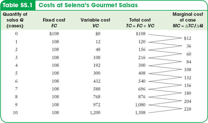
Selena’s Gourmet Salsas produces bottled salsa; Table 55.1 shows how its costs per day depend on the number of cases of salsa it produces per day. The firm has a fixed cost of $108 per day, shown in the second column, which is the daily rental cost of its food-
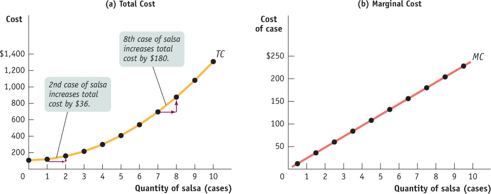
| Figure 55.2 | The Total and Marginal Cost Curves for Selena’s Gourmet Salsas |
The significance of the slope of the total cost curve is shown by the fifth column of Table 55.1, which indicates marginal cost—
or
AP® Exam Tip
Marginal cost is equal to the slope of the total cost curve.

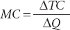
As in the case of marginal product, marginal cost is equal to “rise” (the increase in total cost) divided by “run” (the increase in the quantity of output). So just as marginal product is equal to the slope of the total product curve, marginal cost is equal to the slope of the total cost curve.
Now we can understand why the total cost curve gets steeper as it increases from left to right: as you can see in Table 55.1, marginal cost at Selena’s Gourmet Salsas rises as output increases. And because marginal cost equals the slope of the total cost curve, a higher marginal cost means a steeper slope. Panel (b) of Figure 55.2 shows the marginal cost curve corresponding to the data in Table 55.1. Notice that, as in Figure 53.1, we plot the marginal cost for increasing output from 0 to 1 case of salsa halfway between 0 and 1, the marginal cost for increasing output from 1 to 2 cases of salsa halfway between 1 and 2, and so on.
Why does the marginal cost curve slope upward? Because there are diminishing returns to inputs in this example. As output increases, the marginal product of the variable input declines. This implies that more and more of the variable input must be used to produce each additional unit of output as the amount of output already produced rises. And since each unit of the variable input must be paid for, the additional cost per additional unit of output also rises.
Recall that the flattening of the total product curve is also due to diminishing returns: if the quantities of other inputs are fixed, the marginal product of an input falls as more of that input is used. The flattening of the total product curve as output increases and the steepening of the total cost curve as output increases are just flip-
Average Cost
Average total cost, often referred to simply as average cost, is total cost divided by quantity of output produced.
In addition to total cost and marginal cost, it’s useful to calculate average total cost, often simply called average cost. The average total cost is total cost divided by the quantity of output produced; that is, it is equal to total cost per unit of output. If we let ATC denote average total cost, the equation looks like this:
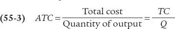
Average total cost is important because it tells the producer how much the average or typical unit of output costs to produce. Marginal cost, meanwhile, tells the producer how much one more unit of output costs to produce. Although they may look very similar, these two measures of cost typically differ. And confusion between them is a major source of error in economics, both in the classroom and in real life. Table 55.2 uses data from Selena’s Gourmet Salsas to calculate average total cost. For example, the total cost of producing 4 cases of salsa is $300, consisting of $108 in fixed cost and $192 in variable cost (from Table 55.1). So the average total cost of producing 4 cases of salsa is $300/4 = $75. You can see from Table 55.2 that as the quantity of output increases, average total cost first falls, then rises.
Table 55.2Average Costs for Selena’s Gourmet Salsas
| Quantity of salsa Q (cases) | Total cost TC | Average total cost of case ATC = TC/Q | Average fixed cost of case AFC = FC/Q | Average variable cost of case AVC = VC/Q |
| 1 | $120 | $120.00 | $108.00 | $12.00 |
| 2 | 156 | 78.00 | 54.00 | 24.00 |
| 3 | 216 | 72.00 | 36.00 | 36.00 |
| 4 | 300 | 75.00 | 27.00 | 48.00 |
| 5 | 408 | 81.60 | 21.60 | 60.00 |
| 6 | 540 | 90.00 | 18.00 | 72.00 |
| 7 | 696 | 99.43 | 15.43 | 84.00 |
| 8 | 876 | 109.50 | 13.50 | 96.00 |
| 9 | 1,080 | 120.00 | 12.00 | 108.00 |
| 10 | 1,308 | 130.80 | 10.80 | 120.00 |
AP® Exam Tip
Be prepared to calculate total, fixed, variable, marginal, and average costs on the AP® Exam.
A U-
Figure 55.3 plots that data to yield the average total cost curve, which shows how average total cost depends on output. As before, cost in dollars is measured on the vertical axis and quantity of output is measured on the horizontal axis. The average total cost curve has a distinctive U shape that corresponds to how average total cost first falls and then rises as output increases. Economists believe that such U-
| Figure 55.3 | The Average Total Cost Curve for Selena’s Gourmet Salsas |
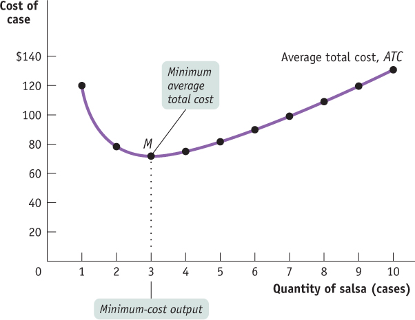
Average fixed cost is the fixed cost per unit of output.
Average variable cost is the variable cost per unit of output.
To help our understanding of why the average total cost curve is U-
Average total cost is the sum of average fixed cost and average variable cost; it has a U shape because these components move in opposite directions as output rises.

Average fixed cost falls as more output is produced because the numerator (the fixed cost) is a fixed number but the denominator (the quantity of output) increases as more is produced. Another way to think about this relationship is that, as more output is produced, the fixed cost is spread over more units of output; the end result is that the fixed cost per unit of output—the average fixed cost—
So increasing output has two opposing effects on average total cost—
The spreading effect. The larger the output, the greater the quantity of output over which fixed cost is spread, leading to lower average fixed cost.
The diminishing returns effect. The larger the output, the greater the amount of variable input required to produce additional units, leading to higher average variable cost.
At low levels of output, the spreading effect is very powerful because even small increases in output cause large reductions in average fixed cost. So at low levels of output, the spreading effect dominates the diminishing returns effect and causes the average total cost curve to slope downward. But when output is large, average fixed cost is already quite small, so increasing output further has only a very small spreading effect. Diminishing returns, however, usually grow increasingly important as output rises. As a result, when output is large, the diminishing returns effect dominates the spreading effect, causing the average total cost curve to slope upward. At the bottom of the U-
AP® Exam Tip
You may be required to draw these cost curves from memory on the AP® Exam. Questions about the relationship between the curves are common.
Figure 55.4 brings together in a single picture the four other cost curves that we have derived from the total cost curve for Selena’s Gourmet Salsas: the marginal cost curve (MC), the average total cost curve (ATC), the average variable cost curve (AVC), and the average fixed cost curve (AFC). All are based on the information in Tables 55.1 and 55.2. As before, cost is measured on the vertical axis and the quantity of output is measured on the horizontal axis.
| Figure 55.4 | The Marginal and Average Cost Curves for Selena’s Gourmet Salsas |
Let’s take a moment to note some features of the various cost curves. First of all, marginal cost slopes upward—
Finally, notice that the marginal cost curve intersects the average total cost curve from below, crossing it at its lowest point, point M in Figure 55.4. This last feature is our next subject of study.
Minimum Average Total Cost
The minimum-
For a U-
In Figure 55.4, the bottom of the U is at the level of output at which the marginal cost curve crosses the average total cost curve from below. Is this an accident? No—
At the minimum-
cost output, average total cost is equal to marginal cost. At output less than the minimum-
cost output, marginal cost is less than average total cost and average total cost is falling. And at output greater than the minimum-
cost output, marginal cost is greater than average total cost and average total cost is rising.
To understand these principles, think about how your grade in one course—
AP® Exam Tip
When drawing cost curves, be sure to have the marginal cost curve intersect the average total cost curve at the lowest point on the average total cost curve.
Similarly, if marginal cost—
| Figure 55.5 | The Relationship Between the Average Total Cost Curve and the Marginal Cost Curve |
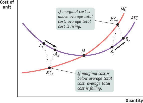
But if your grade in physics is more than the average of your previous grades, this new grade raises your GPA. Similarly, if marginal cost is greater than average total cost, producing that extra unit raises average total cost. This is illustrated by the movement from B1 to B2 in Figure 55.5, where the marginal cost, MCH, is higher than average total cost. So any quantity of output at which marginal cost is greater than average total cost must be on the upward-
Finally, if a new grade is exactly equal to your previous GPA, the additional grade neither raises nor lowers that average—
Does the Marginal Cost Curve Always Slope Upward?
AP® Exam Tip
As is true for the average total cost curve, the marginal cost curve intersects the average variable cost curve at the lowest point on the average variable cost curve.
Up to this point, we have emphasized the importance of diminishing returns, which lead to a marginal product curve that always slopes downward and a marginal cost curve that always slopes upward. In practice, however, economists believe that marginal cost curves often slope downward as a firm increases its production from zero up to some low level, sloping upward only at higher levels of production: marginal cost curves look like the curve labeled MC in Figure 55.6.
| Figure 55.6 | More Realistic Cost Curves |
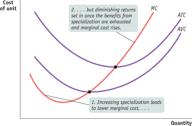
This initial downward slope occurs because a firm often finds that, when it starts with only a very small number of workers, employing more workers and expanding output allows its workers to specialize in various tasks. This, in turn, lowers the firm’s marginal cost as it expands output. For example, one individual producing salsa would have to perform all the tasks involved: selecting and preparing the ingredients, mixing the salsa, bottling and labeling it, packing it into cases, and so on. As more workers are employed, they can divide the tasks, with each worker specializing in one aspect or a few aspects of salsa-
However, as Figure 55.6 also shows, the key features we saw from the example of Selena’s Gourmet Salsas remain true: the average total cost curve is U-
Figure 55.7 shows the relationship between the marginal product of labor curve and the marginal cost curve under the assumptions that labor is the only variable input and the wage rate remains unchanged. The horizontal axis on the top graph measures the quantity of labor; the horizontal axis on the bottom graph measures the quantity of output produced by the quantity of labor shown in the top graph. As marginal product rises to its peak at the dotted line, marginal cost falls, because less and less additional labor is needed to make each additional unit of output. To the right of the dotted line, marginal cost rises as marginal product falls, because more and more additional labor is needed to make each additional unit of output. So marginal product and marginal cost go in opposite directions.
| Figure 55.7 | Links Between Productivity and Cost |
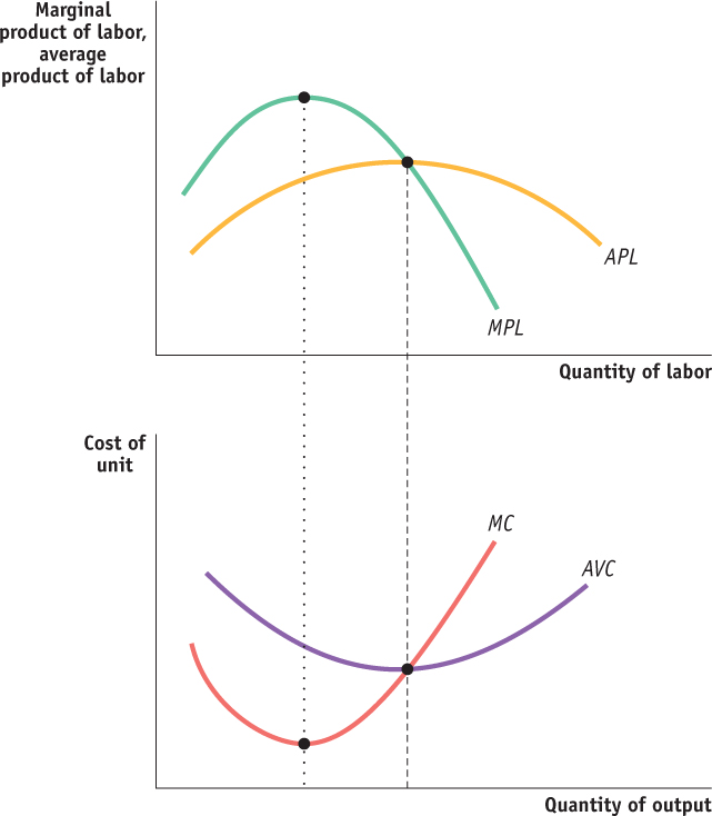
The average product of an input is the total product divided by the quantity of the input.
The average product curve for an input shows the relationship between the average product and the quantity of the input.
The average product of an input is the total product divided by the quantity of the input. For example, if 5 workers produce 75 bushels of wheat, the average product of labor is 75/5 = 15 bushels. The average product curve for labor, labeled APL in Figure 55.7, shows the relationship between the average product of labor and the quantity of labor. With labor as the only variable input and a fixed wage rate, average product and average variable cost go in opposite directions, just like marginal product and marginal cost. To the left of the dashed line in Figure 55.7, the average product is rising and the average variable cost is falling, while to the right of the dashed line, average product is falling and average variable cost is rising.