Tackle the Test: Free-Response Questions
Question
Create a table with two hypothetical prices for a good and two corresponding quantities demanded. Choose the prices and quantities so that they illustrate the law of demand. Using your data, draw a correctly labeled graph showing the demand curve for the good. Using the same graph, illustrate an increase in demand for the good.
Rubric for FRQ 1 (6 points)
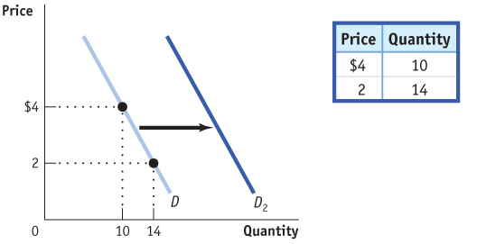
1 point: Table with data labeled “Price” (or “P”) and “Quantity” (or “Q”)
1 point: Values in the table show a negative relationship between P and Q
1 point: Graph with “Price” on the vertical axis and “Quantity” on the horizontal axis
1 point: Negatively sloped curve labeled “Demand” or “D”
1 point: Demand curve correctly plots the data from the table
1 point: A second demand curve (with a label such as D2) shown to the right of the original demand curve
Question
Draw a correctly labeled graph showing the demand for apples. On your graph, illustrate what happens to the demand for apples if a new report from the Surgeon General finds that an apple a day really does keep the doctor away. (3 points)
Rubric for FRQ 2 (3 points)
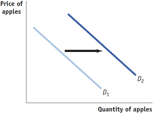
1 point: The vertical axis is labeled “Price” and the horizontal axis is labeled “Quantity.”
1 point: The original demand curve is downwardsloping and labeled.
1 point: The new demand curve is labeled, downward-sloping, and to the right of the original demand curve.