Mapping the Utility Function
Earlier we introduced the concept of a utility function, which determines a consumer’s total utility, given his or her consumption bundle. Here we will extend the analysis by learning how to express total utility as a function of the consumption of two goods. This will deepen our understanding of the trade-
Indifference Curves
Ingrid is a consumer who buys only two goods: housing, measured by the number of rooms in her house or apartment, and restaurant meals. How can we represent her utility function in a way that takes account of her consumption of both goods?
One way is to draw a three-
| Figure D.1 | Ingrid’s Utility Function |
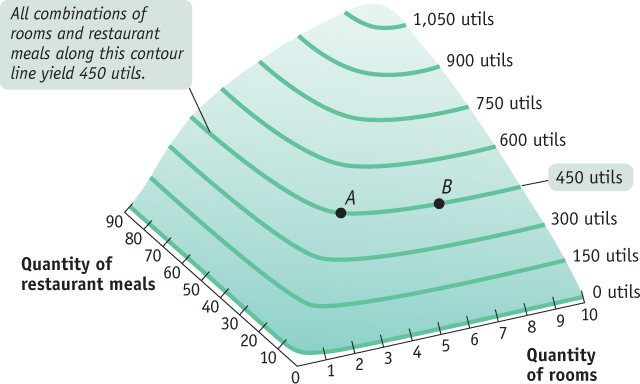
A three-
The same principle can be applied to the representation of a utility function. In Figure D.2, Ingrid’s consumption of rooms is measured on the horizontal axis and her consumption of restaurant meals on the vertical axis. The curve here corresponds to the contour line in Figure D.1, drawn at a total utility of 450 utils. This curve shows all the consumption bundles that yield a total utility of 450 utils As we’ve seen, one point on that contour line is A, a consumption bundle consisting of 3 rooms and 30 restaurant meals. Another point on that contour line is B, a consumption bundle consisting of 6 rooms but only 15 restaurant meals. Because B lies on the same contour line, it yields Ingrid the same total utility—
| Figure D.2 | An Indifference Curve |
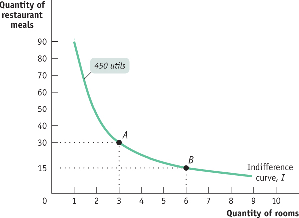
An indifference curve shows all the consumption bundles that yield the same amount of total utility for an individual.
A contour line that represents consumption bundles that give a particular individual the same amount of total utility is known as an indifference curve. An individual is always indifferent between any two bundles that lie on the same indifference curve. For a given consumer, there is an indifference curve corresponding to each possible level of total utility. For example, the indifference curve in Figure D.2 shows consumption bundles that yield Ingrid 450 utils; different indifference curves would show consumption bundles that yield Ingrid 400 utils, 500 utils, and so on.
The entire utility function of an individual can be represented by an indifference curve map—a collection of indifference curves, each of which corresponds to a different total utility level.
A collection of indifference curves that represents a given consumer’s entire utility function, with each indifference curve corresponding to a different level of total utility, is known as an indifference curve map. Figure D.3 shows three indifference curves—
| Figure D.3 | An Indifference Curve MAP |
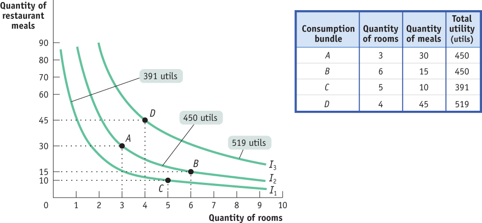
Although Ingrid is indifferent between A and B, she is certainly not indifferent between A and C: as you can see from the table, C generates only 391 utils, fewer than A or B. So Ingrid prefers consumption bundles A and B to bundle C. This is evident from the graph because C is on indifference curve I1, and I1 lies below I2. Bundle D, though, generates 519 utils, more than A and B. So bundle D is on indifference curve I3, which lies above I2. Clearly, Ingrid prefers D to either A or B. And, even more strongly, she prefers D to C.
Are Utils Useful?
Are Utils Useful?
In the table that accompanies Figure D.3, we give the number of utils achieved on each of the indifference curves shown in the figure. But is this information actually needed?
The answer is no. As you will see shortly, the indifference curve map tells us all we need to know in order to find a consumer’s optimal consumption bundle. That is, it’s important that Ingrid has higher total utility along indifference curve I2 than she does along I1, but it doesn’t matter how much higher her total utility is. In other words, we don’t have to measure utils in order to understand how consumers make choices.
Economists say that consumer theory requires an ordinal measure of utility—
So why introduce the concept of utils at all? The answer is that it is much easier to understand the basis of rational choice by using the concept of measurable utility.
Properties of Indifference Curves
No two individuals have the same indifference curve map because no two individuals have the same preferences. But economists believe that, regardless of the person, every indifference curve map has two general properties. These are illustrated in panel (a) of Figure D.4 on the next page.
| Figure D.4 | Properties of Indifference Curves |
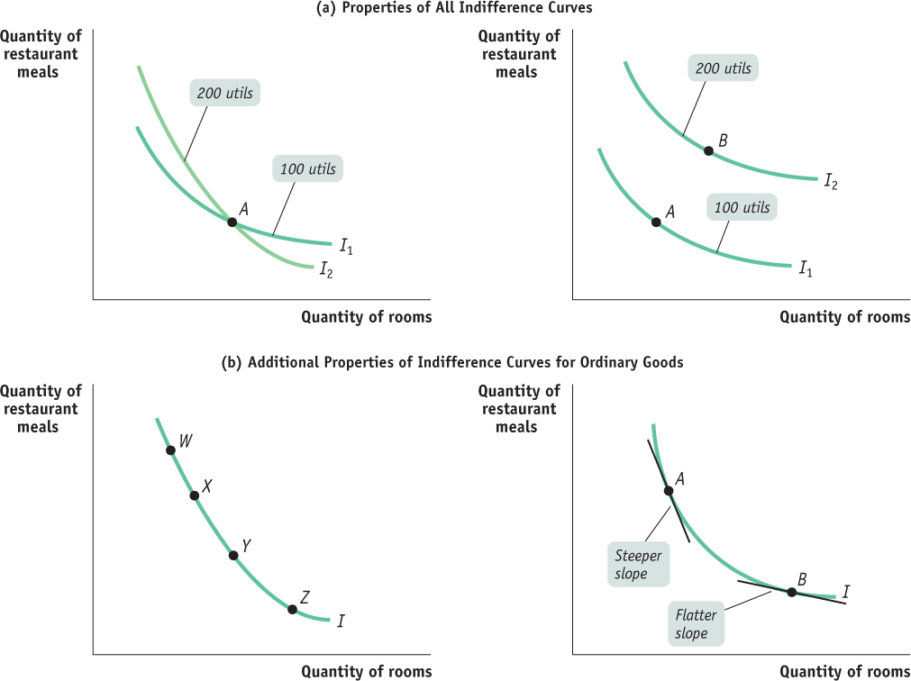
Indifference curves never cross. Suppose that we tried to draw an indifference curve map like the one depicted in the left diagram in panel (a), in which two indifference curves cross at A. What is the total utility at A? Is it 100 utils or 200 utils? Indifference curves cannot cross because each consumption bundle must correspond to one unique total utility level—
not, as shown at A, two different total utility levels. The farther out an indifference curve lies—the farther it is from the origin—
the higher the level of total utility it indicates. The reason, illustrated in the right diagram in panel (a), is that we assume that more is better—we consider only the consumption bundles for which the consumer is not satiated. Bundle B, on the outer indifference curve, contains more of both goods than bundle A on the inner indifference curve. So B, because it generates a higher total utility level (200 utils), lies on a higher indifference curve than A. Furthermore, economists believe that, for most goods, consumers’ indifference curve maps also have two additional properties. They are illustrated in panel (b) of Figure D.4:
Indifference curves slope downward. Here, too, the reason is that more is better. The left diagram in panel (b) shows four consumption bundles on the same indifference curve: W, X, Y, and Z. By definition, these consumption bundles yield the same level of total utility. But as you move along the curve to the right, from W to Z, the quantity of rooms consumed increases. The only way a person can consume more rooms without gaining utility is by giving up some restaurant meals. So the indifference curve must slope downward.
Indifference curves have a convex shape. The right diagram in panel (b) shows that the slope of each indifference curve changes as you move down the curve to the right: the curve gets flatter. If you move up an indifference curve to the left, the curve gets steeper. So the indifference curve is steeper at A than it is at B. When this occurs, we say that an indifference curve has a convex shape—
it is bowed- in toward the origin. This feature arises from diminishing marginal utility, a principle we discussed in Module 51. Recall that when a consumer has diminishing marginal utility, consumption of another unit of a good generates a smaller increase in total utility than the previous unit consumed. Next we will examine in detail how diminishing marginal utility gives rise to convex- shaped indifference curves.
Goods that satisfy all four properties of indifference curve maps are called ordinary goods. The vast majority of goods in any consumer’s utility function fall into this category. In the next section we will define ordinary goods more precisely and see the key role that diminishing marginal utility plays for them.