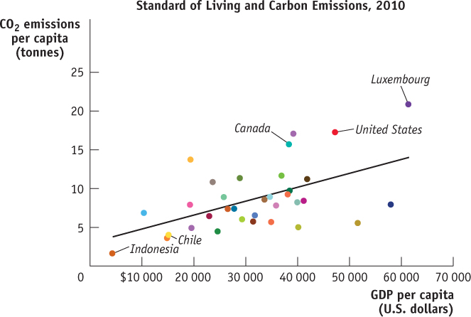
Figure2-15Scatter Diagram In a scatter diagram, each point represents the corresponding values of the x- and y-variables for a given observation. Here, each point indicates the GDP per capita and the amount of carbon emissions per capita for a given country for a sample of 34 countries in a single year. The upward-
Source: OECD Factbook, 2012.
Source: OECD Factbook, 2012.