27-8
Actual and Potential Output from 1990 to 2014
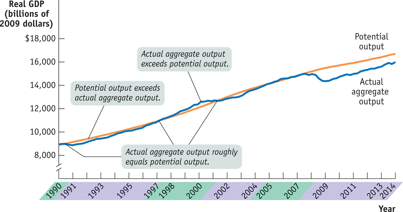
Actual and Potential Output from 1990 to 2014 This figure shows the performance of actual and potential output in the United States from 1990 to 2014. The orange line shows estimates of U.S. potential output, produced by the Congressional Budget Office, and the blue line shows actual aggregate output. The purple- shaded years are periods in which actual aggregate output fell below potential output, and the green- shaded years are periods in which actual aggregate output exceeded potential output. As shown, significant shortfalls occurred in the recessions of the early 1990s and after 2000. Actual aggregate output was significantly above potential output in the boom of the late 1990s, and a huge shortfall occurred after the recession of 2007– 2009. Sources: Congressional Budget Office; Bureau of Economic Analysis.