FIGURE 2A-9 Scatter Diagram
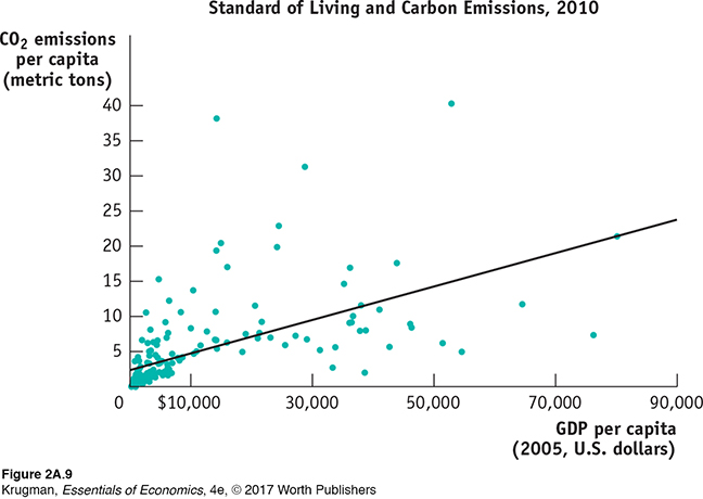
In a scatter diagram, each point represents the corresponding values of the x- and y-variables for a given observation. Here, each point indicates the GDP per capita and the amount of carbon emissions per capita for a given country for a sample of 181 countries. The upward-sloping fitted line here is the best approximation of the general relationship between the two variables.Data from: World Bank.