How Graphs Work
Most graphs in economics are based on a grid built around two perpendicular lines that show the values of two variables, helping you visualize the relationship between them. So a first step in understanding the use of such graphs is to see how this system works.
Two-Variable Graphs
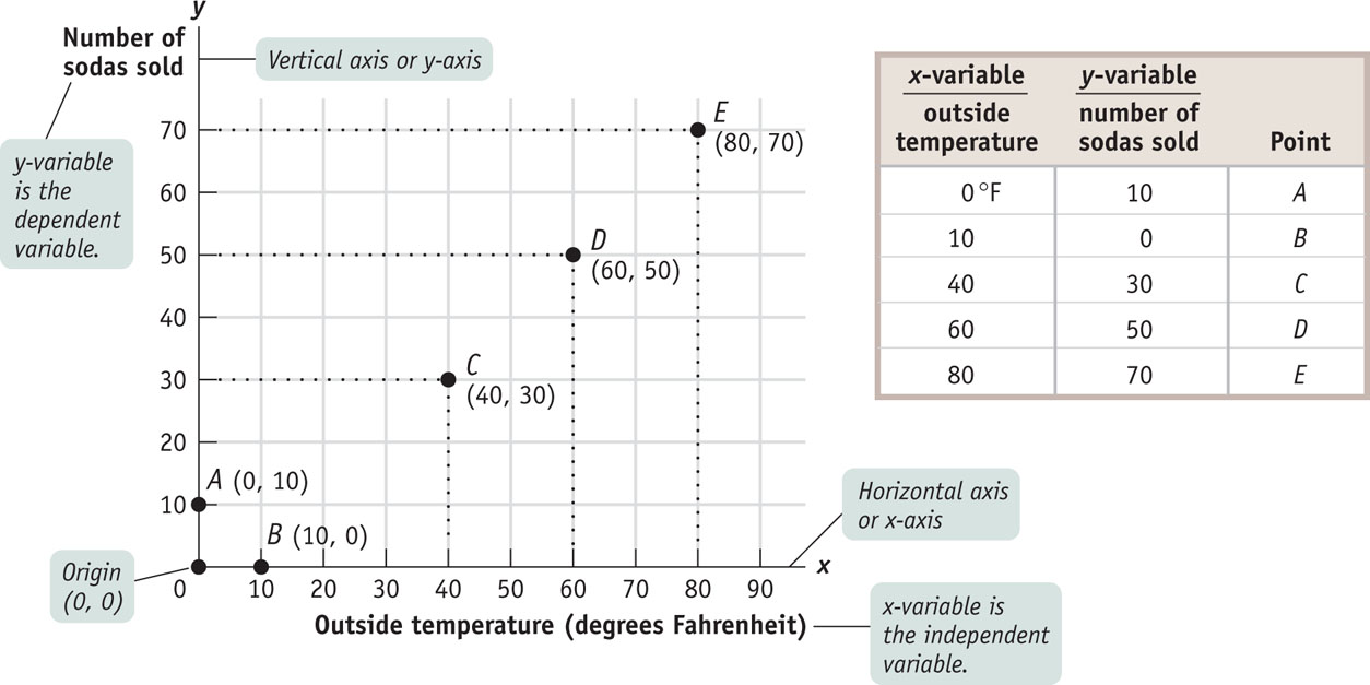
Figure 2A-1 shows a typical two-variable graph. It illustrates the data in the accompanying table on outside temperature and the number of sodas a typical vendor can expect to sell at a baseball stadium during one game. The first column shows the values of outside temperature (the first variable) and the second column shows the values of the number of sodas sold (the second variable). Five combinations or pairs of the two variables are shown, each denoted by A through E in the third column.
FIGURE 2A-1 Plotting Points on a Two-Variable Graph

The line along which values of the x-variable are measured is called the horizontal axis or x-axis. The line along which values of the y-variable are measured is called the vertical axis or y-axis. The point where the axes of a two-variable graph meet is the origin.
Now let’s turn to graphing the data in this table. In any two-variable graph, one variable is called the x-variable and the other is called the y-variable. Here we have made outside temperature the x-variable and number of sodas sold the y-variable. The solid horizontal line in the graph is called the horizontal axis or x-axis, and values of the x-variable—outside temperature—are measured along it. Similarly, the solid vertical line in the graph is called the vertical axis or y-axis, and values of the y-variable—number of sodas sold—are measured along it. At the origin, the point where the two axes meet, each variable is equal to zero. As you move rightward from the origin along the x-axis, values of the x-variable are positive and increasing. As you move up from the origin along the y-axis, values of the y-variable are positive and increasing.
You can plot each of the five points A through E on this graph by using a pair of numbers—the values that the x-variable and the y-variable take on for a given point. In Figure 2A-1, at point C, the x-variable takes on the value 40 and the y-variable takes on the value 30. You plot point C by drawing a line straight up from 40 on the x-axis and a horizontal line across from 30 on the y-axis. We write point C as (40, 30). We write the origin as (0, 0).
Looking at point A and point B in Figure 2A-1, you can see that when one of the variables for a point has a value of zero, it will lie on one of the axes. If the value of the x-variable is zero, the point will lie on the vertical axis, like point A. If the value of the y-variable is zero, the point will lie on the horizontal axis, like point B.
A causal relationship exists between two variables when the value taken by one variable directly influences or determines the value taken by the other variable. In a causal relationship, the determining variable is called the independent variable; the variable it determines is called the dependent variable.
Most graphs that depict relationships between two economic variables represent a causal relationship, a relationship in which the value taken by one variable directly influences or determines the value taken by the other variable. In a causal relationship, the determining variable is called the independent variable; the variable it determines is called the dependent variable. In our example of soda sales, the outside temperature is the independent variable. It directly influences the number of sodas that are sold, the dependent variable in this case.
By convention, we put the independent variable on the horizontal axis and the dependent variable on the vertical axis. Figure 2A-1 is constructed consistent with this convention; the independent variable (outside temperature) is on the horizontal axis and the dependent variable (number of sodas sold) is on the vertical axis. An important exception to this convention is in graphs showing the economic relationship between the price of a product and quantity of the product: although price is generally the independent variable that determines quantity, it is always measured on the vertical axis.
Curves on a Graph
A curve is a line on a graph that depicts a relationship between two variables. It may be either a straight line or a curved line. If the curve is a straight line, the variables have a linear relationship. If the curve is not a straight line, the variables have a nonlinear relationship.
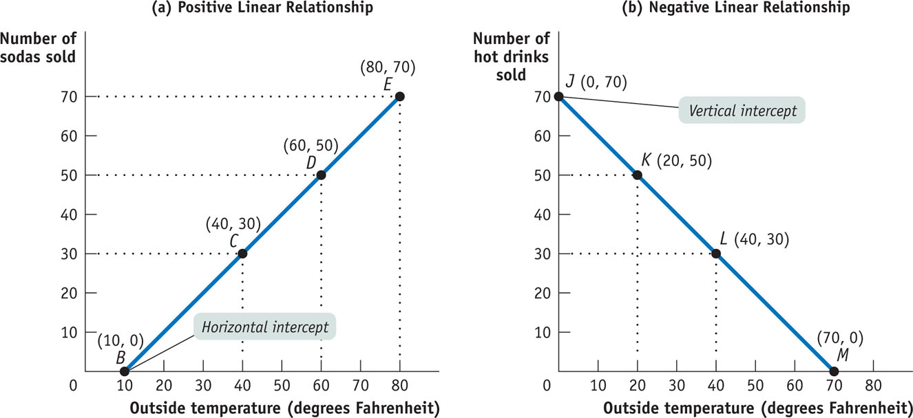
Panel (a) of Figure 2A-2 contains some of the same information as Figure 2A-1, with a line drawn through the points B, C, D, and E. Such a line on a graph is called a curve, regardless of whether it is a straight line or a curved line. If the curve that shows the relationship between two variables is a straight line, or linear, the variables have a linear relationship. When the curve is not a straight line, or nonlinear, the variables have a nonlinear relationship.
FIGURE 2A-2 Drawing Curves

Two variables have a positive relationship when an increase in the value of one variable is associated with an increase in the value of the other variable. It is illustrated by a curve that slopes upward from left to right.
Two variables have a negative relationship when an increase in the value of one variable is associated with a decrease in the value of the other variable. It is illustrated by a curve that slopes downward from left to right.
The horizontal intercept of a curve is the point at which it hits the horizontal axis; it indicates the value of the x-variable when the value of the y-variable is zero.
The vertical intercept of a curve is the point at which it hits the vertical axis; it shows the value of the y-variable when the value of the x-variable is zero.
A point on a curve indicates the value of the y-variable for a specific value of the x-variable. For example, point D indicates that at a temperature of 60°F, a vendor can expect to sell 50 sodas. The shape and orientation of a curve reveal the general nature of the relationship between the two variables. The upward tilt of the curve in panel (a) of Figure 2A-2 means that vendors can expect to sell more sodas at higher outside temperatures.
When variables are related this way—that is, when an increase in one variable is associated with an increase in the other variable—the variables are said to have a positive relationship. It is illustrated by a curve that slopes upward from left to right. Because this curve is also linear, the relationship between outside temperature and number of sodas sold illustrated by the curve in panel (a) of Figure 2A-2 is a positive linear relationship.
When an increase in one variable is associated with a decrease in the other variable, the two variables are said to have a negative relationship. It is illustrated by a curve that slopes downward from left to right, like the curve in panel (b) of Figure 2A-2. Because this curve is also linear, the relationship it depicts is a negative linear relationship. Two variables that might have such a relationship are the outside temperature and the number of hot drinks a vendor can expect to sell at a baseball stadium.
Return for a moment to the curve in panel (a) of Figure 2A-2 and you can see that it hits the horizontal axis at point B. This point, known as the horizontal intercept, shows the value of the x-variable when the value of the y-variable is zero. In panel (b) of Figure 2A-2, the curve hits the vertical axis at point J. This point, called the vertical intercept, indicates the value of the y-variable when the value of the x-variable is zero.