Graphs That Depict Numerical Information
Graphs can also be used as a convenient way to summarize and display data without assuming some underlying causal relationship. Graphs that simply display numerical information are called numerical graphs. Here we will consider four types of numerical graphs: time-
Types of Numerical Graphs
A time-
You have probably seen graphs that show what has happened over time to economic variables such as the unemployment rate or stock prices. A time-
For example, Figure 2A-8 shows real gross domestic product (GDP) per capita—
2A-8
Time-
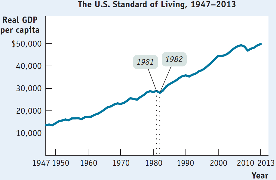
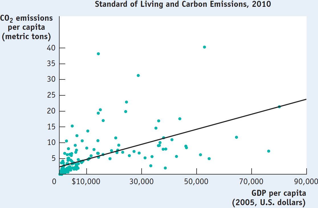
Figure 2A-9 is an example of a different kind of numerical graph. It represents information from a sample of 181 countries on the standard of living, again measured by GDP per capita, and the amount of carbon emissions per capita, a measure of environmental pollution. Each point here indicates an average resident’s standard of living and his or her annual carbon emissions for a given country.
2A-9
Scatter Diagram
A scatter diagram shows points that correspond to actual observations of the x- and y-variables. A curve is usually fitted to the scatter of points.
A pie chart shows how some total is divided among its components, usually expressed in percentages.
The points lying in the upper right of the graph, which show combinations of a high standard of living and high carbon emissions, represent economically advanced countries such as the United States. (The country with the highest carbon emissions, at the top of the graph, is Qatar.) Points lying in the bottom left of the graph, which show combinations of a low standard of living and low carbon emissions, represent economically less advanced countries such as Afghanistan and Sierra Leone.
The pattern of points indicates that there is a positive relationship between living standard and carbon emissions per capita: on the whole, people create more pollution in countries with a higher standard of living.
2A-10
Pie Chart
This type of graph is called a scatter diagram, in which each point corresponds to an actual observation of the x-variable and the y-variable. In scatter diagrams, a curve is typically fitted to the scatter of points; that is, a curve is drawn that approximates as closely as possible the general relationship between the variables. As you can see, the fitted line in Figure 2A-9 is upward sloping, indicating the underlying positive relationship between the two variables. Scatter diagrams are often used to show how a general relationship can be inferred from a set of data.
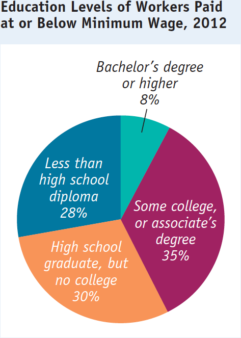
A pie chart shows the share of a total amount that is accounted for by various components, usually expressed in percentages. For example, Figure 2A-10 is a pie chart that depicts the education levels of workers who in 2012 were paid the federal minimum wage or less. As you can see, the majority of workers paid at or below the minimum wage had no college degree. Only 8% of workers who were paid at or below the minimum wage had a bachelor’s degree or higher.
A bar graph uses bars of varying height or length to show the comparative sizes of different observations of a variable.
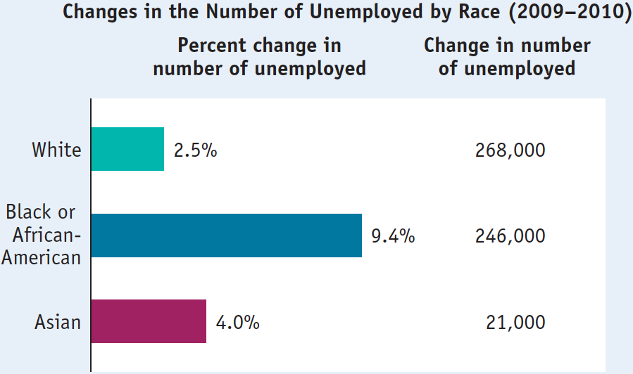
Bar graphs use bars of various heights or lengths to indicate values of a variable. In the bar graph in Figure 2A-11, the bars show the percent change in the number of unemployed workers in the United States from 2009 to 2010, separately for White, Black or African-
2A-11
Bar Graph
Problems in Interpreting Numerical Graphs
Although we’ve explained that graphs are visual images that make ideas or information easier to understand, graphs can be constructed (intentionally or unintentionally) in ways that are misleading and can lead to inaccurate conclusions. This section raises some issues to be aware of when you are interpreting graphs.
Features of Construction Before drawing any conclusions about what a numerical graph implies, pay close attention to the scale, or size of increments, shown on the axes. Small increments tend to visually exaggerate changes in the variables, whereas large increments tend to visually diminish them. So the scale used in construction of a graph can influence your interpretation of the significance of the changes it illustrates—
Take, for example, Figure 2A-12, which shows real GDP per capita in the United States from 1981 to 1982 using increments of $500. You can see that real GDP per capita fell from $28,936 to $27,839. A decrease, sure, but is it as enormous as the scale chosen for the vertical axis makes it seem?
2A-12
Interpreting Graphs: The Effect of Scale
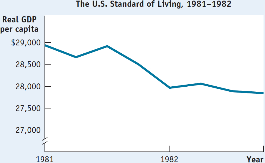
If you go back and reexamine Figure 2A-8, which shows real GDP per capita in the United States from 1947 to 2013, you can see that this would be a misguided conclusion. Figure 2A-8 includes the same data shown in Figure 2A-12, but it is constructed with a scale having increments of $10,000 rather than $500. From it you can see that the fall in real GDP per capita from 1981 to 1982 was, in fact, relatively insignificant.
In fact, the story of real GDP per capita—
An axis is truncated when some of the values on the axis are omitted, usually to save space.
Related to the choice of scale is the use of truncation in constructing a graph. An axis is truncated when part of the range is omitted. This is indicated by two slashes (//) in the axis near the origin. You can see that the vertical axis of Figure 2A-12 has been truncated—
You must also consider exactly what a graph is illustrating. For example, in Figure 2A-11, you should recognize that what is being shown are percent changes in the number of unemployed, not numerical changes. The unemployment rate for Black or African-
In fact, a correct interpretation of Figure 2A-11 shows that the greatest number of newly unemployed workers were White: the total number of unemployed White workers grew by 268,000, which is greater than the increase in the number of unemployed Black or African-
Omitted Variables From a scatter diagram that shows two variables moving either positively or negatively in relation to each other, it is easy to conclude that there is a causal relationship. But relationships between two variables are not always due to direct cause and effect. Quite possibly an observed relationship between two variables is due to the unobserved effect of a third variable on each of the other two variables.
An omitted variable is an unobserved variable that, through its influence on other variables, creates the erroneous appearance of a direct causal relationship among those variables.
An unobserved variable that, through its influence on other variables, creates the erroneous appearance of a direct causal relationship among those variables is called an omitted variable. For example, in New England, a greater amount of snowfall during a given week will typically cause people to buy more snow shovels. It will also cause people to buy more de-
To attribute a causal relationship between these two variables, however, is misguided; more snow shovels sold do not cause more de-
So before assuming that a pattern in a scatter diagram implies a cause-
The error of reverse causality is committed when the true direction of causality between two variables is reversed.
Reverse Causality Even when you are confident that there is no omitted variable and that there is a causal relationship between two variables shown in a numerical graph, you must also be careful that you don’t make the mistake of reverse causality—coming to an erroneous conclusion about which is the dependent and which is the independent variable by reversing the true direction of causality between the two variables.
For example, imagine a scatter diagram that depicts the grade point averages (GPAs) of 20 of your classmates on one axis and the number of hours that each classmate spends studying on the other. A line fitted between the points will probably have a positive slope, showing a positive relationship between GPA and hours of studying. We could reasonably infer that hours spent studying is the independent variable and that GPA is the dependent variable. But you could make the error of reverse causality: you could infer that a high GPA causes a student to study more, whereas a low GPA causes a student to study less.
As you’ve just seen, it is important to understand how graphs can mislead or be interpreted incorrectly. Policy decisions, business decisions, and political arguments are often based on interpretation of the types of numerical graphs we’ve just discussed. Problems of misleading features of construction, omitted variables, and reverse causality can lead to important and undesirable consequences.