The Supply Curve
Some deposits of natural gas are easier to tap than others. Before the widespread use of fracking, drillers would limit their natural gas wells to deposits that lay in easily reached pools beneath the earth. How much natural gas they would tap from existing wells, and how extensively they searched for new deposits and drilled new wells, depended on the price they expected to get for the natural gas. The higher the price they expected, the more they would tap existing wells as well as drill and tap new wells.
The quantity supplied is the actual amount of a good or service people are willing to sell at some specific price.
So just as the quantity of natural gas that consumers want to buy depends upon the price they have to pay, the quantity that producers of natural gas, or of any good or service, are willing to produce and sell—
The Supply Schedule and the Supply Curve
A supply schedule shows how much of a good or service would be supplied at different prices.
The table in Figure 3-6 shows how the quantity of natural gas made available varies with the price—
3-6
The Supply Schedule and the Supply Curve
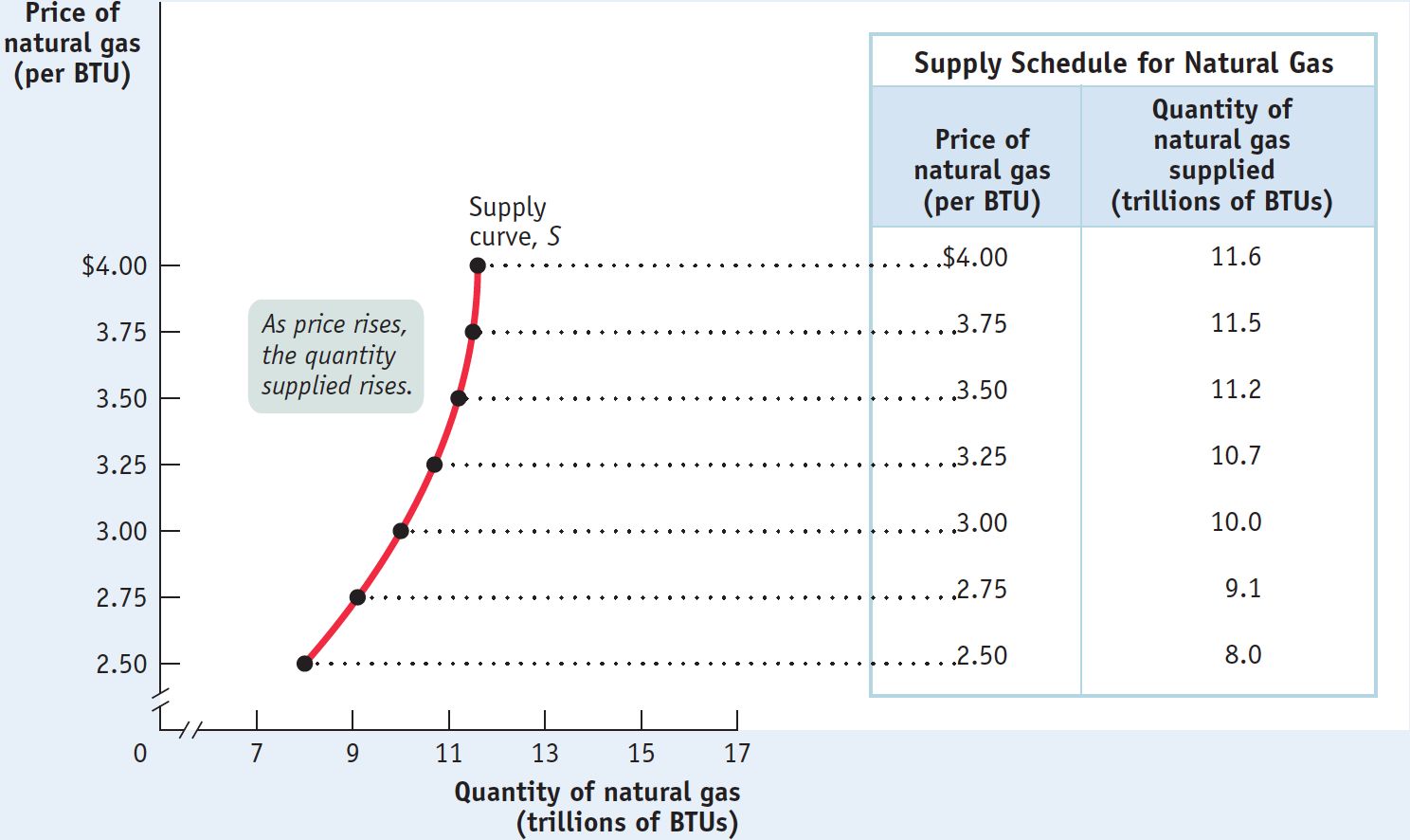
A supply schedule works the same way as the demand schedule shown in Figure 3-1: in this case, the table shows the number of BTUs of natural gas producers are willing to sell at different prices. At a price of $2.50 per BTU, producers are willing to sell only 8 trillion BTUs of natural gas per year. At $2.75 per BTU, they’re willing to sell 9.1 trillion BTUs. At $3, they’re willing to sell 10 trillion BTUs, and so on.
A supply curve shows the relationship between quantity supplied and price.
In the same way that a demand schedule can be represented graphically by a demand curve, a supply schedule can be represented by a supply curve, as shown in Figure 3-6. Each point on the curve represents an entry from the table.
Suppose that the price of natural gas rises from $3 to $3.25; we can see that the quantity of natural gas producers are willing to sell rises from 10 trillion to 10.7 trillion BTUs. This is the normal situation for a supply curve, that a higher price leads to a higher quantity supplied. So just as demand curves normally slope downward, supply curves normally slope upward: the higher the price being offered, the more of any good or service producers will be willing to sell.
Shifts of the Supply Curve
As we described in the opening story, innovations in the technology of drilling natural gas deposits have recently led to a huge increase in U.S. production of natural gas—
3-7
An Increase in Supply
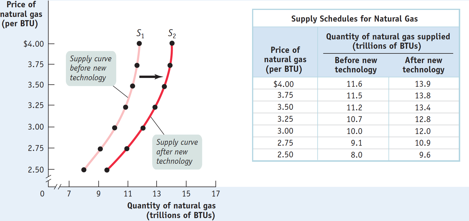
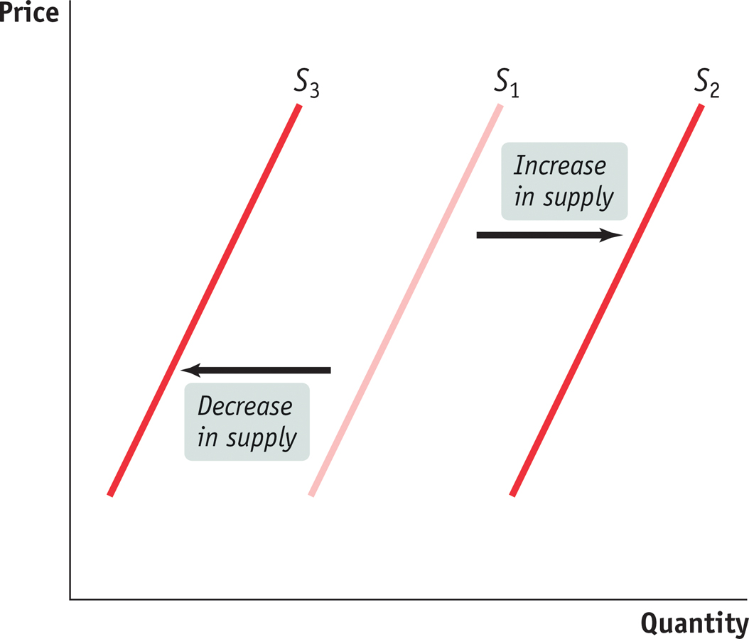
A shift of the supply curve is a change in the quantity supplied of a good or service at any given price. It is represented by the change of the original supply curve to a new position, denoted by a new supply curve.
Just as a change in demand schedules leads to a shift of the demand curve, a change in supply schedules leads to a shift of the supply curve—a change in the quantity supplied at any given price. This is shown in Figure 3-7 by the shift of the supply curve before the adoption of new natural gas–
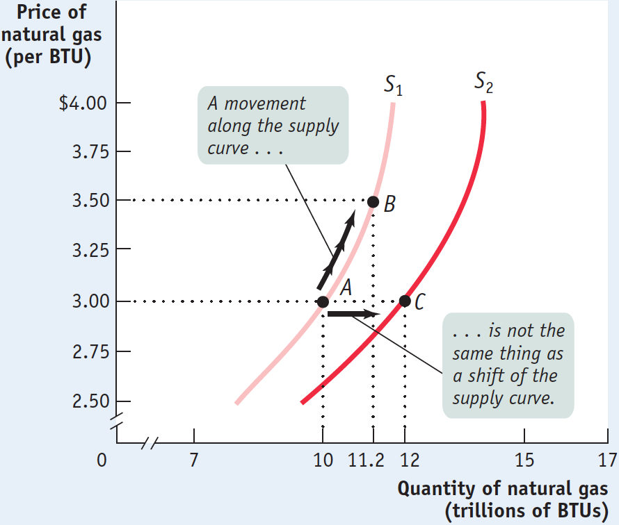
A movement along the supply curve is a change in the quantity supplied of a good arising from a change in the good’s price.
As in the analysis of demand, it’s crucial to draw a distinction between such shifts of the supply curve and movements along the supply curve—changes in the quantity supplied arising from a change in price. We can see this difference in Figure 3-8. The movement from point A to point B is a movement along the supply curve: the quantity supplied rises along S1 due to a rise in price. Here, a rise in price from $3 to $3.50 leads to a rise in the quantity supplied from 10 trillion to 11.2 trillion BTUs of natural gas. But the quantity supplied can also rise when the price is unchanged if there is an increase in supply—
3-8
Movement Along the Supply Curve versus Shift of the Supply Curve
Understanding Shifts of the Supply Curve
Figure 3-9 illustrates the two basic ways in which supply curves can shift. When economists talk about an “increase in supply,” they mean a rightward shift of the supply curve: at any given price, producers supply a larger quantity of the good than before. This is shown in Figure 3-9 by the rightward shift of the original supply curve S1 to S2. And when economists talk about a “decrease in supply,” they mean a leftward shift of the supply curve: at any given price, producers supply a smaller quantity of the good than before. This is represented by the leftward shift of S1 to S3.
3-9
Shifts of the Supply Curve
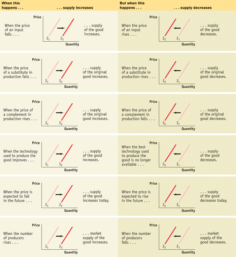
Economists believe that shifts of the supply curve for a good or service are mainly the result of five factors (though, as with demand, there are other possible causes):
Changes in input prices
Changes in the prices of related goods or services
Changes in technology
Changes in expectations
Changes in the number of producers
An input is a good or service that is used to produce another good or service.
Changes in Input Prices To produce output, you need inputs. For example, to make vanilla ice cream, you need vanilla beans, cream, sugar, and so on. An input is any good or service that is used to produce another good or service. Inputs, like outputs, have prices. And an increase in the price of an input makes the production of the final good more costly for those who produce and sell it. So producers are less willing to supply the final good at any given price, and the supply curve shifts to the left. That is, supply decreases. For example, fuel is a major cost for airlines. When oil prices surged in 2007–
Similarly, a fall in the price of an input makes the production of the final good less costly for sellers. They are more willing to supply the good at any given price, and the supply curve shifts to the right. That is, supply increases.
Changes in the Prices of Related Goods or Services A single producer often produces a mix of goods rather than a single product. For example, an oil refinery produces gasoline from crude oil, but it also produces heating oil and other products from the same raw material. When a producer sells several products, the quantity of any one good it is willing to supply at any given price depends on the prices of its other co-
This effect can run in either direction. An oil refiner will supply less gasoline at any given price when the price of heating oil rises, shifting the supply curve for gasoline to the left. But it will supply more gasoline at any given price when the price of heating oil falls, shifting the supply curve for gasoline to the right. This means that gasoline and other co-
In contrast, due to the nature of the production process, other goods can be complements in production. For example, producers of natural gas often find that natural gas wells also produce oil as a by-
Changes in Technology As the opening story illustrates, changes in technology affect the supply curve. Improvements in technology enable producers to spend less on inputs (in this case, drilling equipment, labor, land purchases, and so on), yet still produce the same amount of output. When a better technology becomes available, reducing the cost of production, supply increases and the supply curve shifts to the right.
Improved technology enabled natural gas producers to more than double output in less than two years. Technology is also the main reason that natural gas has remained relatively cheap, even as demand has grown.
Changes in Expectations Just as changes in expectations can shift the demand curve, they can also shift the supply curve. When suppliers have some choice about when they put their good up for sale, changes in the expected future price of the good can lead a supplier to supply less or more of the good today.
For example, consider the fact that gasoline and other oil products are often stored for significant periods of time at oil refineries before being sold to consumers. In fact, storage is normally part of producers’ business strategy. Knowing that the demand for gasoline peaks in the summer, oil refiners normally store some of their gasoline produced during the spring for summer sale. Similarly, knowing that the demand for heating oil peaks in the winter, they normally store some of their heating oil produced during the fall for winter sale.
In each case, there’s a decision to be made between selling the product now versus storing it for later sale. Which choice a producer makes depends on a comparison of the current price versus the expected future price. This example illustrates how changes in expectations can alter supply: an increase in the anticipated future price of a good or service reduces supply today, a leftward shift of the supply curve. But a fall in the anticipated future price increases supply today, a rightward shift of the supply curve.
An individual supply curve illustrates the relationship between quantity supplied and price for an individual producer.
Changes in the Number of Producers Just as changes in the number of consumers affect the demand curve, changes in the number of producers affect the supply curve. Let’s examine the individual supply curve, by looking at panel (a) in Figure 3-10. The individual supply curve shows the relationship between quantity supplied and price for an individual producer. For example, suppose that Louisiana Drillers is a natural gas producer and that panel (a) of Figure 3-10 shows the quantity of BTUs it will supply per year at any given price. Then SLouisiana is its individual supply curve.
3-10
The Individual Supply Curve and the Market Supply Curve
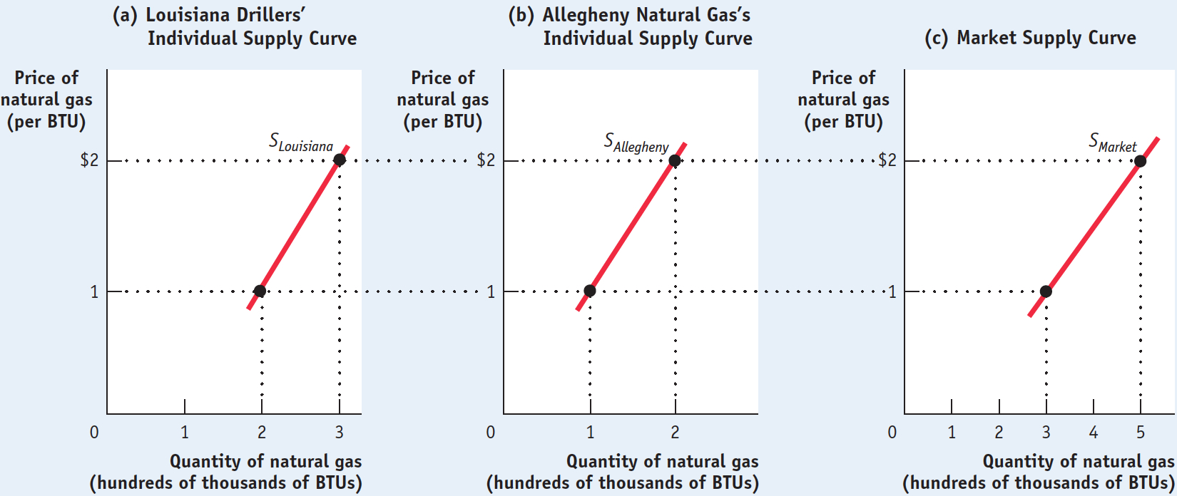
The market supply curve shows how the combined total quantity supplied by all individual producers in the market depends on the market price of that good. Just as the market demand curve is the horizontal sum of the individual demand curves of all consumers, the market supply curve is the horizontal sum of the individual supply curves of all producers. Assume for a moment that there are only two natural gas producers, Louisiana Drillers and Allegheny Natural Gas. Allegheny’s individual supply curve is shown in panel (b). Panel (c) shows the market supply curve. At any given price, the quantity supplied to the market is the sum of the quantities supplied by Louisiana Drillers and Allegheny Natural Gas. For example at a price of around $2 per BTU, Louisiana Drillers supplies 200,000 BTUs and Allegheny Natural Gas supplies 100,000 BTUs per year, making the quantity supplied to the market 300,000 BTUs.
Clearly, the quantity supplied to the market at any given price is larger when Allegheny Natural Gas is also a producer than it would be if Louisiana Drillers were the only supplier. The quantity supplied at a given price would be even larger if we added a third producer, then a fourth, and so on. So an increase in the number of producers leads to an increase in supply and a rightward shift of the supply curve.
For a review of the factors that shift supply, see Table 3-2.
3-2
Factors That Shift Supply
!worldview! ECONOMICS in Action: Only Creatures Small and Pampered
Only Creatures Small and Pampered
Back in the 1970s, British television featured a popular show titled All Creatures Great and Small. It chronicled the real life of James Herriot, a country veterinarian who tended to cows, pigs, sheep, horses, and the occasional house pet, often under arduous conditions, in rural England during the 1930s. The show made it clear that in those days the local vet was a critical member of farming communities, saving valuable farm animals and helping farmers survive financially. And it was also clear that Mr. Herriot considered his life’s work well spent.

But that was then and this is now. According to an article in the New York Times, the United States has experienced a severe decline in the number of farm veterinarians over the past 25 years. The source of the problem is competition. As the number of household pets has increased and the incomes of pet owners have grown, the demand for pet veterinarians has increased sharply. As a result, vets are being drawn away from the business of caring for farm animals into the more lucrative business of caring for pets. As one vet stated, she began her career caring for farm animals but changed her mind after “doing a C-
How can we translate this into supply and demand curves? Farm veterinary services and pet veterinary services are like gasoline and fuel oil: they’re related goods that are substitutes in production. A veterinarian typically specializes in one type of practice or the other, and that decision often depends on the going price for the service. America’s growing pet population, combined with the increased willingness of doting owners to spend on their companions’ care, has driven up the price of pet veterinary services. As a result, fewer and fewer veterinarians have gone into farm animal practice. So the supply curve of farm veterinarians has shifted leftward—
In the end, farmers understand that it is all a matter of dollars and cents; they get fewer veterinarians because they are unwilling to pay more. As one farmer, who had recently lost an expensive cow due to the unavailability of a veterinarian, stated, “The fact that there’s nothing you can do, you accept it as a business expense now. You didn’t used to. If you have livestock, sooner or later you’re going to have deadstock.” (Although we should note that this farmer could have chosen to pay more for a vet who would have then saved his cow.)
Quick Review
The supply schedule shows how the quantity supplied depends on the price. The supply curve illustrates this relationship.
Supply curves are normally upward sloping: at a higher price, producers are willing to supply more of a good or service.
A change in price results in a movement along the supply curve and a change in the quantity supplied.
Increases or decreases in supply lead to shifts of the supply curve. An increase in supply is a rightward shift: the quantity supplied rises for any given price. A decrease in supply is a leftward shift: the quantity supplied falls for any given price.
The five main factors that can shift the supply curve are changes in (1) input prices, (2) prices of related goods or services, (3) technology, (4) expectations, and (5) number of producers.
The market supply curve is the horizontal sum of the individual supply curves of all producers in the market.
3-2
Question 3.2
Explain whether each of the following events represents (i) a shift of the supply curve or (ii) a movement along the supply curve.
More homeowners put their houses up for sale during a real estate boom that causes house prices to rise.
The quantity of houses supplied rises as a result of an increase in prices. This is a movement along the supply curve.Many strawberry farmers open temporary roadside stands during harvest season, even though prices are usually low at that time.
The quantity of strawberries supplied is higher at any given price. This is a rightward shift of the supply curve.Immediately after the school year begins, fast-
food chains must raise wages, which represent the price of labor, to attract workers. The quantity of labor supplied is lower at any given wage. This is a leftward shift of the supply curve compared to the supply curve during school vacation. So, in order to attract workers, fast-food chains have to offer higher wages.Many construction workers temporarily move to areas that have suffered hurricane damage, lured by higher wages.
The quantity of labor supplied rises in response to a rise in wages. This is a movement along the supply curve.Since new technologies have made it possible to build larger cruise ships (which are cheaper to run per passenger), Caribbean cruise lines offer more cabins, at lower prices, than before.
The quantity of cabins supplied is higher at any given price. This is a rightward shift of the supply curve.
Solutions appear at back of book.