1.2 5Supply and Equilibrium
WHAT YOU WILL LEARN
 What the supply curve is
 The difference between movements along the supply curve and changes in supply
 The factors that shift the supply curve
 How supply and demand curves determine a markets equilibrium price and equilibrium quantity
 In the case of a shortage or surplus, how price moves the market back to equilibrium
The Supply Curve
Some parts of the world are especially well suited to growing cotton, and the United States is one of those. But even in the United States, some land is better suited to growing cotton than other land. Whether American farmers restrict their cotton-
The quantity supplied is the actual amount of a good or service people are willing to sell at some specific price.
So just as the quantity of cotton that consumers want to buy depends on the price they have to pay, the quantity that producers are willing to produce and sell—
The Supply Schedule and the Supply Curve
A supply schedule shows how much of a good or service would be supplied at different prices.
The table in Figure 5-1 shows how the quantity of cotton made available varies with the price—
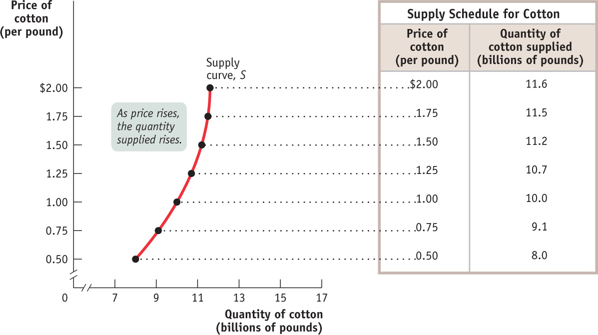
A supply schedule works the same way as the demand schedule shown in Figure 4-1: in this case, the table shows the number of pounds of cotton farmers are willing to sell at different prices. At a price of $0.50 per pound, farmers are willing to sell only 8 billion pounds of cotton per year. At $0.75 per pound, they’re willing to sell 9.1 billion pounds. At $1, they’re willing to sell 10 billion pounds, and so on.
A supply curve shows the relationship between quantity supplied and price.
In the same way that a demand schedule can be represented graphically by a demand curve, a supply schedule can be represented by a supply curve, as shown in Figure 5-1. Each point on the curve represents an entry from the table.
The law of supply is the general proposition that, all else constant, a higher price leads to higher quantity supplied, and a lower price leads to lower quantity supplied.
Suppose that the price of cotton rises from $1 to $1.25; we can see that the quantity of cotton farmers are willing to sell rises from 10 billion to 10.7 billion pounds. This is the normal situation for a supply curve, reflecting the general proposition that a higher price leads to a higher quantity supplied. Some economists refer to this relationship as the law of supply.
Shifts of the Supply Curve
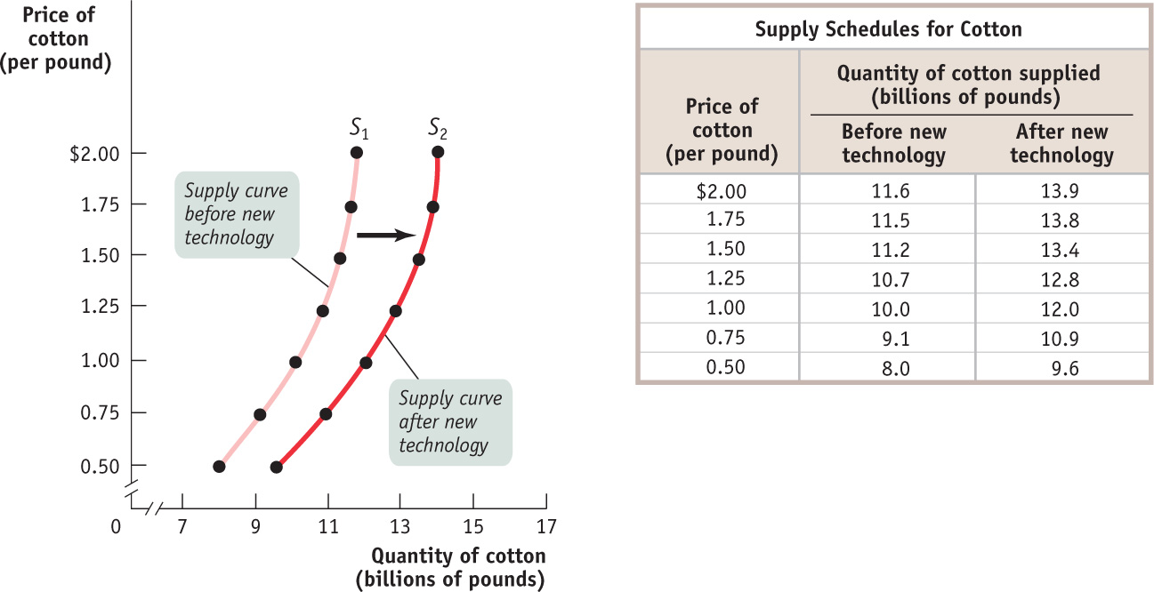
Until recently, cotton remained relatively cheap for several decades. One reason is that the amount of land cultivated for cotton expanded by more than 35% from 1945 to 2007. However, the major factor accounting for cotton’s relative cheapness was advances in the production technology, with output per acre more than quadrupling from 1945 to 2007. Figure 5-2 illustrates these events in terms of the supply schedule and the supply curve for cotton.
A change in supply is a shift of the supply curve, which changes the quantity supplied at any given price.
The table in Figure 5-2 shows two supply schedules. The schedule before improved cotton-
A movement along the supply curve is a change in the quantity supplied of a good arising from a change in the good’s price.
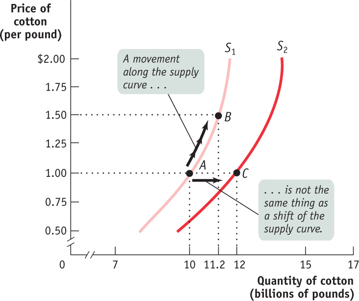
As in the analysis of demand, it’s crucial to draw a distinction between such shifts of the supply curve and movements along the supply curve—changes in the quantity supplied arising from a change in price. We can see this difference in Figure 5-3. The movement from point A to point B is a movement along the supply curve: the quantity supplied rises along S1 due to a rise in price. Here, a rise in price from $1 to $1.50 leads to a rise in the quantity supplied from 10 billion to 11.2 billion pounds of cotton. But the quantity supplied can also rise when the price is unchanged if there is an increase in supply—
Understanding Shifts of the Supply Curve
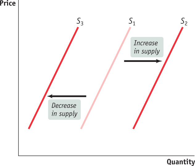
Figure 5-4 illustrates the two basic ways in which supply curves can shift. When economists talk about an “increase in supply,” they mean a rightward shift of the supply curve: at any given price, producers supply a larger quantity of the good than before. This is shown in Figure 5-4 by the rightward shift of the original supply curve S1 to S2. And when economists talk about a “decrease in supply,” they mean a leftward shift of the supply curve: at any given price, producers supply a smaller quantity of the good than before. This is represented by the leftward shift of S1 to S3.
Economists believe that shifts of the supply curve for a good or service are mainly the result of five factors (though, as in the case of demand, there are other possible causes):
- Changes in input prices
- Changes in the prices of related goods or services
- Changes in technology
- Changes in expectations
- Changes in the number of producers
An input is a good or service that is used to produce another good or service.
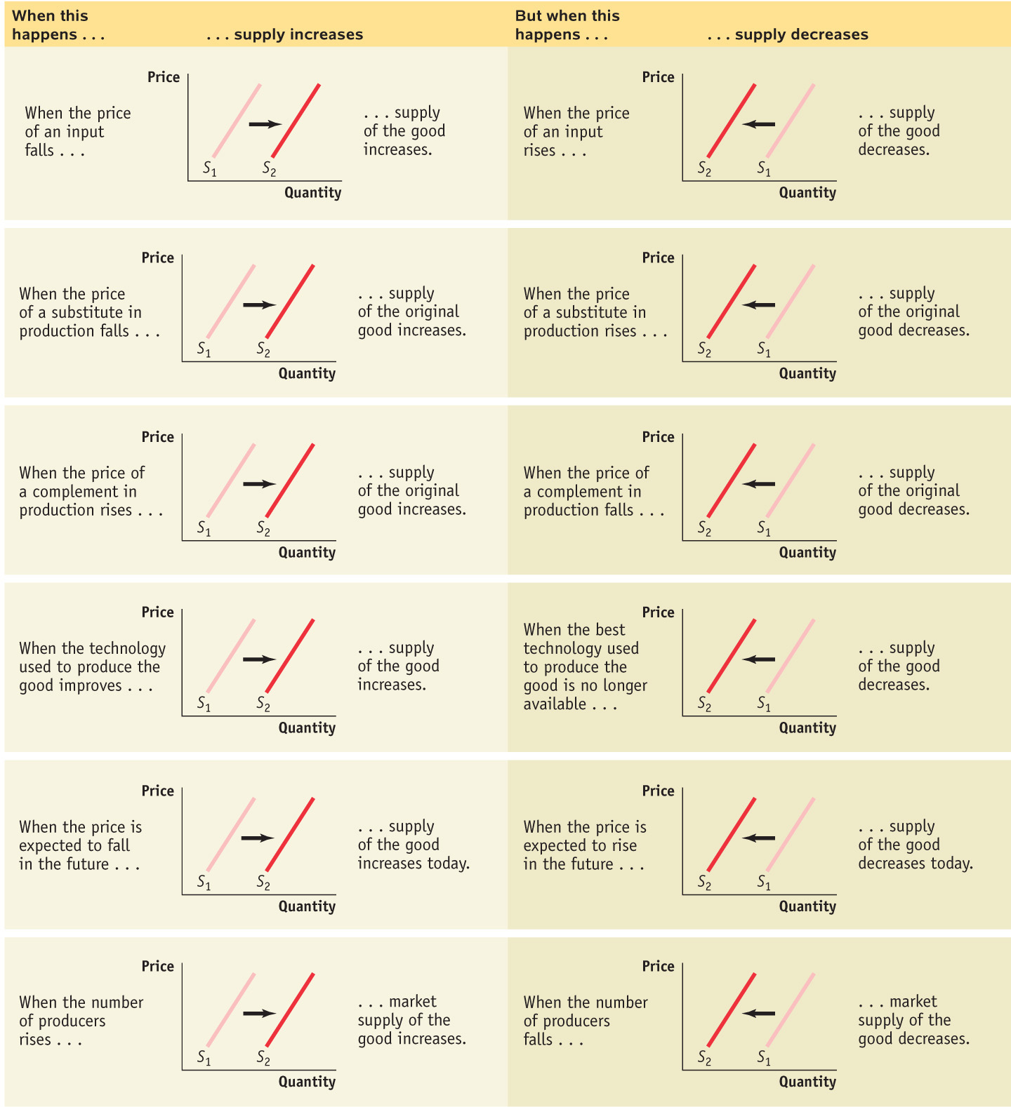
Changes in Input PricesTo produce output, you need inputs. For example, to make vanilla ice cream, you need vanilla beans, cream, sugar, and so on. An input is any good or service that is used to produce another good or service. Inputs, like outputs, have prices. And an increase in the price of an input makes the production of the final good more costly for those who produce and sell it. So producers are less willing to supply the final good at any given price, and the supply curve shifts to the left. For example, fuel is a major cost for airlines. When oil prices surged in 2007–
Changes in the Prices of Related Goods or ServicesA single producer often produces a mix of goods rather than a single product. For example, an oil refinery produces gasoline from crude oil, but it also produces heating oil and other products from the same raw material. When a producer sells several products, the quantity of any one good it is willing to supply at any given price depends on the prices of its other co-
This effect can run in either direction. An oil refiner will supply less gasoline at any given price when the market price of heating oil rises, shifting the supply curve for gasoline to the left. But it will supply more gasoline at any given price when the market price of heating oil falls, shifting the supply curve for gasoline to the right. This means that gasoline and other co-

In contrast, due to the nature of the production process, other goods can be complements in production. For example, producers of crude oil—
Changes in TechnologyWhen economists talk about “technology,” they don’t necessarily mean high tech—
Improvements in technology enable producers to sell more of their product at the same price. When a better technology becomes available, reducing the cost of production, supply increases, and the supply curve shifts to the right. Improved technology enabled farmers to more than quadruple cotton output per acre planted over the past several decades. Improved technology is also the main reason that, until recently, cotton remained relatively cheap even as worldwide demand grew.
Changes in ExpectationsJust as changes in expectations can shift the demand curve, they can also shift the supply curve. When suppliers have some choice about when they put their good up for sale, changes in the expected future price of the good can lead a supplier to supply less or more of the good today.
For example, consider the fact that gasoline and other oil products are often stored for significant periods of time at oil refineries before being sold to consumers. In fact, storage is usually part of producers’ business strategy. Knowing that the demand for gasoline peaks in the summer, oil refiners usually store some of their gasoline produced during the spring for summer sale. Similarly, knowing that the demand for heating oil peaks in the winter, they usually store some of their heating oil produced during the fall for winter sale. In each case, there’s a decision to be made between selling the product now versus storing it for later sale. Which choice a producer makes depends on a comparison of the current price versus the expected future price. This example illustrates how changes in expectations can alter supply: an increase in the anticipated future price of a good or service reduces supply today, a leftward shift of the supply curve. But a fall in the anticipated future price increases supply today, a rightward shift of the supply curve.
An individual supply curve illustrates the relationship between quantity supplied and price for an individual producer.
Changes in the Number of ProducersJust as changes in the number of consumers affect the demand curve, changes in the number of producers affect the supply curve. Let’s examine the individual supply curve, which shows the relationship between quantity supplied and price for an individual producer. For example, suppose that Mr. Silva is a Brazilian cotton farmer and that panel (a) of Figure 5-5 shows how many pounds of cotton he will supply per year at any given price. Then SSilva is his individual supply curve.
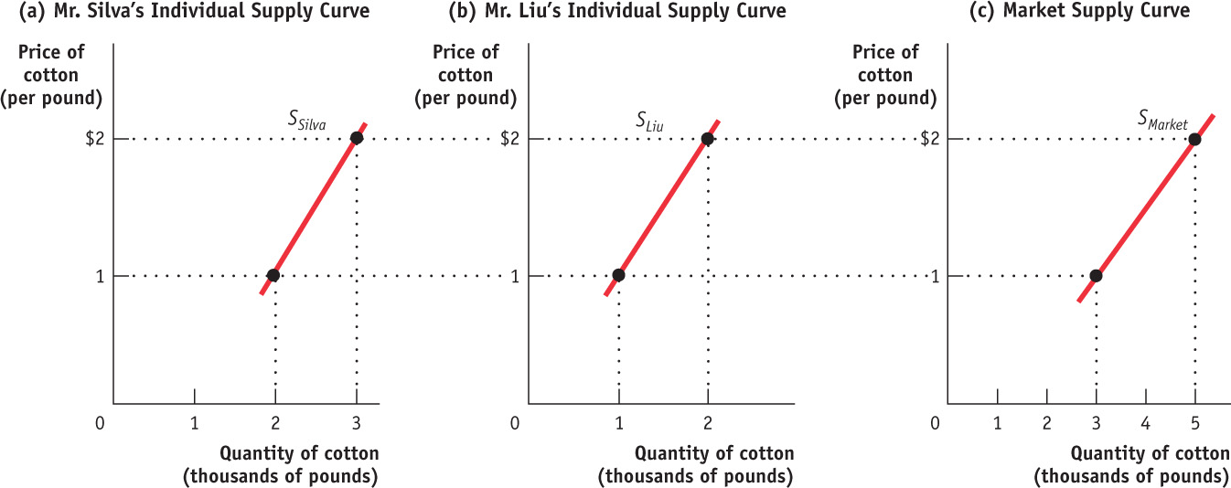
The market supply curve shows how the combined total quantity supplied by all individual producers in the market depends on the market price of that good. Just as the market demand curve is the horizontal sum of the individual demand curves of all consumers, the market supply curve is the horizontal sum of the individual supply curves of all producers.
Assume for a moment that there are only two producers of cotton, Mr. Silva and Mr. Liu, a Chinese cotton farmer. Mr. Liu’s individual supply curve is shown in panel (b). Panel (c) shows the market supply curve. At any given price, the quantity supplied to the market is the sum of the quantities supplied by Mr. Silva and Mr. Liu. For example, at a price of $2 per pound, Mr. Silva supplies 3,000 pounds of cotton per year and Mr. Liu supplies 2,000 pounds per year, making the quantity supplied to the market 5,000 pounds.
Clearly, the quantity supplied to the market at any given price is larger with Mr. Liu present than it would be if Mr. Silva were the only supplier. The quantity supplied at a given price would be even larger if we added a third producer, then a fourth, and so on. So an increase in the number of producers leads to an increase in supply and a rightward shift of the supply curve.
For a review of the factors that shift supply, see Table 5-1.
5-1
Factors That Shift Supply
ONLY CREATURES SMALL AND PAMPERED
During the 1970s, British television featured a popular show titled All Creatures Great and Small. It chronicled the real life of James Herriot, a country veterinarian who tended to cows, pigs, sheep, horses, and the occasional house pet, often under arduous conditions, in rural England during the 1930s. The show made it clear that in those days the local vet was a critical member of farming communities, saving valuable farm animals and helping farmers survive financially. And it was also clear that Mr. Herriot considered his life’s work well spent.
But that was then and this is now. According to a recent article in the New York Times, the United States has experienced a severe decline in the number of farm veterinarians over the past two decades. The source of the problem is competition. As the number of household pets has increased and the incomes of pet owners have grown, the demand for pet veterinarians has increased sharply. As a result, vets are being drawn away from the business of caring for farm animals into the more lucrative business of caring for pets. As one vet stated, she began her career caring for farm animals but changed her mind after “doing a C-

How can we translate this into supply and demand curves? Farm veterinary services and pet veterinary services are like gasoline and fuel oil: they’re related goods that are substitutes in production. A veterinarian typically specializes in one type of practice or the other, and that decision often depends on the going price for the service. America’s growing pet population, combined with the increased willingness of doting owners to spend on their companions’ care, has driven up the price of pet veterinary services. As a result, fewer and fewer veterinarians have gone into farm animal practice. So the supply curve of farm veterinarians has shifted leftward—
In the end, farmers understand that it is all a matter of dollars and cents; they get fewer veterinarians because they are unwilling to pay more. As one farmer, who had recently lost an expensive cow due to the unavailability of a veterinarian, stated, “The fact that there’s nothing you can do, you accept it as a business expense now. You didn’t used to. If you have livestock, sooner or later you’re going to have deadstock.” (Although we should note that this farmer could have chosen to pay more for a vet who would have then saved his cow.)
Supply, Demand, and Equilibrium
We have now covered the first three key elements in the supply and demand model: the demand curve, the supply curve, and the set of factors that shift each curve. The next step is to put these elements together to show how they can be used to predict the actual price at which the good is bought and sold, as well as the actual quantity transacted.
An economic situation is in equilibrium when no individual would be better off doing something different.
In competitive markets this interaction of supply and demand tends to move toward what economists call equilibrium. Imagine a busy afternoon at your local supermarket; there are long lines at the checkout counters. Then one of the previously closed registers opens. The first thing that happens is a rush to the newly opened register. But soon enough things settle down and shoppers have rearranged themselves so that the line at the newly opened register is about as long as all the others. This situation—
The concept of equilibrium helps us understand the price at which a good or service is bought and sold as well as the quantity transacted of the good or service. A competitive market is in equilibrium when the price has moved to a level at which the quantity of a good demanded equals the quantity of that good supplied. At that price, no individual seller could make herself better off by offering to sell either more or less of the good and no individual buyer could make himself better off by offering to buy more or less of the good. Think of shoppers at the supermarket who cannot make themselves better off (cannot save time) by changing lines. Similarly, at the market equilibrium, the price has moved to a level that exactly matches the quantity demanded by consumers to the quantity supplied by sellers.
A competitive market is in equilibrium when price has moved to a level at which the quantity demanded of a good equals the quantity supplied of that good. The price at which this takes place is the equilibrium price, also referred to as the market-
The price that matches the quantity supplied and the quantity demanded is the equilibrium price; the quantity bought and sold at that price is the equilibrium quantity. The equilibrium price is also known as the market-
Finding the Equilibrium Price and Quantity
The easiest way to determine the equilibrium price and quantity in a market is by putting the supply curve and the demand curve on the same diagram. Since the supply curve shows the quantity supplied at any given price and the demand curve shows the quantity demanded at any given price, the price at which the two curves cross is the equilibrium price: the price at which quantity supplied equals quantity demanded.
Figure 5-6 combines the demand curve from Figure 4-1 and the supply curve from Figure 5-1. They intersect at point E, which is the equilibrium of this market; $1 is the equilibrium price and 10 billion pounds is the equilibrium quantity.
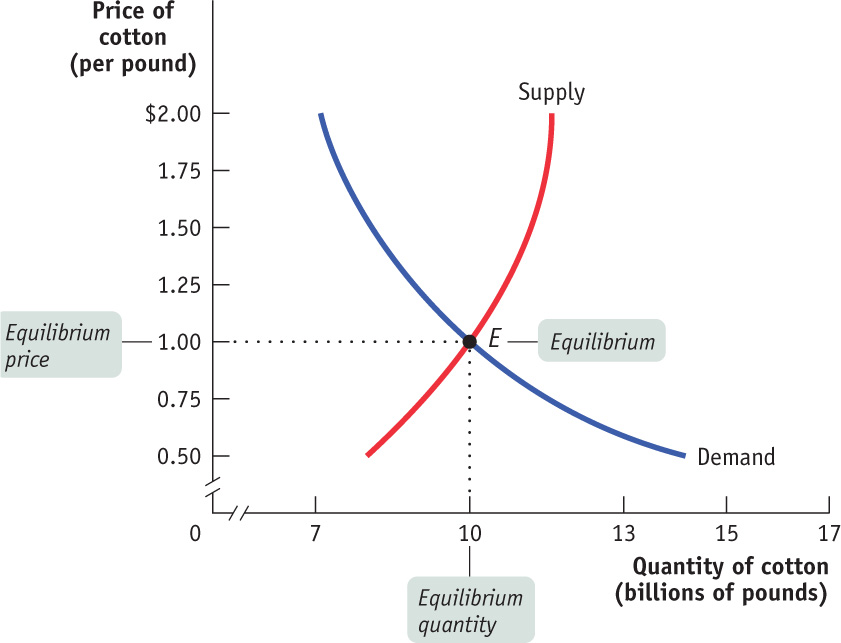
Let’s confirm that point E fits our definition of equilibrium. At a price of $1 per pound, cotton farmers are willing to sell 10 billion pounds a year and cotton consumers want to buy 10 billion pounds a year. So at the price of $1 a pound, the quantity of cotton supplied equals the quantity demanded. Notice that at any other price the market would not clear: every willing buyer would not be able to find a willing seller, or vice versa. More specifically, if the price were more than $1, the quantity supplied would exceed the quantity demanded; if the price were less than $1, the quantity demanded would exceed the quantity supplied.
The model of supply and demand, then, predicts that given the demand and supply curves shown in Figure 5-6, 10 billion pounds of cotton would change hands at a price of $1 per pound. But how can we be sure that the market will arrive at the equilibrium price? We begin by answering three simple questions:
- Why do all sales and purchases in a market take place at the same price?
- Why does the market price fall if it is above the equilibrium price?
- Why does the market price rise if it is below the equilibrium price?
Why Do All Sales and Purchases in a Market Take Place at the Same Price?
There are some markets where the same good can sell for many different prices, depending on who is selling or who is buying. For example, have you ever bought a souvenir in a “tourist trap” and then seen the same item on sale somewhere else (perhaps even in the shop next door) for a lower price? Because tourists don’t know which shops offer the best deals and don’t have time for comparison shopping, sellers in tourist areas can charge different prices for the same good.
But in any market where the buyers and sellers have both been around for some time, sales and purchases tend to converge at a generally uniform price, so we can safely talk about the market price. It’s easy to see why. Suppose a seller offered a potential buyer a price noticeably above what the buyer knew other people to be paying. The buyer would clearly be better off shopping elsewhere—
Why Does the Market Price Fall if It Is Above the Equilibrium Price?
Suppose the supply and demand curves are as shown in Figure 5-6 but the market price is above the equilibrium level of $1—
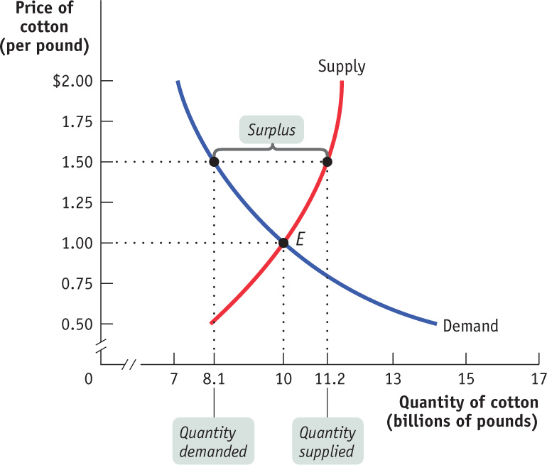
There is a surplus of a good or service when the quantity supplied exceeds the quantity demanded. Surpluses occur when the price is above its equilibrium level.
As the figure shows, at a price of $1.50 there would be more pounds of cotton available than consumers wanted to buy: 11.2 billion pounds versus 8.1 billion pounds. The difference of 3.1 billion pounds is the surplus—also known as the excess supply—of cotton at $1.50.
This surplus means that some cotton farmers are frustrated: at the current price, they cannot find consumers who want to buy their cotton. The surplus offers an incentive for those frustrated would-
Why Does the Market Price Rise if It Is Below the Equilibrium Price?
Now suppose the price is below its equilibrium level—
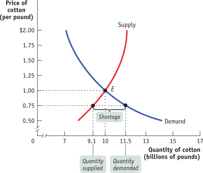
There is a shortage of a good or service when the quantity demanded exceeds the quantity supplied. Shortages occur when the price is below its equilibrium level.
When there is a shortage, there are frustrated would-
Using Equilibrium to Describe Markets
We have now seen that a market tends to have a single price, the equilibrium price. If the market price is above the equilibrium level, the ensuing surplus leads buyers and sellers to take actions that lower the price. And if the market price is below the equilibrium level, the ensuing shortage leads buyers and sellers to take actions that raise the price. So the market price always moves toward the equilibrium price, the price at which there is neither surplus nor shortage.
5
Solutions appear at the back of the book.
Check Your Understanding
Explain whether each of the following events represents (i) a change in supply or (ii) a movement along the supply curve.
-
a. During a real estate boom that causes house prices to rise, more homeowners put their houses up for sale.
The quantity of houses supplied rises as a result of an increase in prices. This is a movement along the supply curve. -
b. Many strawberry farmers open temporary roadside stands during harvest season, even though prices are usually low at that time.
The quantity of strawberries supplied is higher at any given price. This is an increase in supply, which shifts the supply curve to the right. -
c. Immediately after the school year begins, fewer young people are available to work. Fast-
food chains must raise wages, which represent the price of labor, to attract workers. The quantity of labor supplied is lower at any given wage. This is a decrease in supply, which shifts the supply curve leftward compared to the supply curve during school vacation. So, in order to attract workers, fast-food chains have to offer higher wages. -
d. Many construction workers temporarily move to areas that have suffered hurricane damage, lured by higher wages.
The quantity of labor supplied rises in response to a rise in wages. This is a movement along the supply curve. -
e. Since new technologies have made it possible to build larger cruise ships (which are cheaper to run per passenger), Caribbean cruise lines have offered more cabins, at lower prices, than before.
The quantity of cabins supplied is higher at any given price. This is an increase in supply, which shifts the supply curve to the right.
-
In the following three situations, the market is initially in equilibrium. After each event described below, does a surplus or shortage exist at the original equilibrium price? What will happen to the equilibrium price as a result?
-
a. In 2013 there was a bumper crop of wine grapes.
This is an increase in supply, so the supply curve shifts rightward. At the original equilibrium price of the year before, the quantity of grapes supplied exceeds the quantity demanded, and the result is a surplus. The price of grapes will fall. -
b. After a hurricane, Florida hoteliers often find that many people cancel their upcoming vacations, leaving them with empty hotel rooms.
This is a decrease in demand, so the demand curve shifts leftward. At the original equilibrium price, the quantity of hotel rooms supplied exceeds the quantity demanded. The result is a surplus. The rates for hotel rooms will fall. -
c. After a heavy snowfall, many people want to buy second-
hand snowblowers at the local tool shop. Demand increases, so the demand curve for second-hand snowblowers shifts rightward. At the original equilibrium price, the quantity of second-hand snowblowers demanded exceeds the quantity supplied. This is a case of shortage. The equilibrium price of second-hand snowblowers will rise.
-
Multiple-
Question
Which of the following will decrease the supply of good “X”?
A. B. C. D. E. Question
An increase in the demand for steak will lead to an increase in which of the following?
A. B. C. D. E. Question
A technological advance in textbook production will lead to which of the following?
A. B. C. D. E. Question
Which of the following is true at equilibrium?
A. B. C. D. E. Question
The market price of a good will tend to rise if
A. B. C. D. E.
Critical-
Draw a correctly labeled graph showing the market for oranges in equilibrium. Show on your graph how a hurricane that destroys large numbers of orange groves in Florida will affect supply and demand, if at all.

SUPPLY VERSUS QUANTITY SUPPLIED
 Where does the writer of this statement go wrong? Economists generally agree that when demand decreases, the price falls. But a fall in price leads to a decrease in supply that, in turn, causes the price to rise again.
 THE WRITER CONFUSES A SHIFT OF THE SUPPLY CURVE (A DECREASE IN SUPPLY) AND A MOVEMENT ALONG THE SUPPLY CURVE (A CHANGE IN THE QUANTITY SUPPLIED). While economists agree that a decrease in demand leads to a fall in price, the fall in price leads only to a movement along the supply curve, not a shift of the supply curve. So that part of the statement is false. Always be careful to distinguish between a shift of the supply curve and a movement along the supply curve. A corrected statement would read:
Economists generally agree that when there is a decrease in demand, the price falls. And when the price falls, this leads to a decrease in the quantity supplied. It’s as simple as that!
To learn more, see Figure 5-3, which illustrates a movement along the supply curve versus a shift of the supply curve.
