Chapter Introduction
A-
Whether you’re reading about economics in the news or in your economics textbook, you will see many graphs. Visual presentations can make it easier to understand verbal descriptions, numerical information, or ideas. In economics, graphs are used to facilitate understanding. But to get the full benefit from these visual aids, you need to know how to interpret them. This appendix explains how graphs are constructed, interpreted, and used in economics.
Graphs, Variables, and Economic Models
A quantity that can take on more than one value is called a variable.
If you were reading an article about the relationship between educational attainment and income, you would probably see a graph showing the income levels for workers with different levels of education. This graph would depict the idea that, in general, having more education increases a person’s income. This graph, like most graphs in economics, would depict the relationship between two economic variables. A variable is a quantity that can take on more than one value, such as the number of years of education a person has, the price of a can of soda, or a household’s income.
Earlier we discussed how economic analysis relies heavily on models, simplified descriptions of real situations. Most economic models describe the relationship between two variables, simplified by holding constant other variables that may affect the relationship. For example, an economic model might describe the relationship between the price of a can of soda and the number of cans of soda that consumers will buy, assuming that everything else that affects consumers’ purchases of soda stays constant. This type of model can be described mathematically or verbally, but illustrating the relationship in a graph makes it easier to understand. Next we show how graphs that depict economic models are constructed and interpreted.
How Graphs Work
Most graphs in economics are based on a grid built around two perpendicular lines that show the values of two variables, helping you visualize the relationship between them. So a first step in understanding the use of such graphs is to see how this system works.
Two-Variable Graphs
Figure A-1 shows a typical two-
FIGUREA-1Plotting Points on a Two-Variable Graph

Now let’s turn to graphing the data in this table. In any two-
The solid horizontal line in the graph is called the horizontal axis or x-axis, and values of the x-variable—
The line along which values of the x-
A-
You can plot each of the five points A through E on this graph by using a pair of numbers—
Looking at point A and point B in Figure A-1, you can see that when one of the variables for a point has a value of zero, it will lie on one of the axes. If the value of the x-variable is zero, the point will lie on the vertical axis, like point A. If the value of the y-variable is zero, the point will lie on the horizontal axis, like point B.
A causal relationship exists between two variables when the value taken by one variable directly influences or determines the value taken by the other variable. In a causal relationship, the determining variable is called the independent variable; the variable it determines is called the dependent variable.
Most graphs that depict relationships between two economic variables represent a causal relationship, a relationship in which the value taken by one variable directly influences or determines the value taken by the other variable. In a causal relationship, the determining variable is called the independent variable; the variable it determines is called the dependent variable. In our example of soda sales, the outside temperature is the independent variable. It directly influences the number of sodas that are sold, which is the dependent variable in this case.
By convention, we put the independent variable on the horizontal axis and the dependent variable on the vertical axis. Figure A-1 follows this convention: the independent variable (outside temperature) is on the horizontal axis and the dependent variable (number of sodas sold) is on the vertical axis.
An important exception to this convention is in graphs showing the economic relationship between the price of a product and quantity of the product: although price is generally the independent variable that determines quantity, it is always measured on the vertical axis.
A-
Curves on a Graph
A curve is a line on a graph that depicts a relationship between two variables. It may be either a straight line or a curved line. If the curve is a straight line, the variables have a linear relationship. If the curve is not a straight line, the variables have a nonlinear relationship.
Panel (a) of Figure A-2 contains some of the same information as Figure A-1, with a line drawn through the points B, C, D, and E. Such a line on a graph is called a curve, regardless of whether it is a straight line or a curved line. If the curve that shows the relationship between two variables is a straight line, or linear, the variables have a linear relationship. When the curve is not a straight line, or nonlinear, the variables have a nonlinear relationship.
FIGUREA-2Drawing Curves

A point on a curve indicates the value of the y-variable for a specific value of the x-variable. For example, point D indicates that at a temperature of 60°F, a vendor can expect to sell 50 sodas. The shape and orientation of a curve reveal the general nature of the relationship between the two variables. The upward tilt of the curve in panel (a) of Figure A-2 suggests that vendors can expect to sell more sodas at higher outside temperatures.
Two variables have a positive relationship when an increase in the value of one variable is associated with an increase in the value of the other variable. It is illustrated by a curve that slopes upward from left to right.
When variables are related in this way—
Two variables have a negative relationship when an increase in the value of one variable is associated with a decrease in the value of the other variable. It is illustrated by a curve that slopes downward from left to right.
When an increase in one variable is associated with a decrease in the other variable, the two variables are said to have a negative relationship. It is illustrated by a curve that slopes downward from left to right, like the curve in panel (b) of Figure A-2. Because this curve is also linear, the relationship it depicts is a negative linear relationship. Two variables that might have such a relationship are the outside temperature and the number of hot drinks a vendor can expect to sell at a baseball stadium.
A-
The horizontal intercept of a curve is the point at which it hits the horizontal axis; it indicates the value of the x-variable when the value of the y-variable is zero.
The vertical intercept of a curve is the point at which it hits the vertical axis; it shows the value of the y-variable when the value of the x-variable is zero. The slope of a line or curve is a measure of how steep it is.
Return for a moment to the curve in panel (a) of Figure A-2, and you can see that it hits the horizontal axis at point B. This point, known as the horizontal intercept, shows the value of the x-variable when the value of the y-variable is zero. In panel (b) of Figure A-2, the curve hits the vertical axis at point J. This point, called the vertical intercept, indicates the value of the y-variable when the value of the x-variable is zero.
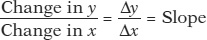
A Key Concept: The Slope of a Curve
The slope of a line is measured by “rise over run”—the change in the y-variable between two points on the line divided by the change in the x-variable between those same two points.
The slope of a curve is a measure of how steep it is; the slope indicates how sensitive the y-variable is to a change in the x-variable. In our example of outside temperature and the number of cans of soda a vendor can expect to sell, the slope of the curve would indicate how many more cans of soda the vendor could expect to sell with each 1° increase in temperature. Interpreted this way, the slope gives meaningful information.
Even without numbers for x and y, it is possible to arrive at important conclusions about the relationship between the two variables by examining the slope of a curve at various points.
The Slope of a Linear Curve
Along a linear curve the slope, or steepness, is measured by dividing the “rise” between two points on the curve by the “run” between those same two points. The rise is the amount that y changes, and the run is the amount that x changes. Here is the formula:
In the formula, the symbol Δ (the Greek uppercase delta) stands for “change in.” When a variable increases, the change in that variable is positive; when a variable decreases, the change in that variable is negative.
The slope of a curve is positive when the rise (the change in the y-variable) has the same sign as the run (the change in the x-variable). That’s because when two numbers have the same sign, the ratio of those two numbers is positive.
The curve in panel (a) of Figure A-2 has a positive slope: along the curve, both the y-variable and the x-variable increase. The slope of a curve is negative when the rise and the run have different signs. That’s because when two numbers have different signs, the ratio of those two numbers is negative. The curve in panel (b) of Figure A-2 has a negative slope: along the curve, an increase in the x-variable is associated with a decrease in the y-variable.
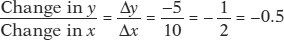
Figure A-3 illustrates how to calculate the slope of a linear curve. Let’s focus first on panel (a). From point A to point B the value of the y-variable changes from 25 to 20 and the value of the x-variable changes from 10 to 20. So the slope of the line between these two points is
FIGUREA-3Calculating the Slope

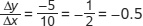 , where the negative sign indicates that the curve is downward sloping. In panel (b), the curve has a slope from A to B of
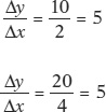
  . The slope from C to D is
  . The slope is positive, indicating that the curve is upward sloping. Furthermore, the slope between A and B is the same as the slope between C and D, making this a linear curve. The slope of a linear curve is constant: it is the same regardless of where it is calculated along the curve.
Because a straight line is equally steep at all points, the slope of a straight line is the same at all points. In other words, a straight line has a constant slope. You can check this by calculating the slope of the linear curve between points A and B and between points C and D in panel (b) of Figure A-3.
A-
Horizontal and Vertical Curves and Their Slopes
When a curve is horizontal, the value of y along that curve never changes—
If a curve is vertical, the value of x along the curve never changes—
A vertical or a horizontal curve has a special implication: it means that the x-variable and the y-variable are unrelated. Two variables are unrelated when a change in one variable (the independent variable) has no effect on the other variable (the dependent variable). To put it a slightly different way, two variables are unrelated when the dependent variable is constant regardless of the value of the independent variable. If, as is usual, the y-variable is the dependent variable, the curve is horizontal. If the dependent variable is the x-variable, the curve is vertical.
The Slope of a Nonlinear Curve
A nonlinear curve is one in which the slope is not the same between every pair of points.
A nonlinear curve is one in which the slope changes as you move along it. Panels (a), (b), (c), and (d) of Figure A-4 show various nonlinear curves. Panels (a) and (b) show nonlinear curves whose slopes change as you follow the line’s progression, but the slopes always remain positive.
FIGUREA-4Nonlinear Curves

 , and from C to D it is
  . The slope is positive and increasing; it gets steeper as it moves to the right. In panel (b) the slope of the curve from A to B is
  , and from C to D it is
 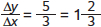 . The slope is positive and decreasing; it gets flatter as it moves to the right. In panel (c) the slope from A to B is
 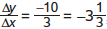 , and from C to D it is
 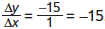 . The slope is negative and increasing; it gets steeper as it moves to the right. And in panel (d) the slope from A to B is
  = −20, and from C to D it is
  . The slope is negative and decreasing; it gets flatter as it moves to the right.
The slope in each case has been calculated by using the arc method—that is, by drawing a straight line connecting two points along a curve. The average slope between those two points is equal to the slope of the straight line between those two points.
Although both curves tilt upward, the curve in panel (a) gets steeper as the line moves from left to right in contrast to the curve in panel (b), which gets flatter. A curve that is upward sloping and gets steeper, as in panel (a), is said to have positive increasing slope. A curve that is upward sloping but gets flatter, as in panel (b), is said to have positive decreasing slope.
A-
When we calculate the slope along these nonlinear curves, we obtain different values for the slope at different points. How the slope changes along the curve determines the curve’s shape. For example, in panel (a) of Figure A-4, the slope of the curve is a positive number that steadily increases as the line moves from left to right, whereas in panel (b), the slope is a positive number that steadily decreases.
A-
The absolute value of a negative number is the value of the negative number without the minus sign.
Absolute ValueThe slopes of the curves in panels (c) and (d) are negative numbers. Economists often prefer to express a negative number as its absolute value, which is the value of the negative number without the minus sign.
In general, we denote the absolute value of a number by two parallel bars around the number; for example, the absolute value of −4 is written as |−4| = 4. In panel (c), the absolute value of the slope steadily increases as the line moves from left to right. The curve therefore has negative increasing slope. And in panel (d), the absolute value of the slope of the curve steadily decreases along the curve. This curve therefore has negative decreasing slope.
Maximum and Minimum Points
The slope of a nonlinear curve can change from positive to negative or vice versa. When the slope of a curve changes from positive to negative, it creates what is called a maximum point of the curve. When the slope of a curve changes from negative to positive, it creates a minimum point.
A nonlinear curve may have a maximum point, the highest point along the curve. At the maximum, the slope of the curve changes from positive to negative.
Panel (a) of Figure A-5 illustrates a curve in which the slope changes from positive to negative as the line moves from left to right. When x is between 0 and 50, the slope of the curve is positive. At x equal to 50, the curve attains its highest point—
FIGUREA-5Maximum and Minimum Points

Panel (b) shows a curve with a minimum point, the point at which the slope changes from negative to positive.
A nonlinear curve may have a minimum point, the lowest point along the curve. At the minimum, the slope of the curve changes from negative to positive.
In contrast, the curve shown in panel (b) of Figure A-5 is U-
A-
Calculating the Area Below or Above a Curve
Sometimes it is useful to be able to measure the size of the area below or above a curve. To keep things simple, we’ll only calculate the area below or above a linear curve.
How large is the shaded area below the linear curve in panel (a) of Figure A-6? First, note that this area has the shape of a right triangle. A right triangle is a triangle in which two adjacent sides form a 90° angle. We will refer to one of these sides as the height of the triangle and the other side as the base of the triangle. For our purposes, it doesn’t matter which of these two sides we refer to as the base and which as the height.
FIGUREA-6Calculating the Area Below and Above a Linear Curve

Calculating the area of a right triangle is straightforward: multiply the height of the triangle by the base of the triangle, and divide the result by 2. The height of the triangle in panel (a) of Figure A-6 is 10 − 4 = 6. And the base of the triangle is 3 − 0 = 3. So the area of that triangle is

How about the shaded area above the linear curve in panel (b) of Figure A-6? We can use the same formula to calculate the area of this right triangle. The height of the triangle is 8 − 2 = 6. And the base of the triangle is 4 − 0 = 4. So the area of that triangle is

Graphs That Depict Numerical Information
Graphs are also used as a convenient way to summarize and display data without assuming some underlying causal relationship. Graphs that simply display numerical information are called numerical graphs.
A-
Here we will consider the four most widely used types of numerical graphs: time-
A time-
Time-
FIGUREA-7Time-Series Graph

A scatter diagram shows points that correspond to actual observations of the x- and y-variables. A curve is usually fitted to the scatter of points.
Scatter DiagramFigure A-8 is an example of a different kind of numerical graph. It represents information from a sample of 184 countries on the standard of living, measured by GDP per capita, and the amount of carbon emissions per capita, a measure of environmental pollution. This type of graph is a scatter diagram. In these graphs, each point corresponds to an actual observation of the x-variable and the y-variable. Typically, a curve is fitted to the scatter of points; that is, a curve is drawn to approximate, as closely as possible, the general relationship between the variables. Each point in Figure A-8 indicates an average resident’s standard of living and his or her annual carbon emissions for a given country.
FIGUREA-8Scatter Diagram

The points lying in the upper right of the graph, which show combinations of a high standard of living and high carbon emissions, represent economically advanced countries such as the United States. (The country with the highest carbon emissions, at the top of the graph, is Qatar.) Points lying in the bottom left of the graph, which show combinations of a low standard of living and low carbon emissions, represent economically less advanced countries such as Afghanistan and Sierra Leone.
The pattern of points indicates that there is a positive relationship between living standard and carbon emissions per capita: on the whole, people create more pollution in countries with a higher standard of living. As you can see, the fitted line in Figure A-8 is upward sloping, indicating the underlying positive relationship between the two variables.
A-
Scatter diagrams are often used to show how a general relationship can be inferred from a set of data.
A pie chart shows how some total is divided among its components, usually expressed in percentages.
Pie ChartA pie chart shows the share of a total amount that is accounted for by various components, usually expressed in percentages. Figure A-9 is a pie chart that depicts the education levels of workers who in 2009 were paid the federal minimum wage or less. As you can see, the majority of workers paid at or below the minimum wage had no college degree. Only 8% of workers who were paid at or below the minimum wage had a bachelor’s degree or higher.
FIGUREA-9Pie Chart

A bar graph uses bars of varying height or length to show the comparative sizes of different observations of a variable.
Bar GraphA graph that uses bars of various heights or lengths to indicate values of a variable is a bar graph. In the bar graph in Figure A-10, the bars show the percent change in the number of unemployed workers in the United States from 2009 to 2010, separately for White, Black or African-
FIGUREA-10Bar Graph
