Close Reading a Visual Text
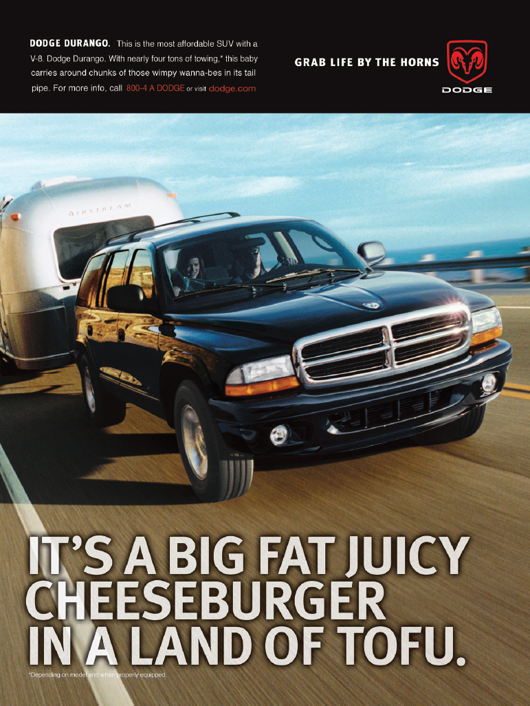
Many of the same tools of rhetorical analysis and close reading that we have practiced on written texts are also useful for detecting how visual texts convey their messages. These tools work whether the visual texts are advertisements, photos, fine art, or political cartoons. Let’s start by looking at an ad for the Dodge Durango.

The rhetorical triangle still applies: what are the relationships among the text’s subject (a powerful sport utility vehicle), its audience (the potential SUV buyer), and the speaker (in this case, Dodge and the advertising agency it hired to create the ad)? The advertisement appeals to ethos in the text at the top left: it banks on associations to Dodge cars and trucks—power, dependability, toughness. Its appeals to pathos play on preconceptions about food: a cheeseburger is real food, tofu is somehow fake; cheeseburgers are what you want to eat, tofu is what you’re supposed to eat; a big powerful truck is what you really want, a small fuel-efficient car is what you are supposed to have. As for logos, the Durango is affordable; it makes sense to own one. Why not enjoy life, drive an affordable SUV, and eat big juicy cheeseburgers?
When we analyze a visual text, we still look at the words, both individually and in the way they are placed on the page. Look at the text at the top left part of the ad.
Dodge Durango. This is the most affordable SUV with a V-8. Dodge Durango. With nearly four tons of towing, this baby carries around chunks of those wimpy wanna-bes in its tail pipe.
Note the aggressive tone. How is that aggressiveness created? It may be the repetition of “Dodge Durango” with its hard consonant sounds; it may be the prepositional phrase announcing that the vehicle can tow four tons. It’s a “baby” that carries “chunks” of its competitors in its tailpipe. The use of the colloquialism “baby” contrasts nicely with the image of the car as a predator eating the competition. The owner of a Dodge Durango will be the kind of person whose car is his or her “baby” and who is the leader of the pack, not one “of those wimpy wanna-bes.” The Dodge logo—a ram’s head—and slogan “grab life by the horns” appear at the top right of the ad. Both the image and the words play with the connotations of horns: strength, masculinity, and noise. The imperative sentence is a call to action that can be paraphrased as “Don’t be a wimp! Enjoy life now!” Finally, the text at the bottom of the ad has yet another message. The large white letters on the dark road are boldly designed, but the message is gentle and even funny. “[B]ig fat juicy cheeseburger” acknowledges our natural desire for pleasures that are not always healthy. But who can resist when the alternative is tofu? The antecedent of It’s is, of course, the SUV; but the pronoun suggests an understanding, an insider’s wink.
We study the images in the text the same way: individually and in terms of composition, or arrangement on the page. For instance, notice that even though the Dodge logo is very aggressive, the photo is less so. In fact, the photo shows a man and a woman in the car, pulling a vintage Airstream motor home, thus suggesting not only a family atmosphere but also good taste, as Airstreams are collectibles. Perhaps it is a pitch to the rising number of women car buyers or to the use of an SUV as a less stodgy replacement for a minivan. Though the front of the Dodge Durango is outsized, a reminder of the power under the hood, the ocean and sky in the background temper the aggressiveness of the looming SUV; it looks like a beautiful day for a cool couple with great taste to be out for a ride.
So what is the advertisement’s message? Or are there a few different messages? If you were to write an essay analyzing the “language” of the visual text, you might consider a thesis that argues for the ad’s multiple messages. Here’s one example:
The Dodge Durango ad balances aggressiveness with humor; it appeals to men and women with its reminder that life is too short not to enjoy its guilty pleasures.