Graphing
Many chemical experiments involve changing one variable and seeing how another variable changes as a result. The results of experimental procedures can be listed in a table, but it is often helpful to look on a graph for any trends in the data.
Data consisting of two variables, such as temperature and volume measurements, can be graphed using a coordinate plane. Each point on the coordinate plane can be identified by a pair of numbers (x, y) called coordinates. The first number, the x-coordinate, describes how far the point is to the right or left of the origin; the second number, the y-coordinate, describes how far up or down the point is.
In the example below, a coordinate pair represents one (temperature, volume) data point. The quantity that the experimenter is changing, in this case temperature, is called the independent variable. It is graphed on the horizontal axis, the x-axis. The resulting measurement, or the dependent variable, is graphed on the vertical axis, or y-axis. The dependent variable in this example is the volume. If the experiment had been set up to measure changes in temperature as a result of changes in volume, the independent variable would have been volume, and temperature would have been the dependent variable.
Normally, you graph the dependent variable versus the independent variable. (Versus means “compared with” and is abbreviated “vs.”)
Example 1
Graphing Coordinate Pairs
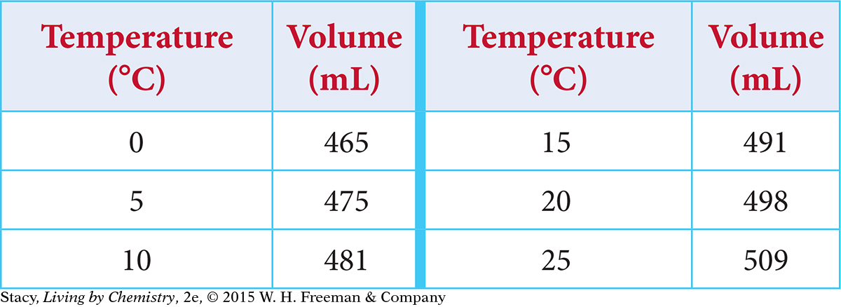
Graph these results for the heating of a gas:
Solution
The temperature is being changed, so temperature is the independent variable and should be graphed on the x-axis. The volume changes as a result, so it is the dependent variable and should be graphed on the y-axis. To graph the data, you need to decide on the scale for each axis. The x-axis can start at 0 °C and go up to 30 °C. To save space, you don’t need to show the y-axis starting at 0; it can go from 450 to 520. Label the axes “Temperature (°C)” and “Volume (mL).” Graph the coordinate pairs. Title the graph. In the title, the dependent variable is usually named first.
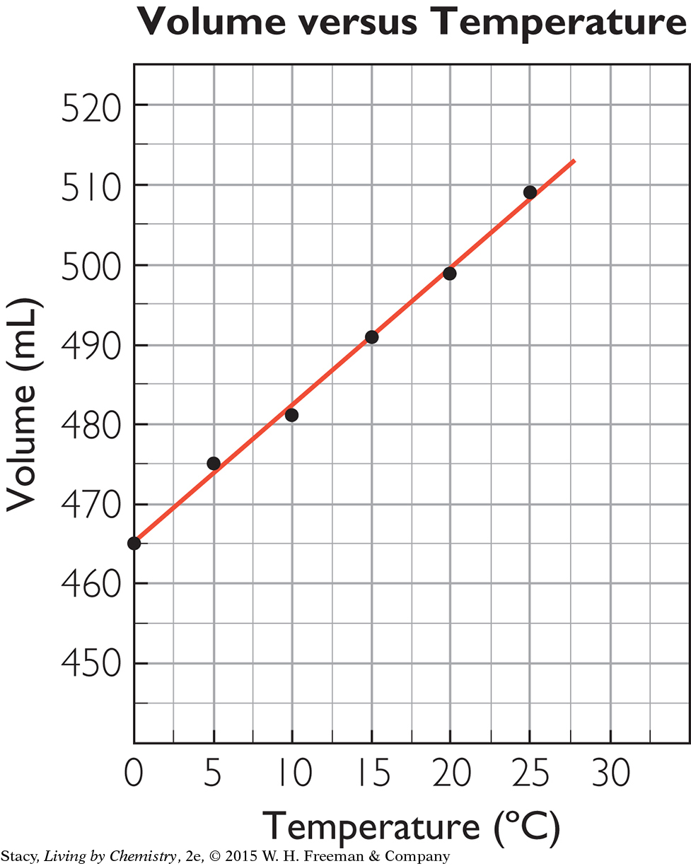
Notice that the points in the graph of volume versus temperature lie nearly in a straight line. Small errors in measurement account for the variation. The points are close enough to a line to indicate that the relationship between temperature and volume is linear. As one quantity increases, the other increases at a constant rate. So the quantities vary directly, or are directly proportional.
Example 2
Volume versus Pressure
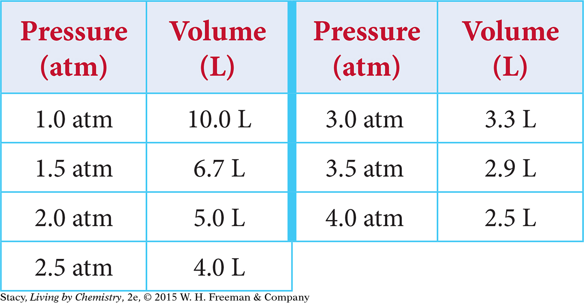
Graph the results of an experiment in which a gas’s volume is measured as pressure is applied. The temperature of the gas is kept from changing. This table shows the data collected.
Solution
An appropriate scale for the independent variable on the x-axis is 0 atm to 4.5 atm. The scale for the dependent variable on the y-axis can go from 0 L to 12 L. Label the axes and indicate the units: “Pressure (atm)” and “Volume (L).” The coordinate pairs to graph are (1.0, 10), (1.5, 6.7), (2.0, 5.0), and so on. Title the graph Volume versus Pressure.
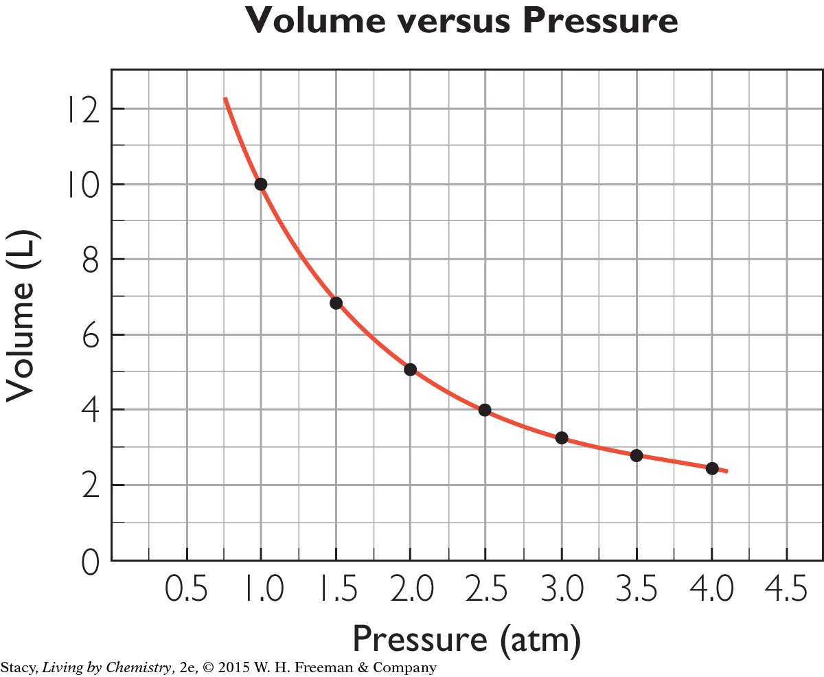
The points in the graph of volume versus pressure do not lie in a line, but you can draw a smooth curve through the points to show the trend. The shape of the graph is typical of relationships that are inversely proportional.
Practice Exercises
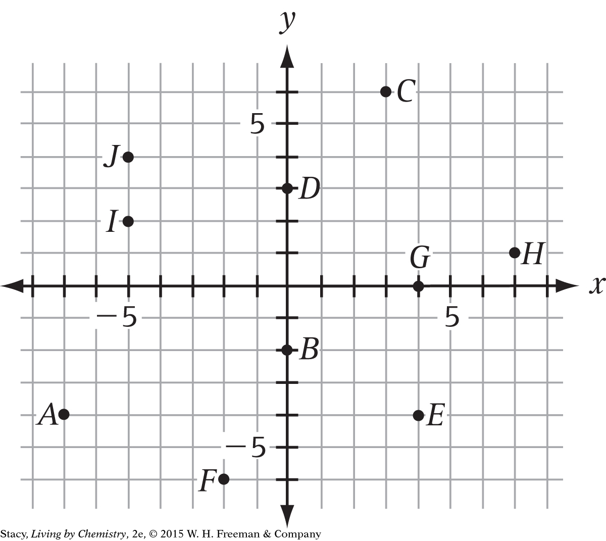
The examples all used coordinate pairs with positive values. But points can also have negative coordinates. The coordinates of point A are (–7, –4). Name the (x, y) coordinates of each point pictured.
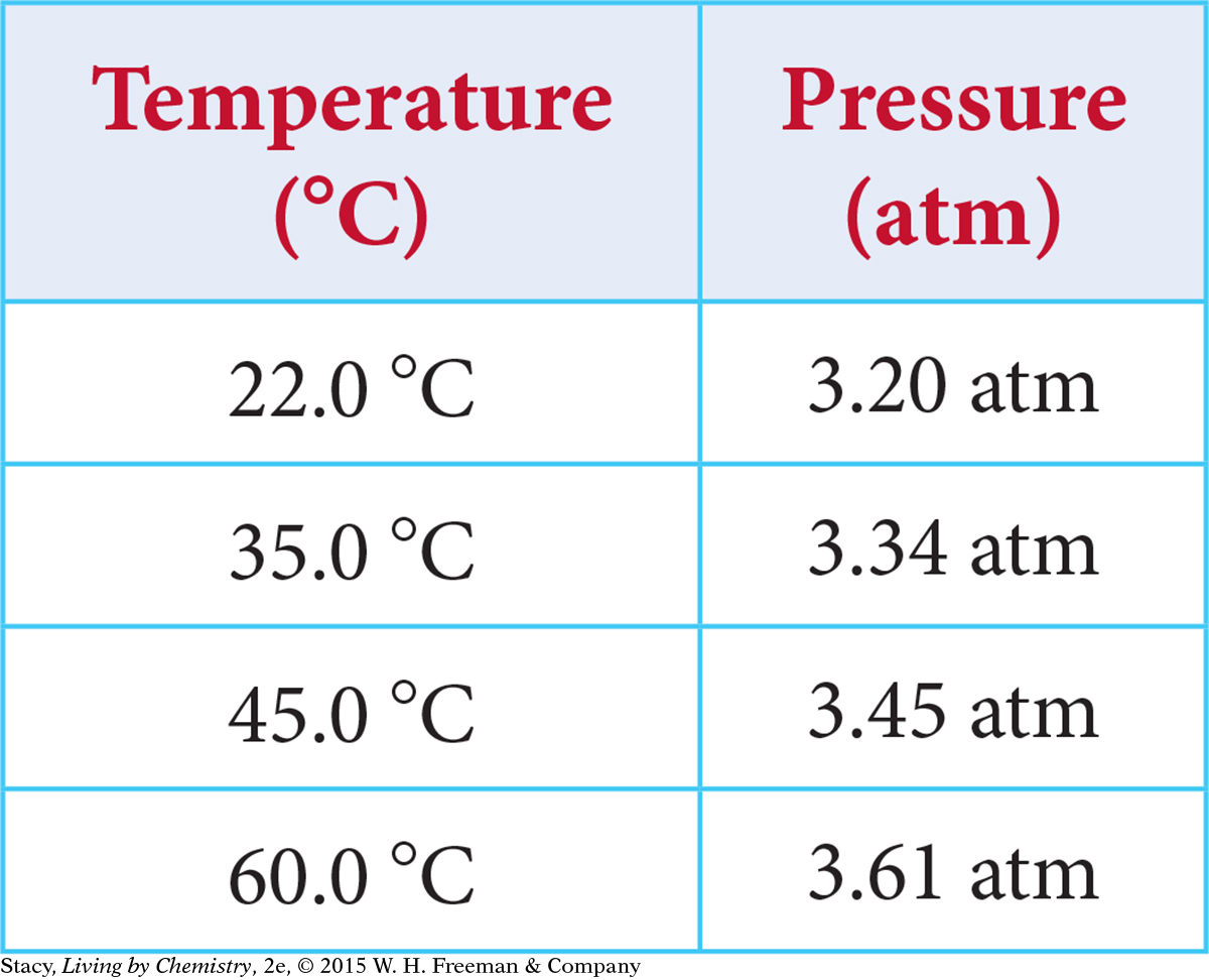
A sealed rigid container is heated and the pressure in the container is measured. Describe the graph of the data (your scales, axes titles, graph title, plotted points, and shape of the curve through the points).
These coordinate pairs represent measurements of volume and mass of copper: (1.1, 9.8), (2.3, 20.5), (2.7, 24.1), (4.5, 40.1). If these are graphed, what will be the shape of the graph? Are mass and volume directly proportional or inversely proportional?
Answers
B (0, –2), C (3, 6), D (0, 3), E (4, –4), F (–2, –6), G (4, 0), H (7, 1), I (– 5, 2), J (– 5, 4)
Sample answer: The x-axis is “Temperature (°C)” with a scale from 20 to 6 5. The y-axis is “Pressure (atm)” with a scale of 3.10 to 3.70. Plotted points are (22, 3.20), (3 5, 3.34), (4 5, 3.4 5), (60, 3.61). The graph title might be Pressure versus Temperature. The points lie in a straight line; the quantities are directly proportional.
A straight line through the origin; directly proportional.