Informational Report Presented through an Interactive Graphic
When reporting information to a broad audience or to multiple audiences, you may determine that different readers are primarily interested in different sections of your document. Chapter 5 recommends writing modular reports, or reports broken into various components addressed to different readers, in such situations. If you are working with information that can be presented visually, you might also consider creating an interactive graphic that allows users to navigate to the specific information they seek.
This interactive map, developed by researchers from the University of Maryland, Google, and the U.S. government, uses satellite data to illustrate changes in forest size over time and across the globe. The map is updated annually, and the data it draws on account for any and all possible causes of change in forest cover, from human-made disturbances such as logging to natural activity such as storms. The creators of the map wanted to provide a tool that would allow anyone anywhere to access data about forest change in the local region and in the world—data that were previously unavailable in many locations. This map collects global data in a single repository but gives users control over the nature and scope of what they view.
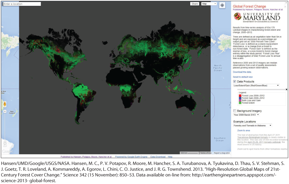
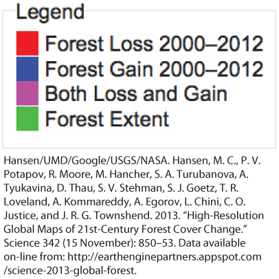
Watch the brief video demonstration below. You will see that the map’s home screen presents a global view of forest change. Forest loss, gain, and extent are represented by various colors explained in the map’s legend. From the home screen, users can navigate to specific locations for more detailed views of forest change in specific geographic areas. A dropdown menu in the panel to the right of the map allows users to view locations in which significant changes have recently occurred, such as the Tuscaloosa-Birmingham region of Alabama, where forests were devastated by a tornado in 2011. Users can also go directly to the search box in the upper left-hand corner of the map to view data for any location they wish.
Hansen/UMD/Google/USGS/NASA. Hansen, M. C., P. V. Potapov, R. Moore, M. Hancher, S. A. Turubanova, A. Tyukavina, D. Thau, S. V. Stehman, S. J. Goetz, T. R. Loveland, A. Kommareddy, A. Egorov, L. Chini, C. O. Justice, and J. R. G. Townshend. 2013. “High-Resolution Global Maps of 21st-Century Forest Cover Change.” Science 342 (15 November): 850–53. Data available on-line from: http://earthenginepartners.appspot.com/science-2013-global-forest.
Now that you’ve watched the video, answer the questions that follow.
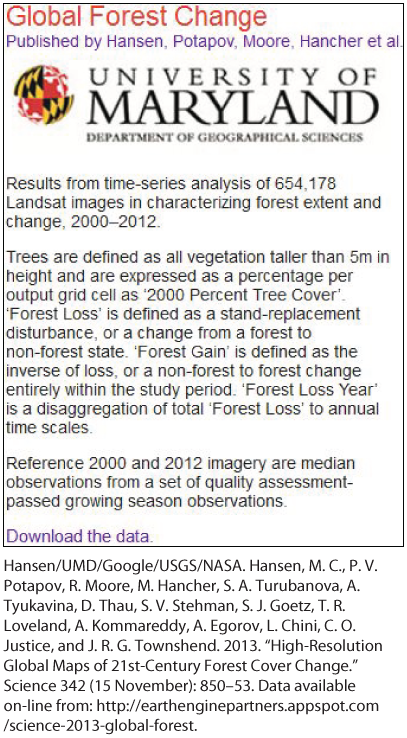
At the top of the page the following text is given, “Global Forest Change: Published by Hansen, Potapov, Moore, Hancher et al.” Followed by the college logo and name “University of Maryland: Department of Geographical Sciences.” The content below reads, “Results from time-series analysis of 654,178 Landsat images in characterizing forest extent and change, 2000-2012. Trees are defined as all vegetation taller than 5m in height and are expressed as a percentage per output grid cell as ‘2000 percent tree cover’. ‘Forest Loss’ is defined as a stand-replacement disturbance, or a change from a forest to non-forest state. ‘Forest Gain’ is defined as the inverse of loss, or a non-forest to forest change entirely within the study period. ‘Forest loss year’ is a disaggregation of total ‘Forest Loss’ to annual time scales. Reference 2000 and 2012 imagery are median observations from a set of quality assessment passed growing season observations.” A link reading, “Download the data” is given at the bottom of the page.
1 of 5
2 of 5
3 of 5