This infographic about how job seekers in England use social media presents three sets of data, each of which uses a different organizational pattern. The questions below ask you to think about the organizational patterns.
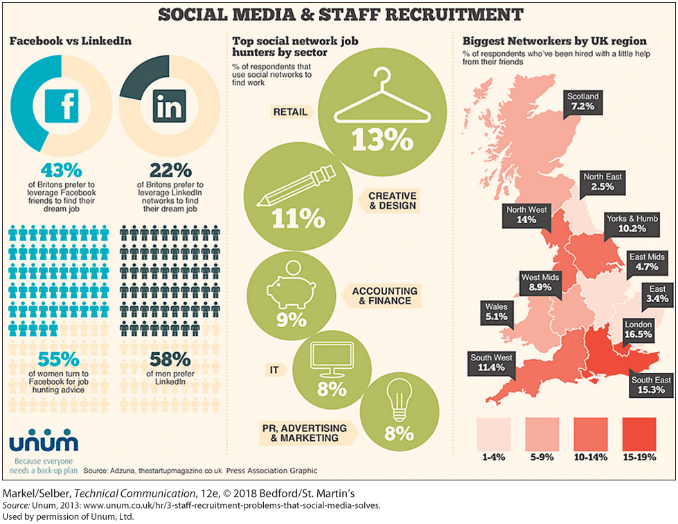
This infographic is titled Social Media & Staff Recruitment. It is organized into three segments.
At left, Facebook and Linked in are compared. Ring-shaped pie charts with a logo of each in the middle tell us the following, putting the percentages in large type:
- 43% of Britons prefer to leverage Facebook friends to find their dream job.
- 22% of Britons prefer to leverage Linked In networks to find their dream job.
Below the pie charts, a pictograph is shown in which people icons each represent a percentage point. 55 are arrayed on the left, Facebook side, and 58 are arrayed on the right, Linked In side. These charts tell us the following, putting the percentages in large type:
- 55% of women turn to Facebook for job hunting advice.
- 58% of men prefer Linked In.
The middle portion of the infographic shows top social network job hunters by sector, in percentage of respondents that use social networks to find work. Each sector is represented by a circle with the percentage and representative image. The circles are arranged in an arc.
- Retail: 13%. Icon is coat hanger.
- Creative and design: 11%. Icon is a pencil.
- Accounting and finance: 9%. Icon is a piggybank.
- IT: 8%. Icon is a computer monitor.
- P R, Advertising, and marketing: 8%. Icon is a light bulb.
The right side of the infographic shows the biggest networkers by U K region in percentage of respondents who've been hired with a little help from their friends. The graphic is a map of England by region, with each region tinted according to percentage. 1 to 4% is very light red; 5 to 9% is light red; 10 to 14% is medium red, and 15 to 19% is dark red. The regions are labeled as well as colored:
- Scotland: 7.2%
- North East: 2.5%
- North West: 14%
- York and Humb: 10.2%
- East Mids: 4.7%
- West Mids: 8.9%
- East: 3.4%
- Wales: 5.1%
- London: 16.5%
- South West: 11.4%
- South East: 15.3%.
Source: Adzuna, thestartupmagazine.co.uk.