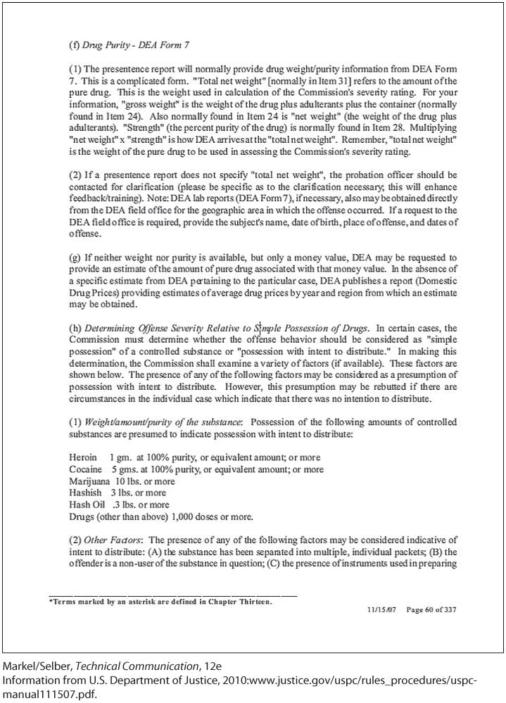
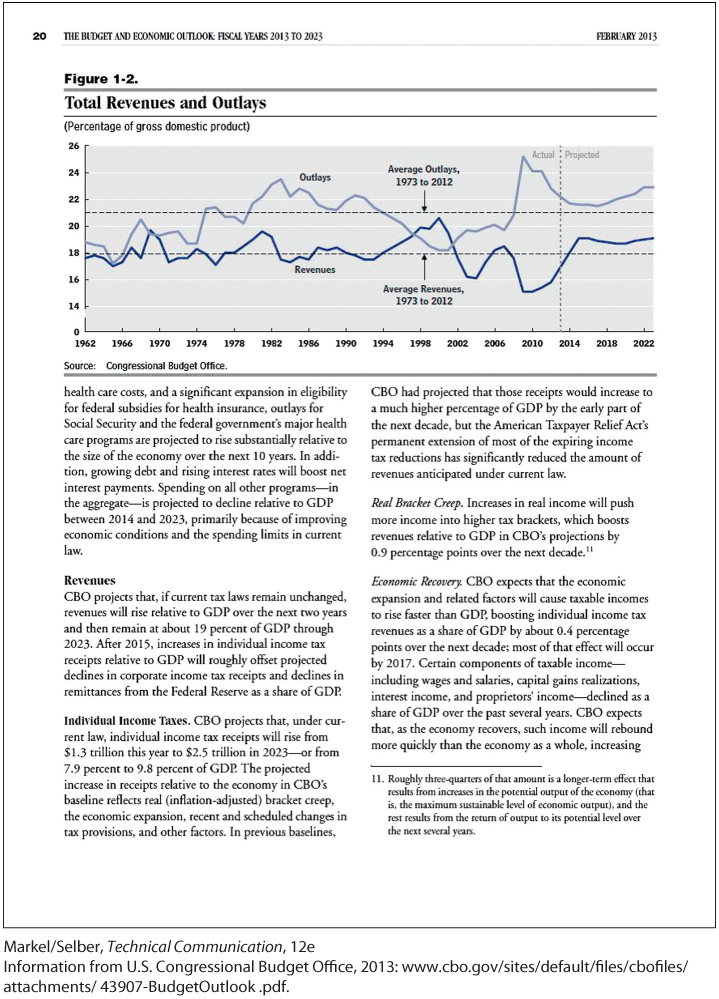
The two pages shown here come from different government reports. Both are printed on 8½ × 11-inch paper. The questions following each ask you to think about page design as discussed in this chapter.
"The page is titled as “Physical Activity Builds A Healthy and Strong America.” The page is horizontally divided into three sections. The first section is labeled as “THE PROBLEM” and it is vertically divided into two parts. The first part shows text “1 IN 2,” two pictorial representations of human beings, and a text beside the pictorial representations that reads, “About 1 in 2 adults live with a chronic disease. About half of this group has two or more.” In the second part of the first section, a pictorial representation of a woman in a circle is shown. The text ½ is written inside the circle toward the right side. Text beside the circle reads, “Only half of adults get the physical activity they need to help reduce and prevent chronic disease.”The second section is labeled as “NOT GETTING ENOUGH PHYSICAL ACTIVITY COSTS MONEY.” Text to the left end of the section titled “dollar 117 BILLION” reads, “dollar 117 billion in annual health care costs are associated with inadequate physical activity.” Four illustrations with milestones, “1 year, 5 years, and 10 years” are shown beside the text. The first illustration shows a man reading a book before the 1 year milestone. The second illustration shows a woman walking a dog and the third shows a man cycling, between both the first and the fifth year milestones. The fourth illustration shows a woman jogging between five years and ten-year milestones. The third section is labeled as “IMPACT ON MILITARY READINESS.” A US map overlaid with a few outlines of humans and an illustration of a boy holding a US flag is shown toward the left of the section. Text below the map reads, “Nearly 1 in 4 young adults are too heavy to serve in our military.” Text beside the map reads, “Long-term military readiness is at risk unless a large-scale change in physical activity and nutrition takes place in America. Mission: Readiness Military Leaders for Kids.”"
"The page is titled as “Physical Activity Builds A Healthy and Strong America.” The page is horizontally divided into three sections. The first section is labeled as “THE PROBLEM” and it is vertically divided into two parts. The first part shows text “1 IN 2,” two pictorial representations of human beings, and a text beside the pictorial representations that reads, “About 1 in 2 adults live with a chronic disease. About half of this group has two or more.” In the second part of the first section, a pictorial representation of a woman in a circle is shown. The text ½ is written inside the circle toward the right side. Text beside the circle reads, “Only half of adults get the physical activity they need to help reduce and prevent chronic disease.”The second section is labeled as “NOT GETTING ENOUGH PHYSICAL ACTIVITY COSTS MONEY.” Text to the left end of the section titled “dollar 117 BILLION” reads, “dollar 117 billion in annual health care costs are associated with inadequate physical activity.” Four illustrations with milestones, “1 year, 5 years, and 10 years” are shown beside the text. The first illustration shows a man reading a book before the 1 year milestone. The second illustration shows a woman walking a dog and the third shows a man cycling, between both the first and the fifth year milestones. The fourth illustration shows a woman jogging between five years and ten-year milestones. The third section is labeled as “IMPACT ON MILITARY READINESS.” A US map overlaid with a few outlines of humans and an illustration of a boy holding a US flag is shown toward the left of the section. Text below the map reads, “Nearly 1 in 4 young adults are too heavy to serve in our military.” Text beside the map reads, “Long-term military readiness is at risk unless a large-scale change in physical activity and nutrition takes place in America. Mission: Readiness Military Leaders for Kids.”"

1 of 6
2 of 6
3 of 6
