FIGURE 8-
Making Fair Comparisons
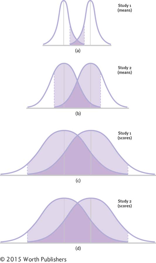
The top two pairs of curves (a and b) depict two studies, study 1 and study 2. The first study (a) compared two samples with very large sample sizes, so each curve is very narrow. The second study (b) compared two samples with much smaller sample sizes, so each curve is wider. The first study has less overlap, but that doesn’t mean it has a bigger effect than study 2; we just can’t compare the effects. The bottom two pairs (c and d) depict the same two studies, but used standard deviation for the individual scores. Now they are comparable and we see that they have the same amount of overlap—
Making Fair Comparisons
The top two pairs of curves (a and b) depict two studies, study 1 and study 2. The first study (a) compared two samples with very large sample sizes, so each curve is very narrow. The second study (b) compared two samples with much smaller sample sizes, so each curve is wider. The first study has less overlap, but that doesn’t mean it has a bigger effect than study 2; we just can’t compare the effects. The bottom two pairs (c and d) depict the same two studies, but used standard deviation for the individual scores. Now they are comparable and we see that they have the same amount of overla