Chapter 2 Introduction
BEFORE YOU GO ON
You should understand the different types of variables—nominal, ordinal, and scale (Chapter 1).
You should understand the difference between a discrete variable and a continuous variable (Chapter 1).
Page 24
We begin this chapter with a demonstration of how statistics can reveal hidden patterns within children’s television programming. It has been suggested that children who are exposed to fast-paced television programming—quick camera changes, lots of sound effects, multiple plots—have more difficulty with learning and tend to be less imaginative (Healy, 1990). In addition, the popular children’s program Sesame Street has also been criticized for its fast pacing, which critics believe encourages children to love television but not to love learning (Postman, 1985).
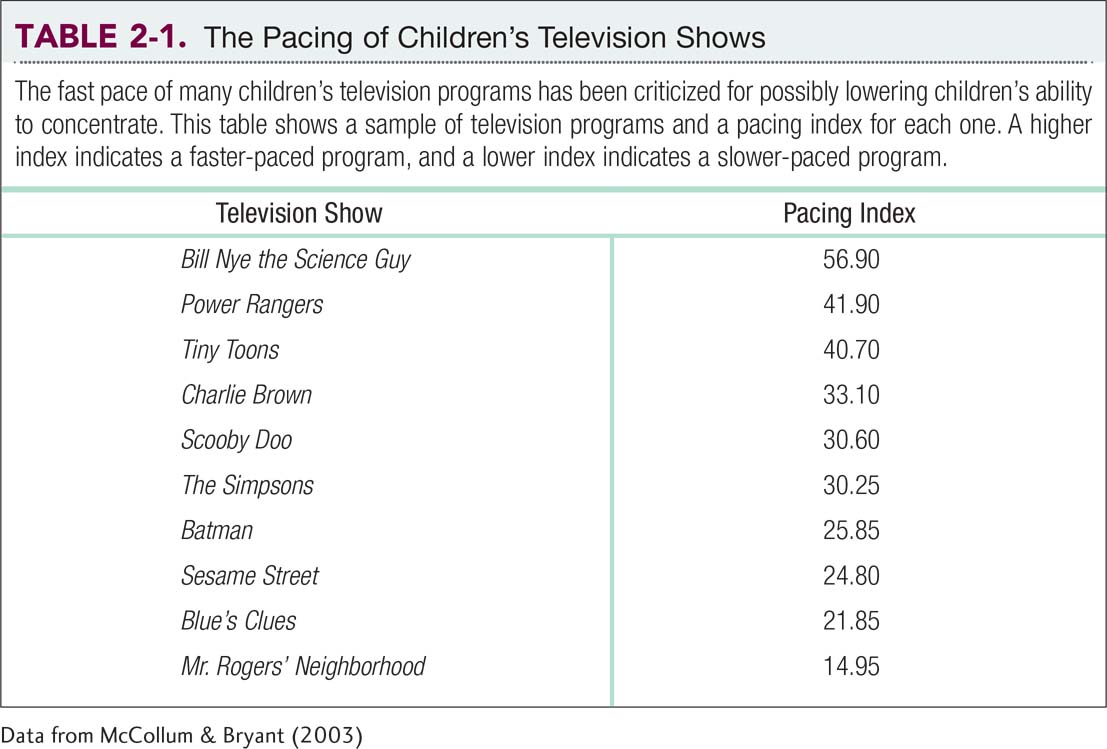
To understand the effects of pacing, researchers created a list that reported the pacing scores for 87 popular children’s television programs broadcast in the United States (McCollum & Bryant, 2003). Table 2-1 depicts an excerpt of these pacing scores; you can see that Mr. Rogers’ Neighborhood was the slowest-paced show (not surprising to those who have seen it), with a pacing score of 14.95. The fastest-paced show was Bill Nye the Science Guy, with a pacing score of 56.90.

Data from McCollum & Bryant (2003)
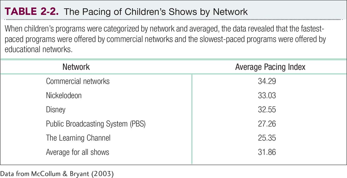
The first step in discovering hidden patterns in these data about children’s television programming is to organize observations about the programming. That will allow us to ask better questions, such as whether fast-paced programs harm children’s ability to learn. The jury is still out. Even though Sesame Street is slow-paced relative to other shows, some researchers still regard it as too fast-paced to achieve its educational goals (Schmidt & Vandewater, 2008). However, the researchers who developed the pacing index discovered some other interesting information when they averaged the pacing of children’s television shows across different networks. The list in Table 2-2, in order of rank, shows that commercial networks produced the fastest-paced shows and that educational television produced the slowest-paced shows. Perhaps fast pacing helps commercial networks win the competition for viewers’ eyes, whereas slow pacing wins the competition for viewers’ minds.

Data from McCollum & Bryant (2003)
In this chapter, we learn how to organize individual data points in a table. Then we go one step further and learn how to use two types of graphs—histograms and frequency polygons—to show the overall pattern of data. Finally, we learn to use these graphs to understand the shape of the distribution of the data points. These tools are important steps for using statistics in the behavioral sciences.

