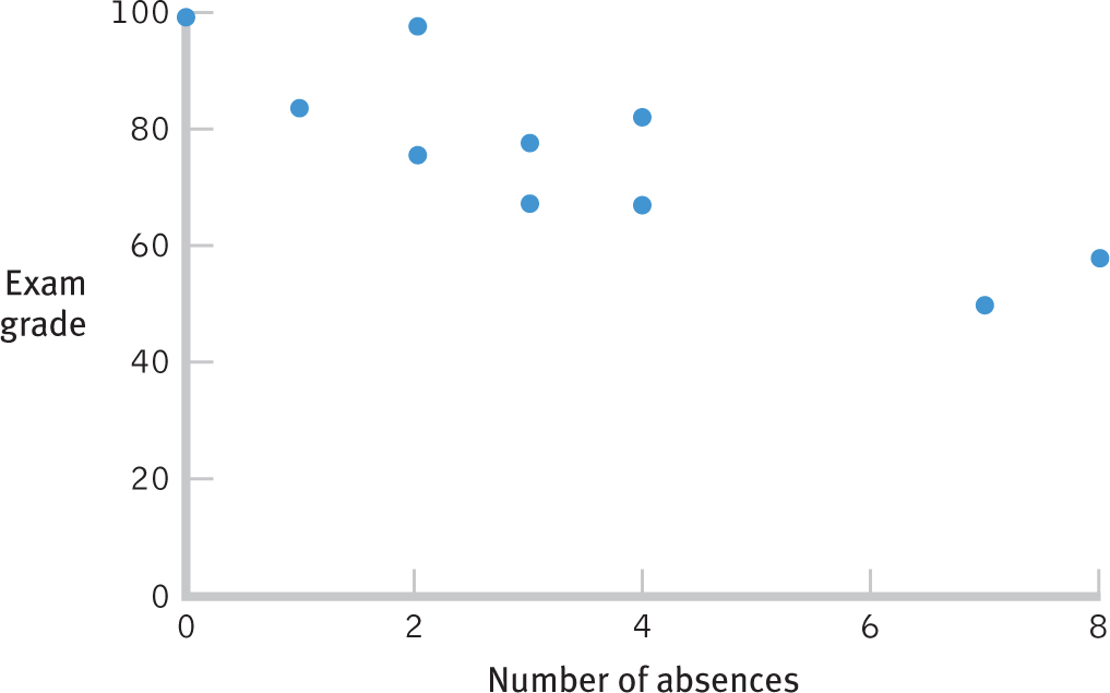
Always Start with a Scatterplot Before calculating a correlation coefficient for the relation between number of absences from class and exam grade, we construct a scatterplot. If the relation between the variables appears to be roughly linear, we can calculate a Pearson correlation coefficient. We can also use the scatterplot to make a guess about what we expect from the correlation. Here, the correlation appears to be negative. The pattern of data goes down and to the right, and high scores on one variable are associated with low scores on the other. In addition, we would expect a somewhat large correlation— that is, fairly close to −1.00—because the data are fairly close to forming a straight line.