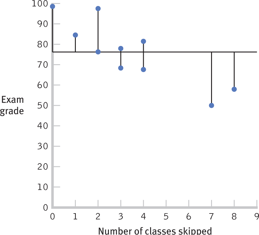
Figure 16-5
Visualizing Error A graph with a horizontal line for the mean, 76, allows us to visualize the error that would result if we predicted the mean for everyone. We draw lines for each person’s point on a scatterplot to the mean. Those lines are a visual representation of error.