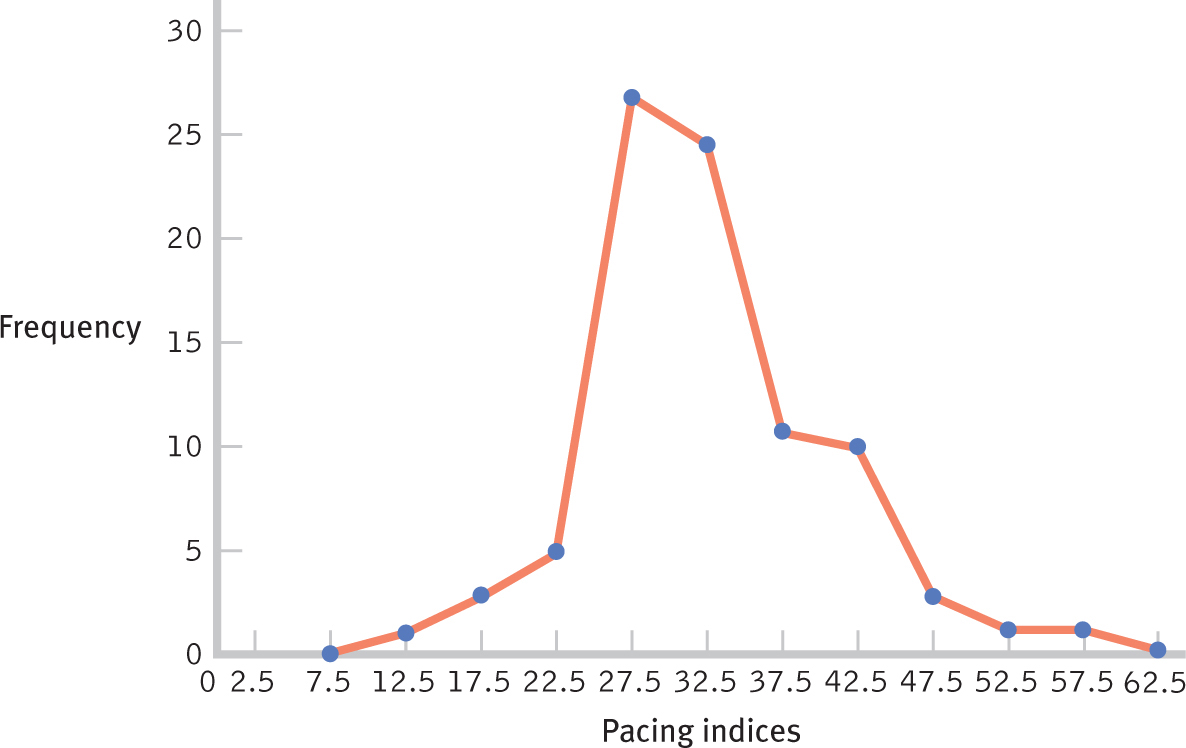
Figure 2-3
Frequency Polygon as Another Graphing Option for the TV Pacing Index Data Frequency polygons are an alternative to histograms. This frequency polygon depicts the same data that were depicted in the histogram in Figure 2-2. In either case, the graph provides an easily interpreted “picture” of the distribution.

