Figure 3-1
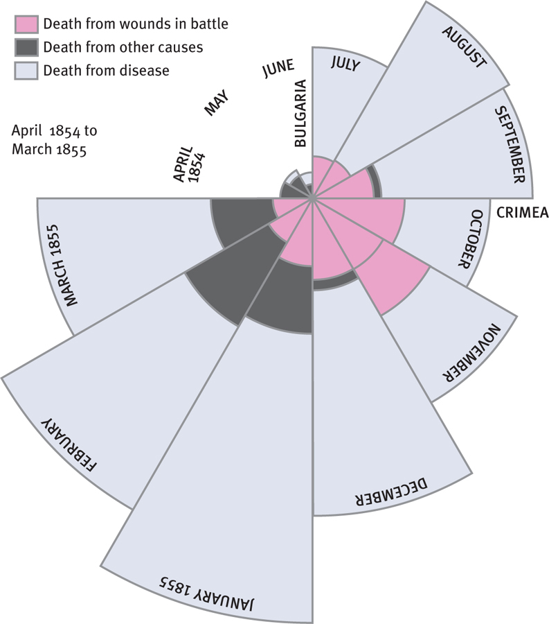
Graphs That Persuade Florence Nightingale’s coxcomb graphs, “Causes of Mortality in the Army in the East,” address the period from April 1854 to March 1856. This adaptation of her April 1854 to March 1855 graphic is called a coxcomb graph because the data arrangement resembles the shape of a rooster’s head. The 12 sections represent the ordinal variable of a year broken into 12 months. The size of the sections representing each month indicates the variable of how many people died in that particular month. The colors correspond to the different causes of death.