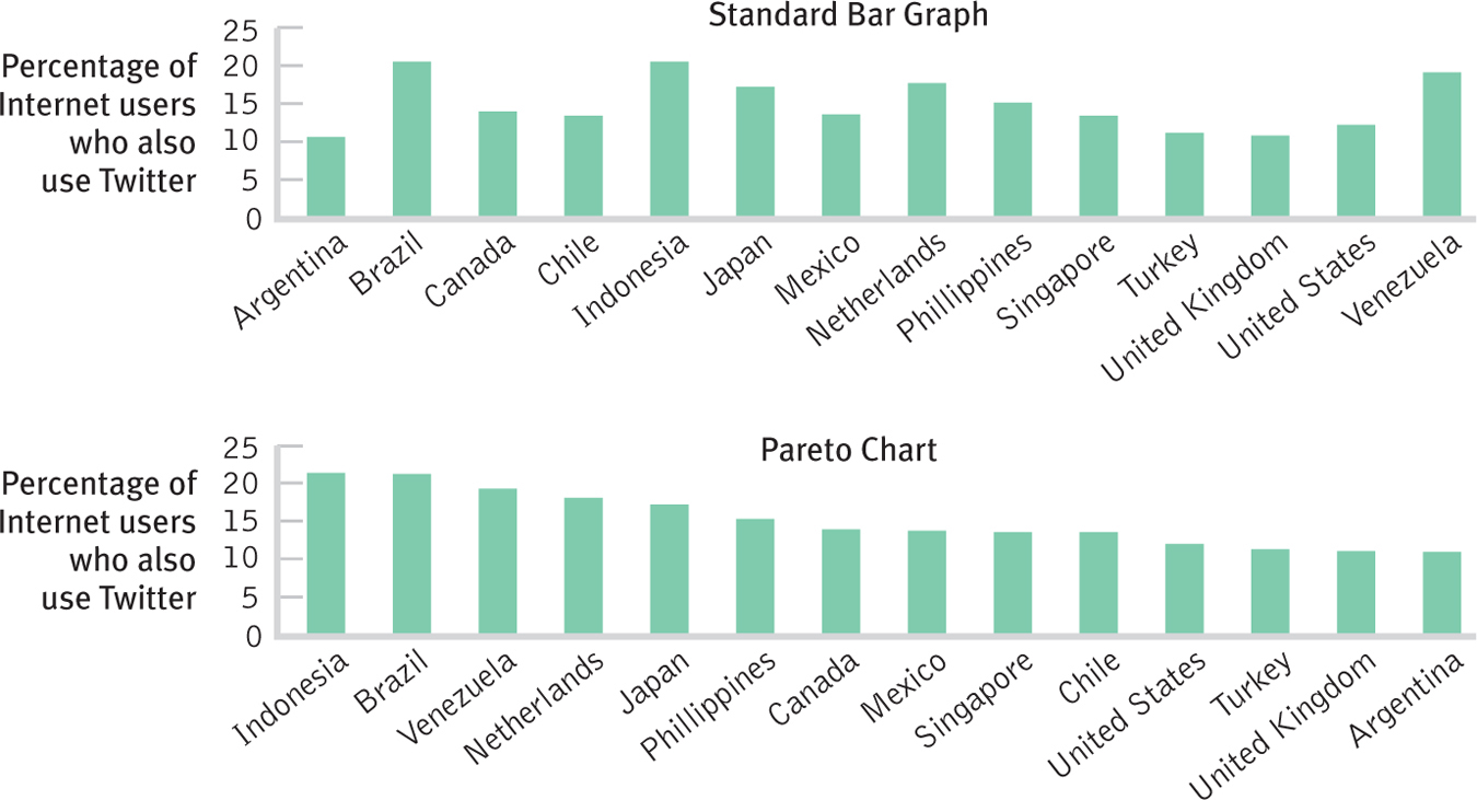
The Flexibility of the Bar Graph The standard bar graph provides a comparison of Twitter usage among 14 levels of a nominal dependent variable, country. The Pareto chart, a version of a bar graph, orders the countries from highest to lowest along the horizontal axis, which allows us to more easily pick out the highest and lowest bars. We can more easily know that Canada places in the middle of these countries, and that the United States and the United Kingdom are toward the bottom. We have to do more work to draw these conclusions from the original bar graph.